Bootstrap v5.3.3 is here with bug fixes, documentation improvements, and more follow-up enhancements for color modes. Keep reading for the highlights!
Highlights
Fixed a breaking change introduced with color modes where it was required to manually import variables-dark.scss when building Bootstrap with Sass. Now, _variables.scss will automatically import _variables-dark.scss. If you were already importing _variables-dark.scss manually, you should keep doing it as it won’t break anything and will be the way to go in v6.
Fixed a regression in the selector engine that wasn’t able to handle multiple IDs anymore.
Color modes
Badges now use the .text-bg-* text utilities to be certain that the text is always readable (especially when the customized colors are different in light and dark modes).
Fixed our color-modes.js script to handle the case where the OS is set to light mode and the auto color mode is used on the website. If you copied the script from our docs, you should apply this change to your own script.
Fixed color schemes description in the color modes documentation to show that color-scheme() only accept light and dark values as parameters.
Miscellaneous
Allowed <dl>, <dt> and <dd> in the sanitizer.
Dropped evenly items distribution for modal and offcanvas headers.
Fixed the accordion CSS selectors to avoid inheritance issues when nesting accordions.
Fixed the focus box-shadow for the validation stated form controls.
Fixed the focus ring on focused checked buttons.
Fixed the product example mobile navbar toggler.
Changed the RTL processing of carousel control icons.
Docs
Dropped unnecessary right margin for example code blocks.
Bootstrap v5.3.2 is here with bug fixes, documentation improvements, and more follow-up enhancements for color modes. Keep reading for the highlights!
Highlights
Passing a percentage unit to the global abs() is deprecated since Dart Sass v1.65.0. It resulted in a deprecation warning when compiling Bootstrap with Dart Sass. This has been fixed internally by changing the values passed to the divide() function. The divide() function has not been fixed itself so that we can keep supporting node-sass cross-compatibility. In v6, this won’t be an issue as we plan to drop support for node-sass.
Using multiple ids in a collapse target wasn’t working anymore and has been fixed.
Color modes
Increased color contrast of form range track background in light and dark modes.
Fixed table state rendering for color modes with a focus on the striped table in dark mode to increase color contrast.
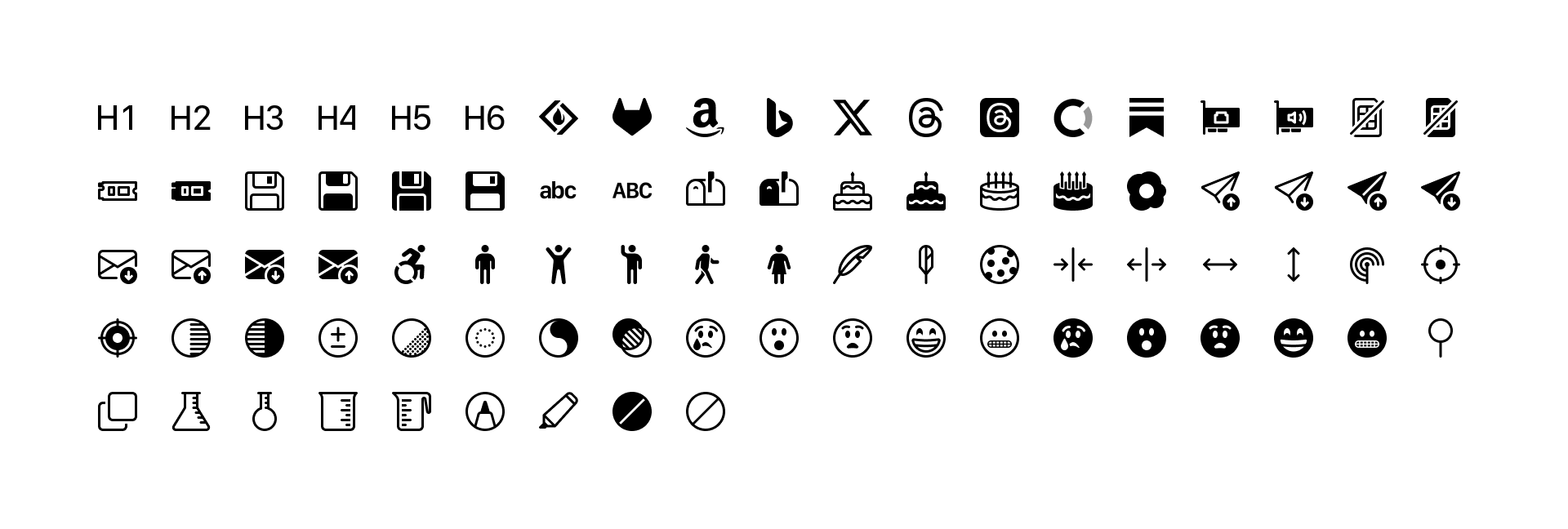
Bootstrap Icons v1.11.0 has arrived with 100 new icons—including new floppy disk icons, additional brand icons, new person icons, new emojis, some birthday cake, a few new science icons, and more. We’re now at over 2,000 icons!
100 new icons
Here’s a quick look at all the new icons in v1.11.0:
I’ve also started adding a new added tag to icon pages with this release. So far I’ve only tagged v1.10.0 and v1.11.0 versions, but more will come. Once those are all tagged, you’ll be able to search for icons added in each release. Stay tuned!
Looking for more new icons? Head to the issue tracker to check for open requests or submit a new one.
The Figma file is now published to the Figma Community! It’s the same Bootstrap Icons Figma file you’ve seen from previous releases, just a little more accessible to those using the app.
It’s official, the final stable release of v5.3.0 has landed! It’s been a monumental effort to revamp our codebase for CSS variables and color modes, one that will see continued changes leading up to an eventual Bootstrap 6. And we’re so excited to finally ship it!
On top of all the work that’s gone into this release, a lot has happened behind the scenes since we shipped our pre-releases. Keep reading to learn everything that’s new in v5.3.0.
Keep reading for the deep dive on all the top new features.
Dark mode
Bootstrap’s core has been rewritten to provide first-class support for dark mode. Moreover, Bootstrap now supports any number of color modes, allowing you to build your own custom themes or more nuanced color modes. Let’s take a look at how our new dark mode works first.
Bootstrap’s new dark mode is opt-in by default, meaning you’ll need to set a data-bs-theme attribute on the root <html> element to change the entire page’s design. This was done to best support custom color modes beyond light and dark—more on that later. It also helps folks who aren’t ready for dark mode in their own designs.
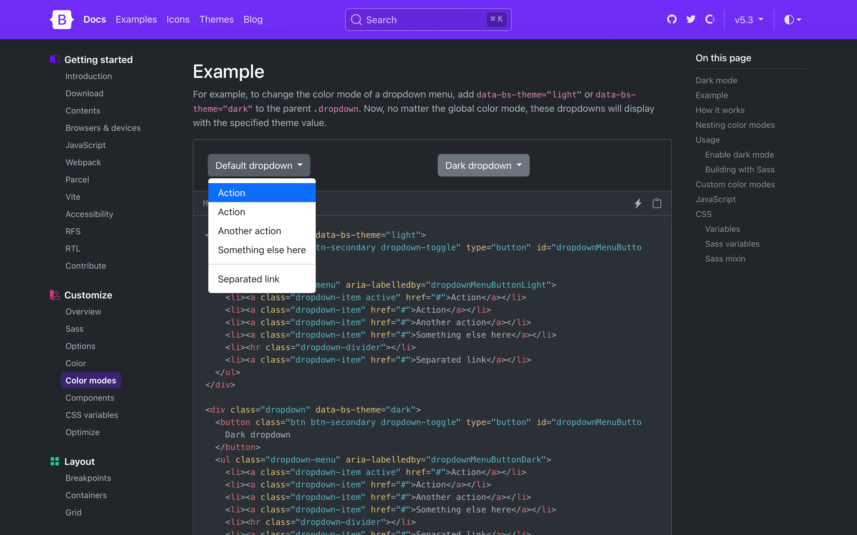
Need a more isolated dark mode? You can also set the color mode on a parent element like the .dropdown shown below. This will only affect the dropdown and its children instead of the entire page.
Dark mode styles are written with and generated through the new color-mode() Sass mixin. The mixin allows you to write styles specific to a particular color mode, like dark mode.
Together with the new $color-mode-type Sass variable, you can also change how color modes behave in Bootstrap. The default value is data, which tells Bootstrap to generate CSS selectors that scope the color mode’s styles to the data attributes you’ve seen above.
The other supported value is media-query, which generates media query selectors instead. This is helpful for those who want light and dark modes, automatically, and without a user override.
While we haven’t written a new JavaScript plugin for toggling color modes, we’ve written a great script for toggling color modes via data-bs-theme in our docs. Our implementation defaults to a user’s operating system color mode (auto), but also allows users to override that with a particular mode (light or dark) that’s recorded in local storage for easy reference on future page loads. You can use and adapt this script as needed.
New color mode variables
There’s also a new _variables-dark.scss stylesheet that houses dark mode-specific Sass variables. This is where we modify mostly global values, and some component-specific values, for dark mode. We recommend creating separate Sass stylesheets for additional custom color modes (e.g., a blue theme might have _variables-blue.scss). We expect this stylesheet to be simplified in our next major release as we continue to streamline the code base.)
Dark mode colors are all derived from our theme colors, meaning you can easily change the color mode palettes by updating the original theme colors. This means we’re not using our already tinted and shaded colors (e.g., shade-color($danger, 60%) instead of red-800 for the new danger emphasis color).
Bootstrap v5.3.0 ships with dark mode enabled, but you can also disable it by updating the boolean $enable-dark-mode Sass variable.
If you’re using the CDN or starter template, using the new color modes is straightforward. Add the data-bs-theme attribute with light or dark values to the <html> element and you’ll be using either the light or dark theme.
When we set out to add dark mode support to Bootstrap, we didn’t want to just add a dark mode. We wanted to build the foundations for a color mode system that could be used to create any number of themes and color modes. That’s why we lead with the data-bs-theme attribute and the new color-mode() Sass mixin, and why we’ve added so many new CSS variables in these latest releases.
To add a custom color mode, create your own data-bs-theme selector with a custom value as the name of your color mode, then modify any Sass and CSS variables as needed. We created a separate _variables-dark.scss stylesheet to house Bootstrap’s dark mode-specific Sass variables, but that’s not required for you.
For example, you can create a “blue theme” with the selector data-bs-theme="blue". In your custom Sass or CSS file, add the new selector and override any global or component CSS variables as needed. If you’re using Sass, you can also use Sass’s functions within your CSS variable overrides.
Heads up! Applying color modes to elements that aren’t the <html> or <body> elements requires classes like .text-body and .bg-body. This is because many HTML elements have no set color or background to style until you add them yourself. We’ve included them here for you just in case.
[data-bs-theme="blue"]{// CSS variable overrides and styles
}
<divdata-bs-theme="blue"> ...
</div>
Refreshed color palette
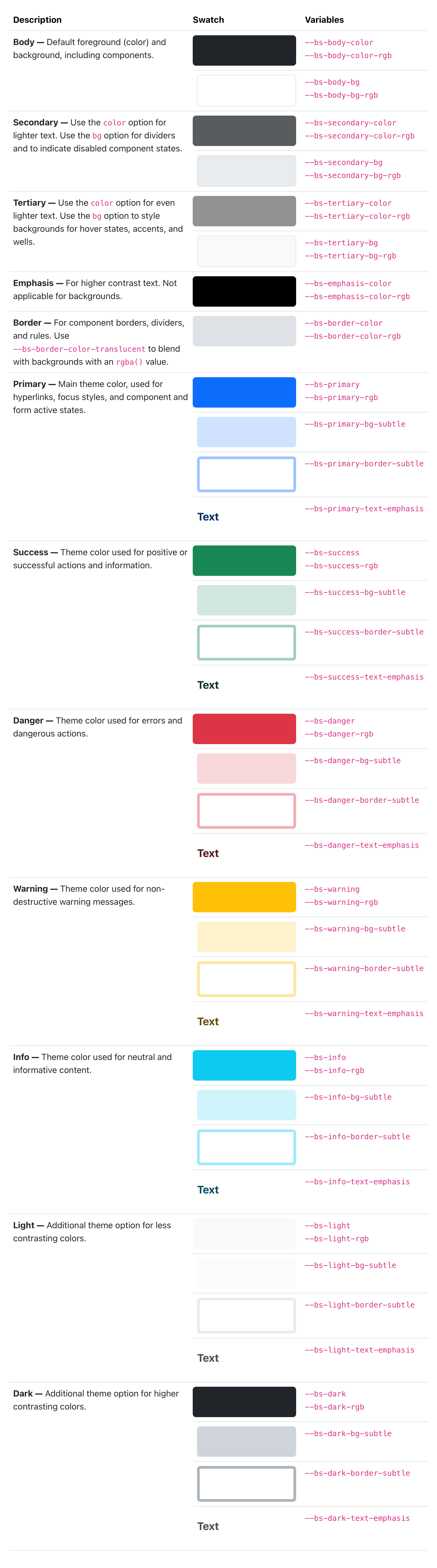
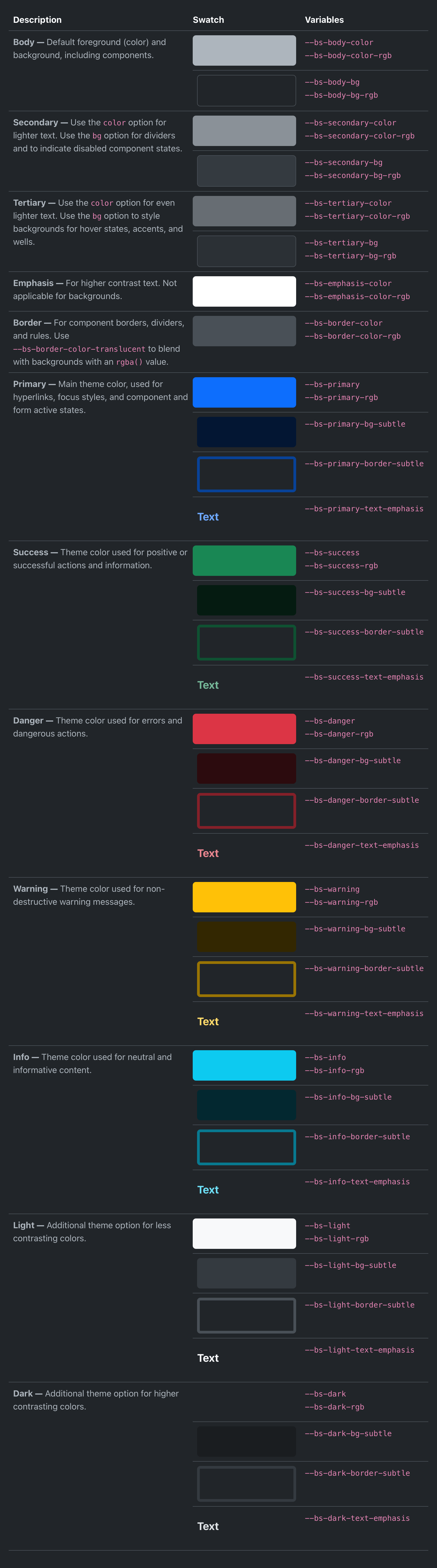
We’ve revamped our color palette to include all new Sass variables, CSS variables, and utilities for setting color, background-color, and border-color. Our foreground and background colors have been expanded to include new secondary, tertiary, and emphasis colors, while our theme colors have been expanded on to include their subtle background colors, subtle border colors, and darker text colors.
We’ve rebuilt some components (like list groups and alerts) to use these new variables in their source Sass and compiled CSS so that they respond to the color mode changes.
New link helpers and utilities
Link styling has infinitely better in v5.3.0 with a slew of all-new link helpers and utilities. First up, we’ve added styles to place icons like Bootstrap Icons alongside links with the new icon link helper.
On the utilities side, we have new classes for setting link color opacity, underline offset, underline color, and underline opacity. Explore the new links utilities.
Lastly, we’ve added a new .link-body-emphasis helper alongside our colored links. This creates a colored link using our color mode responsive emphasis color.
There’s a new .nav variant and modifier class with .nav-underline. Add .nav-underline to a .nav to get a simpler bottom border under the active nav link. See the docs for an example.
Beyond all the color mode updates, new helpers, and new utilities, we have a ton of other quality-of-life updates in this release. Here’s a quick rundown of the highlights:
Navs now have new :focus-visible styles that better match our custom button focus styles.
CSS variable-based border-width utilities have been reverted to set their property directly (as was done before v5.2.0). This avoids inheritance issues across nested elements, including tables.
Added new .border-black utility to match our .text-black and .bg-black utilities.
Deprecated the .text-muted utility and $text-muted Sass variable. It’s been replaced by .text-body-secondary and $body-secondary-color.
Added a check for interpolated variables to catch compilation errors with Node Sass when using Sass variables in calc() functions.
Started using --bs-border-radius variables across more components.
Added .d-inline-grid utility class.
Fixed .tooltip-inner placement when using variations in fallbackPlacements.
Fix selectors for dark mode carousel overrides when compiling with $color-mode-type: media-query.
Updated the styling of floating labels when “floated” to include a background-color to help with multiple lines of text in textareas. This also fixes the colors when form elements are disabled in floating forms.
Updated RFS to v10.0.0.
Next up
We’ll be shipping some patch releases for v5.3.x in the coming weeks to address any issues that come up. We’ll also be working on v5.4.0, which will primarily focus on improvements to our utilities API and related code. Stay tuned for more updates on that front!
 @julien-deramond
February 20, 2024
@julien-deramond
February 20, 2024