Bootstrap 4 Alpha 6
 @mdo
January 06, 2017
@mdo
January 06, 2017
Alpha 6 has landed, and it’s one of our biggest ships to date. We’ve rewritten our grid system and all major components in flexbox, forging ahead with it as our default layout option as we drop IE9 support. With 700 commits since our last release, we have some catching up to do.
Read one for highlights from this release. We also recommend reviewing the ship list and milestone for a more detailed look at what’s changed.
Embracing Flexbox
Bootstrap 4 is now flexbox by default! Flexbox is an immensely powerful layout tool, providing unparalleled flexibility (hah) and control to our grid system and core components. It comes at the cost of dropping IE9 support, but brings significant improvements to component layout, alignment, and sizing.
Bootstrap flexbox on jsbin.com
If you’re unfamiliar with flexbox, here’s some of the power you can expect to utilize in Bootstrap 4:
- Automatic equal-width grid columns (e.g., two columns are automatically 50% wide)
- Equal height and equal width cards
- Vertical and horizontal centering without hardcoding values with
translateormargin - Utility classes for easily (and responsively!) changing display, direction, alignment, and more
- Auto margins for easy spacing
- Justified navigation and button groups
- No more HTML white space or broken table-style rendering
Nearly every component now takes advantage of flexbox in place of display: table hacks and floats. That means less reliance on clearfix, more control over DOM and visual order, and fewer bugs. Navs, list groups, cards, and more all utilize flexbox. Even more complex components like the carousel have been modified to use flexbox in some places.
Bootstrap carousel on jsbin.com
Responsive utilities and the great infix
With Alpha 6, we’ve made Bootstrap’s extensive suite of utilities—including classes for display, float, and flexbox, and more—completely responsive. To keep these class names as approachable and representative of their scope as possible, we’ve also made two important changes to their naming scheme.
-
First, we’ve dropped the
-xsinfix from our lowest (extra small) breakpoint. xs isn’t a responsive breakpoint quite likesm,md,lg, andxlbecause it doesn’t start applying styles at amin-widthand up. It simply applies to everything as there’s no bounding@mediaquery. -
Second, we’ve renamed several classes to better articulate their property-value pairings. Instead of pull, we use float. Instead of creating new names for the various flexbox properties, we start with the property name.
Put that all together and you end up with updated classes like .col-6, .d-none, .float-right, .d-md-flex, .justify-content-end, and .text-lg-left. These new classes bring immense power and customization to folks building with Bootstrap. They also make it easier for those migrating from v3 with clearer mappings to legacy class names.
More grid improvements
We’re back at it with more grid improvements. This time we’ve added responsive autosizing columns and more container padding options. Add any number of .col-* classes and they’ll automatically be equal in width.
Bootstrap flexbox auto columns on jsbin.com
Padding for grid containers can now be configured across breakpoints with the new $grid-gutter-widths Sass map. In addition, you can remove gutters from grid rows and their columns with the .no-gutters modifier.
Updated navbar
As mentioned in our last release, the Alpha 5 navbar was a little half baked. This time around, we’re completely baked. No, but seriously, the navbar has been rewritten to provide better built-in responsive behaviors and improved layout customization thanks to our move to flexbox.
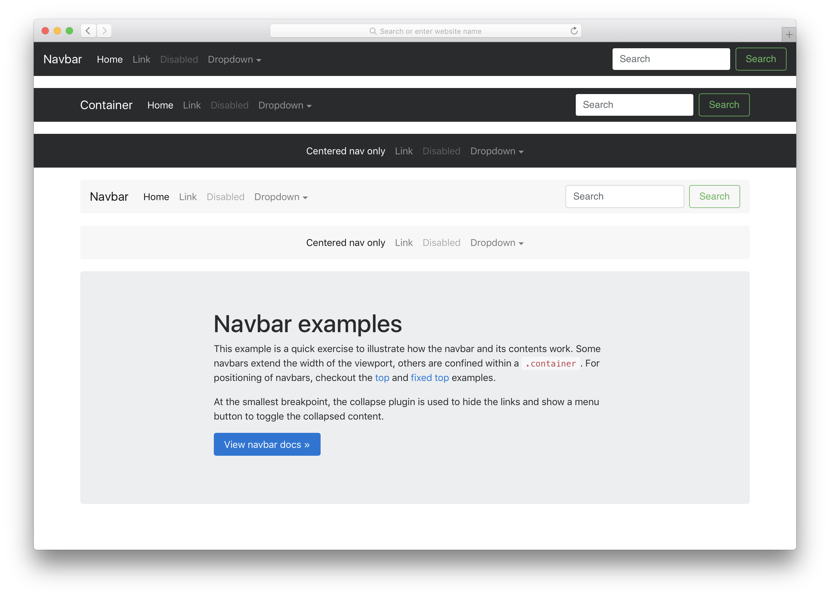
Here’s the rundown on what’s changed:
- Navbars are built with flexbox! Instead of floats, you’ll need flexbox and margin utilities.
- Navbar navs no longer require the
.navbase class. While it provided a starting point, these shared styles often got in the way of navbar behaviors. Now it’s just.navbar-navand utilities for alignment. - The
.navbar-toggleableclasses are now applied to the.navbarinstead of the.collapsewithin. This allows us to provide better responsive behavior with just one class change. - The responsive navbar toggle,
.navbar-toggler, has also been updated. The icon is once again a child element,.navbar-toggler-icon, for improved customization. It also includes easy modifiers for absolutely aligning it to the top right or top left.
Check out the navbar docs to learn more and see it in action.
Up next, our first beta
Like you, we’re very much ready for our first beta release. Luckily, we’re in great shape to get there from this alpha. We have the fewest open issues and pulls we’ve had in easily the last 18 months, and the contributions from the community have been outstanding. As we head to our first beta, we’ll be focused on not adding anything new, ideally making as few breaking changes as possible, and emphasizing documentation quality and bug fixes.
We need your help to get there though. Please dive into this latest release and continue to report bugs and submit pull requests as you can. Every bit helps us improve the next release!
For more details on this release’s changes, take a look at the Alpha 6 ship list issue, as well as the closed Alpha 6 milestone. Be sure to join our official Slack room! and dive into our issue tracker with bug reports, questions, and general feedback whenever possible.
Using the Bootstrap CDN? Review the changelog and update your CDN links to point to the latest files:
<!-- Latest compiled and minified CSS -->
<link rel="stylesheet" href="https://maxcdn.bootstrapcdn.com/bootstrap/4.0.0-alpha.6/css/bootstrap.min.css" integrity="sha384-rwoIResjU2yc3z8GV/NPeZWAv56rSmLldC3R/AZzGRnGxQQKnKkoFVhFQhNUwEyJ" crossorigin="anonymous">

<!-- Latest compiled and minified JavaScript -->
<script src="https://maxcdn.bootstrapcdn.com/bootstrap/4.0.0-alpha.6/js/bootstrap.min.js" integrity="sha384-vBWWzlZJ8ea9aCX4pEW3rVHjgjt7zpkNpZk+02D9phzyeVkE+jo0ieGizqPLForn" crossorigin="anonymous"></script>