Bootstrap 5 Alpha 2
 @mdo
September 29, 2020
@mdo
September 29, 2020
We’re back at it again with a brand new alpha release of Bootstrap 5! Our second alpha has brought some new and improved features, color contrast improvements, improved helpers and utilities, and some documentation design updates.
Check out the latest in the docs at https://v5.getbootstrap.com. Read the release notes for a full list of changes since Alpha 1. Our migration guide has also been updated with a new section for Alpha 2.
Updated docs nav
We’ve cleaned up the navigation in our docs to make things a little easier to use while on a mobile device or a narrow viewport. We’ve redesigned the main navbar to hide links on small devices, and when expanded, those navigation links now have larger tap targets.
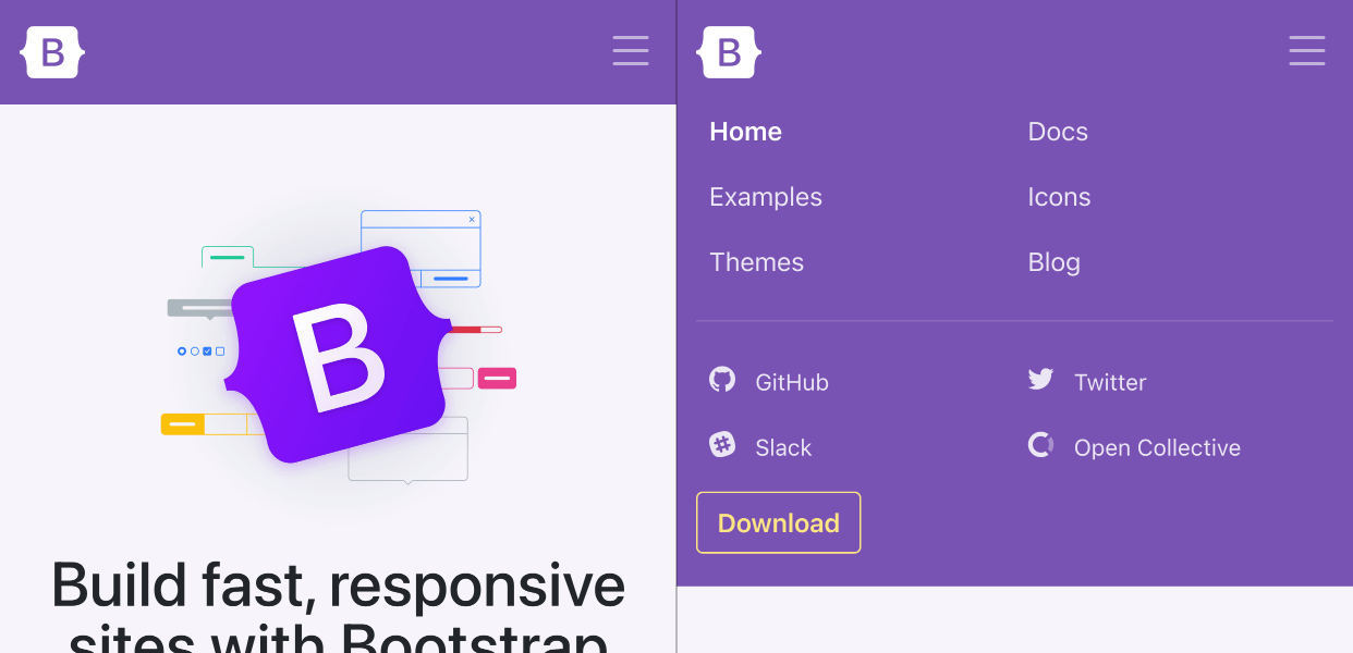
Our subnav has also be streamlined to take up a single horizontal bad on mobile, giving more space for documentation. We’ve also differentiated the expanding and collapsing menu icons between the two navs.
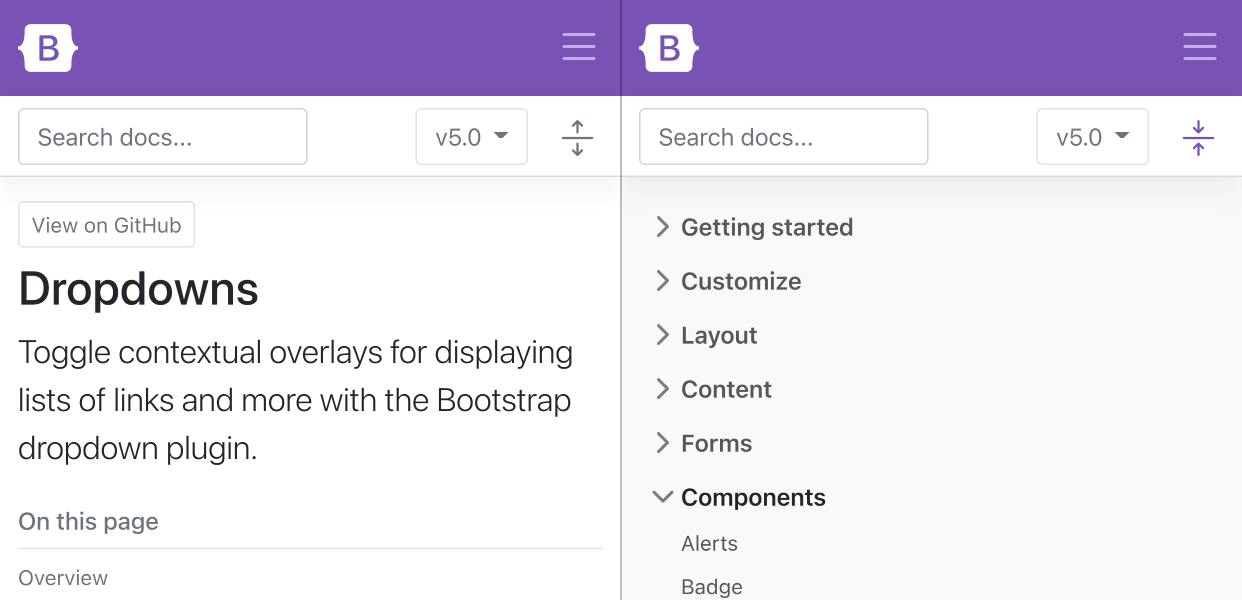
Together this should make it a little faster and easier to navigate our docs, and serve as a fun little demo for others.
Dark carousel
Add .carousel-dark to any .carousel to switch from the default white text, controls, and indicators to black.
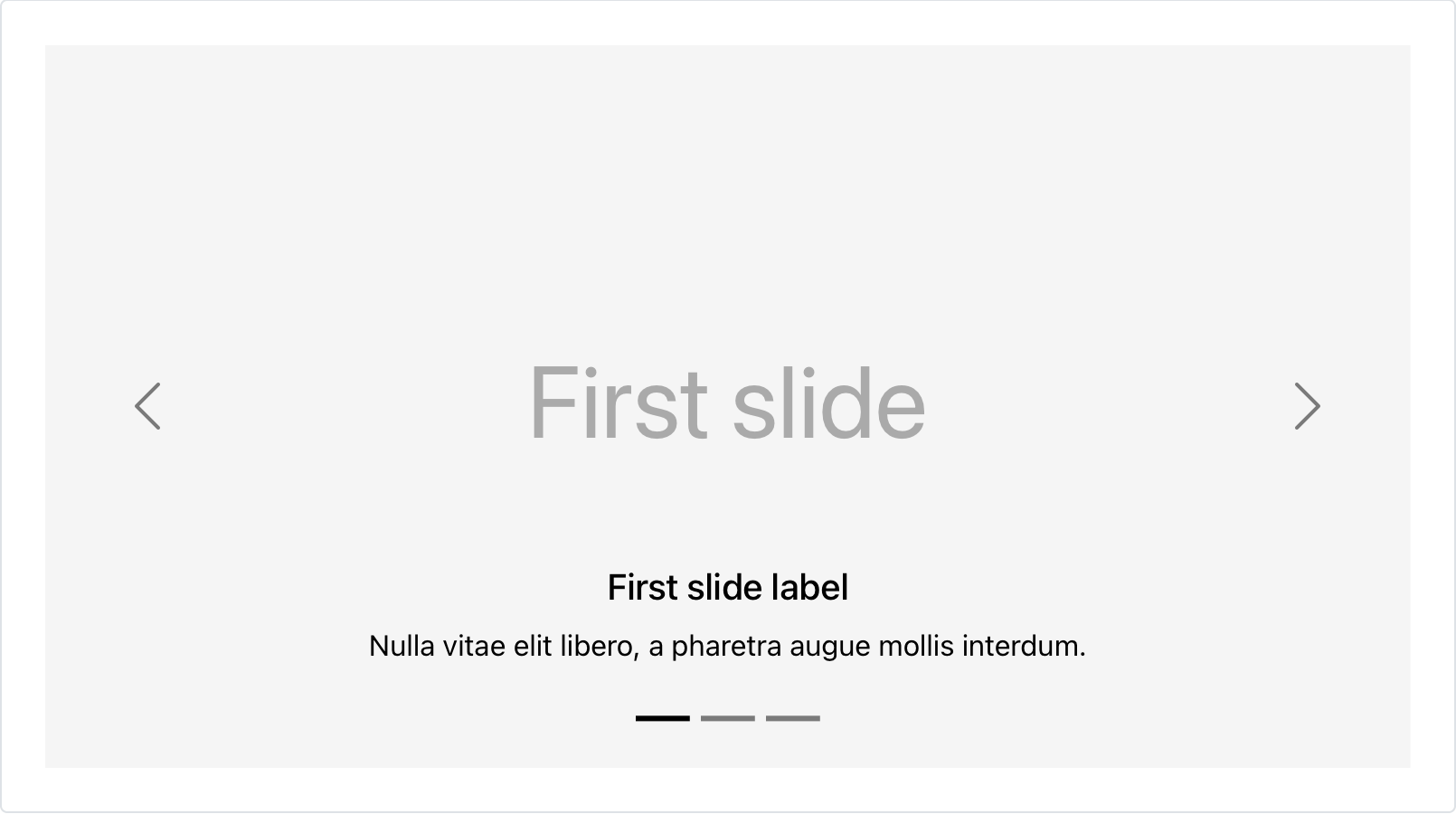
Values are configurable via Sass variables. To save on filesize, we’re using a CSS filter to invert out SVGs for the carouse controls. Pretty neat if you ask us!
Dark dropdowns
For the first time since Bootstrap v1 nearly nine years ago, we have dark dropdown menus! Add .dropdown-menu-dark to any dropdown menu to change the appearance. Dark dropdowns are opt-in, so you’ll need to add the class as you go.
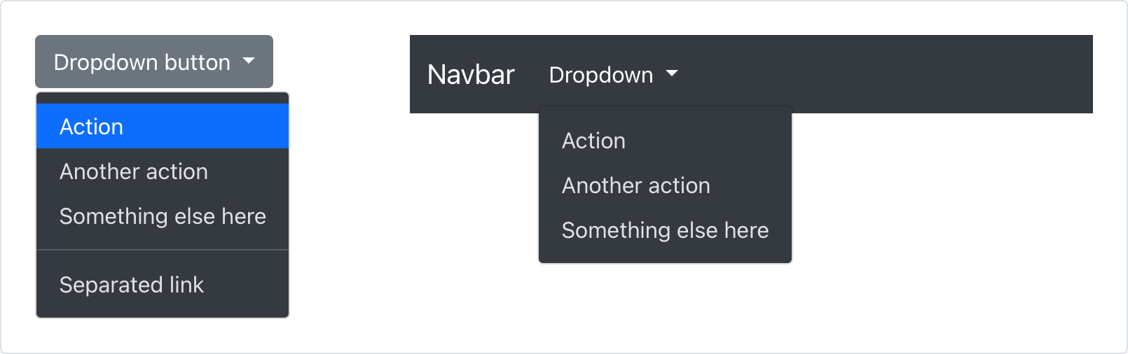
We’d like to revisit some of this later in v5 with minor releases that advance dark mode throughout the entire project. Until then, enjoy the new classes!
Redesigned close button
Our close button has been renamed, redesigned, new focus state, and a new color option.

We’ve renamed the class from the rather generic .close to .btn-close. In addition, we’ve dropped the use of × in our HTML for an SVG background-image via CSS. With updated styling all around, the close button has a clearer focus state and even an all-new white variant (also powered by a CSS filter).
Position utilities
Thanks to our contributors, we’ve added new directional positioning utilities. Quickly position an element with our new top, right, bottom, and left utilities with support for 0, 50%, and 100% by default.

Combine with new translate utilities to center elements on an edge or corner, too! The new utilities are configurable and extensible thanks to the utilities API and some smart Sass map defaults.
More highlights
Some other incremental changes to a few components and changes include:
- Container horizontal
paddinghas been updated to match the row gutters variables and values. - Checkboxes and radios downsized to
1emfrom1.25emfor improved font scaling support. - Improved colors with green and cyan getting new values, plus higher contrast ratios all around.
- Improved toast styling, now without
overflow: hidden. - Badge padding increased a smidge.
- Revamped “responsive embed” helpers, now called ratio helpers. New class names across the board, more flexible styles, and a new CSS variable for custom dynamic and responsive ratios.
- Screen reader classes are now “visually hidden” classes.
- New
.border-widthutility.
See all the changes in the v5 Alpha 2 project board and be sure to read the Migration guide for details on what’s changed since Alpha 1.
Coming in Alpha 3
We’ve pushed some additional breaking changes and important component updates to Alpha 3. To give you a heads up, here are some important upcoming moves:
- Offcanvas support is coming thanks to new side modals!
- We’re revamping the input group component, dropping support for quite a few variations. It’s too complex, supports too many variations, and has had the most annoying
border-radiusbug through all of v4. (I’m so sorry about that!) - We’re upgrading floating labels from a docs Example into a fully fledge form layout option, with support for textual inputs, selects, and textareas.
- We’re adding font-size utilities and updating our font-weight utilities.
- RTL is still coming! The PR is being reviewed by our team and we’re hoping to land it in Alpha 3 so we can get some folks testing with it.
For a more up to date list of changes, be sure to follow along with the v5 Alpha 3 project board. More docs improvements are planned with the potential for more breaking changes as well. From there it’s onto final breaking changes in Beta 3.
Release expectations
We’ll be alternating releases across v4 and v5 to keep the momentum up. We’re shipping v4.5.3 next and then moving right back to v5 for Alpha 3. We’ve noted our intended release schedule in our release repo. We’ll also keep updating that repo’s readme as we go.
Get started
Head to https://v5.getbootstrap.com to explore the new release. We’ve also published this updated as a pre-release to npm, so if you’re feeling bold or are curious about what’s new, you can pull the latest in that way.
npm i bootstrap@next
Support the team
Visit our Open Collective page or our team members’ GitHub profiles to help support the maintainers contributing to Bootstrap.