Bootstrap v5.3.8 is out with a reversion for a dropdown focus bug, some CSS updates, and several docs updates. The plan is for this to be the last patch release before v5.4.0 drops.
To start, there’s a brief update on Bootstrap Themes, with more communication to come. The team has decided to sunset https://themes.getbootstrap.com. As such, we’ve removed links to and mentions of the Themes site from our docs in this release to start. Stay tuned for more info.
Now, here are the release highlights:
Docs
Streamline release prep script
Restore local dev port to 9001
Use Example shortcode instead of divs with only .bd-example class
Fix scss autorecompile in dev mode
OSSF Scorecard
Workflows: Use SHA-1 for third-party actions
Unminify downloadable example HTML files
Add tooltips to buttons when <Example> is used, not just <Code>
Migrate MyGet script to GH actions
Minor range example code optimization
Remove Themes from docs
Release v5.3.8
CSS
Fix color-contrast() function for WCAG 2.1 compliance
Set cursor pointer on input search cancel button
Prevent spinner distortion in flex containers with multiline content
JavaScript
Revert “Attempt to return focus explicitly to dropdown trigger”
Read the GitHub v5.3.8 changelog for a full list of changes (including a ton of documentation and dependency updates) in this release.
Mark and Julien recently represented Bootstrap in the second round of the GitHub Secure Open Source Fund this past June. The program is designed to programmatically and financially improve the security and sustainability of open source projects, and we were honored to be a part of it.
GitHub brought together open source maintainers, security experts, and ecosystem partners for an intensive, hands-on learning experience. Throughout three weeks, we had a few days of mixed expert-led presentations, collaborative workshops, and dedicated office hours with security specialists. Between sessions, we had homework: concrete, project-specific actions to immediately strengthen our codebase, workflows, and processes.
As usual, this was done in our spare time, making the pace intense but manageable. Thanks to the flexibility of remote participation, we balanced the program’s demands around our workdays, with sessions either before or after work depending on our time zones.
What the program covered
The program was organized into three thematic weeks, each combining presentations, workshops, and actionable takeaways. Here’s an overview of the modules we attended:
Week 1
Welcome & Program Overview
Licensing and Security Compliance
What You Need To Know About Security Advisories
Security Lab Office Hours
Secure Code Game
GitHub Sponsors Success
Responding to Security Incidents
Week 2
Threat Modeling 101
Secure Your GitHub Actions
Keeping Users Safe from Malware, Abuse, Fraud, and Online Harms
Open SSF with David Wheeler
CodeQL: From Zero to Hero
Secure by Design: End-to-End Secure UX
Week 3
AI/LLM & MCP Security
Leverage GitHub Copilot to Ship Secure Code
Fuzzing
Better Together Closing Session
What we found most valuable
While every module provided value, a few stood out for Bootstrap focused either on immediate impact or organizational relevance.
Specifically, since our core team is small and changes over time, we need to ensure that security practices are well understood, easily actionable by maintainers remotely and autonomously, and thoroughly documented. One thing we’ll remember is that an Incident Response Plan must be in place before any incident occurs to avoid panic and confusion.
There were also several great takeaways around Threat Modeling, secure GitHub Actions, some GitHub security features, and other tools that we can use to improve our security posture.
But the most valuable part was the community aspect. Engaging with other maintainers, sharing experiences, questions, and solutions, and learning from each other’s challenges and successes was incredibly enriching. It reminded us that we’re not alone in this journey: the Open Source community is a powerful support network.
For those wondering, there were folks from various projects, including Express.js, JUnit, nvm, Oh My Zsh, and many more (53 projects in total).
How Bootstrap is improving
As a direct result of the program, we implemented immediate security actions:
Performed a SBOM analysis of our dependencies to identify vulnerabilities.
Enabled Private Vulnerability Reporting to allow users to report security issues privately.
Experimented during the session some fuzzing on our codebase to identify potential security issues.
We have started drafting an Incident Response Plan, which we plan to finalize in the coming months, and have initiated discussions around developing a Threat Model for Bootstrap. Since the program, we’ve also reintegrated the OSS Scorecard into our workflow (for the second time, actually!) to track our security posture and compliance with best practices, and also used sha-1 hashes for the versions of the GitHub Actions we use.
There’s still a lot to do, but we feel more confident in our ability to maintain Bootstrap securely and sustainably. In the coming months, we’ll continue refining our build processes, documentation, and testing to make Bootstrap more secure for everyone who uses it.
Thank you
A huge thank you to the Funding & Ecosystem Partners who made this program possible, to the GitHub team and security experts for their guidance, and to all the maintainers of the other projects for their insights and camaraderie.
If you maintain an open source project, we highly recommend applying for a future session: it’s an investment that pays dividends in resilience, trust, and peace of mind.
Bootstrap v5.3.7 was just released with some follow-up fixes from our migration to Astro, plus a handful of small fixes. We expect to have another patch release shortly due to at least one recent regression, so stay tuned for that.
In the mean time, here are some highlights!
Docs
Fixed broken “View on GitHub” URLs
Corrected HTML <head> content generated by the “Download examples” button
Refined sanitizer documentation for clarity and completeness
Improved accessibility in the “On this page” table of contents and section heading anchor links
Relocated ads to the right sidebar to minimize content reflow
Added a new section on the Download page for the Intelissence extension
Clarified the “Via JavaScript” usage example for Accordion Collapse
Made internal documentation improvements to support future maintenance (no visible user impact)
Mention CDN integrity and crossorigin attributes in introduction page
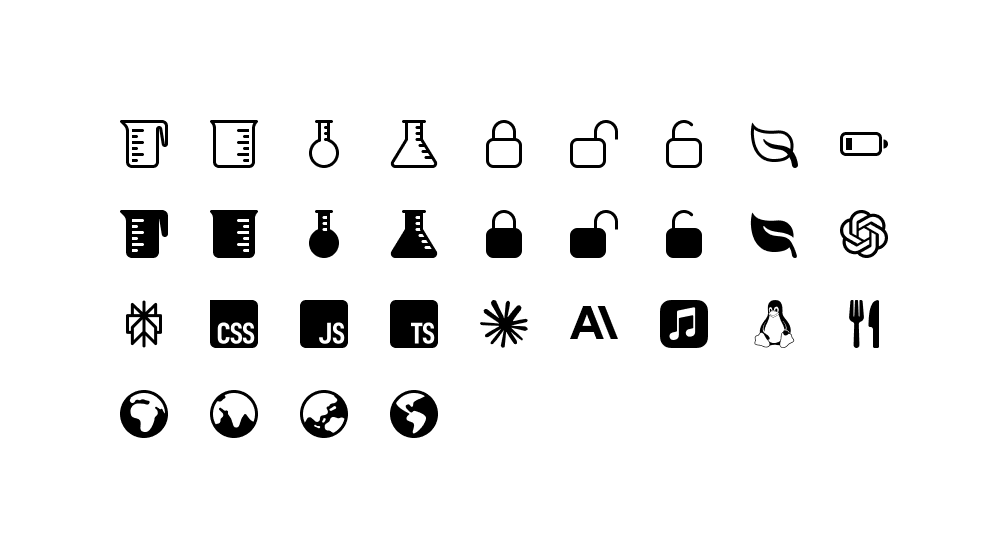
In the last few weeks, a handful of new Bootstrap Icons releases have gone out. Here’s a recap of what’s new in our v1.12.x and v1.13.x releases so far.
v1.12
v1.12.0 added a single icon, mostly because people wouldn’t stop asking for it haha, and v1.12.1 added a page to the docs for it. That was all for Bluesky.
v1.13.0 and v1.13.1
New in v1.13.0 are several icons, some guidance around how to use Sass files with Vite, and a few little bug fixes to some fill rules. v1.13.1 was a hotfix to resolve an issue with search on our docs.
The Figma file is now published to the Figma Community! It’s the same Bootstrap Icons Figma file you’ve seen from previous releases, just a little more accessible to those using the app.
Bootstrap v5.3.6 was just released to migrate our documentation to Astro from Hugo. Also included are a few bug fixes and documentation updates.
Here are some highlights:
Ported the docs from Hugo to Astro for our own sanity!
Added usage docs for Accordion JavaScript
Prevent .visually-hidden overflowing children to become focusable
Limit .card-group selectors to immediate children to fix some inheritance issues
Most importantly, a massive thank you and shoutout to Bootstrap maintainer Julien for all the work that went into our Astro migration. What a massive ship.
Read the GitHub v5.3.6 changelog for a full list of changes (including a ton of documentation and dependency updates) in this release.
Bootstrap v5.3.5 was released as a hotfix for a regression from upstream in Autoprefixer that caused floating form labels to always be “floated” in Firefox due to unintended CSS output.
Read the GitHub v5.3.5 changelog for a full list of changes (including a ton of documentation and dependency updates) in this release.
Bootstrap v5.3.3 is here with bug fixes, documentation improvements, and more follow-up enhancements for color modes. Keep reading for the highlights!
Highlights
Fixed a breaking change introduced with color modes where it was required to manually import variables-dark.scss when building Bootstrap with Sass. Now, _variables.scss will automatically import _variables-dark.scss. If you were already importing _variables-dark.scss manually, you should keep doing it as it won’t break anything and will be the way to go in v6.
Fixed a regression in the selector engine that wasn’t able to handle multiple IDs anymore.
Color modes
Badges now use the .text-bg-* text utilities to be certain that the text is always readable (especially when the customized colors are different in light and dark modes).
Fixed our color-modes.js script to handle the case where the OS is set to light mode and the auto color mode is used on the website. If you copied the script from our docs, you should apply this change to your own script.
Fixed color schemes description in the color modes documentation to show that color-scheme() only accept light and dark values as parameters.
Miscellaneous
Allowed <dl>, <dt> and <dd> in the sanitizer.
Dropped evenly items distribution for modal and offcanvas headers.
Fixed the accordion CSS selectors to avoid inheritance issues when nesting accordions.
Fixed the focus box-shadow for the validation stated form controls.
Fixed the focus ring on focused checked buttons.
Fixed the product example mobile navbar toggler.
Changed the RTL processing of carousel control icons.
Docs
Dropped unnecessary right margin for example code blocks.
Bootstrap v5.3.2 is here with bug fixes, documentation improvements, and more follow-up enhancements for color modes. Keep reading for the highlights!
Highlights
Passing a percentage unit to the global abs() is deprecated since Dart Sass v1.65.0. It resulted in a deprecation warning when compiling Bootstrap with Dart Sass. This has been fixed internally by changing the values passed to the divide() function. The divide() function has not been fixed itself so that we can keep supporting node-sass cross-compatibility. In v6, this won’t be an issue as we plan to drop support for node-sass.
Using multiple ids in a collapse target wasn’t working anymore and has been fixed.
Color modes
Increased color contrast of form range track background in light and dark modes.
Fixed table state rendering for color modes with a focus on the striped table in dark mode to increase color contrast.
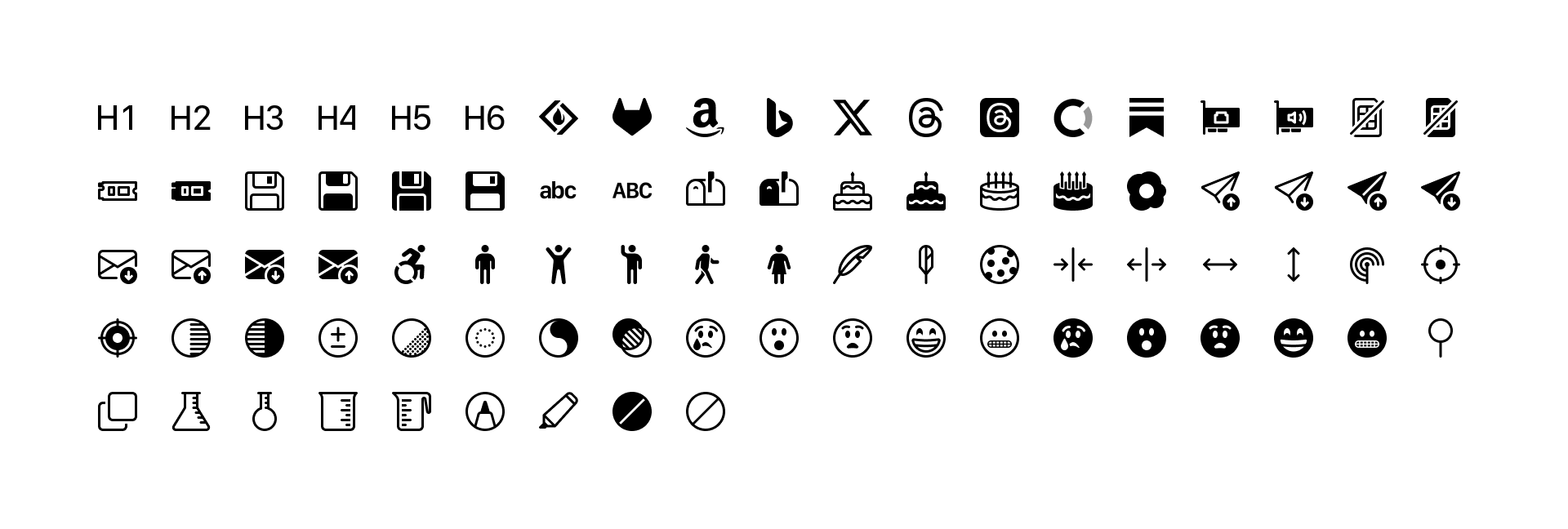
Bootstrap Icons v1.11.0 has arrived with 100 new icons—including new floppy disk icons, additional brand icons, new person icons, new emojis, some birthday cake, a few new science icons, and more. We’re now at over 2,000 icons!
100 new icons
Here’s a quick look at all the new icons in v1.11.0:
I’ve also started adding a new added tag to icon pages with this release. So far I’ve only tagged v1.10.0 and v1.11.0 versions, but more will come. Once those are all tagged, you’ll be able to search for icons added in each release. Stay tuned!
Looking for more new icons? Head to the issue tracker to check for open requests or submit a new one.
The Figma file is now published to the Figma Community! It’s the same Bootstrap Icons Figma file you’ve seen from previous releases, just a little more accessible to those using the app.
 @mdo
August 25, 2025
@mdo
August 25, 2025