It’s official, the final stable release of v5.3.0 has landed! It’s been a monumental effort to revamp our codebase for CSS variables and color modes, one that will see continued changes leading up to an eventual Bootstrap 6. And we’re so excited to finally ship it!
On top of all the work that’s gone into this release, a lot has happened behind the scenes since we shipped our pre-releases. Keep reading to learn everything that’s new in v5.3.0.
Keep reading for the deep dive on all the top new features.
Dark mode
Bootstrap’s core has been rewritten to provide first-class support for dark mode. Moreover, Bootstrap now supports any number of color modes, allowing you to build your own custom themes or more nuanced color modes. Let’s take a look at how our new dark mode works first.
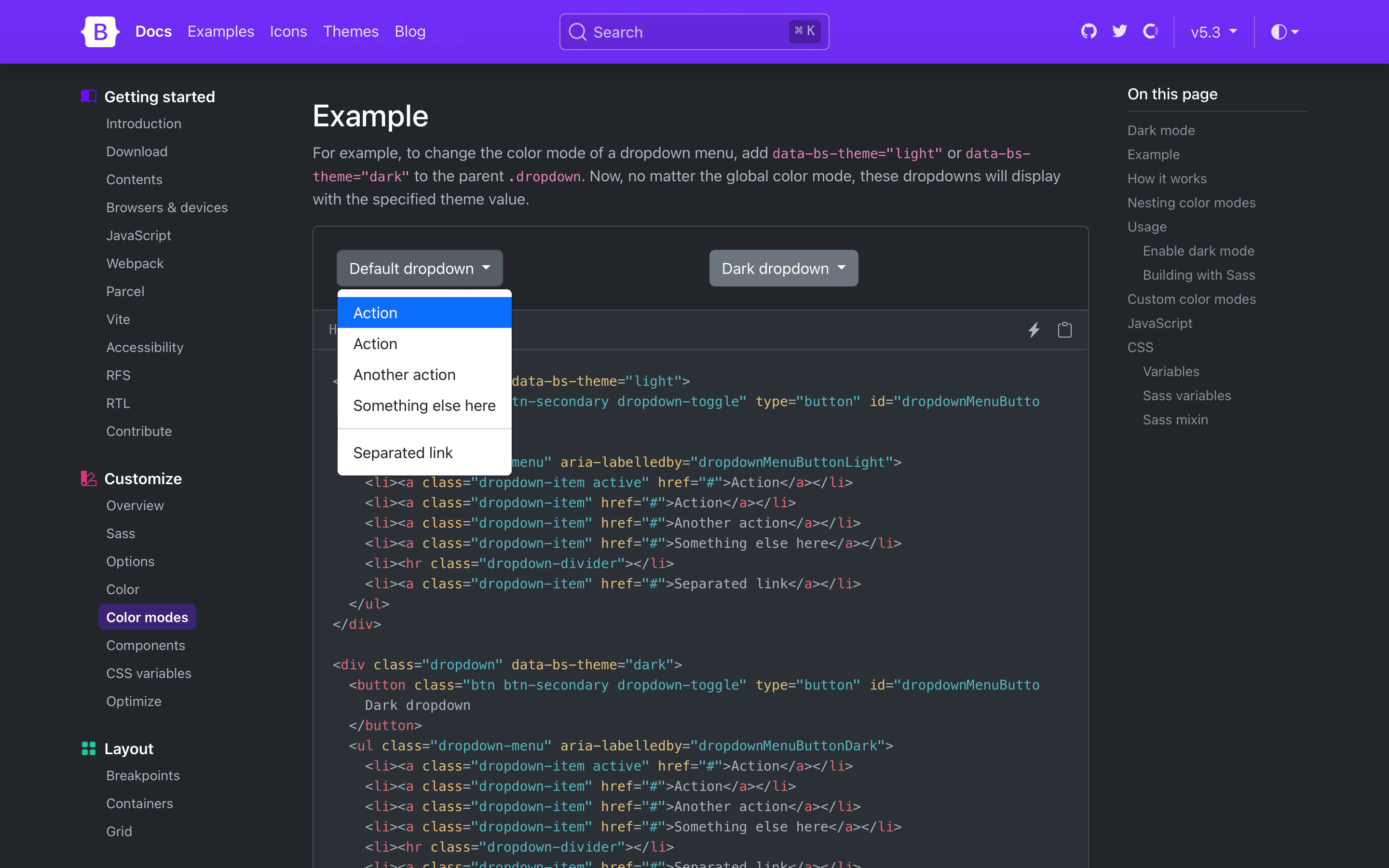
Bootstrap’s new dark mode is opt-in by default, meaning you’ll need to set a data-bs-theme attribute on the root <html> element to change the entire page’s design. This was done to best support custom color modes beyond light and dark—more on that later. It also helps folks who aren’t ready for dark mode in their own designs.
Need a more isolated dark mode? You can also set the color mode on a parent element like the .dropdown shown below. This will only affect the dropdown and its children instead of the entire page.
Dark mode styles are written with and generated through the new color-mode() Sass mixin. The mixin allows you to write styles specific to a particular color mode, like dark mode.
Together with the new $color-mode-type Sass variable, you can also change how color modes behave in Bootstrap. The default value is data, which tells Bootstrap to generate CSS selectors that scope the color mode’s styles to the data attributes you’ve seen above.
The other supported value is media-query, which generates media query selectors instead. This is helpful for those who want light and dark modes, automatically, and without a user override.
While we haven’t written a new JavaScript plugin for toggling color modes, we’ve written a great script for toggling color modes via data-bs-theme in our docs. Our implementation defaults to a user’s operating system color mode (auto), but also allows users to override that with a particular mode (light or dark) that’s recorded in local storage for easy reference on future page loads. You can use and adapt this script as needed.
New color mode variables
There’s also a new _variables-dark.scss stylesheet that houses dark mode-specific Sass variables. This is where we modify mostly global values, and some component-specific values, for dark mode. We recommend creating separate Sass stylesheets for additional custom color modes (e.g., a blue theme might have _variables-blue.scss). We expect this stylesheet to be simplified in our next major release as we continue to streamline the code base.)
Dark mode colors are all derived from our theme colors, meaning you can easily change the color mode palettes by updating the original theme colors. This means we’re not using our already tinted and shaded colors (e.g., shade-color($danger, 60%) instead of red-800 for the new danger emphasis color).
Bootstrap v5.3.0 ships with dark mode enabled, but you can also disable it by updating the boolean $enable-dark-mode Sass variable.
If you’re using the CDN or starter template, using the new color modes is straightforward. Add the data-bs-theme attribute with light or dark values to the <html> element and you’ll be using either the light or dark theme.
When we set out to add dark mode support to Bootstrap, we didn’t want to just add a dark mode. We wanted to build the foundations for a color mode system that could be used to create any number of themes and color modes. That’s why we lead with the data-bs-theme attribute and the new color-mode() Sass mixin, and why we’ve added so many new CSS variables in these latest releases.
To add a custom color mode, create your own data-bs-theme selector with a custom value as the name of your color mode, then modify any Sass and CSS variables as needed. We created a separate _variables-dark.scss stylesheet to house Bootstrap’s dark mode-specific Sass variables, but that’s not required for you.
For example, you can create a “blue theme” with the selector data-bs-theme="blue". In your custom Sass or CSS file, add the new selector and override any global or component CSS variables as needed. If you’re using Sass, you can also use Sass’s functions within your CSS variable overrides.
Heads up! Applying color modes to elements that aren’t the <html> or <body> elements requires classes like .text-body and .bg-body. This is because many HTML elements have no set color or background to style until you add them yourself. We’ve included them here for you just in case.
[data-bs-theme="blue"]{// CSS variable overrides and styles
}
<divdata-bs-theme="blue"> ...
</div>
Refreshed color palette
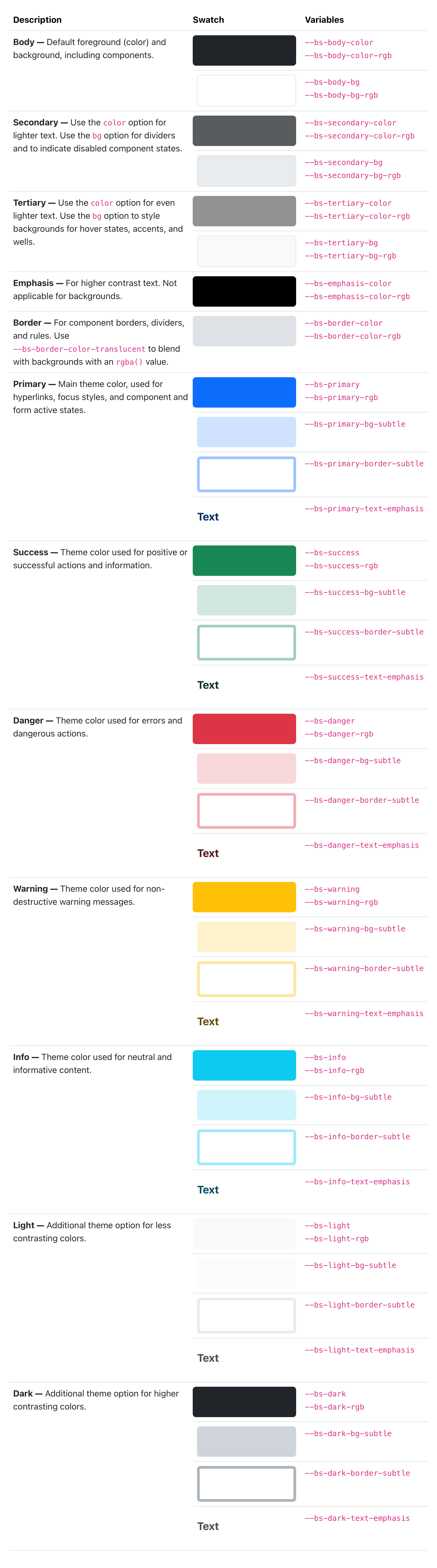
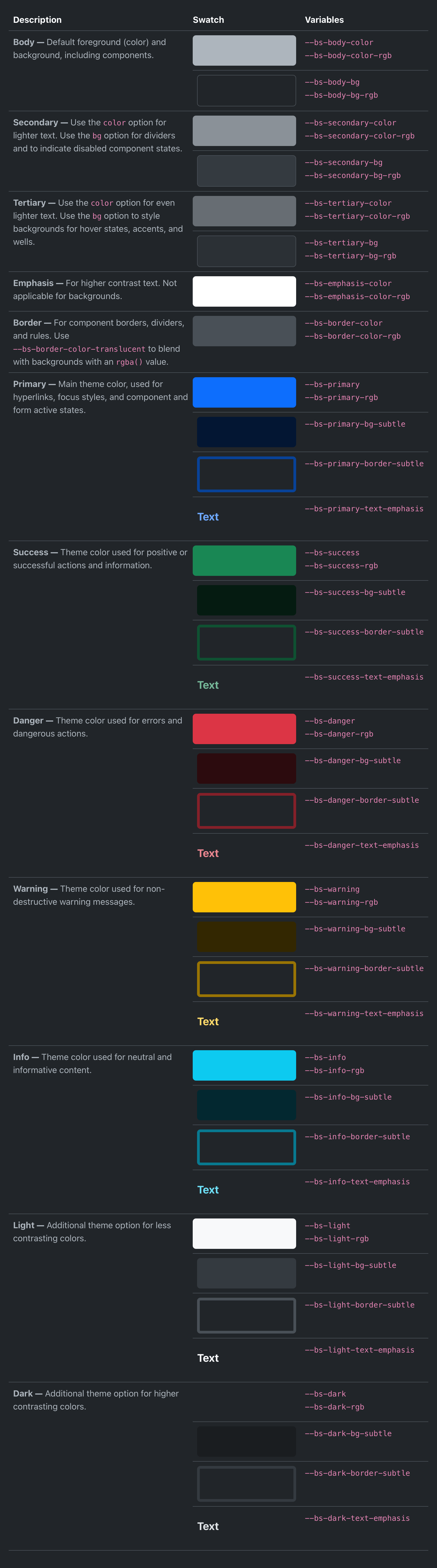
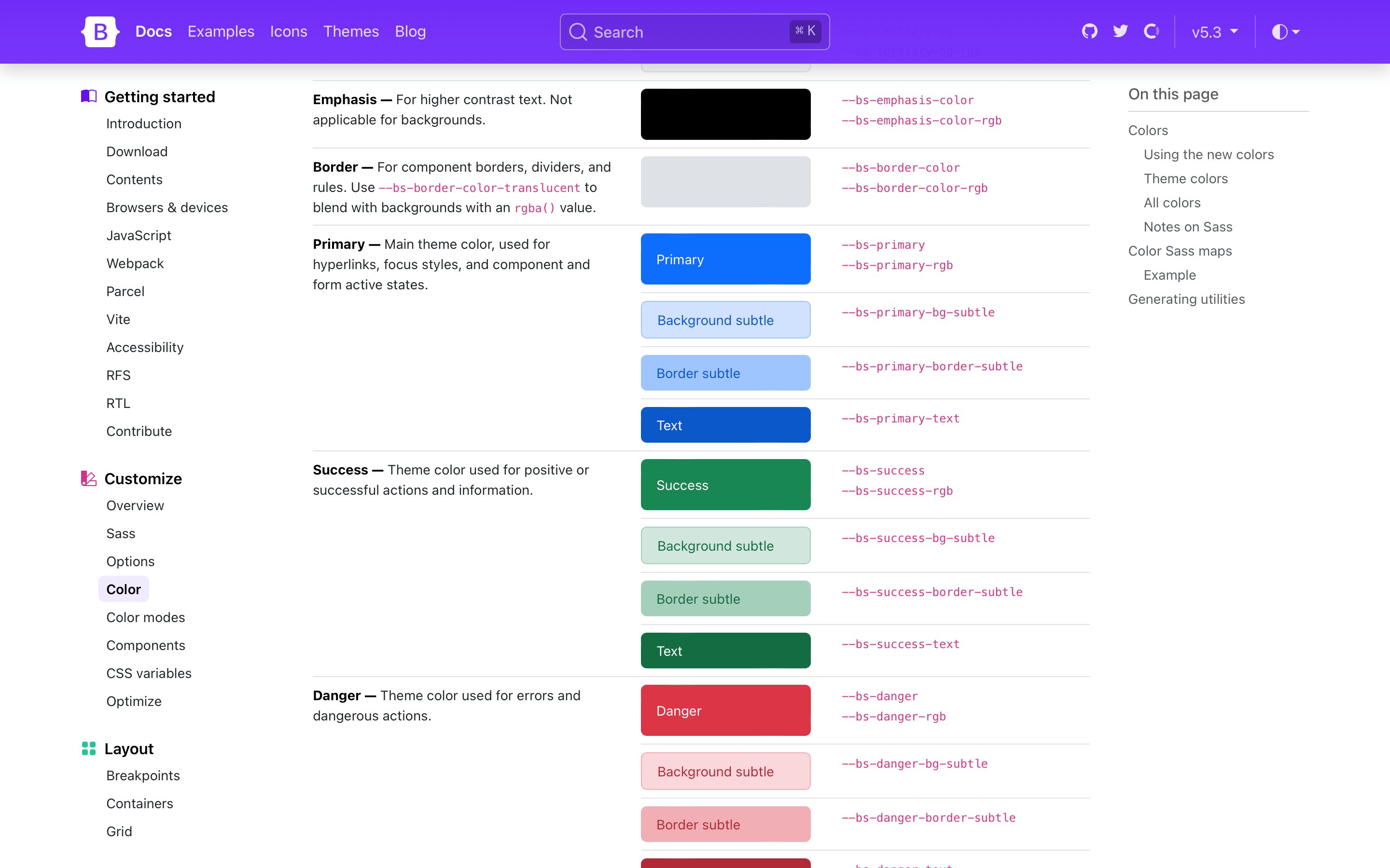
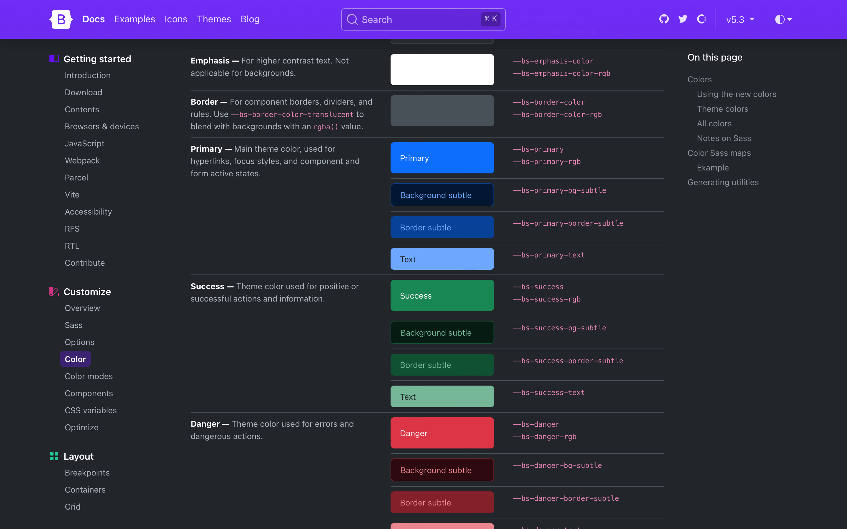
We’ve revamped our color palette to include all new Sass variables, CSS variables, and utilities for setting color, background-color, and border-color. Our foreground and background colors have been expanded to include new secondary, tertiary, and emphasis colors, while our theme colors have been expanded on to include their subtle background colors, subtle border colors, and darker text colors.
We’ve rebuilt some components (like list groups and alerts) to use these new variables in their source Sass and compiled CSS so that they respond to the color mode changes.
New link helpers and utilities
Link styling has infinitely better in v5.3.0 with a slew of all-new link helpers and utilities. First up, we’ve added styles to place icons like Bootstrap Icons alongside links with the new icon link helper.
On the utilities side, we have new classes for setting link color opacity, underline offset, underline color, and underline opacity. Explore the new links utilities.
Lastly, we’ve added a new .link-body-emphasis helper alongside our colored links. This creates a colored link using our color mode responsive emphasis color.
There’s a new .nav variant and modifier class with .nav-underline. Add .nav-underline to a .nav to get a simpler bottom border under the active nav link. See the docs for an example.
Beyond all the color mode updates, new helpers, and new utilities, we have a ton of other quality-of-life updates in this release. Here’s a quick rundown of the highlights:
Navs now have new :focus-visible styles that better match our custom button focus styles.
CSS variable-based border-width utilities have been reverted to set their property directly (as was done before v5.2.0). This avoids inheritance issues across nested elements, including tables.
Added new .border-black utility to match our .text-black and .bg-black utilities.
Deprecated the .text-muted utility and $text-muted Sass variable. It’s been replaced by .text-body-secondary and $body-secondary-color.
Added a check for interpolated variables to catch compilation errors with Node Sass when using Sass variables in calc() functions.
Started using --bs-border-radius variables across more components.
Added .d-inline-grid utility class.
Fixed .tooltip-inner placement when using variations in fallbackPlacements.
Fix selectors for dark mode carousel overrides when compiling with $color-mode-type: media-query.
Updated the styling of floating labels when “floated” to include a background-color to help with multiple lines of text in textareas. This also fixes the colors when form elements are disabled in floating forms.
Updated RFS to v10.0.0.
Next up
We’ll be shipping some patch releases for v5.3.x in the coming weeks to address any issues that come up. We’ll also be working on v5.4.0, which will primarily focus on improvements to our utilities API and related code. Stay tuned for more updates on that front!
Hot on the heels of our second alpha, we’re releasing a third (and unexpected) alpha for v5.3.0 today with some fixes for some Node Sass compilation errors. In addition, we’ve added a handful of other updates. We’re still on target to ship our stable release soon!
Once again, if you’re new to the v5.3.0 alpha releases, please read through the Migration guide for the first alpha and last month’s second alpha.
Here’s a look at what’s changed in this quick release:
Fixed wrong interpolated variables with node-sass/Hugo.
Added a check for interpolated variables to catch compilation errors with Node Sass when using Sass variables in calc() functions.
Started using --bs-border-radius variables across more components.
Added .d-inline-grid utility class.
Fixed .tooltip-inner placement when using variations in fallbackPlacements.
Fix selectors for dark mode carousel overrides when compiling with $color-mode-type: media-query.
Updated the styling of floating labels when “floated” to include a background-color to help with multiple lines of text in textareas. This also fixes the colors when form elements are disabled in floating forms.
Our second alpha release of v5.3.0 has landed with a ton of enhancements and bug fixes for our new color modes! There’s still more to come, but we’ve held off shipping until we ironed out enough issues. Huzzah, we have!
This v5.3.0 release is a monumental update for Bootstrap 5. It’s big enough that it could’ve been a v6 on its own, but we wanted to do right by the community and get color modes out the door without the massive major release upgrade. We’re getting super close now, so bear with us as we continue to chip away at this.
Removed several duplicate and unused root CSS variables.
Color modes
Dark mode colors are now derived from our theme colors (e.g., $primary) in Sass, rather than color-specific tints or shades (e.g., $blue-300). This allows for a more automated dark mode when customizing the default theme colors.
Added Sass maps for generating theme colors for dark mode text, subtle background, and subtle border.
Snippet examples are now ready for dark mode with updated markup and reduced custom styles.
Added color-scheme: dark to dark mode CSS to change OS level controls like scrollbars
Form validation border-color and text color states now respond to dark mode, thanks to new Sass and CSS variables.
Dropped recently added form control background CSS variables and reassigned the Sass variables to use CSS variables instead. This simplifies the styling across color modes and avoids an issue where form controls in dark mode wouldn’t update properly.
Our box-shadows will once again always stay dark instead of inverting to white when in dark mode.
Improved HTML and JavaScript for our color mode toggle script. The selector for changing the active SVG has been improved, and the markup made more accessible with ARIA attributes.
Improved docs code syntax colors and more across light and dark modes.
Removed the ability to nest light mode components within dark mode. This was super incomplete unfortunately and just isn’t practical without quadrupling our selectors for every component. Maybe in v6!
Typography
We no longer set a color for $headings-color-dark or --bs-heading-color for dark mode. To avoid several problems of headings within components appearing the wrong color, we’ve set the Sass variable to null and added a null check like we use on the default light mode.
Components
Cards now have a color set on them to improve rendering across color modes.
Added a new .nav-underline variant for our navigation with a simpler bottom border under the active nav link. See the docs for an example.
Navs now have new :focus-visible styles that better match our custom button focus styles.
Helpers
Added a new .icon-link helper to quickly place and align Bootstrap Icons alongside a textual link. Icon links support our new link utilities, too.
Added a new focus ring helper for removing the default outline and setting a custom box-shadow focus ring.
Utilities
Renamed Sass and CSS variables ${color}-text to ${color}-text-emphasis to match their associated utilities.
Added new .link-body-emphasis helper alongside our colored links. This creates a colored link using our color mode responsive emphasis color.
Added new link utilities for link color opacity, underline offset, underline color, and underline opacity. Explore the new links utilities.
CSS variable-based border-width utilities have been reverted to set their property directly (as was done before v5.2.0). This avoids inheritance issues across nested elements, including tables.
Added new .border-black utility to match our .text-black and .bg-black utilities.
Deprecated Deprecated the .text-muted utility and $text-muted Sass variable. It’s been replaced by .text-body-secondary and $body-secondary-color.
Docs
Updated docs page table of contents to use Scrollspy (shoutout to our v3 docs!).
Revamped syntax highlighting colors for code snippets across color modes.
Improved content and rendering of several docs callouts.
Document more color mode features and usage suggestions.
Added theme toggling to examples pages.
Updated dependencies across the board, including in our guides.
Known issues
While not an exhaustive list, here’s some of the stuff we’re going to be working on before calling this release stable. You can track these and more in the v5.3.0-stable project on GitHub.
Add new functionality to utilities with mixins and functions.
Some components need another pass at enabling full-color mode responsiveness. Bear in mind, some components like buttons won’t get full-color mode adaptivity until v6.
Labels in disabled floating forms have incorrect rendering.
Docs need to be updated for modifying theme colors across color modes.
Examples need another pass for dark mode support, new screenshots, and more.
Improve click/tap area for range inputs.
Up next will be the stable release of v5.3.0. Originally this was planned as a beta, but I think we’re getting close enough to call this final with one more release.
It’s a Christmas miracle—Bootstrap v5.3.0-alpha1 has arrived just in time for the holiday break! This release brings new color mode support, an expanded color palette with variables and utilities, and more.
We’re keeping things short and simple in this blog post with deeper dives into the new color modes and more coming in future posts. For now, we want you to enjoy the holiday break and come back next year feeling refreshed and rejuvenated. Keep reading for what’s new and we’ll see you next year!
Dark mode and color modes
Bootstrap now supports an explicit opt-in for creating multiple color modes via the data-bs-theme attribute on the root <html> element. We opted for a data attribute solution so that you can create any number of themes instead of just light and dark. We use a new Sass mixin, color-mode(), to generate our dark mode styles with either a data attribute (the default) or a media query. The latter is useful if you only have two color modes and want automatic color mode changing via CSS.
For those wanting to build something more advanced, you can read how we built our own color mode picker with JavaScript that respects the device or operating system setting by default, but still allows someone to override it with an explicit theme.
If you’re using the CDN or starter template, using the new color modes is straightforward. Add the data-bs-theme attribute with light or dark values to the <html> element and you’ll be using either the light or dark theme.
Want to use CSS media queries to change the color mode instead? You can also build Bootstrap with Sass and customize how you use color modes. Read the docs to learn more. You can even create custom color modes.
Expanded color palette
We have a huge new color palette update with new Sass variables, CSS variables, and utilities to boot. Foreground and background colors have new secondary, tertiary, and emphasis colors to choose from, while our theme colors have expanded on to include their subtle background colors, subtle border colors, and darker text colors. We’ve rebuilt some components (like list groups and alerts) to use these new variables in their source Sass and compiled CSS so that they respond to the color mode changes.
Added new CSS variables for grid breakpoints, link colors, close button, alert links, forms, and more. In addition, many components have been updated to use more global CSS variables like --bs-border-color to better respond to changing color modes.
Floating forms have been updated to be more bulletproof and now include proper support for textareas.
Added many new utilities, including fw-medium, overflow and object-fit utilities, z-index, and more. Plus, border-radius utilities have been updated so that you can combine .rounded-{top|bottom|start|end} with .rounded-{0-5|pill|circle}.
Fixed some Popper tooltip and popover consistency issues.
As we iron out the release with your feedback and bug reports, we’ll also be updating the Bootstrap Blog and Bootstrap Icons sites to use the new themes soon. We’ll also continue to refine how our components and utilities work with the new color modes, adding Sass testing to improve our coverage of how folks build with Bootstrap, and much more.
Bootstrap Icons v1.10.0 is here with nearly 150 new icons. This release includes tons of new variants for person, building, and database icons, plus new brands, rockets, road signs, globes, and many more. We’re now at over 1,900 icons!
150 new icons
Here’s a quick look at all the new icons in v1.10.0:
Some highlights for the new icons include:
22 new person icons
26 new house icons
24 new building icons, including a renamed building to buildings
22 new database icons
24 new street sign icons
New globe icons
New EV, taxi, bus, and scooter transportation icons
New rockets
and more!
We also fixed the fill rules for several some issues across the docs, including:
De-duped category names Brand and Brands to be just Brand
Updated tags on several icon pages for additional aliases
Looking for more new icons? Head to the issue tracker to check for open requests or submit a new one.
The Figma file is now published to the Figma Community! It’s the same Bootstrap Icons Figma file you’ve seen from previous releases, just a little more accessible to those using the app.
Bootstrap v5.2.1 is here with fixes from our latest minor release, v5.2. As a patch release, these changes are limited to bug fixes, documentation updates, and some dependency updates.
We’ve also continued to iterate on a few other projects to help folks get up and running with Bootstrap with npm, other JS frameworks, and various build tools. Keep reading to learn more.
Key changes
We’ve updated our calc() functions to work around an apparent bug in postcss-values-parser that prevented our source Sass files from compiling properly when building with React and PostCSS. The fix was to reverse the order of our multiplication inside calc() functions. Be aware you may need to make similar modifications depending on your own customizations.
We’ve also addressed some longstanding issues around button focus and active styling, in particular for checkbox and radio buttons. On mobile devices, input-based buttons have trouble shedding their focus styles. This has been resolved in v5.2.1 with a change from :focus to :focus-visible for our .btns. Now, checkbox and radio buttons no longer change their background-color on :focus-visible and they receive no :hover styling. Regular .btns still have their familiar hover and focus styles.
We debated not including the button focus change in v5.2.1, but felt it was important enough to close several bugs. Let us know what you think and we’ll continue to refine our implementation.
Highlights
In addition to the changes above, we’ve fixed bugs across several components:
Accordion
Update color value to use the $accordion-button-color Sass variable instead of our color contrast function
Buttons
Added a transparent default hover border color CSS variable for buttons to fix a visual regression
.btn-link no longer has a gradient when $enable-gradients is set to true
Forms
Input groups have updated z-index values to ensure proper rendering of validated form fields
Floating labels now reset their text-align to ensure consistent styling
List Groups
Horizontal list groups with only one child now render the correct border-radius
Modified the list-group-item selectors to better support nested imports of Bootstrap’s CSS
Modals
Updated event listeners to ignore clicks on scrollbar clicks, clicks that start inside .modal-dialog but end outside it, and respond to clicks that start and end outside .modal-dialog
Reverted some tooltip plugin updates to prevent issues with selector, dynamic content, and disposed tooltips using title
Fixed trigger: "manual" showing and immediately hiding when calling toggle()
Dependencies
Updated Autoprefixer to fix warnings of the color-adjust property (thanks to @julien-deramond on our team for reporting an issue upstream here)
Docs
Searching our docs on mobile has been improved with the search field now always visible on responsive, narrow viewports
Removed links to and mentions of Slack from across the codebase, as we intend to shutter Slack in favor of GitHub Discussions
Reintroduced proper outline styles for docs code samples and buttons when :not(:focus-visible)
Farewell, Slack!
As mentioned over a month ago, we made the decision to close down our community Slack channel. Slack isn’t great at managing a large scale community and it’s prohibitively expensive as well for a community the size of ours (the Slack was over 45,000 people!). Instead of using Slack or similar tool, we’re encouraging folks to use our Discussions tab on GitHub.
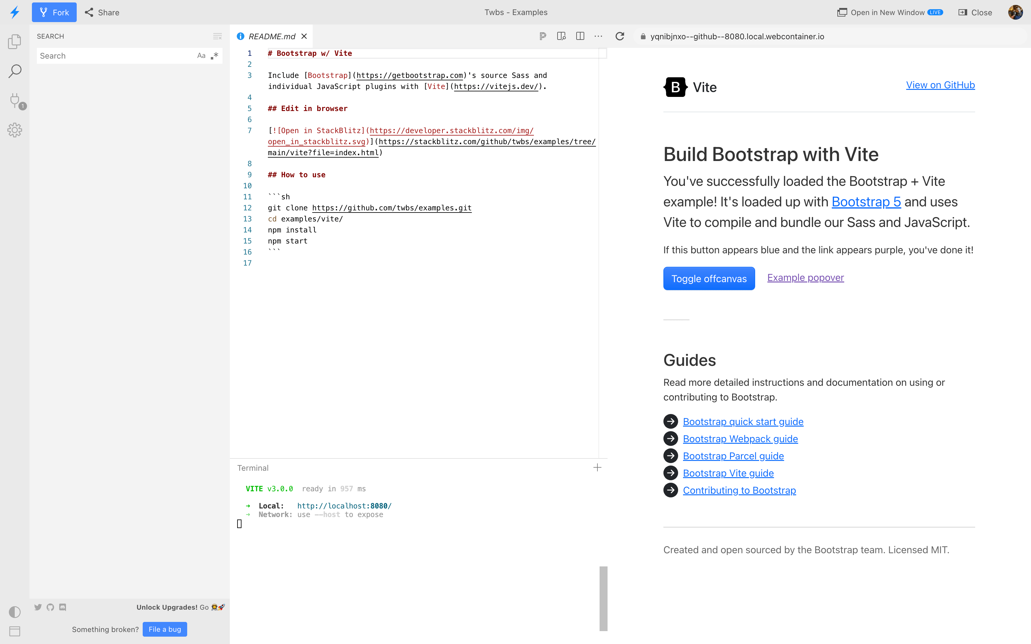
Make sure to checkout (pun intended!) our latest project, the twbs/examples repository! The examples project includes functional demos for all sorts of environments and JS frameworks, with more planned! You can even open every example in StackBlitz and edit them in the browser.
Bootstrap Icons font - Import and compile Sass, Stylelint, PurgeCSS, and our icon font
Have an idea for a new starter example? Feel free to open an issue or pull request!
v4 starter project
We’ve shipped a v2.0.0 update to the twbs/bootstrap-npm-starter project. This release includes Bootstrap v4.6.2, Bootstrap Icons v1.9.1, a new live reload feature for local development, and several dependency updates. This project will remain dedicated to Bootstrap 4 while our twbs/examples repo will focus on v5 and future major releases.
Bootstrap v5.2.0 is finally stable! We’ve ironed out more bugs, improved more documentation, written new guides and built out new functional environment examples, and so much more!
Keep reading for highlights from both beta and stable releases.
Docs redesign
As previewed in our beta release, the docs have been redesigned! It starts with our new homepage where we have a more complete representation of Bootstrap’s features and an updated design.
The docs sidebar navigation has been overhauled to have always expanded groups for easier browsing, a brand new DocSearch experience with search history, and new responsive offcanvas drawers for both sidebar and navbar on mobile.
We even updated our version picker in the navbar to cross-link between minor releases!
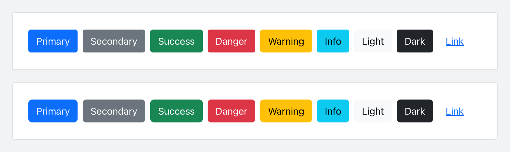
Updated buttons and inputs
With our docs redesign, we refreshed buttons and inputs with modified padding and border-radius. Here’s a look at the before and after of our buttons:
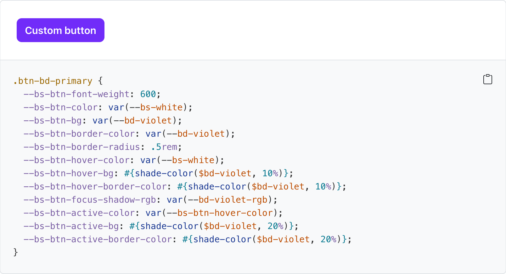
Tons of new CSS variables
Nearly all our components now have CSS variables for real real-time customization, easier theming, and (soon) color mode support starting with dark mode. You can see what CSS variables are available on every docs page, like our buttons:
Values for virtually every CSS variables are assigned via Sass variable, so customization via CSS and Sass are both well supported. Also included for several components are examples of customizing via CSS variables.
New _maps.scss
Bootstrap v5.2.0 introduced a new Sass file with _maps.scss that pulls out several Sass maps from _variables.scss to fix an issue where updates to an original map were not applied to secondary maps that extend it. It’s not ideal, but it resolves a longstanding issue for folks when working with customized maps.
For example, updates to $theme-colors were not being applied to other maps that relied on $theme-colors (like the $utilities-colors and more), which created broken customization workflows. To summarize the problem, Sass has a limitation where once a default variable or map has been used, it cannot be updated. There’s a similar shortcoming with CSS variables when they’re used to compose other CSS variables.
This is also why variable customizations in Bootstrap have to come after @import "functions";, but before @import "variables"; and the rest of our import stack. The same applies to Sass maps—you must override the defaults before they get used. The following maps have been moved to the new _maps.scss:
$theme-colors-rgb
$utilities-colors
$utilities-text
$utilities-text-colors
$utilities-bg
$utilities-bg-colors
$negative-spacers
$gutters
Your custom Bootstrap CSS builds should now look like this with a separate maps import.
  // Functions come first
  @import "functions";

  // Optional variable overrides here
+ $custom-color: #df711b;
+ $custom-theme-colors: (
+   "custom": $custom-color
+ );

  // Variables come next
  @import "variables";

+ // Optional Sass map overrides here
+ $theme-colors: map-merge($theme-colors, $custom-theme-colors);
+
+ // Followed by our default maps
+ @import "maps";
+
  // Rest of our imports
  @import "mixins";
  @import "utilities";
  @import "root";
  @import "reboot";
  // etc
New helpers and utilities
We’ve updated our helpers and utilities to make it easier to quickly build and modify custom components:
Added new .text-bg-{color} helpers. Instead of setting individual .text-* and .bg-* utilities, you can now use the .text-bg-* helpers to set a background-color with contrasting foreground color.
Expanded border-radius utilities to include two new sizes, .rounded-4 and .rounded-5, for more options.
Expect more improvements here as v5’s development continues.
Responsive offcanvas
Our Offcanvas component now has responsive variations. The original .offcanvas class remains unchanged—it hides content across all viewports. To make it responsive, change that .offcanvas class to any .offcanvas-{sm|md|lg|xl|xxl} class.
In addition, we’ve turned every one of those guides into a fully functioning example in our new twbs/examples repo. We’ve even added a couple more examples to the repo, with plans to create even more.
Each guide matches up to a new example in that repo, and nearly all of them can be immediately available in StackBlitz. Now you don’t even need to have a development environment configured on your computer to get started with Bootstrap.
And did we mention that nearly all our code snippets now have an open in StackBlitz button?
And more!
Introduced new $enable-container-classes option. — Now when opting into the experimental CSS Grid layout, .container-* classes will still be compiled, unless this option is set to false. Containers also now keep their gutter values.
Thicker table dividers are now opt-in. — We’ve removed the thicker and more difficult to override border between table groups and moved it to an optional class you can apply, .table-group-divider. See the table docs for an example.
Scrollspy has been rewritten to use the Intersection Observer API, which means you no longer need relative parent wrappers, deprecates offset config, and more. Look for your Scrollspy implementations to be more accurate and consistent in their nav highlighting.
Added .form-check-reverse modifier to flip the order of labels and associated checkboxes/radios.
Added striped columns support to tables via the new .table-striped-columns class.
 @mdo
July 26, 2023
@mdo
July 26, 2023