Bootstrap 5.2.0
 @mdo
July 19, 2022
@mdo
July 19, 2022
Bootstrap v5.2.0 is finally stable! We’ve ironed out more bugs, improved more documentation, written new guides and built out new functional environment examples, and so much more!
Keep reading for highlights from both beta and stable releases.
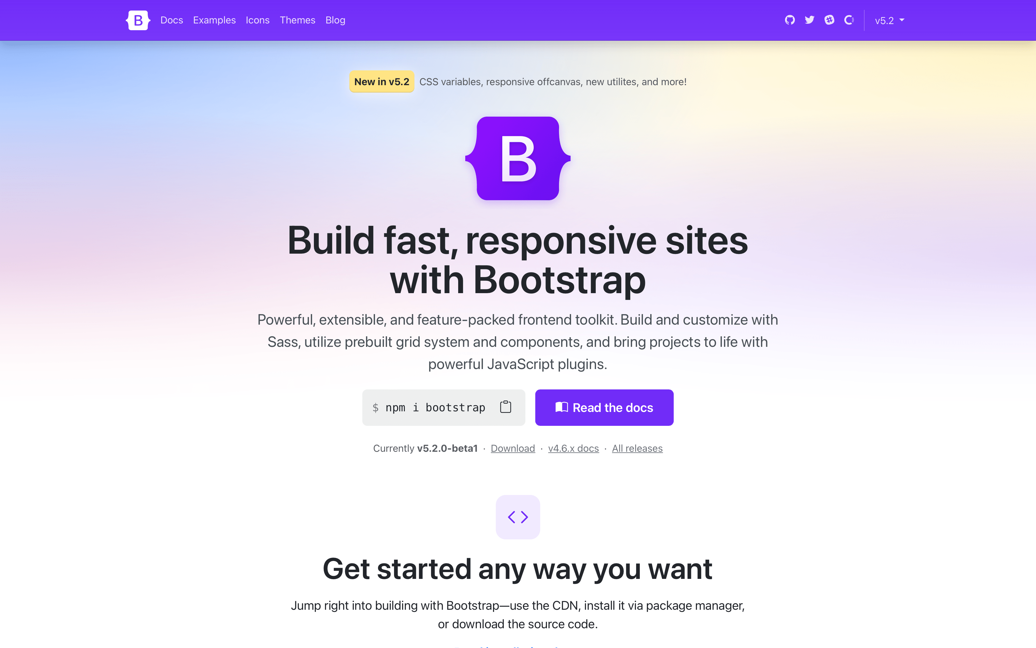
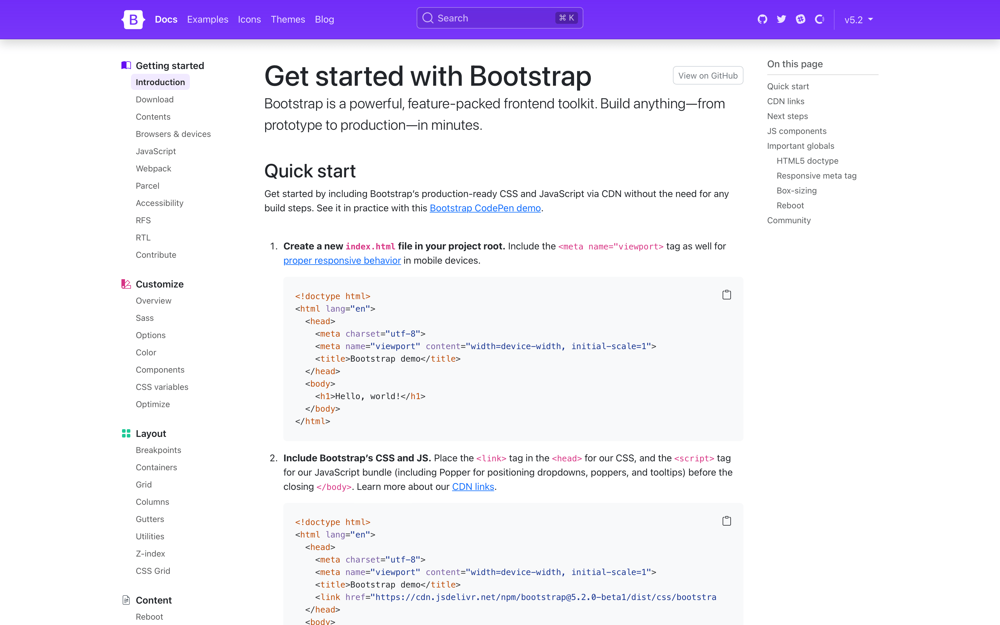
Docs redesign
As previewed in our beta release, the docs have been redesigned! It starts with our new homepage where we have a more complete representation of Bootstrap’s features and an updated design.
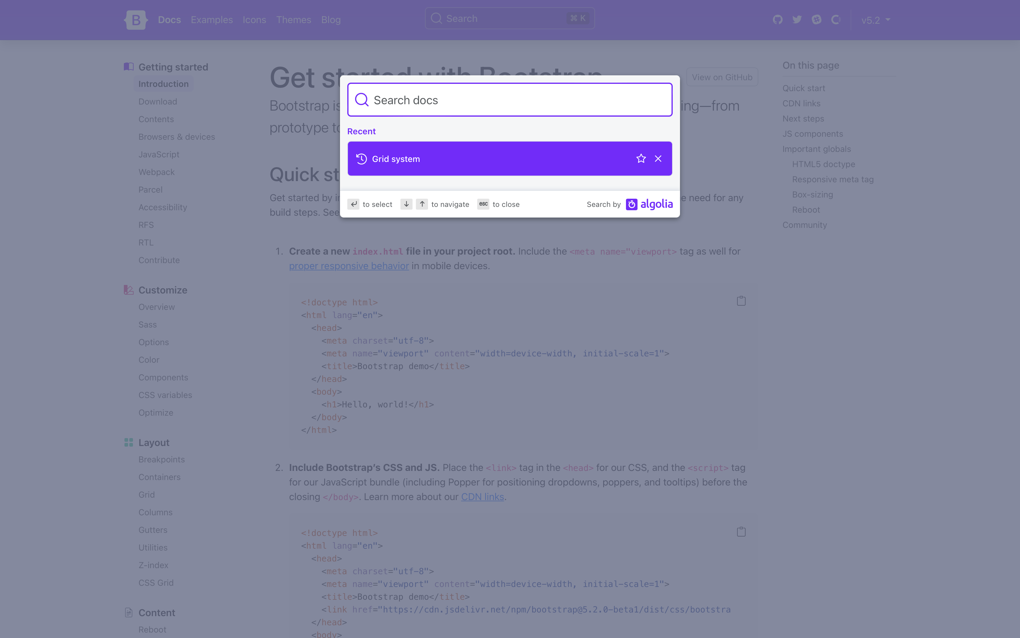
The docs sidebar navigation has been overhauled to have always expanded groups for easier browsing, a brand new DocSearch experience with search history, and new responsive offcanvas drawers for both sidebar and navbar on mobile.
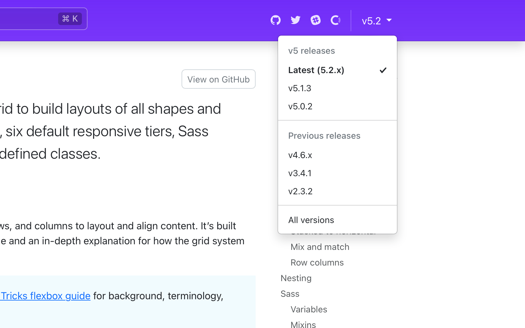
We even updated our version picker in the navbar to cross-link between minor releases!
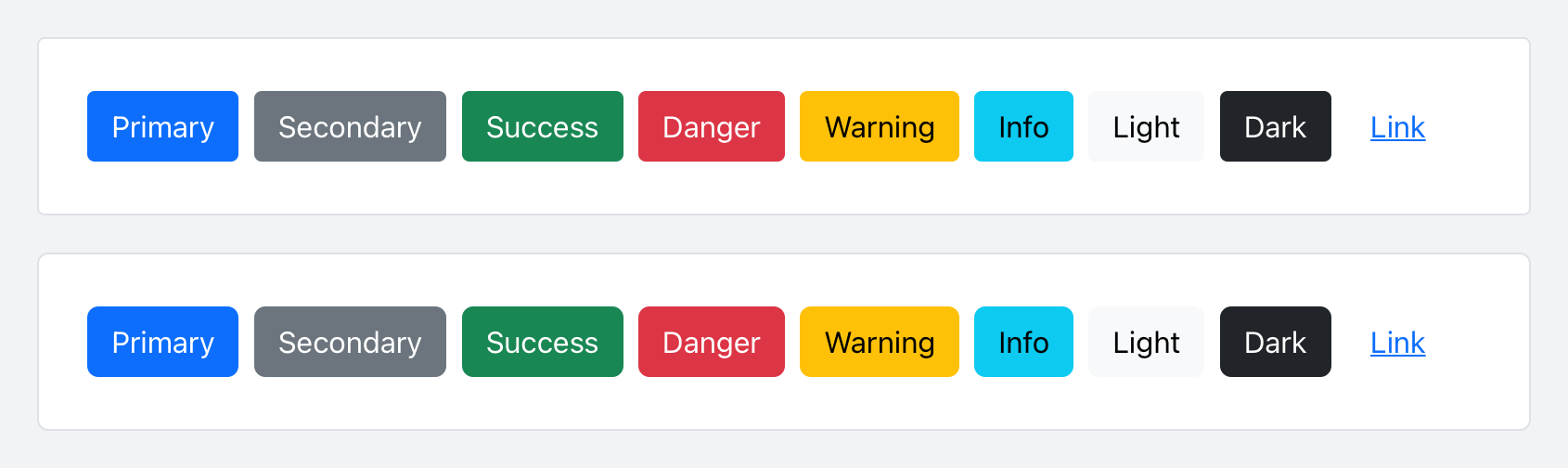
Updated buttons and inputs
With our docs redesign, we refreshed buttons and inputs with modified padding and border-radius. Here’s a look at the before and after of our buttons:
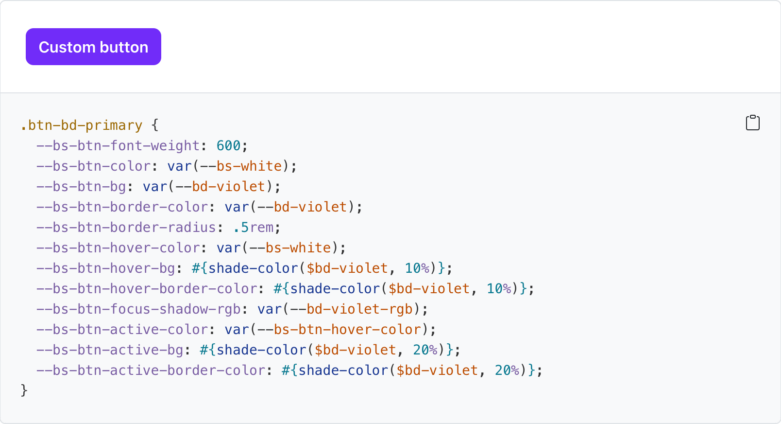
Tons of new CSS variables
Nearly all our components now have CSS variables for real real-time customization, easier theming, and (soon) color mode support starting with dark mode. You can see what CSS variables are available on every docs page, like our buttons:
--#{$prefix}btn-padding-x: #{$btn-padding-x};
--#{$prefix}btn-padding-y: #{$btn-padding-y};
--#{$prefix}btn-font-family: #{$btn-font-family};
@include rfs($btn-font-size, --#{$prefix}btn-font-size);
--#{$prefix}btn-font-weight: #{$btn-font-weight};
--#{$prefix}btn-line-height: #{$btn-line-height};
--#{$prefix}btn-color: #{$body-color};
--#{$prefix}btn-bg: transparent;
--#{$prefix}btn-border-width: #{$btn-border-width};
--#{$prefix}btn-border-color: transparent;
--#{$prefix}btn-border-radius: #{$btn-border-radius};
--#{$prefix}btn-box-shadow: #{$btn-box-shadow};
--#{$prefix}btn-disabled-opacity: #{$btn-disabled-opacity};
--#{$prefix}btn-focus-box-shadow: 0 0 0 #{$btn-focus-width} rgba(var(--#{$prefix}btn-focus-shadow-rgb), .5);
Values for virtually every CSS variables are assigned via Sass variable, so customization via CSS and Sass are both well supported. Also included for several components are examples of customizing via CSS variables.
New _maps.scss
Bootstrap v5.2.0 introduced a new Sass file with _maps.scss that pulls out several Sass maps from _variables.scss to fix an issue where updates to an original map were not applied to secondary maps that extend it. It’s not ideal, but it resolves a longstanding issue for folks when working with customized maps.
For example, updates to $theme-colors were not being applied to other maps that relied on $theme-colors (like the $utilities-colors and more), which created broken customization workflows. To summarize the problem, Sass has a limitation where once a default variable or map has been used, it cannot be updated. There’s a similar shortcoming with CSS variables when they’re used to compose other CSS variables.
This is also why variable customizations in Bootstrap have to come after @import "functions";, but before @import "variables"; and the rest of our import stack. The same applies to Sass maps—you must override the defaults before they get used. The following maps have been moved to the new _maps.scss:
$theme-colors-rgb$utilities-colors$utilities-text$utilities-text-colors$utilities-bg$utilities-bg-colors$negative-spacers$gutters
Your custom Bootstrap CSS builds should now look like this with a separate maps import.
  // Functions come first
  @import "functions";

  // Optional variable overrides here
+ $custom-color: #df711b;
+ $custom-theme-colors: (
+   "custom": $custom-color
+ );

  // Variables come next
  @import "variables";

+ // Optional Sass map overrides here
+ $theme-colors: map-merge($theme-colors, $custom-theme-colors);
+
+ // Followed by our default maps
+ @import "maps";
+
  // Rest of our imports
  @import "mixins";
  @import "utilities";
  @import "root";
  @import "reboot";
  // etc
New helpers and utilities
We’ve updated our helpers and utilities to make it easier to quickly build and modify custom components:
-
Added new
.text-bg-{color}helpers. Instead of setting individual.text-*and.bg-*utilities, you can now use the.text-bg-*helpers to set abackground-colorwith contrasting foregroundcolor. -
Expanded
font-weightutilities to include.fw-semiboldfor semibold fonts. -
Expanded
border-radiusutilities to include two new sizes,.rounded-4and.rounded-5, for more options.
Expect more improvements here as v5’s development continues.
Responsive offcanvas
Our Offcanvas component now has responsive variations. The original .offcanvas class remains unchanged—it hides content across all viewports. To make it responsive, change that .offcanvas class to any .offcanvas-{sm|md|lg|xl|xxl} class.
New Examples repo and guides
Since the beta, we’ve completely rewritten our Webpack guide and Parcel guide. We’ve also added a new Vite guide.

In addition, we’ve turned every one of those guides into a fully functioning example in our new twbs/examples repo. We’ve even added a couple more examples to the repo, with plans to create even more.
- Starter – CDN links for our CSS and JS
- Sass & JS — Import Sass, Autoprefixer, Stylelint, and our JS bundle via npm
- Sass & ESM JS — Import Sass, Autoprefixer, and Stylelint via npm, and then load our ESM JS with a shim
- Webpack - Import and bundle Sass and JS with Webpack
- Parcel - Sass, JS via Parcel
- Vite - Sass, JS via Vite
- Bootstrap Icons font - Import Bootstrap Icons via icon font
Each guide matches up to a new example in that repo, and nearly all of them can be immediately available in StackBlitz. Now you don’t even need to have a development environment configured on your computer to get started with Bootstrap.
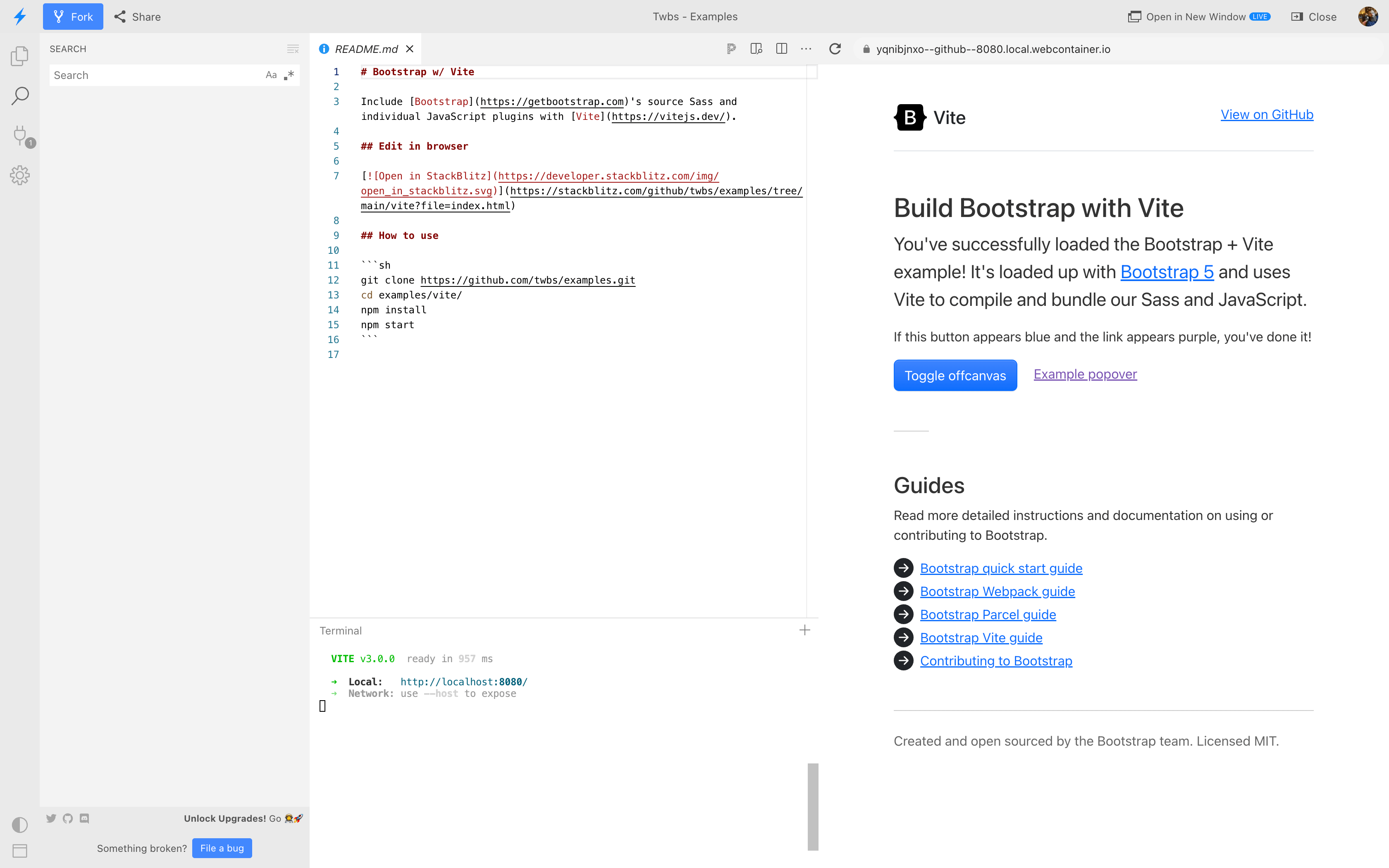
And did we mention that nearly all our code snippets now have an open in StackBlitz button?
And more!
-
Introduced new
$enable-container-classesoption. — Now when opting into the experimental CSS Grid layout,.container-*classes will still be compiled, unless this option is set tofalse. Containers also now keep their gutter values. -
Thicker table dividers are now opt-in. — We’ve removed the thicker and more difficult to override border between table groups and moved it to an optional class you can apply,
.table-group-divider. See the table docs for an example. -
Scrollspy has been rewritten to use the Intersection Observer API, which means you no longer need relative parent wrappers, deprecates
offsetconfig, and more. Look for your Scrollspy implementations to be more accurate and consistent in their nav highlighting. -
Added
.form-check-reversemodifier to flip the order of labels and associated checkboxes/radios. -
Added striped columns support to tables via the new
.table-striped-columnsclass. -
Added a new experimental reserved data attribute
data-bs-configthat can house simple component configuration as a JSON string. -
Added new
smooth-scrollto Scrollspy.
Get the release
Head to https://getbootstrap.com for the latest. It’s also been pushed to npm:
npm i bootstrap@v5.2.0
Read the GitHub v5.2.0 changelog for a complete list of changes in this release.
Support the team
Visit our Open Collective page or our team members’ GitHub profiles to help support the maintainers contributing to Bootstrap.