Bootstrap 4 Beta 2
Just over two months ago we shipped our first beta for Bootstrap 4, and now we’re ready to share our second with you. We’ve improved customization, documentation, build tooling, and naming inconsistencies all while fixing hella bugs.
We’ve done our best to prevent breaking changes, but we had to sneak some in. Regrettably, we’ll also have a few more coming in Beta 3, too. However, we’re clearly outlining all of them for you to make the upgrade and testing process as easy as possible.
Let’s start with the good news though—Beta 2 is here!
Highlights
We’ve pushed over 500 commits in our two months, so we have a few changes since Beta 1 to highlights to share with you.
Improved theming
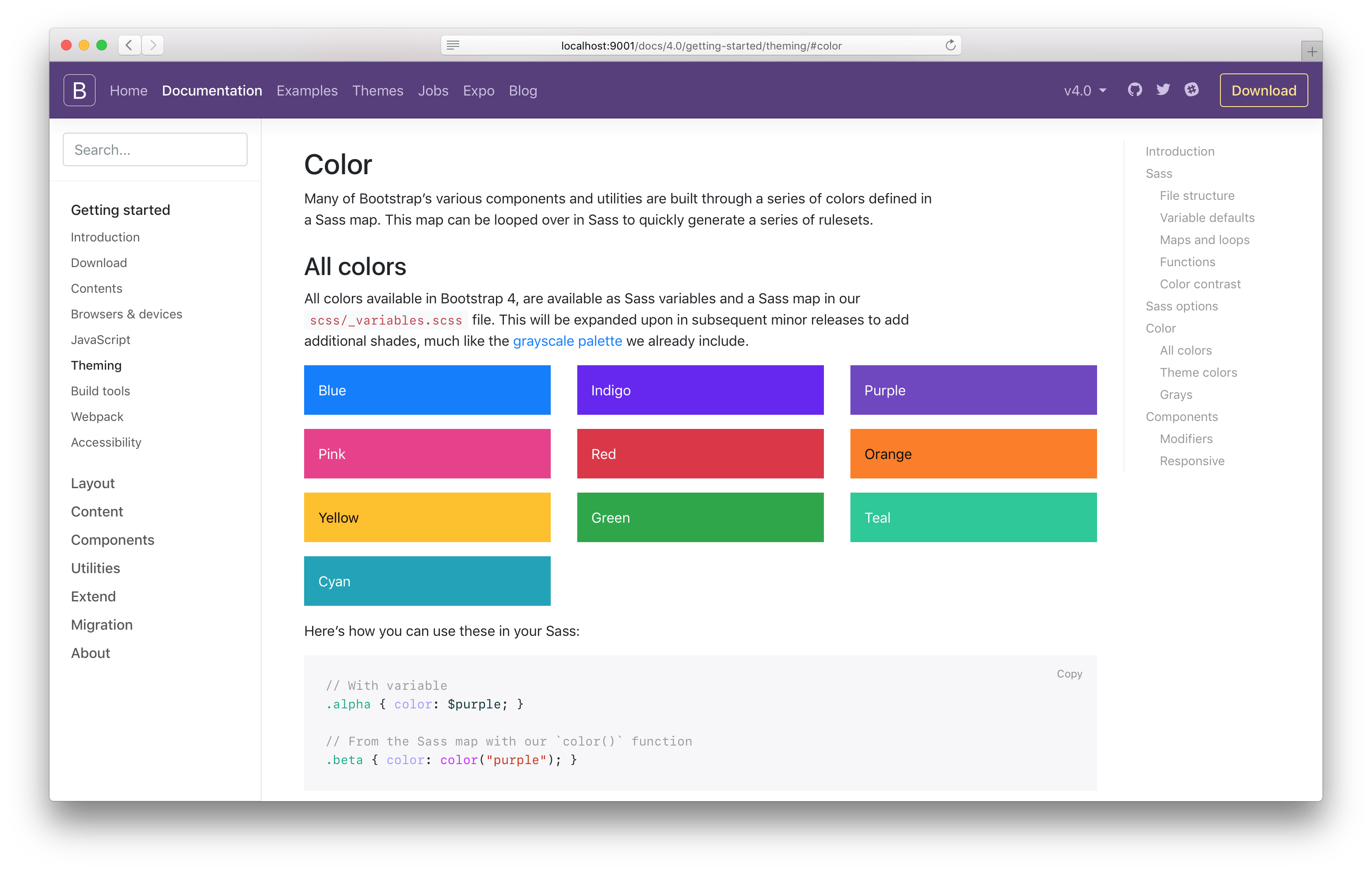
We have a brand new Theming docs page to replace our old Options page (we’ll automatically redirect folks from the old page). This new page delves into the structure of our Sass files, default variables and customizing them, maps and loops we use, functions, colors, and of course or global Sass options. It also includes a new section to explain how we build our components via Sass maps and loops, specifically our modifier classes (e.g., .btn-danger).
In addition to the documentation changes, we’ve made a few CSS changes to improve how folks interact with our theming options.
-
We’ve added new theme color variables in addition to the map. Now you can use
$primaryortheme-color("primary")as needed. The values in$theme-colorsare also now mapped to these new variables instead of their direct color. -
We’ve improved the ability to customize Sass maps. With Beta 1, we didn’t have a setup in place to modify your
$theme-colorsmap without replacing it wholesale. That’s been fixed in Beta 2—override existing values and add more as needed. Our new Theming docs page will show you how it’s done.
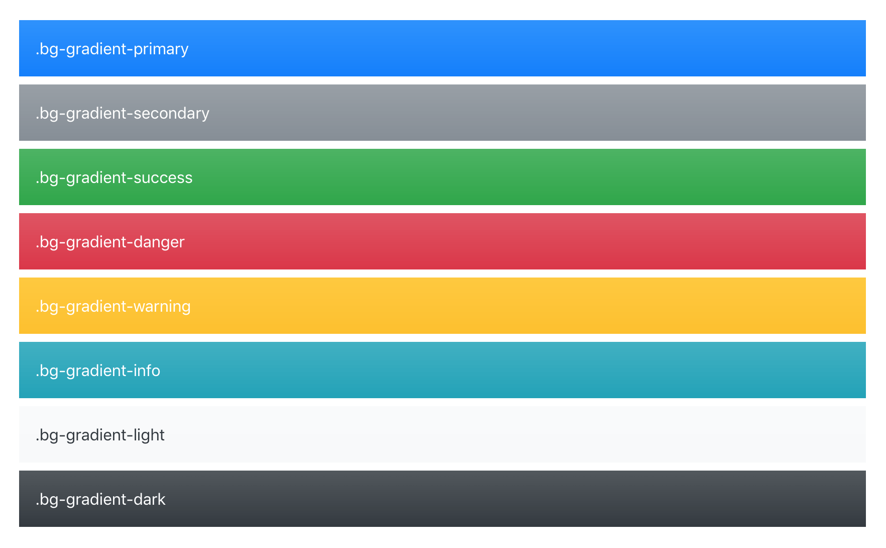
Lastly, our $enable-shadows and $enable-gradients Sass variables have finally been updated and integrated into several of our components. Now, when you enable those variables (both are false by default) and recompile, you’ll see subtle gradients and shadows across alerts, buttons, carousels, custom form controls, and dropdown items.

And when you use $enable-gradients, you’ll enable the new .bg-gradient- utilities (disabled by default) for use in navbars and more.

Check it out and please share any feedback in an issue.
Offset grid classes
We brought them back! Prematurely removed ahead of Beta 1, we underestimated the appeal of the .offset- classes for our grid system. Auto margins are simply not enough for y’all. The styles have been restored and our grid docs have been updated. Enjoy!
Updated migration docs
Given our handful of breaking changes since Beta 1, we added a new section to our migration docs page to detail exactly what we changed that might be broken for you. We had to rename a few classes here and there to ensure everything’s consistent with the rest of the project.
We’ll be updating this page again for Beta 3 in the same way.
And more!
- Introduced new
pointer-eventsusage on modals. The outer.modal-dialogpasses through events withpointer-events: nonefor custom click handling (making it possible to just listen on the.modal-backdropfor any clicks), and then counteracts it for the actual.modal-contentwithpointer-events: auto. - Responsive tables now generate classes for each grid breakpoint, meaning we’ve added
.table-responsive-{sm,md,lg,xl}to the already present.table-responsive. You might need to adjust your usage depending on when you want a table to resize. - Remove unnecessary
colorfrom.badge, and its associated$badge-colorvariable. - Include two new dist files which contain Popper.js inside
bootstrap.bundle.jsandbootstrap.bundle.min.js. - Dropped support for Bower as they’ve deprecated the package manager.
- Switched breadcrumbs from
floatto flexbox. - Switched to Stylelint for our CSS linting needs.
- We’re now outputting a handful of CSS variables in our compiled CSS for easy prototyping and customizing with our dist files.
- Changed the
color-yiqfrom a mixin that included thecolorproperty to a function that returns a value, allowing you to use it for any CSS property.
Coming in Beta 3
Beta 3 is up next for us and already has a GitHub project board setup to track issues and PRs. Beyond the standard docs improvements and bug fixes, there are a few issues and PRs that are of mind for us:
- Revisiting form checkbox and radio markup to ensure we can customize validation messaging (while also making the markup match our custom form checks).
- More control over input and button variables.
- Improved focus styling for validated custom checks and radios.
- Addressing form validation feedback in input groups.
Be sure to follow those issues and PRs if you’re interested in when the merge to our v4-dev branch.
Getting to v4 Final
After Beta 3, we’re hoping to quickly move into a final v4 release. Ideally, it’ll also be a smoother and more focused release than the Alpha 6 to Beta 1 move. We heard from a lot of you that the delta between those two releases was too great.
For more details on this release’s changes, take a look at the Beta 2 ship list issue, as well as the Beta 2 project. Be sure to join our official Slack room! and dive into our issue tracker with bug reports, questions, and general feedback whenever possible.

