Bootstrap 5 Alpha 3
 @mdo
November 11, 2020
@mdo
November 11, 2020
Our third alpha release has landed with tons of updates to our components, utilities, docs, forms, JavaScript, and more. This is a larger alpha release for us and sets us up for our first beta where we’ll introduce some final breaking changes and features.
We’re trying to move fast and keep the future of the project and the web in general in mind, so this release is an important milestone for us. We’re balancing practical migration from v4 with meaningful changes that reflect the ever-changing front-end community.
We think you’ll love this release, so keep on reading and let us know what you think!
Components
We’ve improved a handful of components in this release, and even dropped one for some new and improved utilities.
New accordion
We’ve dropped the .card based accordion for a brand new .accordion component, solving several bugs in the process. Our new accordion still uses the Collapse JavaScript plugin, but with custom HTML and CSS to support it, it’s better and easier than ever to use.
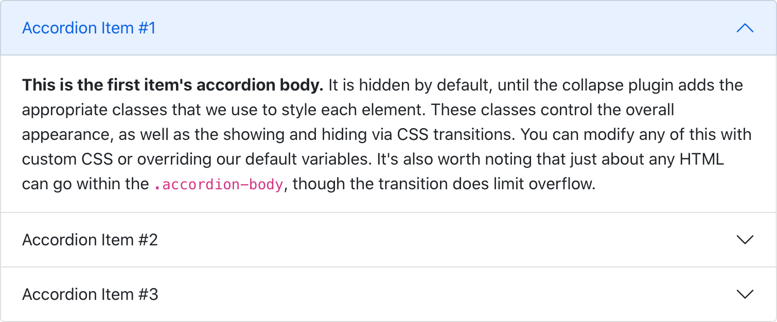
The new accordion includes Bootstrap Icons as chevron icons indicating state and click-ability. We’ve included support for a flush accordion (add .accordion-flush) to remove the outer borders, allowing for easier placement inside parent elements.
See the PR for extra details on what’s new, or visit the new docs page.
New block buttons
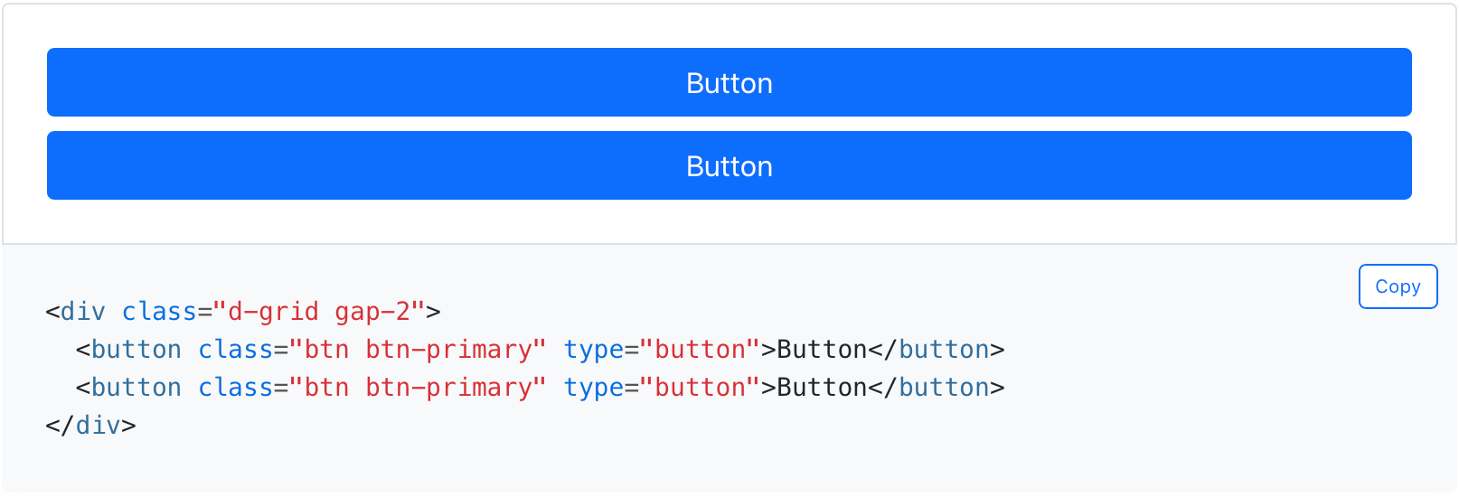
Block buttons are no more in v5—we’ve dropped the .btn-block class for .d-grid and .gap-* utilities. This allows for the same behavior and style, but with much greater control over spacing, alignment, and even responsive layout options.
See the buttons docs page for details.
Docs improvements
We’re always looking for new ways to improve our documentation, and this release is no different. We have a ton of changes big and small.
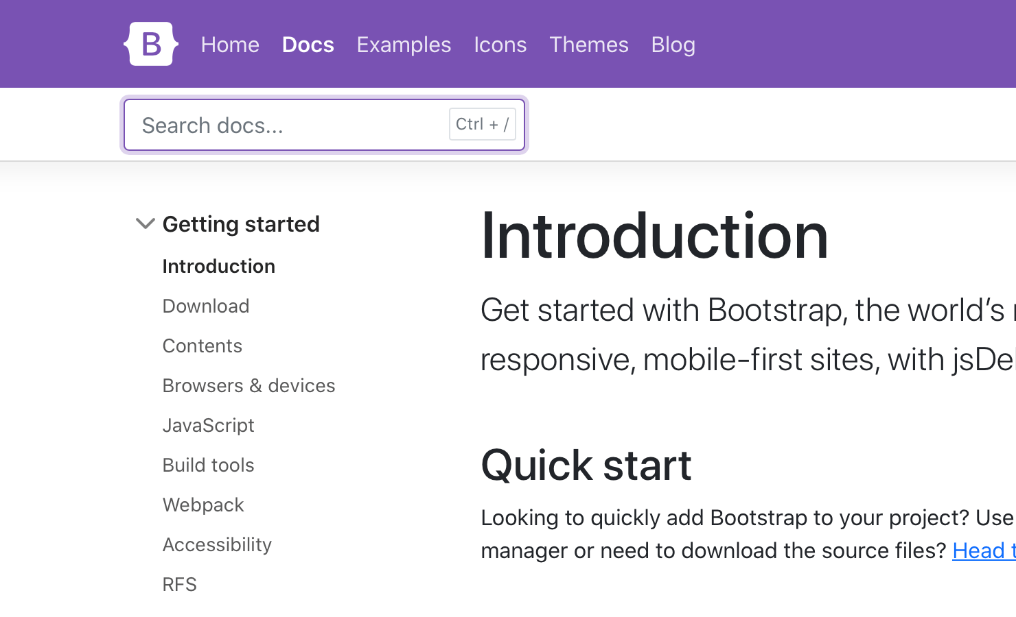
We’ve added a keyboard shortcut to focus you on the search field. Hit Ctrl + / to trigger it.
We’ve also rewritten the docs sidebar to use actual <button> elements instead of anchors, and improved the focus styling.
Content-wise, we’ve renamed the “Navs” page to “Navs & Tabs” to help folks find our tab JavaScript features better. We’ve also made some style changes, improving the focus styles of heading anchor links and removing text wrapping from code snippets for shorter and easier to read code.
Sass
Three important and helpful changes to our Sass source code:
-
We’ve switched to Dart Sass with LibSass being deprecated. We’ve been testing our builds with Dart Sass for a while and decided to make the switch with LibSass being deprecated just a couple of weeks ago. We’re holding on the Sass modules for now.
-
The color system which worked with
color-level()and$theme-color-intervalwas removed in favor of a new color system. Alllighten()anddarken()functions in our codebase are replaced bytint-color()andshade-color(). These functions will mix the color with either white or black instead of changing its lightness by a fixed amount. Thescale-color()will either tint or shade a color depending on whether its weight parameter is positive or negative. See #30622 for more details. -
We’ve added a Sass variable for CSS custom property prefixes.
JS
Ahead of some larger and necessary JavaScript changes in Beta 1, we’ve shipped a few updates to our plugins.
- Simplified dropdown’s placement
- Removed redundant polyfills since we dropped IE and Legacy Edge
- Fixed the carousel
data-intervalbug by checking fordata-intervalon the first slide - Removed
Manipulator.toggleClassto simplify some code since we only used it one place
Utilities
Utility classes are incredibly powerful in Bootstrap, especially with our new utilities API.
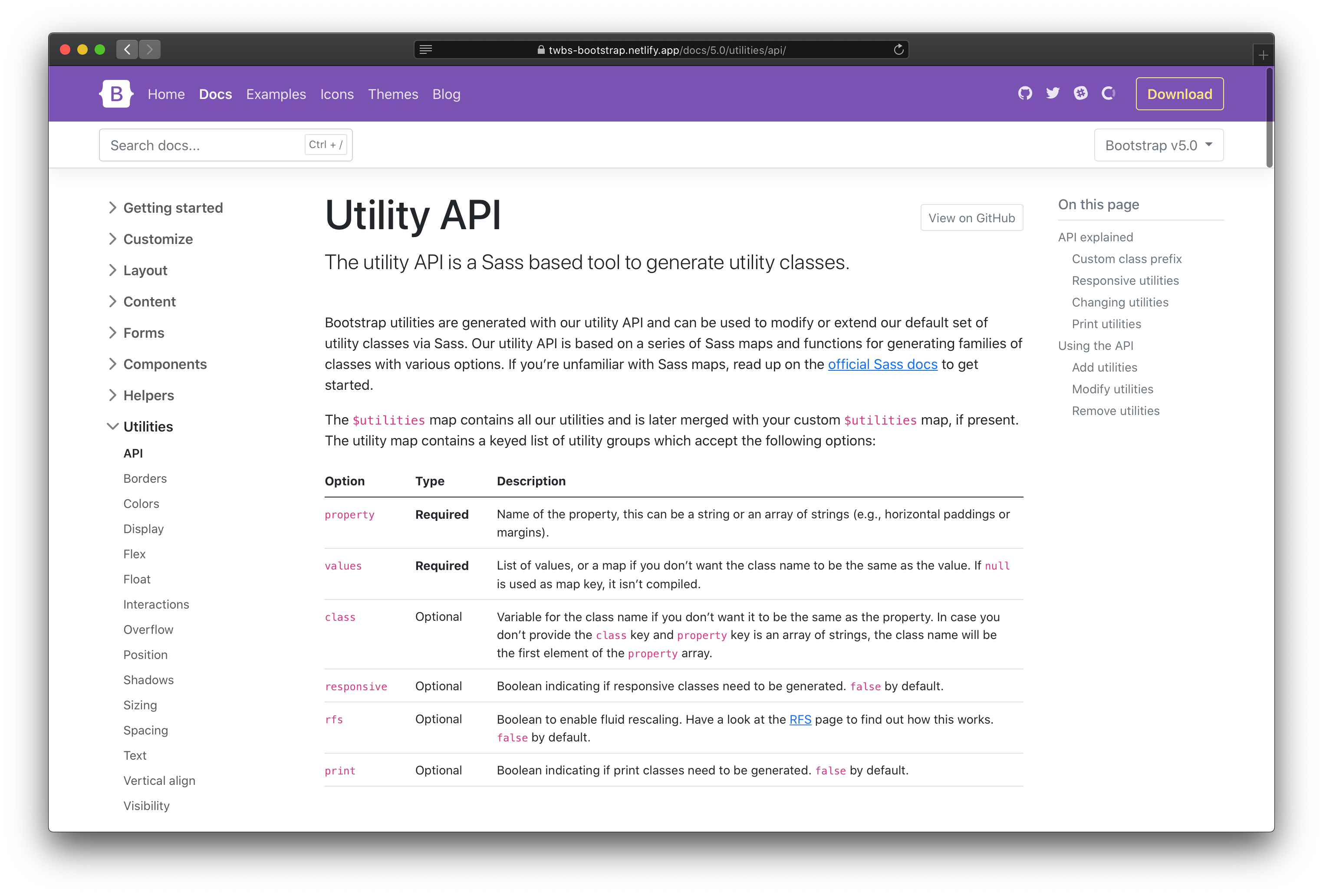
With our first beta, we’ve overhauled our API docs to provide clearer examples and information on adding, modifying, removing, and extending our default utilities.
In addition, we’ve added some new default utilities to make life a little easier:
- Added
.d-gridfordisplay: grid - Added
.fsutilities forfont-size - Renamed
font-weightutilities to.fw - Added
.rounded-1,.rounded-2, and.rounded-3for new small, medium, and largeborder-radiusutilities - Added
.overflow-visibleand.overflow-scrollutilities
Our next release will also add another powerful feature to our utilities, pseudo-class support!
Forms
Forms have some exciting changes thanks to the addition of floating labels as a fully-fledged form layout option and a new file input.
Floating labels
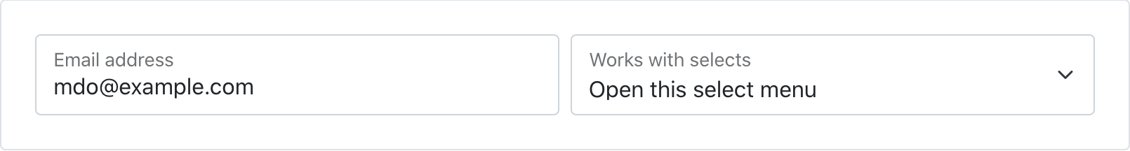
Floating labels include support for textual inputs, selects, and textareas. We have one limitation with textareas where multiple lines of text can be obscured by the floating label. We’re working on fixes for this, so if you have ideas, please let us know!
New file input
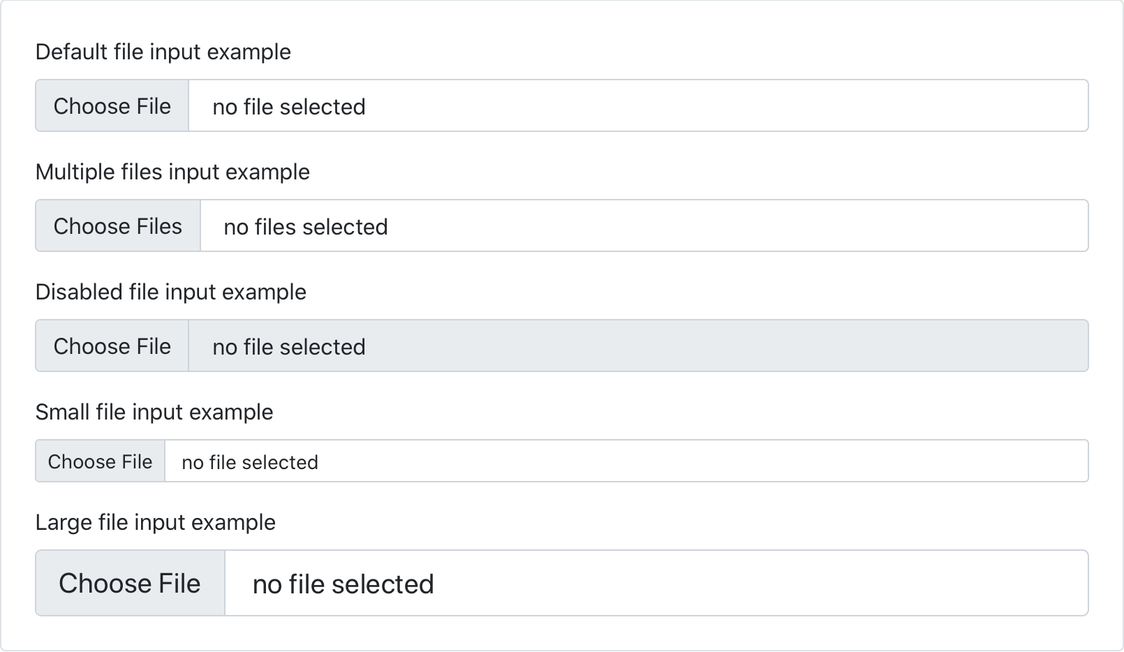
We’ve dropped our custom .form-file class for additional styles on the .form-control class. This means we no longer require additional JavaScript to make our file input styles functional—the new form file is all CSS!
Input group rounded corners
Beyond that, we’ve finally resolved ourselves to adding a new class to fix the rounded corners on input groups when using validation. Add the .has-feedback class to the .input-group to enable validation messages inside input groups without any visual regressions. The good news is this is also being backported to v4 in our next release.
And more
In addition, we’ve made a few other form-related improvements:
- Removed explicit
heightfrom most of our form controls. - Fixed the disabled checkbox toggle buttons
- Added docs examples for disabled
.form-control,.form-select, and.form-rangeelements
Have some form feature requests or improvements we should consider? Please open an issue!
Quality of life
Lastly, across the board we’ve made some minor updates to browser support, Reboot styling, components, and more
- Moved our preferred CDN from BootstrapCDN to jsDelivr
- Dropped support for Legacy Edge (woohoo!)
- Updated to Node.js 14 and PostCSS 8.x
- Removed obsolete prefixes in our CSS
- Added
cursor: pointerand heights to color inputs - Removed
background-clipon.btn-closeso thebackground-imageis no longer clipped - Improved
sans-seriffont selection in Ubuntu - Spinners now slow down when reduced motion is enabled rather than stopping outright
- Fix inconsistent whitespace in breadcrumbs
See all the changes in the v5 Alpha 3 project board and v5 alpha 3 release changelog. Be sure to read the Migration guide for details on what’s changed since Alpha 2.
Coming in Beta 1
Beta 1 will be a more narrowly focused release and we’re hoping to ship these final breaking changes as part of it.
-
RTL! RTL is still coming! The PR is being reviewed by our team would like it to land in Beta 1 to ensure we can get some testing from the community.
-
Updating to Popper.js v2. Still on our radar, but moving slower than we anticipated due to some of the differences in the major release. See the PR for details.
-
Namespaced data attributes to help keep our functionality clearly separated from your own. See the PR.
-
Updated utilities API with pseudo-classes support via a
stateoption. Add any space-separated list of states to get additional utilities for that pseudo-class. See the work-in-progress PR for details.
For a more up to date list of changes, be sure to follow along with the v5 Beta project board.
Get started
Head to https://v5.getbootstrap.com to explore the new release. We’ve also published this updated as a pre-release to npm, so if you’re feeling bold or are curious about what’s new, you can pull the latest in that way.
npm i bootstrap@next
Support the team
Visit our Open Collective page or our team members’ GitHub profiles to help support the maintainers contributing to Bootstrap.