Bootstrap 5
 @mdo
May 05, 2021
@mdo
May 05, 2021
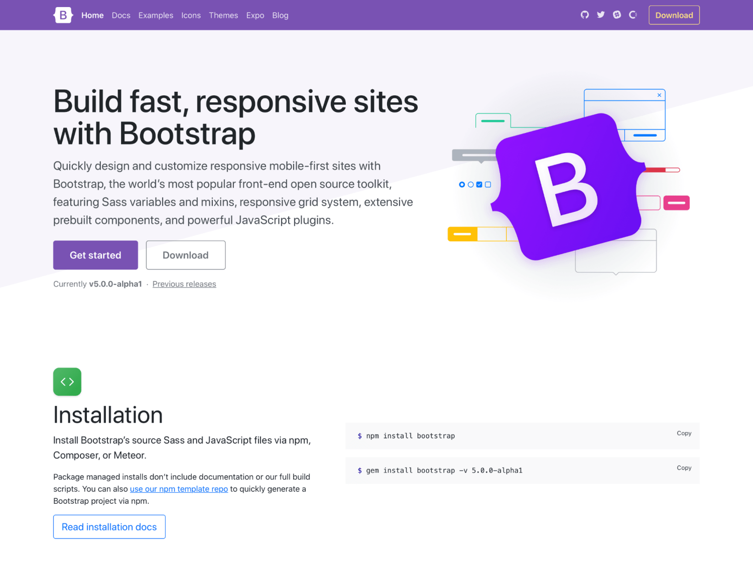
Bootstrap 5 has officially landed! After three alphas, three betas, and several months of hard work, we’re shipping the first stable release of our new major version. It’s been a wild ride made possible by our maintainers and the amazing community that uses and contributes to Bootstrap. Thanks to all who have helped us get here!
Keep reading for details on what’s new compared to v4 and what’s coming for subsequent releases. Want to get right to it? Head to the new v5 docs or fly by the seat of your pants and just npm i bootstrap.
In this post:
- New logo!
- New offcanvas component
- New accordion
- New and updated forms
- RTL is here!
- Overhauled utilities
- New snippet examples
- Grid and layout
- More component updates
- Improved customizing
- Dart Sass
- Browser support
- JavaScript
- Migration guide
- Get the release
- What’s next
- v5.1.0 preview
- Support the team
New logo!
One of the biggest changes with v5 came with our redesigned logo and updated docs design. Inspired by the work we’ve done in Bootstrap Icons, our new logo is a callback to CSS’s curly braces and our longstanding B icon. It’s a small upgrade, but a fun one nonetheless, and one that we feel helps set the tone for this new major release. Still the same Bootstrap, just slightly refined. 😅
And the new docs are brighter, better organized with new content sections, and also feature improved navigation.
New offcanvas component
One of our big new component additions is the all-new offcanvas!
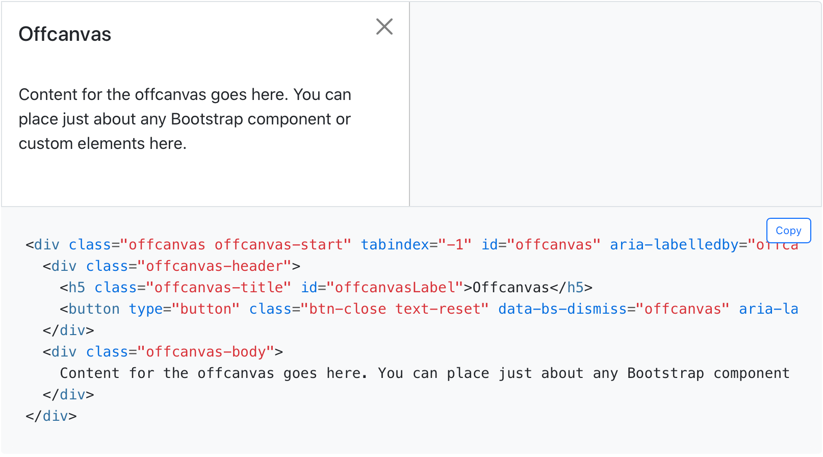
Built on and sharing fundamental pieces of our modals, our new offcanvas component comes with a configurable backdrop, body scroll, and placement. Offcanvas components can be placed on the top, right, bottom, or left of the viewport. Configure these options with data attributes or via the JavaScript APIs.
New accordion
We’ve replaced our .card accordion component with a brand new .accordion component, solving several bugs in the process. Our new accordion still uses the Collapse JavaScript plugin, but with custom HTML and CSS to support it, it’s better and easier than ever to use.
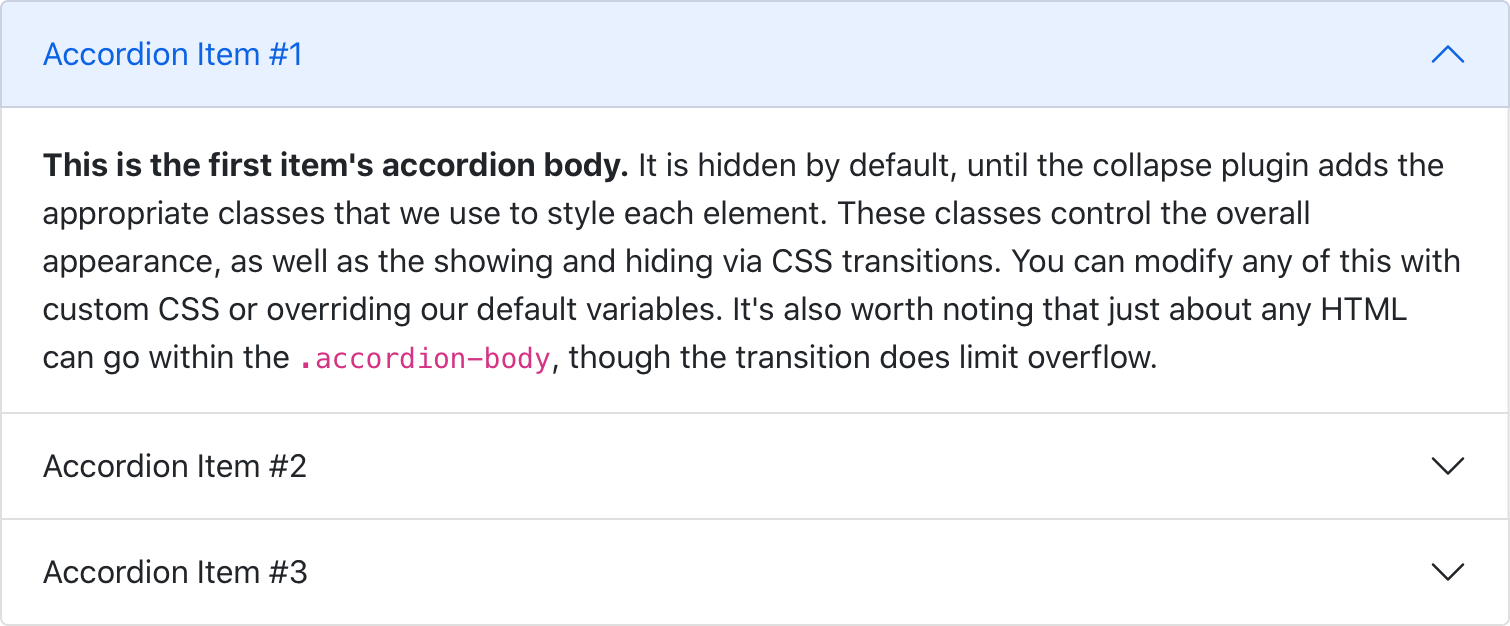
The new accordion includes Bootstrap Icons as chevron icons indicating state and click-ability. We’ve included support for a flush accordion (add .accordion-flush) to remove the outer borders, allowing for easier placement inside parent elements.
Visit the new docs page to learn more.
New and updated forms
We’ve overhauled our Forms documentation and components. We’ve consolidated all our forms styles into a new Forms section (including the input group component) to give them the emphasis they deserve.
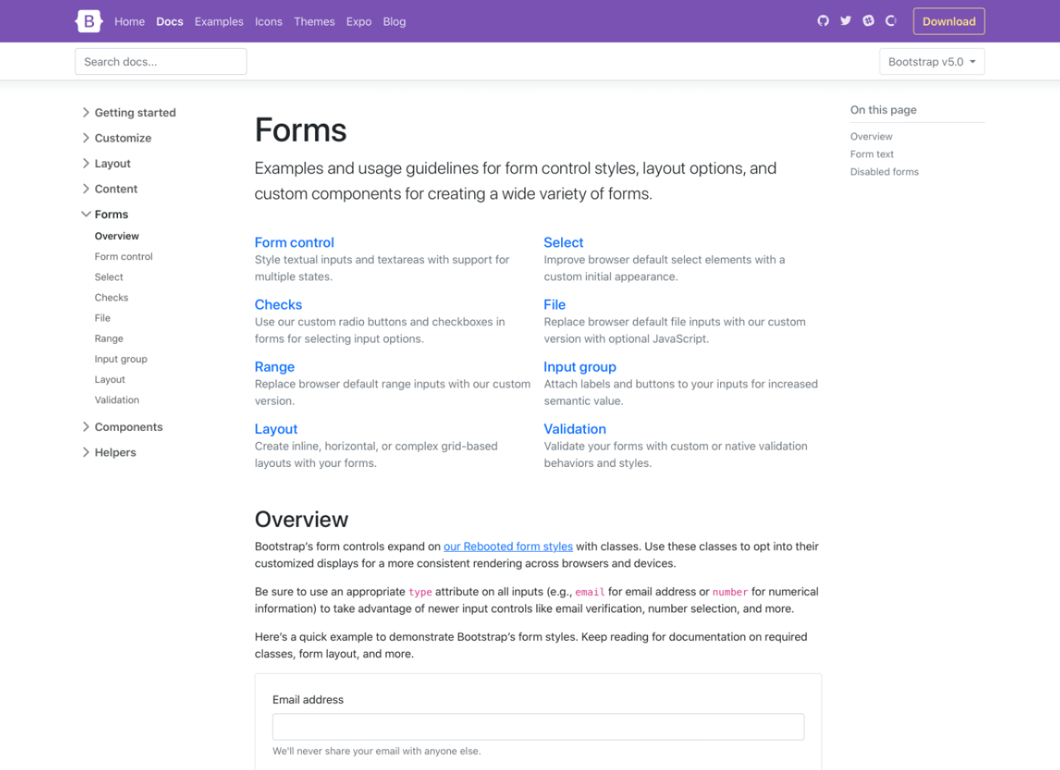
Alongside new docs pages, we’ve redesigned and de-duped all our form controls. In v4 we introduced an extensive suite of custom form controls—checks, radios, switches, files, and more—but those were in addition to whatever defaults each browser provided. With v5, we’ve gone fully custom.
Checks and radios
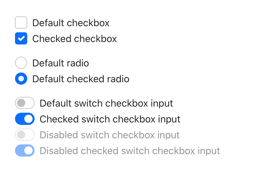
If you’re familiar with v4’s form markup, this shouldn’t look too far off for you. With a single set of form controls and a focus on redesigning existing elements vs generating new ones via pseudo-elements, we have a much more consistent look and feel.
<div class="form-check">
  <input class="form-check-input" type="checkbox" value="" id="flexCheckDefault">
  <label class="form-check-label" for="flexCheckDefault">
    Default checkbox
  </label>
</div>

<div class="form-check">
  <input class="form-check-input" type="radio" name="flexRadioDefault" id="flexRadioDefault1">
  <label class="form-check-label" for="flexRadioDefault1">
    Default radio
  </label>
</div>

<div class="form-check form-switch">
  <input class="form-check-input" type="checkbox" id="flexSwitchCheckDefault">
  <label class="form-check-label" for="flexSwitchCheckDefault">Default switch checkbox input</label>
</div>
Every checkbox, radio, select, file, range, and more includes a custom appearance to unify the style and behavior of form controls across OS and browser. These new form controls are all built on completely semantic, standard form controls—no more superfluous markup, just form controls and labels.
Floating labels
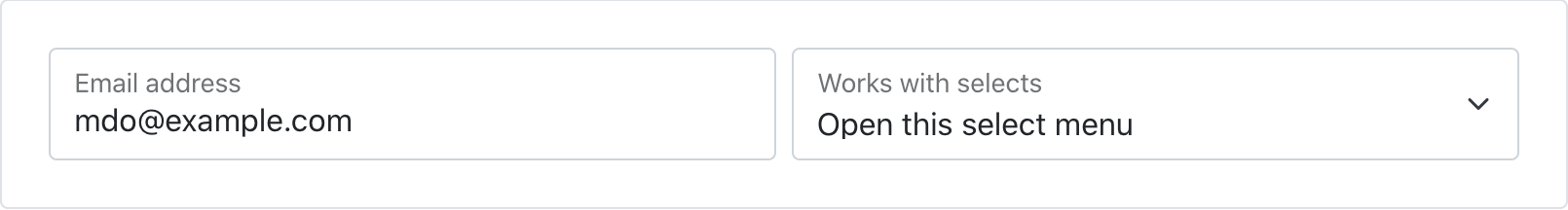
Floating labels include support for textual inputs, selects, and textareas. We have one limitation with textareas where multiple lines of text can be obscured by the floating label. We’re working on fixes for this, so if you have ideas, please let us know!
New file input
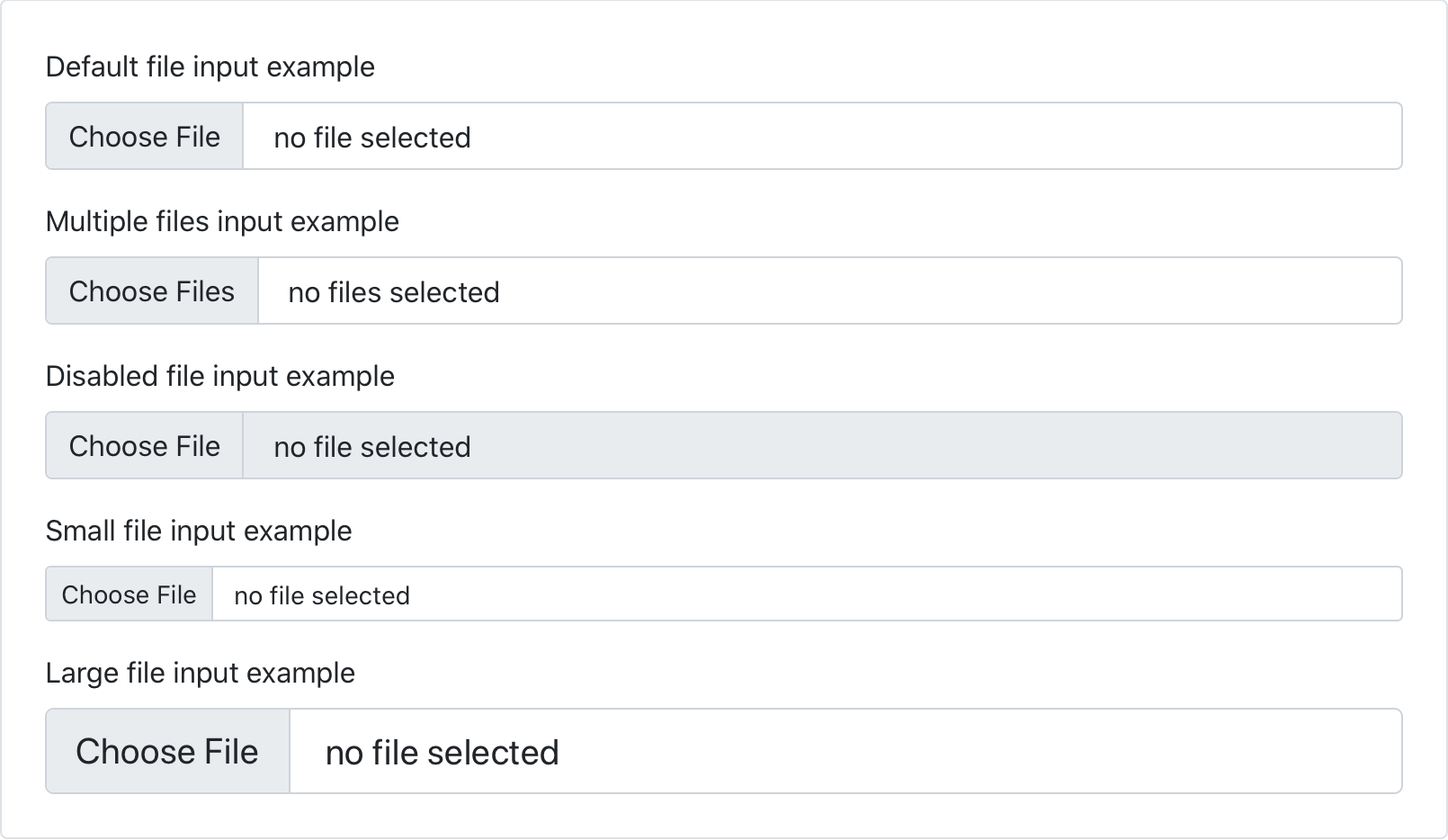
We’ve dropped our custom .form-file class for additional styles on the .form-control class. This means we no longer require additional JavaScript to make our file input styles functional—the new form file is all CSS!
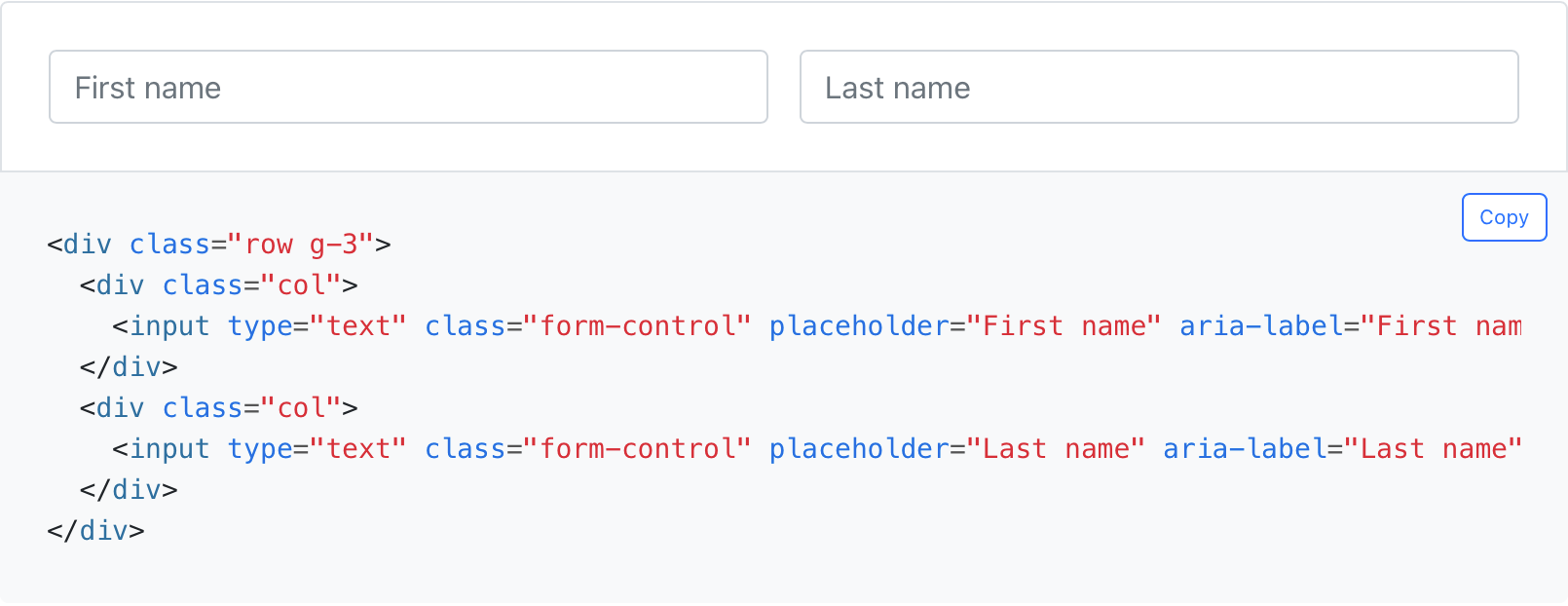
Simplified layout
Using our new grid updates, form layout has never been easier. We’ve dropped the .form-group, .form-row, and .form-inline for the grid system.
Be sure to explore the new forms docs and let us know what you think.
RTL is here!
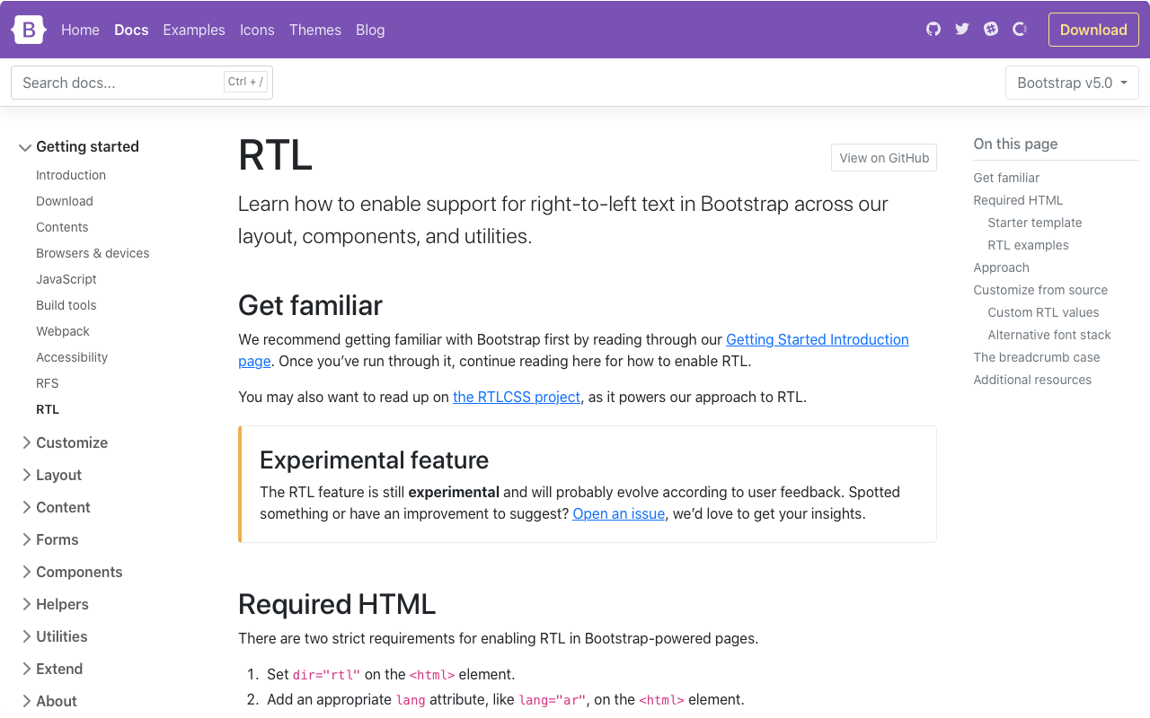
We’ve finally added RTL support to Bootstrap! At a high level, our RTL approach includes a handful of changes:
-
New RTL versions of our CSS dist file, which includes our grid, Reboot, utilities, and standard bundles. See the Contents page for a full list of files.
-
New RTL documentation to help you get started.
-
Five new RTL Examples that show our new RTL CSS in action, converting our Album, Checkout, Carousel, Blog, and Dashboard examples into all-new right-to-left equivalents.
-
Two new cheatsheet kitchen sink pages—the default cheatsheet for our standard CSS and the RTL cheatsheet.
Our approach is built on RTLCSS, an awesome project that helps reprocess an existing LTR stylesheet for RTL. We’ve classified it as an experimental feature for now, anticipating that we’ll get some of this wrong. We’re looking to the community to help us round out the feature as we wrap up some remaining todos.
Overhauled utilities
Given the love utility-driven frameworks have garnered the last few years, we’ve invested in adding more utilities to Bootstrap along with a new method of managing them across your projects.
New utilities API
We’ve implemented a brand new utility API into Bootstrap 5 as the primary way to extend Bootstrap’s default utility classes. Easily generate and customize utilities with support for custom class names, support for generating state-based classes like :hover, print versions, and more.
$utilities: () !default;
$utilities: map-merge(
  (
    // ...
    "margin": (
      responsive: true,
      property: margin,
      class: m,
      values: map-merge($spacers, (auto: auto))
    ),
    // ...
    "opacity": (
      property: o,
      class: opacity,
      state: hover,
      values: (
        0: 0,
        25: .25,
        50: .5,
        75: .75,
        100: 1,
      )
    )
    // ...
  ), $utilities);
Ever since utilities become a preferred way to build, we’ve been working to find the right balance to implement them in Bootstrap while providing control and customization. In v4, we did this with global $enable-* classes, and we’ve even carried that forward in v5. But with an API-based approach, we’ve created a language and syntax in Sass to create your own utilities on the fly while also being able to modify or remove those we provide.
Head to the new Utilities API docs to learn more.
New utilities
Speaking of utilities, we’ve added a ton of new ones to our arsenal, including:
- Added positioning utilities:
top,right,bottom, andleftwith0,50%, and100%values - Added
.d-gridoption, along with newgaputilities for easy grid layouts - Added
.fsutilities forfont-size - Renamed
font-weightutilities to.fw - Added
.rounded-1,.rounded-2, and.rounded-3for new small, medium, and largeborder-radiusutilities - Added
.overflow-visibleand.overflow-scrollutilities
Check out the Migration guide and utilities documentation for more details.
Logical properties for spacing utilities
Part of our approach to adding RTL to Bootstrap was to add it in a way that felt future-friendly to ourselves and the web at large. As such, we’ve embraced the spirit of CSS logical properties and have renamed several classes and variables. It’s a risky change because of the size and impact of the change, but we hope you’ll appreciate it overall!
Most of you have already interacted with logical properties thanks to our flex utilities—they replace direction properties like left and right in favor start and end. Things like align-items-end have been welcomed additions. This makes horizontal directional class names appropriate for LTR and RTL without any additional overhead moving forward.
For example, in a LTR context, instead of .ml-3 for margin-left, use .ms-3. Be sure to read the RTL Migration guide for a full list of renamed classes and variables.
New snippet examples
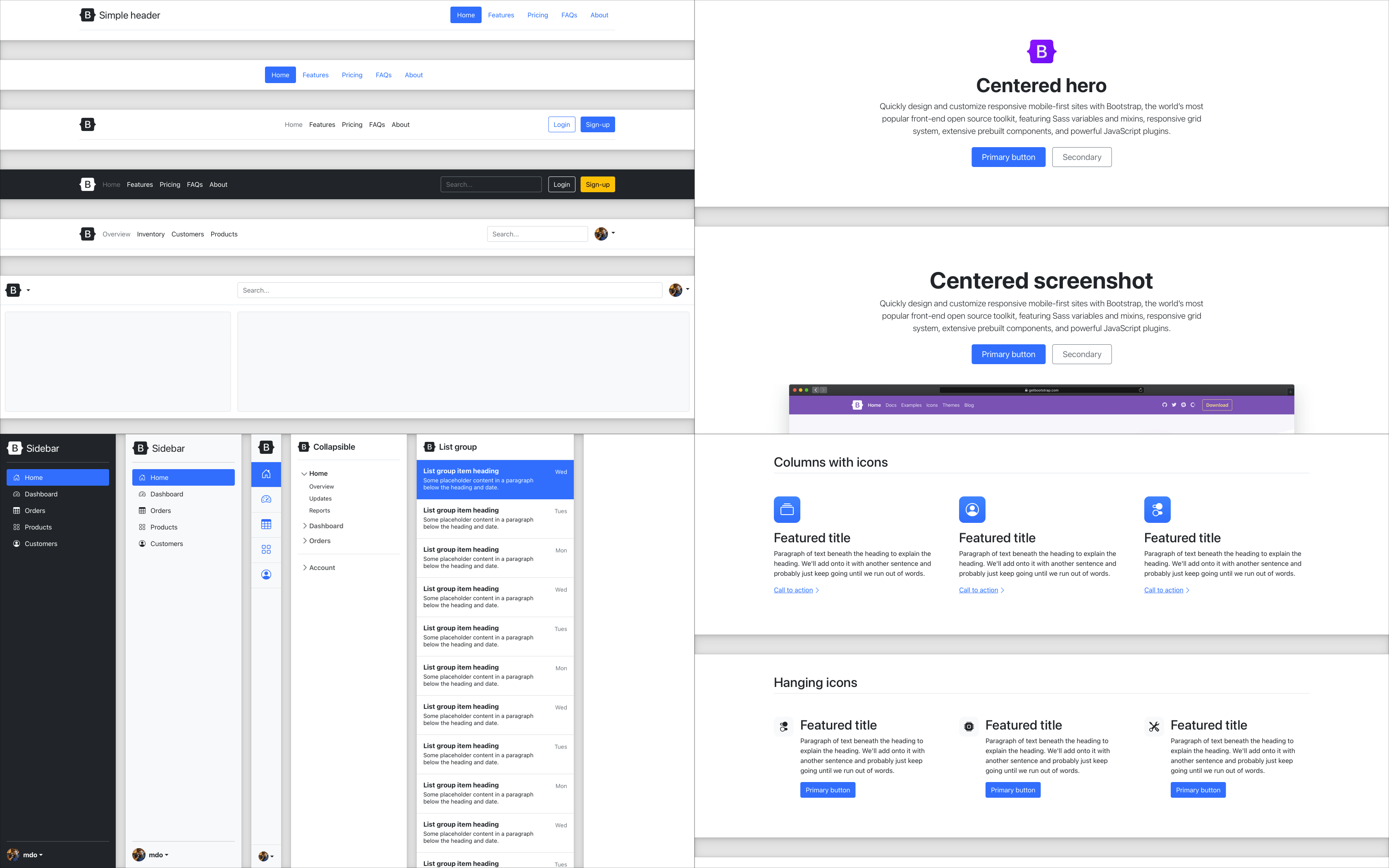
We’ve added four brand new snippet-heavy examples and refreshed a few other examples while we were at it. These new snippet examples feature several variations of common components, served up in different ways for you to easily copy and paste.
These new snippets will continue to grow with new additions over time, showing just how fun and easy it is to build with Bootstrap.
We’ve also updated our starter template with a refreshed design and more resources.
Grid and layout
Our grid system and layout options saw some changes to streamline and improve things, namely:
- Column classes can now be used as
widthutilities (e.g.,.col-6iswidth: 50%) aspaddingis no longer applied outside a.row. - New gutter utilities can responsively customize horizontal and vertical grid gutters. The gutter width has also been reduced to
1.5rem. - Removed
position: relativefrom column classes - Dropped the
.mediacomponent for utilities
We also updated our layout documentation to break apart the exceptionally long pages into more focused topics. We’ve also added a clarified explanation of breakpoints, containers, and more.
Check out the Migration guide and layout documentation for more details.
More component updates
Across the board we’ve made a number of other enhancements and changes to key components:
- We’ve overhauled the JavaScript and positioning for our dropdowns as part of our adoption of Popper 2. You can see all the options in a new example in our docs and new CSS selectors and data attributes used to position them.
- Dropdown menus now have a new
.dropdown-menu-darkmodifier class. - Similarly, carousels now have a new
.carousel-darkmodifier class to invert the controls, text, and indicators. - Added icon examples to our Alert component for adding Bootstrap Icons (or other icon libraries) using utilities
- Our close button has been redesigned with an SVG
background-imageand improved cross-browser styling. - We’ve dropped the
.btn-blockclass for utilities. - We’ve updated navbars with a new
.navbar-nav-scrollfor verticalmax-heightand scrolling of when a collapsed navbar is opened - List groups have a new
.list-group-numberedmodifier class that uses pseudo-elements to create numbered list group items.
Improved customizing
We’ve hunkered down and improved our documentation in several places, giving more explanation, removing ambiguity, and providing much more support for extending Bootstrap. It all starts with a whole new Customize section.
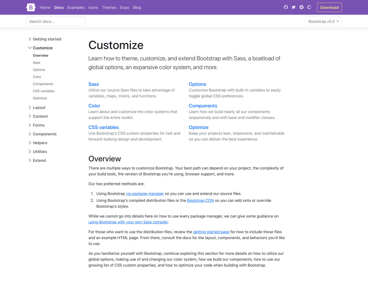
v5’s Customize docs expand on v4’s Theming page with more content and code snippets for building on top of Bootstrap’s source Sass files. We’ve fleshed out more content here and even provided a starter npm project for you to get started with faster and easier. It’s also available as a template repo on GitHub, so you can freely fork and go.
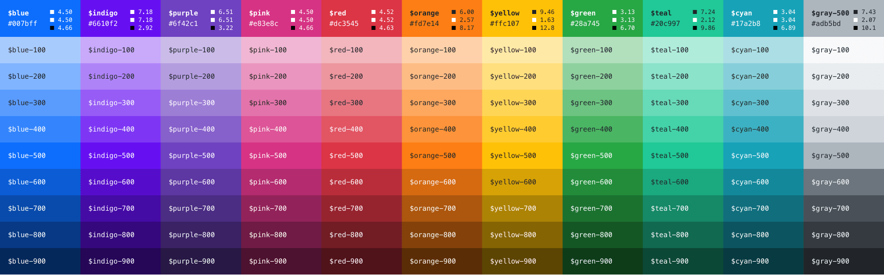
We’ve expanded our color palette in v5, too. With an extensive color system built-in, you can more easily customize the look and feel of your app without ever leaving the codebase. We’ve also done some work to improve color contrast, and even provided color contrast metrics in our Color docs. Hopefully, this will continue to help make Bootstrap-powered sites more accessible to folks all over.
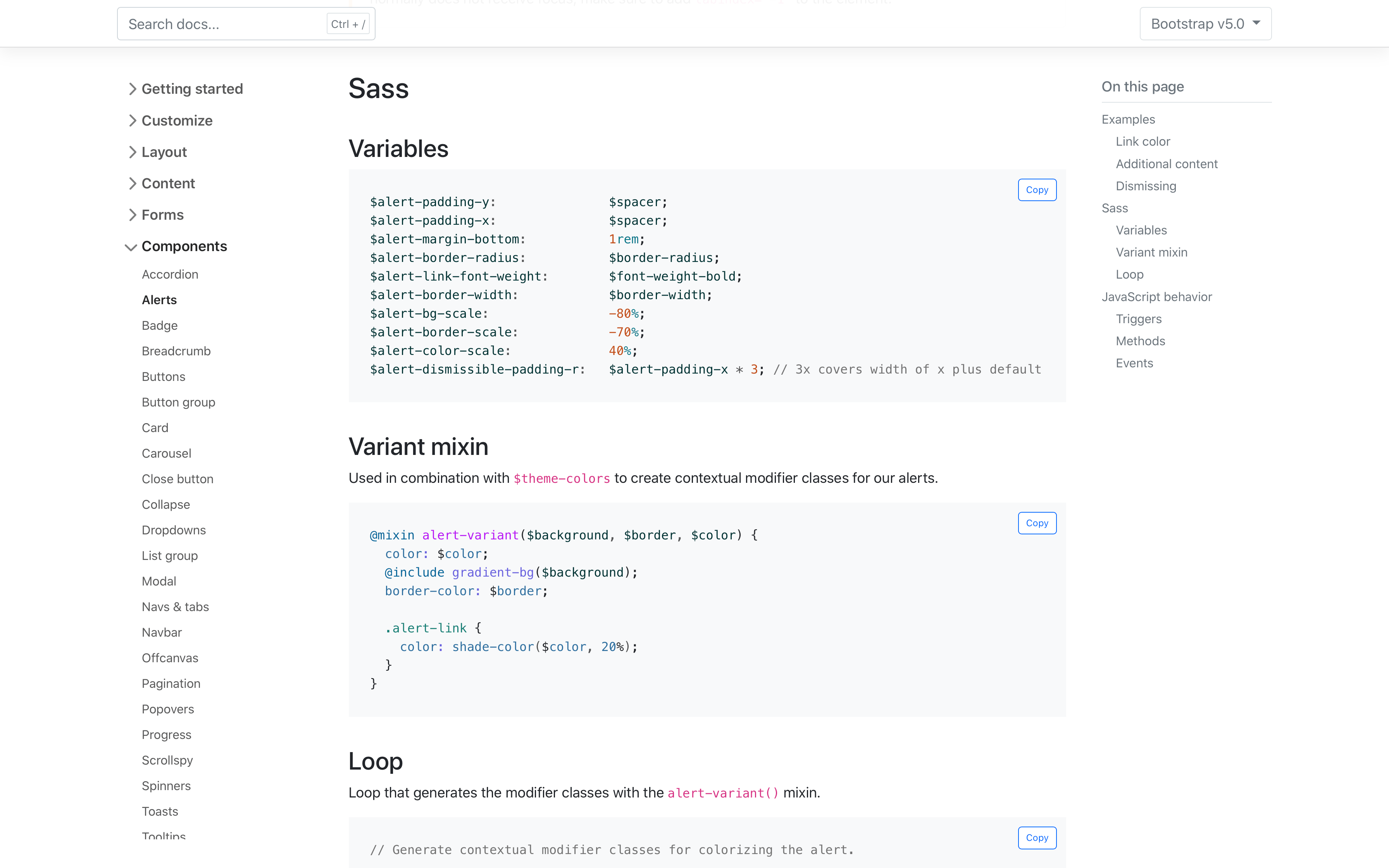
We’ve also added new sections to most of our pages to document the source Sass code that powers each component. Variables, mixins, loops, and maps are all rendered and kept up to date in each page, making it easier to reference and customize values as you build.
Dart Sass
We’ve switched to Dart Sass with LibSass being deprecated. We’ve been testing our builds with Dart Sass for a while and decided to make the switch with LibSass being deprecated just a couple of weeks ago. We’re holding on to the Sass modules for now. We’re still not using the new module system for compatibility concerns and a greater gap for folks upgrading from v4.
Browser support
We’ve dropped a ton of older browsers in this update, making it one of our biggest leaps in a while:
- Dropped Microsoft Edge Legacy
- Dropped Internet Explorer 10 and 11
- Dropped Firefox < 60
- Dropped Safari < 10
- Dropped iOS Safari < 10
- Dropped Chrome < 60
- Dropped Android < 6
You can find the full browser and device support in our .browserslistrc.
JavaScript
The biggest change to our JavaScript has been the removal of jQuery, but we’ve also made a number of enhancements beyond that as well.
- No more jQuery!
- All plugins can now accept a CSS selector as the first argument.
- Updated to Popper 2!
- Data attributes for all JavaScript plugins are now namespaced with
bs. For example, we use data-bs-toggle instead of data-toggle. - We overhauled dropdown, popover, and tooltip placement with the arrival of Popper v2.
- Toast positioning was also overhauled and now leverages our new position utilities.
- Added ability to use custom classes for tooltips and popovers.
- Made various optimizations to better share code across components.
- Changed dropdowns to emit events on
.dropdown-toggleinstead of.dropdown. - Removed underscore from public static methods like
_getInstance()togetInstance(). - Renamed
whiteListtoallowListin popovers and tooltips`
Migration guide
We’ve updated our migration guide page to consolidate all our changes across the six pre-releases into a single set of changes. We’ve condensed much of the content this way and added Breaking change labels throughout to help draw you attention to potential gotchas while upgrading.
We still think there’s more to do here—including tutorial-like guidance on the code changes, diffs and code snippets for our dependencies, etc. If you have suggestions or want to contribute, please open an issue or pull request.
Head to GitHub for a complete list of issues and pull requests in v5.0.0. You can also review the v5.0.0 project board, too.
Get the release
Head to https://getbootstrap.com to explore the new release. We’ve also published this update as our new latest release on npm, so if you’re feeling bold or are curious about what’s new, you can pull the latest in that way.
npm i bootstrap
Review the GitHub v5.0.0 release changelog for a complete list of changes since our last pre-release.
What’s next
Looking ahead, we have some other releases on the horizon:
- Bootstrap v4.6.1
- Bootstrap Icons v1.5.0
- Bootstrap npm starter v2.0.0 with support for Bootstrap 5
- Bootstrap v5.0.1 for follow-up bug fixes from our initial release
- Bootstrap v5.1.0 for our first minor feature release
Feel free to open issues or pull requests if you have any additional ideas for upcoming releases!
v5.1.0 preview
While we were polishing up this release, we also had our eyes towards the future to ship a few minor releases. Here’s a quick look at what’s coming in our next minor release, v5.1.0:
- Opt-in CSS Grid support
- Expanded Sass maps for color palette
- New skeleton placeholder component
- New opacity utilities
- and more!
And more features and updates are planned for a few more releases after that! Check out our projects on GitHub for a closer look.
Support the team
Visit our Open Collective page or our team members’ GitHub profiles to help support the maintainers contributing to Bootstrap.