Bootstrap 5 Beta 2
 @mdo
February 10, 2021
@mdo
February 10, 2021
Our second beta has arrived for Bootstrap 5! We delayed its release to iron out some issues with third-party libraries and stabilize our major changes. We’ve also once again shipped some awesome updates to our documentation.
Next up is our final beta, which we may even promote to a stable release depending on how development proceeds. Stay tuned for that!
Dropdowns
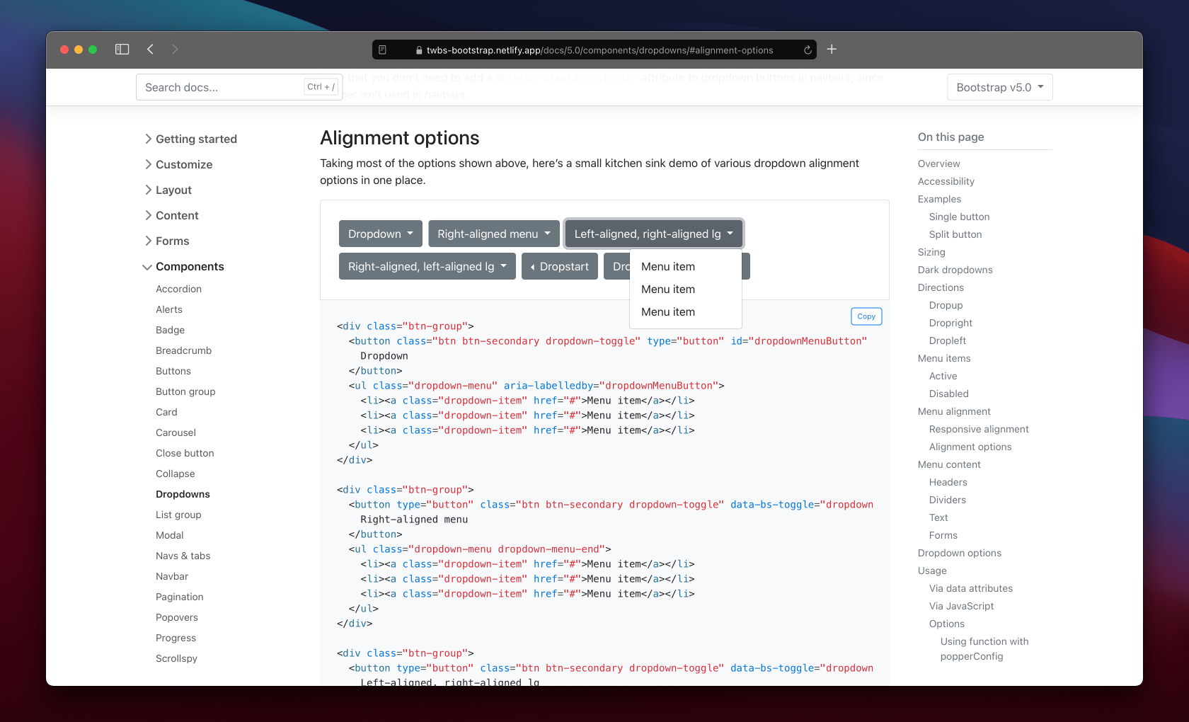
Dropdowns saw a lot of work in Beta 2 because of how much has changed in both our JavaScript and in Popper.js (which we depend on for most dropdown, popover, and tooltip positioning). We’ve modified our dropdown plugin to add a new data attribute to help separate our own positioning styles with that of Popper’s. The issues we saw—like a .dropstart menu overlapping a button or an incorrect responsive .dropdown-menu-end class—were largely the result of competing positioning.
Now when dropdown menus have data-bs-display="static", we’ll add data-bs-popper="static" via JavaScript to their associated .dropdown-menu. When dropdowns are in our navbars, their menus will have data-bs-popper="none" added. This separates two different positioning libraries, ours and Poppers, and ensures all behaviors are supported. You can see all the options in a new example in our docs. We updated our CSS selectors to use these new data attributes, too.
In addition, we’ve removed the initial margins from dropdowns and popovers, instead of relying on Popper’s offsets. These also conflicted with the default styling for elements positioned by Popper.js. Relatedly, there was a bug in how popover arrows were aligned that has now been resolved.
Color utility docs
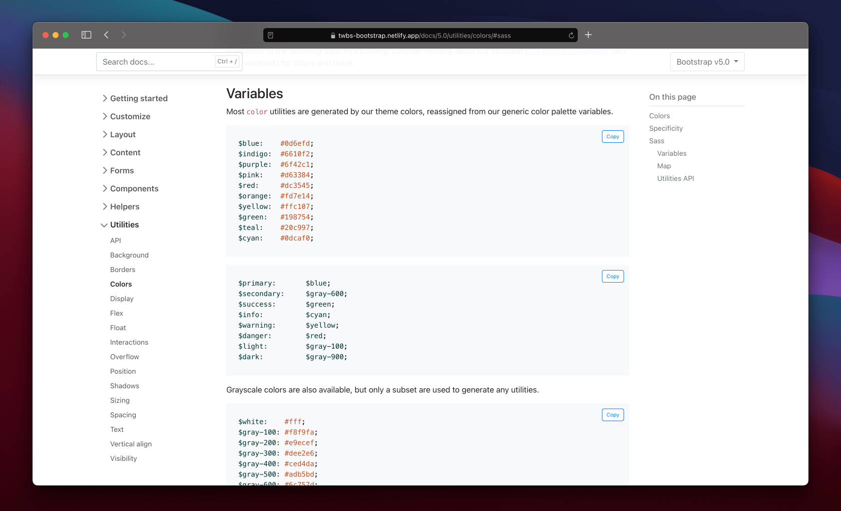
We’ve overhauled our color utility documentation, separating the text color classes from our background-color ones. We’ve also made extensive use of our scss-docs shortcode to include tons more code snippets in our docs.
- Text color utilities remain on their existing page.
- Background utilities have moved to a new page.
Both pages now include a new Sass section, showing relevant snippets of our source code that are related to each set of utilities. We list all our available color variables, our theme color variables and maps, associated mixins and loops, and even where these utilities are generated in the utilities API.
Expect this kind of documentation improvements to continue into our next release. Follow along in the draft pull request that adds Sass docs to all our components on GitHub.
JS updates
We’ve spent a significant amount of time in Beta 2 improving our JavaScript plugins to fix bugs and improve behaviors since dropping jQuery.
- Dropdown now emits events on the
.dropdown-toggleinstead of the.dropdown. - Restored the offset option for dropdowns.
- Fixed modal toggling when clicking on
data-bs-toggle="modal". - We now build our base component as a separate
.jsfile. - We now prevent
getSelectorfrom returning URLs as selector which caused errors in dropdown and scrollspy plugins. - Refactored components to use a utility function to define jQuery plugins
Miscellaneous updates
Across the board, we’ve made a few small changes to other components that are worth a brief mention here.
- Navbars:
- Added a new
.navbar-nav-scrollclass to enable vertical scrolling when a collapsed navbar is opened. It’s customizable via Sass and a CSS variable. Read more in the docs. - We’ve re-added
flex-growto the.navbar-collapseto restore the flexbox behaviors from v4 and prevent some content from being inadvertently squished.
- Added a new
- Forms:
- Removed
vertical-alignfrom.form-select - Form validation mixin updated with additional parameters
- Fixed validation icon placement in
.form-select - Checkboxes and radio buttons are aligned better in input groups
- Removed
- Buttons:
- Added variables for tinting and shading button state colors
- Suppressed the default focus outline for buttons in Chromium
- Toasts:
- Added
word-breakto.toast-body - Added a live example to the docs to trigger a real toast
- Added
- Bundles:
- Added our helpers to the utilities CSS bundle
- Carousels:
- Updated docs examples to use
<button>s wherever possible instead of<a>elements. - CSS selectors changed for using
<button>s as indicators (from.carousel-indicators lito.carousel-indicators [data-bs-target]).
- Updated docs examples to use
For a more complete list of changes, check out the v5 Beta 2 project board or list of issues and PRs in this release.
Get started
Head to https://getbootstrap.com to explore the new release. We’ve also published this updated as a pre-release to npm, so if you’re feeling bold or are curious about what’s new, you can pull the latest in that way.
npm i bootstrap@next
What’s next
We have three releases coming up next for the team:
- Bootstrap v5.0.0-beta3 (possibly promoted to v5 stable)
- Bootstrap v4.6.1 (bringing in some more bugfixes and alignment with the latest in v5)
- Bootstrap Icons v1.4.0
Our v5 Beta 3 will continue to focus on JavaScript issues and documentation improvements. Tooltips in particular need some attention after our fixes to dropdowns and popovers. After v5 goes stable, we’ll look to adding some of the awesome features we’ve built up in our backlog. Check out the v5.1 project for an idea of what’s being planned.
Support the team
Visit our Open Collective page or our team members’ GitHub profiles to help support the maintainers contributing to Bootstrap.