Bootstrap 5 Beta 1
 @mdo
December 07, 2020
@mdo
December 07, 2020
With our first beta release of Bootstrap 5, we’re calling it on new features and breaking changes. From here on out, we’re only fine-tuning features, bugs, and documentation on our way to a stable v5 release. Woohoo!
Just like with the v4 development process, our docs for v5 have been temporarily hosted on a subdomain for the next major release. Starting today, those docs are being moved to the main domain and our old v5.getbootstrap.com domain will redirect.
There are some really awesome new features—RTL!—that have been added in this release, and they’ve come with some important changes. Keep reading for the lowdown and let us know what you think!
RTL
Our biggest addition to the project in years, we’ve finally added RTL support to Bootstrap! Please join me in giving @ffoodd—one of our newest contributors and author of the RTL pull request—a massive thank you. The pull request includes nearly 50 references to existing issues and PRs that have tried to implement the feature into our core.
At a high level, our RTL approach includes a handful of changes:
-
New RTL versions of our CSS dist file, which includes our grid, Reboot, utilities, and standard bundles. See the Contents page for a full list of files.
-
New RTL documentation to help you get started.
-
Five new RTL Examples that show our new RTL CSS in action, converting our Album, Checkout, Carousel, Blog, and Dashboard examples into all new right-to-left equivalents.
-
Two new cheatsheet kitchen sink pages—the default cheatsheet for our standard CSS and the RTL cheatsheet.
Our approach is built on RTLCSS, an awesome project that helps reprocess an existing LTR stylesheet for RTL. We’ve classified it as an experimental feature for now, anticipating that we’ll get some of this wrong. We’re looking to the community to help us round out the feature as we wrap up some remaining todos.
This issue has some outstanding todos already planned for our team to address. See something else we can improve? Please consider opening an issue or pull request.
Read up on RTL in Bootstrap in our docs, including required HTML changes, a starter template, details on our approach, and more.
Renamed classes for logical properties
Part of our approach to adding RTL to Bootstrap was to add it in a way that felt future-friendly to ourselves and the web at large. As such, we’ve embraced the spirit of CSS logical properties and have renamed several classes and variables. It’s a risky change because of the size and impact of the change, but we hope you’ll appreciate it overall!
Most of you have already interacted with logical properties thanks to our flex utilities—they replace direction properties like left and right in favor start and end. Things like align-items-end have been welcomed additions. This makes horizontal directional class names appropriate for LTR and RTL without any additional overhead moving forward.
For example, in a LTR context, instead of .ml-3 for margin-left, use .ms-3. Be sure to read the RTL Migration guide for a full list of renamed classes and variables.
Popper.js v2

We’ve upgraded Popper.js from v1.x to v2.x, bringing with it some small breaking changes to our tooltips and popovers. These two changes are why we haven’t been able to update to v2.x sooner.
- Removed
offsetoption from our Tooltip/Popover and Dropdown plugins; this can still be achieved using thepopperConfigparameter. - The
fallbackPlacementoption has becomefallbackPlacements.
Popper.js v2 also comes with a smaller file size for our primary dependency, updated positioning calculations, and much more. Beyond that, our tooltips and popovers are unchanged and just as powerful.
Namespaced data attributes
We’ve renamed all our data attributes to include bs as an infix, thereby namespacing all the HTML attributes that enable JavaScript behaviors from our plugins. See #31827 for details. It helps keep Bootstrap-required JavaScript triggers clearly identified throughout your projects.
Making this change is a tad annoying, but easy enough to remedy with a find and replace. The new attributes work just like the old ones, just a little more specific. For example, here’s a dropdown button and menu with the newly renamed data-bs-toggle attribute.
<div class="dropdown">
  <button class="btn btn-secondary dropdown-toggle" type="button" id="dropdownMenuButton" data-bs-toggle="dropdown" aria-expanded="false">
    Dropdown button
  </button>
  <ul class="dropdown-menu" aria-labelledby="dropdownMenuButton">
    <li><a class="dropdown-item" href="#">Action</a></li>
    <li><a class="dropdown-item" href="#">Another action</a></li>
    <li><a class="dropdown-item" href="#">Something else here</a></li>
  </ul>
</div>
New toast positioning
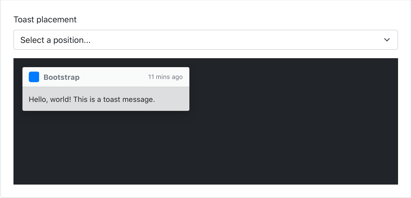
After dabbling in some JavaScript solutions to positioning toasts, we’ve landed on a new CSS-only approach thanks to our new positioning utilities. This comes with some minor breaking changes—namely some changes to exact CSS properties and how we toggle visibility of the toasts—but largely keeps them intact.
Our docs have been updated to include a new position preview picker, too, so you can see them in action. See the pull request for more details.
JS enhancements
Beyond the namespacing, we’ve been chipping away at a few other JavaScript improvements and bug fixes. Here’s a rundown of what’s new:
- Created a new base component to share logic across our components. See #29370.
- Migrate to more modern APIs across our plugins. See #32095.
- Tooltips and popovers can now have custom classes. See #32217.
- Don’t hide modal when
config.keyboardis false. See #32179.
More JavaScript updates are coming soon, from performance and file-size improvements to new features.
States in the utilities API
One of the biggest new features of Bootstrap 5 is our utilities API, an extensible way to customize, add, or remove Bootstrap utilities. We’ve been iterating along the way and our newest improvement is the ability to add pseudo-class variants with the state option.
Use the state option to generate pseudo-class variations. Example pseudo-classes are :hover and :focus. When a list of states are provided, classnames are created for that pseudo-class. For example, to change opacity on hover, add state: hover and you’ll get .opacity-hover:hover in your compiled CSS.
Need multiple pseudo-classes? Use a space-separated list: state: hover focus.
$utilities: (
  "opacity": (
    property: opacity,
    class: opacity,
    state: hover,
    values: (
      0: 0,
      25: .25,
      50: .5,
      75: .75,
      100: 1,
    )
  )
);
Which outputs to:
.opacity-0-hover:hover { opacity: 0; }
.opacity-25-hover:hover { opacity: .25; }
.opacity-50-hover:hover { opacity: .5; }
.opacity-75-hover:hover { opacity: .75; }
.opacity-100-hover:hover { opacity: 1; }
See #31643 for more context on the change.
And more…
Elsewhere we’ve made a handful of other breaking changes and improvements. The most notable updates include:
-
Breaking: Renamed
scale-color()function toshift-color(). See #32149. -
Breaking: Simplified the
make-container()mixin and$container-padding-x. See #31735. -
Fixed: Corners remain rounded now in vertical button groups. See #31303.
-
Fixed: Removed default linear gradient on some table rows that caused undesirable performance. Still more work to do here FYI. See #32277.
-
Updated: Breadcrumbs now have a simplified appearance. Use utilities to restore the
padding,background-color, andborder-radiusas desired. See #32249. -
Updated: Finalized browserslist configuration to match our supported browsers. See #30986.
For a more complete list of of changes, checkout the v5 Beta project board or list of issues and PRs in this release.
Get started
Head to https://getbootstrap.com to explore the new release. We’ve also published this updated as a pre-release to npm, so if you’re feeling bold or are curious about what’s new, you can pull the latest in that way.
npm i bootstrap@next
Support the team
Visit our Open Collective page or our team members’ GitHub profiles to help support the maintainers contributing to Bootstrap.