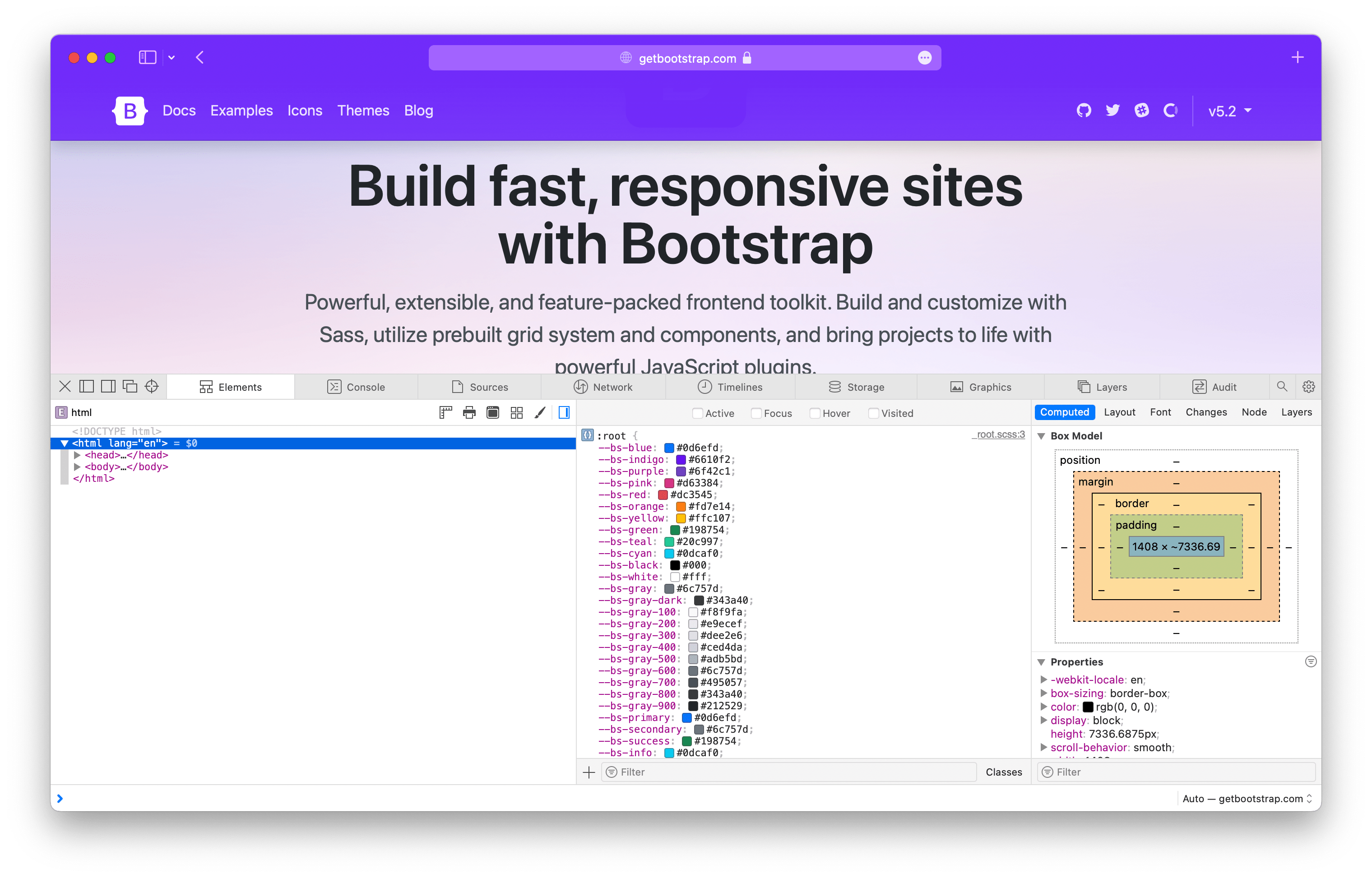
Using CSS variables in Bootstrap

Bootstrap v5.2.0-beta1 added a slew of CSS custom properties, or CSS variables, across the :root level and all our core components. Here’s a quick look at how you can utilize them in your projects.
With CSS variables, you can now customize Bootstrap easier than ever, and without the need for a CSS preprocessor. All the power of Sass is still there behind the scenes, but CSS variables adds a ton of power for the future. Use and compose new values, updates styles globally without recompiling, set fallback values, setup new color modes, and more.
Let’s dig in.
CSS variables?
Their official name is custom properties, but they’re often referred to as CSS variables thanks to their most immediate use case for setting specific values. Consider reading the MDN CSS custom properties article or the CSS Tricks guide if you need a primer.
In a nutshell, CSS variables allow you to name frequently used values. For example, instead of writing #6f42c1 everywhere, you can set --purple: #6f42c1. Then you can use that variable later on with the var() function.
:root {
  --purple: #6f42c1;
}
.custom-element {
  color: var(--purple);
}
We use CSS variables in Bootstrap to set many property values globally, across our components, and in some of our utilities.
Groups of variables
When we talk about CSS variables in Bootstrap, we’re referring to three major groups:
-
Root variables — Globally scoped variables available on the
:rootelement (<html>usually) and accessible by any element throughout the DOM. -
Component variables — Variables scoped specifically to each component, usually on the component’s base class, and their modifier classes and Sass mixins.
-
Utility variables — Used as modifiers within other utility classes.
Regardless of where they are, all of our CSS variables are prefixed with --bs-, so you know where they’re coming from and how they might be used across codebases that mix Bootstrap’s CSS with additional custom styles. You’ll also notice that we don’t put all our component variables at the root level. This keeps CSS variables scoped to their intended use cases and prevents polluted variables in the global :root scope.
It’s also worth mentioning two larger efforts that are still to come around CSS variables:
- Adding CSS variables to all our forms
- Adding more nuanced global theme variables and support for color modes like dark mode.
These are likely coming in v5.3.0 (our next minor release after v5.2.0 stabilizes), so in the mean time, check out the GitHub repo to see how things are shaping up.
Root variables

Bootstrap has a ton of root variables and we’ll only be adding more in future updates for the aforementioned color mode support. As of this post, we have the following CSS variables on the :root element:
-
Colors — All named colors, gray colors, and theme colors. This also includes all our
$theme-colorsin theirrgbformat. -
Body font styles — Everything from
font-sizetocolorand more, all applied to our<body>element. -
Shared properties — For property-value pairings that we consider theme specific, like link colors and border styles.
Root CSS variables are used extensively across other parts of Bootstrap to allow you to easily override our default styles at a global level. For example, if you wanted to adjust the default border-radius and link color for our components, you could override a couple variables instead of writing new selectors.
// custom.css
:root {
  --bs-border-radius: .5rem;
  --bs-link-color: #333;
}
You can even use other root variables to override those values:
// custom.css
:root {
  --bs-border-radius: var(--bs-border-radius-lg);
  --bs-link-color: var(--bs-gray-800);
}
Without CSS variables, you’d have to use a preprocessor like Sass or write new selectors for every instance of these properties across all components. The former is relatively easy, the latter not so much. CSS variables help solve that.
Component variables
On our components, CSS variables get even more power for customizing. Nearly everything under the Components section in our docs sidebar now has CSS variables available to you:
- Accordion
- Alerts
- Badge
- Breadcrumb
- Buttons
- Button group
- Card
- Carousel
- Collapse
- Dropdowns
- List group
- Modal
- Navbar
- Navs & tabs
- Offcanvas
- Pagination
- Placeholders
- Popovers
- Progress
- Spinners
- Toasts
- Tooltips
Scrollspy and close button have no relevant CSS variables, so they’re excluded here.
Throughout our documentation you’ll find examples of customizing our default components by overriding their CSS variables. One great example comes from our own docs where we write our own button styles to create a purple button.
.btn-bd-primary {
  --bs-btn-font-weight: 600;
  --bs-btn-color: var(--bs-white);
  --bs-btn-bg: var(--bd-violet);
  --bs-btn-border-color: var(--bd-violet);
  --bs-btn-border-radius: .5rem;
  --bs-btn-hover-color: var(--bs-white);
  --bs-btn-hover-bg: #{shade-color($bd-violet, 10%)};
  --bs-btn-hover-border-color: #{shade-color($bd-violet, 10%)};
  --bs-btn-focus-shadow-rgb: var(--bd-violet-rgb);
  --bs-btn-active-color: var(--bs-btn-hover-color);
  --bs-btn-active-bg: #{shade-color($bd-violet, 20%)};
  --bs-btn-active-border-color: #{shade-color($bd-violet, 20%)};
}
Which looks like this:

Another great example is from our tooltips. You can add custom classes to tooltips and popovers in Bootstrap with data-bs-custom-class="custom-tooltip". Then, with one CSS variable, you can change the tooltip background and arrow color.
.custom-tooltip {
  --bs-tooltip-bg: var(--bs-primary);
}
Which looks like this:

There are dozens of CSS variables in play across our components. All of them are referenced in a new section on the relevant docs page. For example, here are our modal CSS variables. This is in addition to all the Sass variables, mixins, loops, and maps used for each component.
Utility variables
Not every utility class uses CSS variables, but the ones that do gain a good amount of power and customization. Background, border, and color utilities all have what we call “local CSS variables” to improve their usefulness. Each of them uses CSS variables to customize the alpha transparency value of rgba() colors.
Consider our background color utilities, .bg-*. By default each utility class has a local variable, --bs-bg-opacity with a default value of 1. To change the background utility alpha value, you can override that value with your own styles, or some new .bg-opacity-* utilities.
<div class="p-3 bg-success bg-opacity-25">
  ...
</div>
Here’s how .bg-success looks with all our .bg-opacity-* classes applied:

And the same is available for border color opacity (--bs-border-opacity and .border-opacity-*) and text color opacity (--bs-text-opacity and .text-opacity-*). So many color options are now available with these utilities.
By default, we ship with five values for these various opacity utilities.
| Class names | Alpha value |
|---|---|
.text-opacity-10.bg-opacity-10.border-opacity-10 |
.1 |
.text-opacity-25.bg-opacity-25.border-opacity-25 |
.25 |
.text-opacity-50.bg-opacity-50.border-opacity-50 |
.5 |
.text-opacity-75.bg-opacity-75.border-opacity-75 |
.75 |
.text-opacity-100.bg-opacity-100.border-opacity-100 |
1 |
Expect more CSS variables to make their way into our utilities. There’s a lot of power in real-time customization, even for what we consider immutable styles.
Ready to get started with Bootstrap? Checkout the quick start guide so you can put these new CSS variables to work in your next project!
