Bootstrap 5.2.0 beta
It’s the biggest release since v5 itself—Bootstrap v5.2.0-beta1 is here! This release features redesigned docs, CSS variables for all our components, responsive offcanvas, new helpers and utilities, refined buttons and inputs, and lots of improvements under the hood.
Given the size of the update and time since our last release, we’re doing something different and shipping it as a beta first. Keep reading for details.
Why so long?
I want to start by acknowledging the time it’s taken to ship a new release. As an open source maintainer, I’m constantly worried about not doing or being good enough of a developer for my projects. Pair that with a distributed team all working through this pandemic and me having a heart attack, we’ve all needed some down time. I managed to put together a Bootstrap Icons release with what energy I had before needing another break. The rest of the team has also needed some well deserved down time.
I ask that you all please take some time to send some appreciation and support to your favorite open source maintainers. Everyone could use a little more love in this work.
All that said, we’re shipping v5.2.0-beta1 first since it’s been so long—we’d love your help testing things out. We’ll follow up with a stable release as soon as possible.
Okay, now onto the good parts!
Redesigned docs
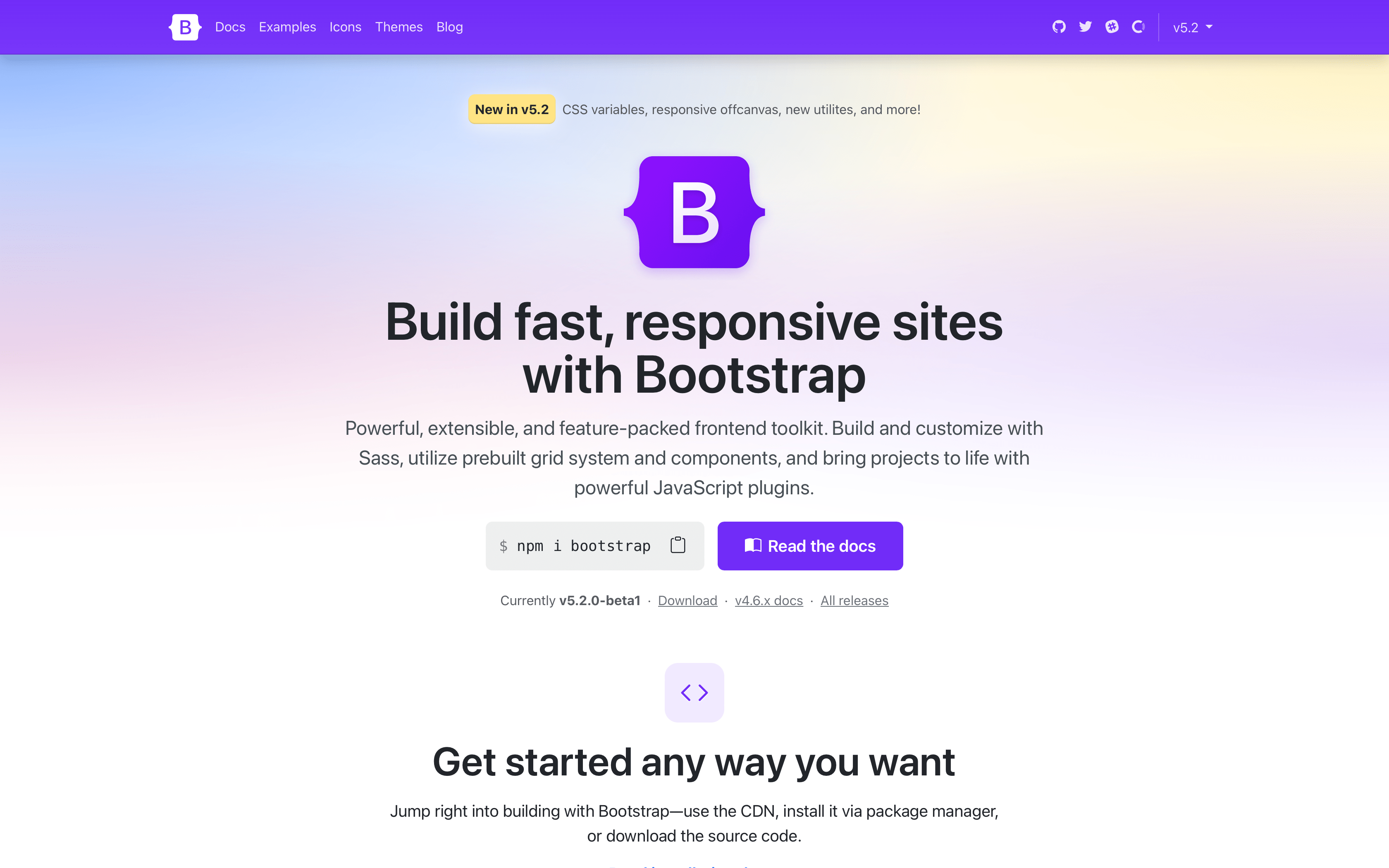
Another release, another docs refresh! From the get go, you’ll notice our Bootstrap Purple™ is much more vibrant now, making everything feel brand new. We’ve rewritten our entire homepage to better show off all the awesome features of Bootstrap.
See the homepage in action and let us know what you think!
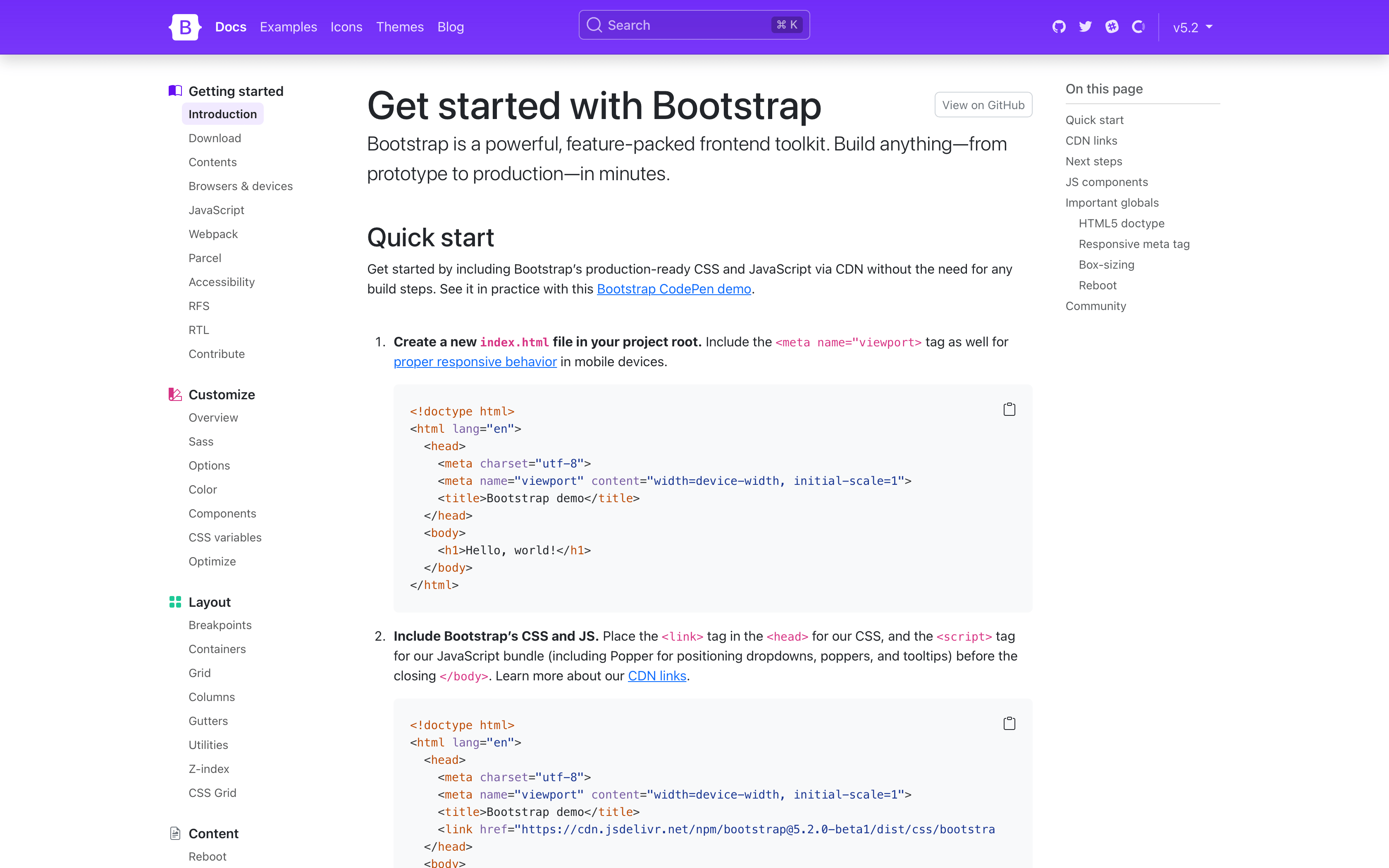
Stepping into the actual docs, you’ll notice quite a few changes. We’ve streamlined our navbar, done away with our subnav, and changed the sidebar to always show every page link for greater discoverability. Show above is also our refreshed quick start guide, which is now a step-by-step instructional guide for using Bootstrap via CDN.
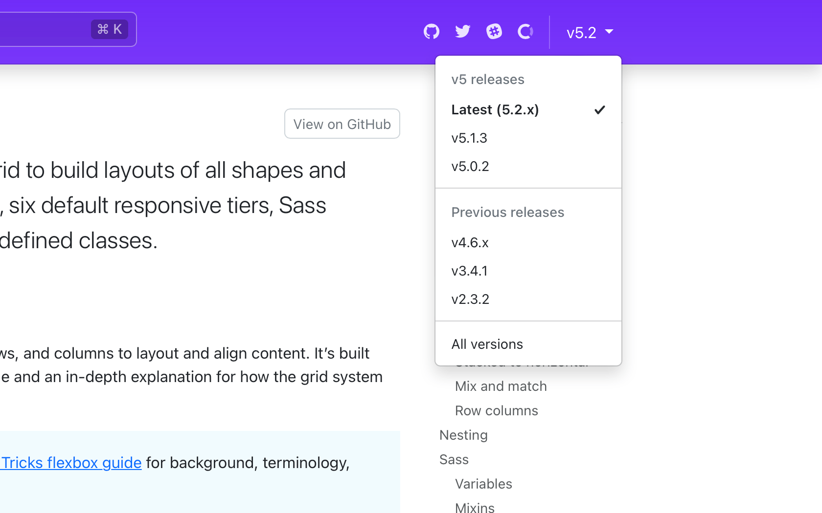
The refreshed navbar also has a long-awaited new version picker for v5.2.0 and beyond. From any page, click the version and see options to navigate to previous minor releases of that same page. When a page doesn’t exist in an older release, you’ll see a disabled version in the dropdown. We currently have no plans to link pages across major versions.
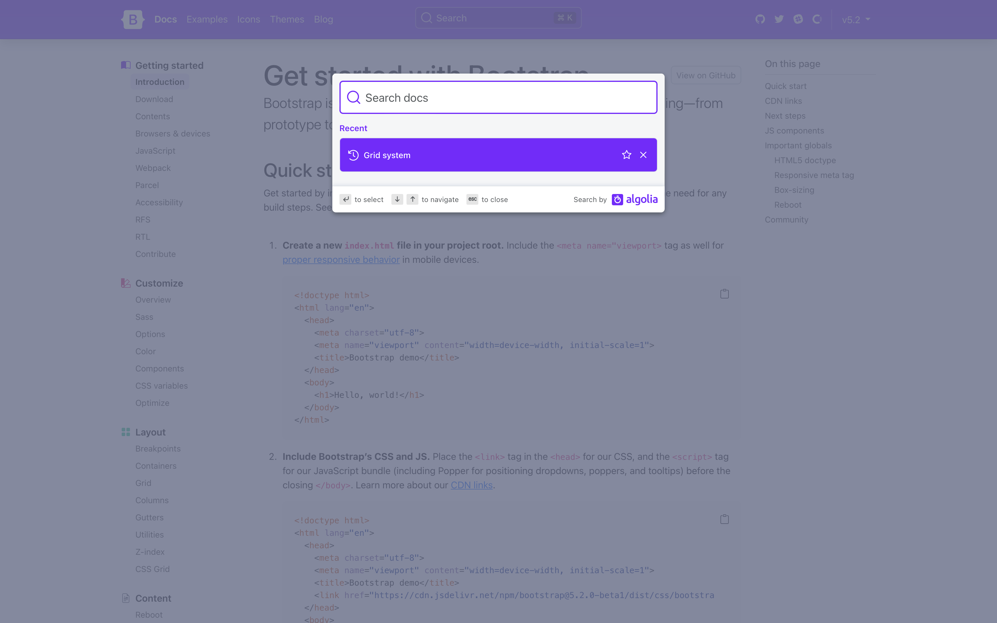
The docs search is now powered by the latest version of Algolia’s DocSearch, bringing an improved design that even shows your most recent searches.
Design tweaks
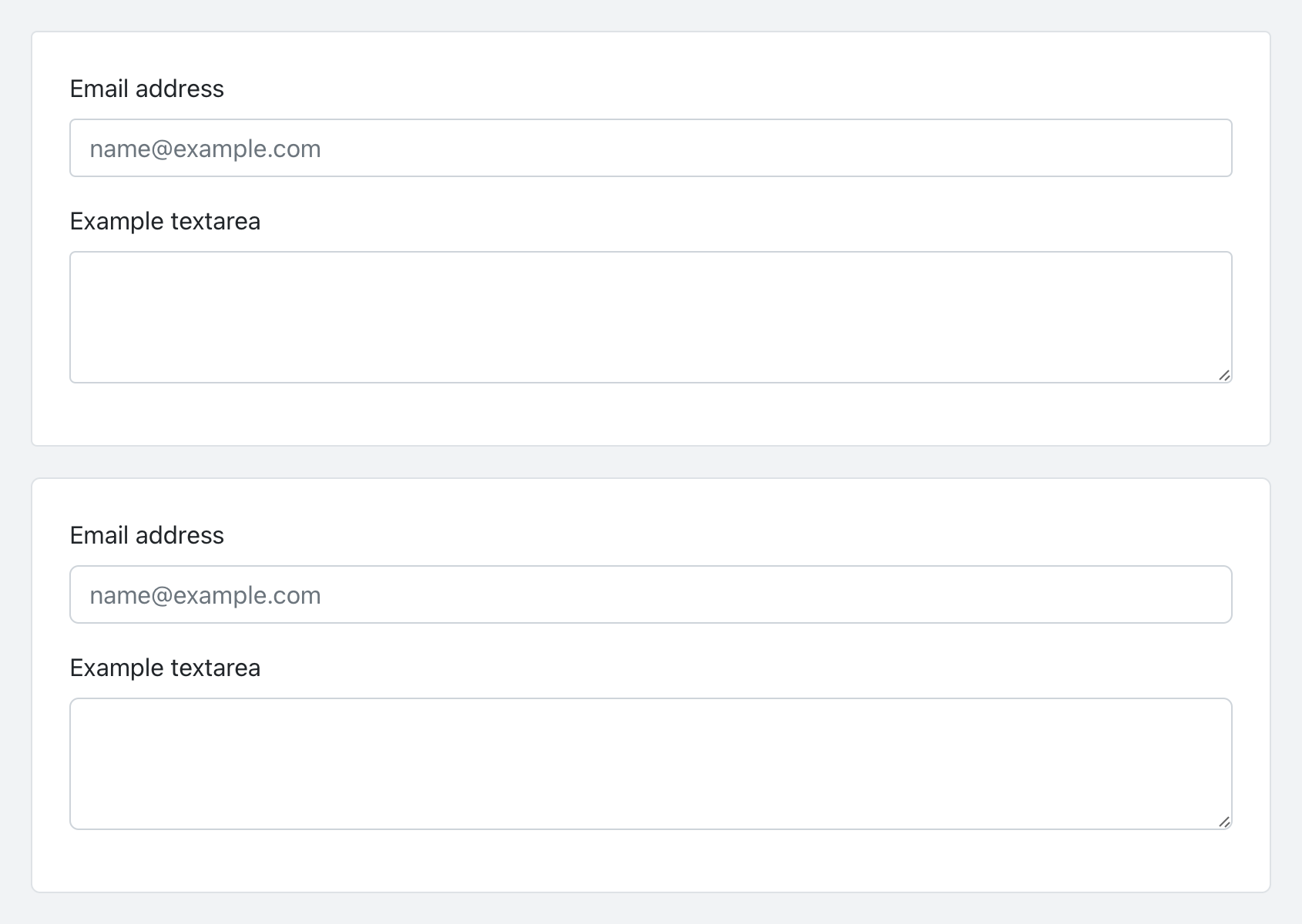
To coincide with our docs redesign, we’ve given our buttons and inputs a slight refresh with some refined border-radius values. It’s a small change, but a welcomed refresh to keep things modern and fresh. Here’s a look at the before and after of our buttons:

And the before and after of our inputs:
Component CSS variables
With this release, all our components now include CSS variables to enable real-time customization, easier theming, and (soon) color mode support starting with dark mode. Every component page has been updated to include a reference guide of the relevant CSS variables. Take for example our buttons:
--#{$prefix}btn-padding-x: #{$btn-padding-x};
--#{$prefix}btn-padding-y: #{$btn-padding-y};
--#{$prefix}btn-font-family: #{$btn-font-family};
@include rfs($btn-font-size, --#{$prefix}btn-font-size);
--#{$prefix}btn-font-weight: #{$btn-font-weight};
--#{$prefix}btn-line-height: #{$btn-line-height};
--#{$prefix}btn-color: #{$body-color};
--#{$prefix}btn-bg: transparent;
--#{$prefix}btn-border-width: #{$btn-border-width};
--#{$prefix}btn-border-color: transparent;
--#{$prefix}btn-border-radius: #{$btn-border-radius};
--#{$prefix}btn-box-shadow: #{$btn-box-shadow};
--#{$prefix}btn-disabled-opacity: #{$btn-disabled-opacity};
--#{$prefix}btn-focus-box-shadow: 0 0 0 #{$btn-focus-width} rgba(var(--#{$prefix}btn-focus-shadow-rgb), .5);
Values for virtually every CSS variables are assigned via Sass variable, so customization via CSS and Sass are both well supported. Also included for several components are examples of customizing via CSS variables.
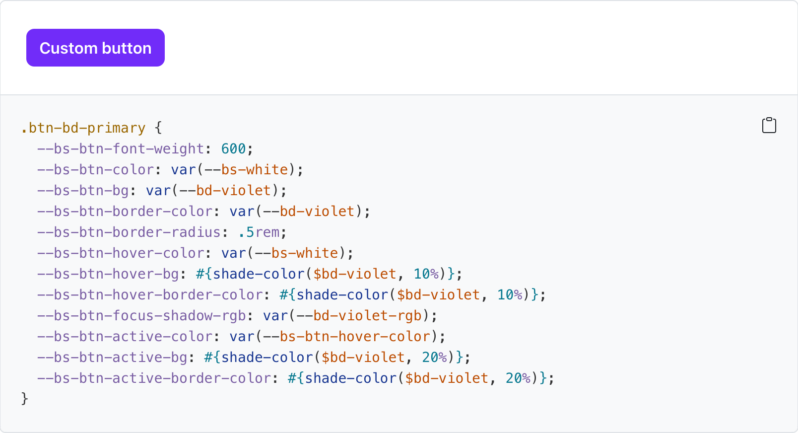
Check out all our components to see how you can customize them to your liking.
New _maps.scss
Bootstrap v5.2.0-beta1 introduces a new Sass file with _maps.scss that pulls out several Sass maps from _variables.scss to fix an issue where updates to an original map were not applied to secondary maps that extend it. It’s not ideal, but it resolves a longstanding issue for folks when working with customized maps.
For example, updates to $theme-colors were not being applied to other maps that relied on $theme-colors (like the $utilities-colors and more), which created broken customization workflows. To summarize the problem, Sass has a limitation where once a default variable or map has been used, it cannot be updated. There’s a similar shortcoming with CSS variables when they’re used to compose other CSS variables.
This is also why variable customizations in Bootstrap have to come after @import "functions";, but before @import "variables"; and the rest of our import stack. The same applies to Sass maps—you must override the defaults before they get used. The following maps have been moved to the new _maps.scss:
$theme-colors-rgb$utilities-colors$utilities-text$utilities-text-colors$utilities-bg$utilities-bg-colors$negative-spacers$gutters
Your custom Bootstrap CSS builds should now look like this with a separate maps import.
  // Functions come first
  @import "functions";

  // Optional variable overrides here
+ $custom-color: #df711b;
+ $custom-theme-colors: (
+   "custom": $custom-color
+ );

  // Variables come next
  @import "variables";

+ // Optional Sass map overrides here
+ $theme-colors: map-merge($theme-colors, $custom-theme-colors);
+
+ // Followed by our default maps
+ @import "maps";
+
  // Rest of our imports
  @import "mixins";
  @import "utilities";
  @import "root";
  @import "reboot";
  // etc
New helpers and utilities
We’re continuing to invest in our helpers and utilities to make it easier to quickly build and modify custom components.
-
Added new
.text-bg-{color}helpers. Instead of setting individual.text-*and.bg-*utilities, you can now use the.text-bg-*helpers to set abackground-colorwith contrasting foregroundcolor. -
Expanded
font-weightutilities to include.fw-semiboldfor semibold fonts. -
Expanded
border-radiusutilities to include two new sizes,.rounded-4and.rounded-5, for more options.
Expect more improvements here as v5’s development continues.
Responsive offcanvas
Our Offcanvas component now has responsive variations. The original .offcanvas class remains unchanged—it hides content across all viewports. To make it responsive, change that .offcanvas class to any .offcanvas-{sm|md|lg|xl|xxl} class.
And tons more!
-
Introduced new
$enable-container-classesoption. — Now when opting into the experimental CSS Grid layout,.container-*classes will still be compiled, unless this option is set tofalse. Containers also now keep their gutter values. -
Thicker table dividers are now opt-in. — We’ve removed the thicker and more difficult to override border between table groups and moved it to an optional class you can apply,
.table-group-divider. See the table docs for an example. -
Scrollspy has been rewritten to use the Intersection Observer API, which means you no longer need relative parent wrappers, deprecates
offsetconfig, and more. Look for your Scrollspy implementations to be more accurate and consistent in their nav highlighting. -
Added
.form-check-reversemodifier to flip the order of labels and associated checkboxes/radios. -
Added striped columns support to tables via the new
.table-striped-columnsclass.
For a complete list of changes, see the project on GitHub.
Coming soon: Dark mode!
Much of the work we’ve done in v5.2.0-beta1 has been in support of adding dark mode to Bootstrap. Yes, it’s finally coming in our next minor release!
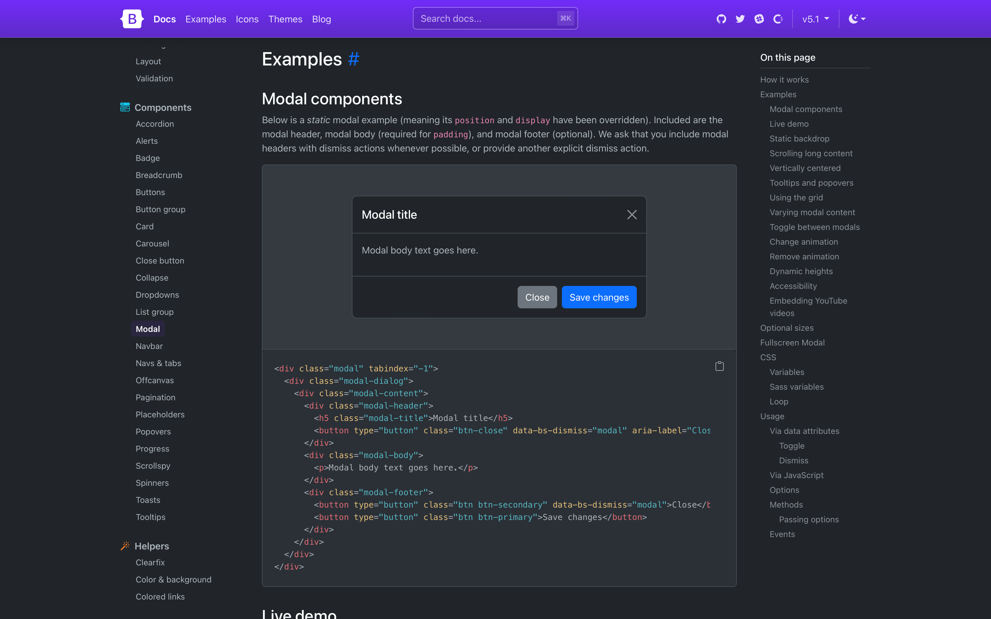
We’re adding tons of new global CSS variables, cleaning up docs styles, and better supporting overall customization. Some details and topics being worked on for dark mode:
-
Do we provide a JS plugin for toggling color modes? Right now we’re just building custom functionality for our docs.
-
Our current implementation is being built with
data-themeselectors which allows explicit color mode switching (via user control vs and system preference) and custom color modes beyondlightanddark. -
We’re adding quite a few new colors outside
$theme-colorsto improve subtle UI customization. These are being implemented via:rootand[data-theme="{theme}"]selectors for global use.
We’d love your feedback along the way, so check out the dark mode pull request and dark mode staging site to test it out.
Also coming in v5.3.0
There’s lots to look forward to in our next minor release, though we’ll likely have some bug fixes along the way.
- Dark mode! As mentioned above, we’re actively working to bring more nuanced color options and color modes to Bootstrap. Follow along.
- An attribute toggle plugin to programmatically toggle a classes and attributes by only writing HTML.
- CSS variables for forms!
- Sticky headers for tables
- Mixins and functions for modifying the utilities API
- An option for “always floating” floating forms.
And likely a lot more!
Get the release
Head to https://getbootstrap.com for the latest. It’s also been pushed to npm:
npm i bootstrap@v5.2.0-beta1
Read the GitHub v5.2.0-beta1 changelog for a complete list of changes in this release.
Support the team
Visit our Open Collective page or our team members’ GitHub profiles to help support the maintainers contributing to Bootstrap.
