We’re back at it again with a brand new alpha release of Bootstrap 5! Our second alpha has brought some new and improved features, color contrast improvements, improved helpers and utilities, and some documentation design updates.
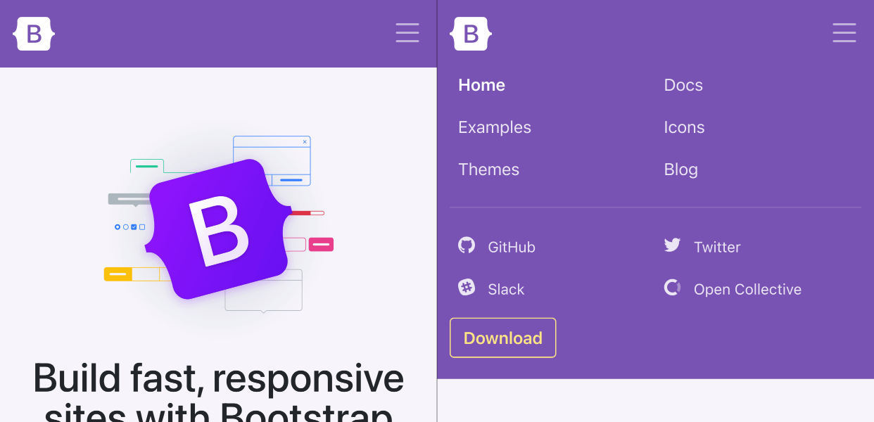
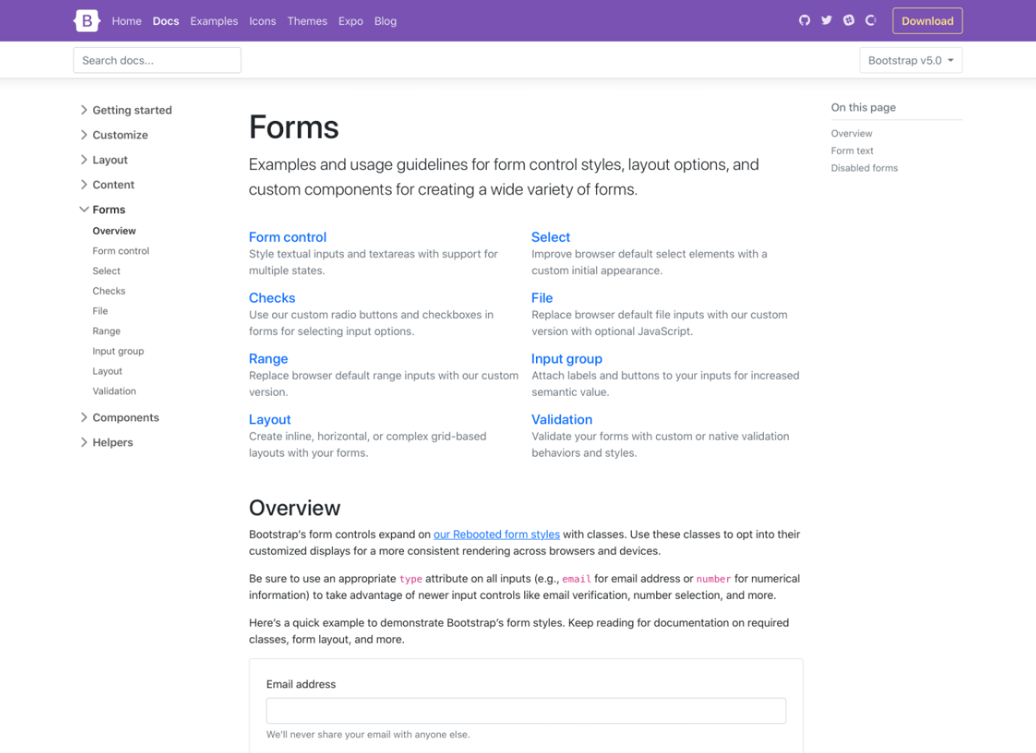
We’ve cleaned up the navigation in our docs to make things a little easier to use while on a mobile device or a narrow viewport. We’ve redesigned the main navbar to hide links on small devices, and when expanded, those navigation links now have larger tap targets.
Our subnav has also be streamlined to take up a single horizontal bad on mobile, giving more space for documentation. We’ve also differentiated the expanding and collapsing menu icons between the two navs.
Together this should make it a little faster and easier to navigate our docs, and serve as a fun little demo for others.
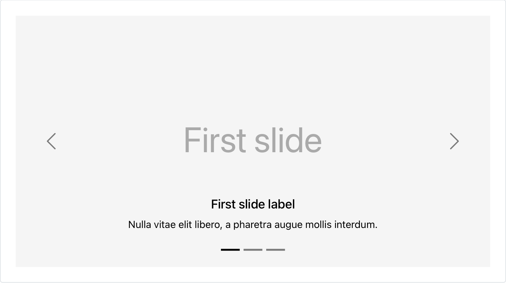
Dark carousel
Add .carousel-dark to any .carousel to switch from the default white text, controls, and indicators to black.
Values are configurable via Sass variables. To save on filesize, we’re using a CSS filter to invert out SVGs for the carouse controls. Pretty neat if you ask us!
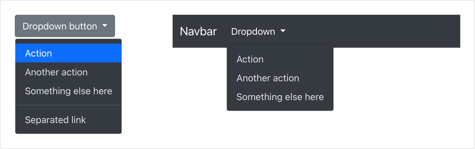
Dark dropdowns
For the first time since Bootstrap v1 nearly nine years ago, we have dark dropdown menus! Add .dropdown-menu-dark to any dropdown menu to change the appearance. Dark dropdowns are opt-in, so you’ll need to add the class as you go.
We’d like to revisit some of this later in v5 with minor releases that advance dark mode throughout the entire project. Until then, enjoy the new classes!
Redesigned close button
Our close button has been renamed, redesigned, new focus state, and a new color option.
We’ve renamed the class from the rather generic .close to .btn-close. In addition, we’ve dropped the use of × in our HTML for an SVG background-image via CSS. With updated styling all around, the close button has a clearer focus state and even an all-new white variant (also powered by a CSS filter).
Position utilities
Thanks to our contributors, we’ve added new directional positioning utilities. Quickly position an element with our new top, right, bottom, and left utilities with support for 0, 50%, and 100% by default.
Combine with new translate utilities to center elements on an edge or corner, too! The new utilities are configurable and extensible thanks to the utilities API and some smart Sass map defaults.
More highlights
Some other incremental changes to a few components and changes include:
Container horizontal padding has been updated to match the row gutters variables and values.
Checkboxes and radios downsized to 1em from 1.25em for improved font scaling support.
Improved colors with green and cyan getting new values, plus higher contrast ratios all around.
Improved toast styling, now without overflow: hidden.
Badge padding increased a smidge.
Revamped “responsive embed” helpers, now called ratio helpers. New class names across the board, more flexible styles, and a new CSS variable for custom dynamic and responsive ratios.
Screen reader classes are now “visually hidden” classes.
We’ve pushed some additional breaking changes and important component updates to Alpha 3. To give you a heads up, here are some important upcoming moves:
We’re revamping the input group component, dropping support for quite a few variations. It’s too complex, supports too many variations, and has had the most annoying border-radius bug through all of v4. (I’m so sorry about that!)
We’re upgrading floating labels from a docs Example into a fully fledge form layout option, with support for textual inputs, selects, and textareas.
RTL is still coming! The PR is being reviewed by our team and we’re hoping to land it in Alpha 3 so we can get some folks testing with it.
For a more up to date list of changes, be sure to follow along with the v5 Alpha 3 project board. More docs improvements are planned with the potential for more breaking changes as well. From there it’s onto final breaking changes in Beta 3.
Release expectations
We’ll be alternating releases across v4 and v5 to keep the momentum up. We’re shipping v4.5.3 next and then moving right back to v5 for Alpha 3. We’ve noted our intended release schedule in our release repo. We’ll also keep updating that repo’s readme as we go.
Get started
Head to https://v5.getbootstrap.com to explore the new release. We’ve also published this updated as a pre-release to npm, so if you’re feeling bold or are curious about what’s new, you can pull the latest in that way.
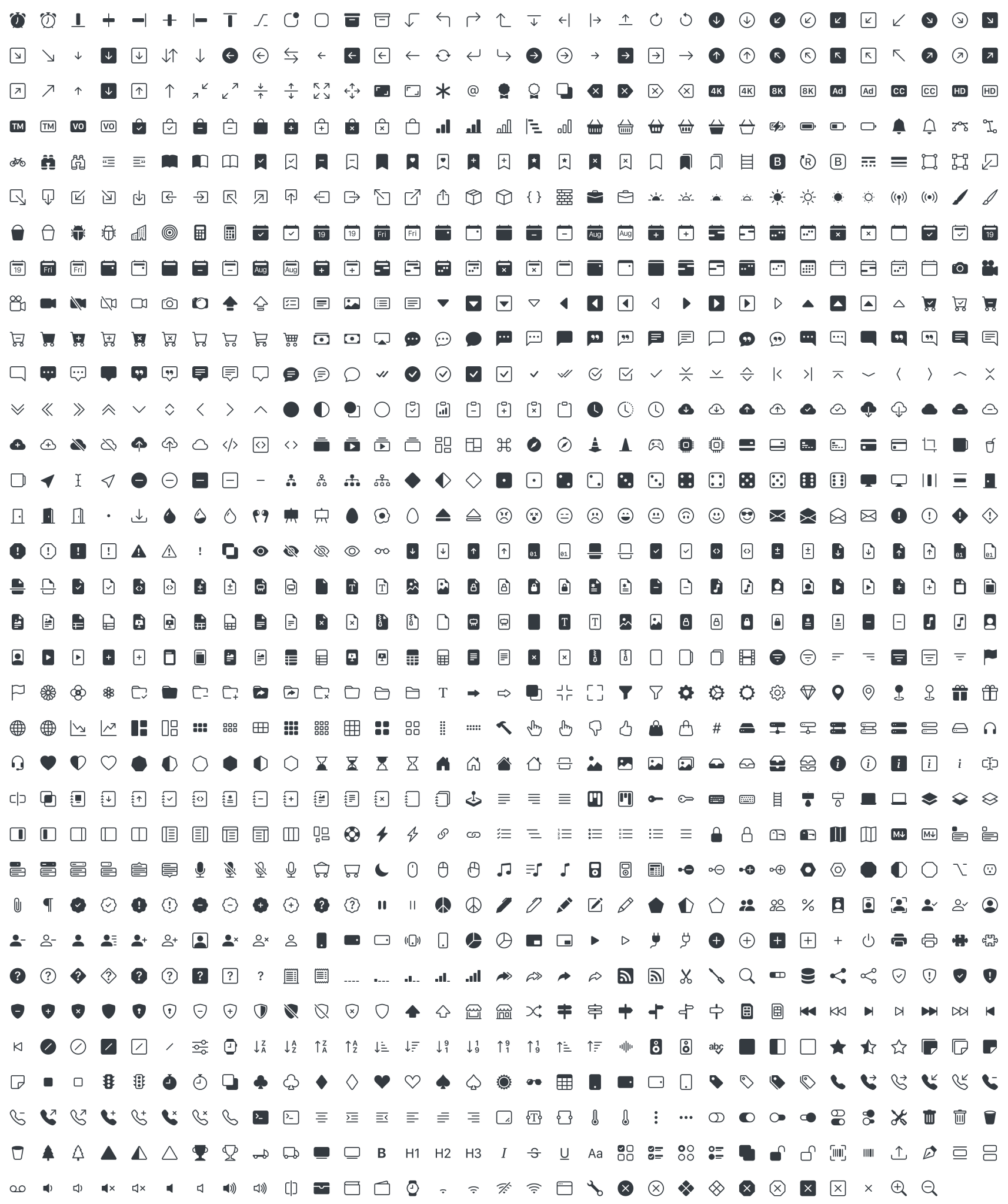
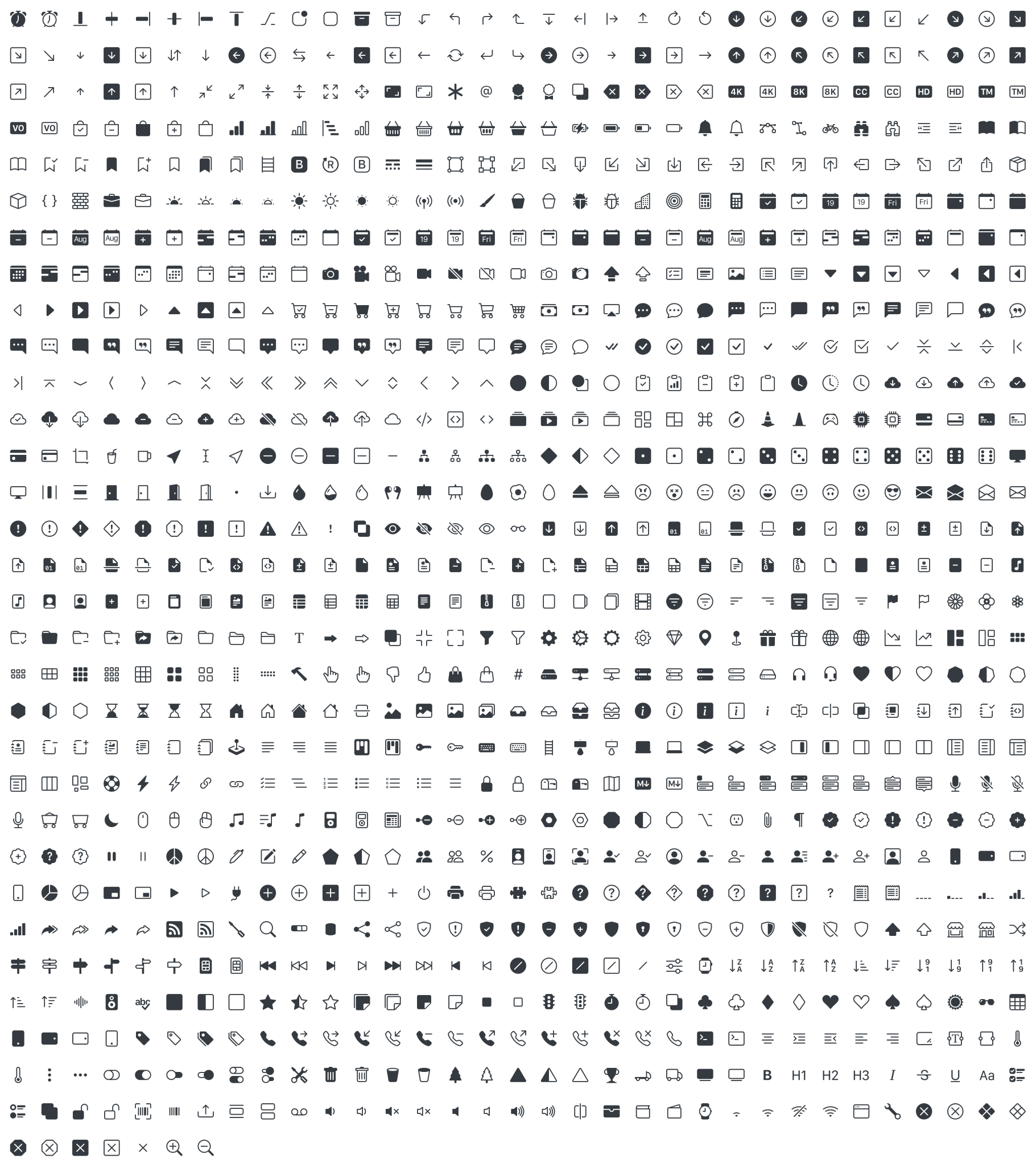
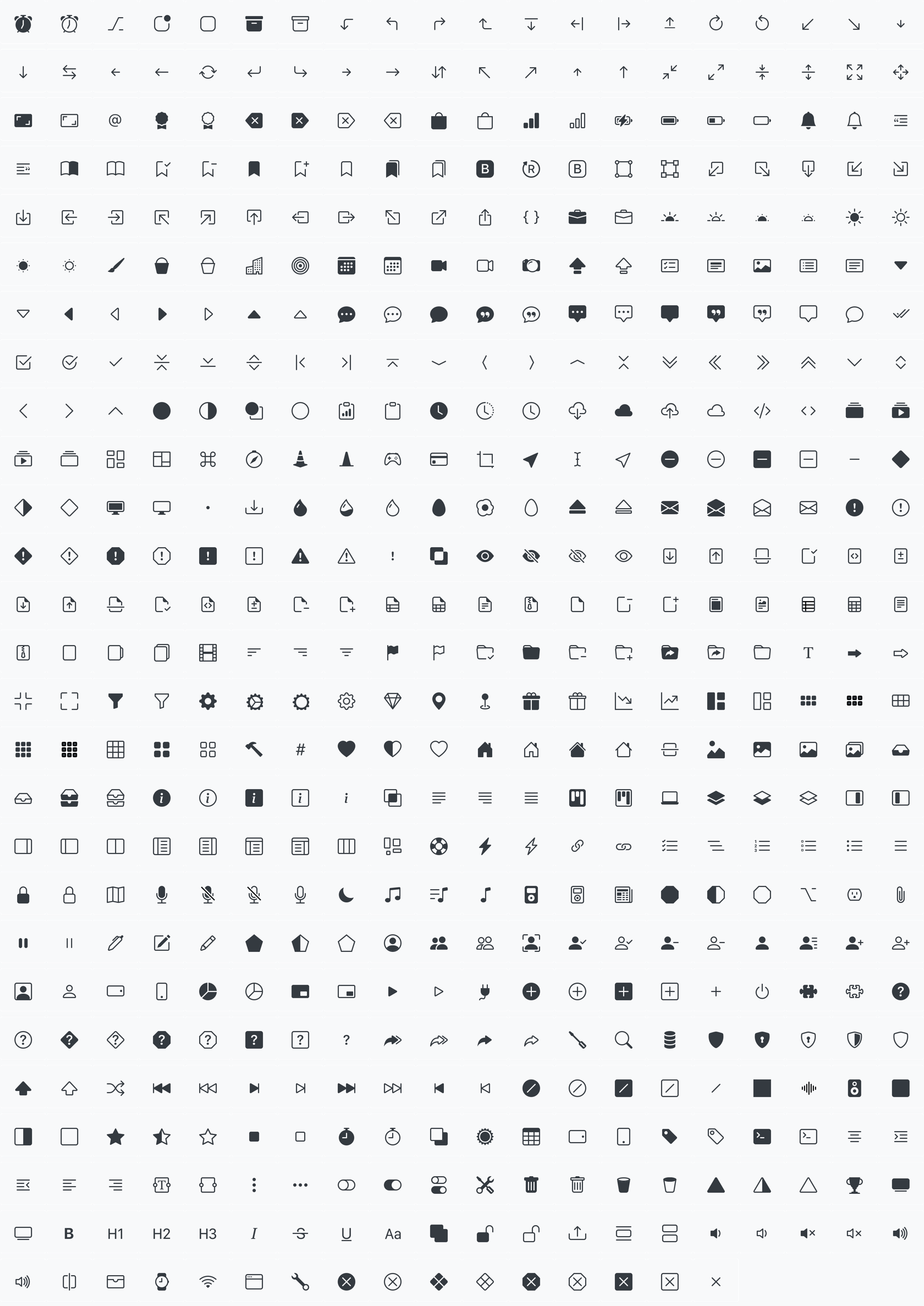
After five alphas over the last nine months, Bootstrap Icons has officially gone stable with our v1.0.0 release! We’re now over 1,100 icons and are on track to add hundreds more in our upcoming minor releases. This has been a labor of love and I’m thrilled to ship this latest update.
Since our fifth alpha two months ago, over a third of our icons have been redrawn as we fine-tuned paths and shapes. Much of the redrawing and improvements here came as preparation for an icon font, but regrettably that’s been pushed back to a v1.1.0 release as the tooling for generating fonts from SVGs has proven more difficult to get right.
1,100+ icons
Our first alpha had just over 200 icons, and here we are with 1,120 icons in our first stable release. And we’ll only have more in future releases.
Usage
If you’ve been following along these last several months, you’ll know Bootstrap icons are SVG based. That makes them super easy to import, customize, and extend—no matter the project. While they’re part of the Bootstrap family, they can be used anywhere. That’s because they’re released under the MIT license.
Use them as embedded SVGs, as external assets with <img> tags, as an SVG sprite, or even embedded in your CSS. Head to the docs to learn more.
For the Figma users out there, you can also snag the icons from Figma.
Up next
We’ll revisit the icon font hopefully in time for our next v1.1.0 release. In addition, there are already another 200+ icons drawn and plans for even more after. We’ll continue to fine-tune and iterate on these icons, so keep the feedback and requests coming.
Today’s patch release is aimed at addressing some small issues introduced over the last few versions of Bootstrap 4. Read on for details and update when you’re ready.
From the addition of responsive containers in v4.4.0 to the most recent row and column adjustments, we had been making incremental changes to our grid system. While our changes have solved some issues, they’ve broken other behaviors and introduced new complexities.
Today’s release rolls back and restores a few things:
#31438 restores the make-container-max-widths mixin. We won’t be using the mixin ourselves, but it will remain in the codebase for the rest of v4 with today’s release. We’ve added a deprecation notice as well.
#31439 removes flex: 1 0 100% from .rows. This was added to address shrinking rows inside the navbar component after our responsive containers were added in v4.4.0. Removing this rolls us back to the expected grid and flex behavior—your row will shrink unfortunately without further changes. We could add extra custom CSS to address this, but it seems shortsighted to rush into that. Instead, apply .flex-fill to the .row and your row will behave as usual.
Similarly, v4.5.1 already removed the min-width: 0 on .cols. This change was introduced to fix <pre> elements not fitting to a column. This an issue with how flexbox works, where a flex container cannot shrink beyond its children’s content. Rather than force this on every column, we recommend you apply this as needed with a custom utility. (We’ll also aim to add this as a new utility in v5.)
We know this kind of hiccups set you back, so please accept our apologies for the bugs. Be sure to read the referenced pull requests above to get up to speed on what happened and how we fixed it. This CodePen demo has all the known grid issues and fixes implemented in it.
We’re shipping our latest patch release today to fix a handful of bugs in Bootstrap 4. While our focus remains on v5’s second alpha release (coming in the next couple weeks), we want to keep v4 as stable and reliable as possible.
Our next couple releases for Bootstrap 4 will continue this trend, focusing on bug fixes, documentation improvements, and (later on) features that help bridge the gap to v5.
#30936: Add role="dialog" in modals via JavaScript
#30992: Avoid preventing input event onclick
#31155: Clear timeout before showing the toast
Build
#30797: Fix release script docs
#31011: Updated Babel config
#31296: Update to Ruby 2.7 and Bundler 2.x
Docs
#30809: Update docs callout for responsive SVG images
#30813: Mention Bootstrap Icons in extend/icons.md page
#30896: Improve wording on Downloads page
#30897: Prevent skip links from overlapping header in docs
#30973: Update some nav examples by removing .nav-item from .nav-link to be more consistent
#31070: Fix some broken examples and typos
#31135: Move color utility callouts to start of page
#31234: Clean up docs forms for accessibility
#31344: Mention toasts in the components requiring JavaScript page
Head to the v4.5 docs to see the latest in action. The full release has been published to npm and will soon appear on the BootstrapCDN and Rubygems.
Next up
We’ll be shipping our second alpha of v5 in the next few weeks. We’ve been a little delayed as we focus on ourselves during these unprecedented times and have all been taking a bit of time off here and there. We’re sorry to keep y’all waiting on v5 and hope you can understand.
After v5’s second alpha, we’ll be targeting a final alpha before our first beta, as well as more patches for v4. We’ll also be releasing the Bootstrap Icons soon. So stay tuned for more!
Today we’re shipping our fifth and final alpha release of Bootstrap Icons. After today’s alpha release, we’ll be moving onto final touch ups of existing icons, closing out some more requests, and buttoning things up for a stable v1 release. Stay tuned!
1,000+ icons
This release adds nearly 300 new glyphs, taking us right past 1,000 icons. We’ve fleshed out all our calendar icons to add ranges and events, added a suite of new phone icons, added tons of new devices and hardware icons, dozens of badges, and so much more.
As was the case with our previous alpha releases, not only do we have tons of brand new icons, but also dozens of fixes and refinements to existing ones. We’ve improved our paths to reduce icon file sizes, spending more time making things pixel perfect and with fewer vector hacks in our Figma files. In addition, we’ve updated our icon processing script to read the viewBox dimensions of each SVG individually to set their width and height. In future updates, this will allow us to create icons of various dimensions instead of our default 16x16.
New SVG sprite
In addition to hundreds of new icons, we’ve added a new bootstrap-icons.svg sprite. For those new to SVG sprites, it allows you to load a single asset and reference fragments of it across your project without inserting the entire HTML for the SVG.
Here’s a quick look at how it works once imported:
We hope to include some optimizations around this in the future as it’s our first endeavor into an SVG sprite system. Feedback and ideas are always welcome in our issues!
Coming in v1 stable
The single biggest feature coming in v1’s stable release will be icon web fonts. There’s a PR underway that requires further SVG path cleanup, as well as some tooling improvements. Overall it feels pretty promising!
While icon fonts are great for a handful of implementation reasons, please be aware that they are not inherently the most accessible option for your visitors. SVGs provide more control and styling options, and allow you to be accessible from the start with aria roles and <title>s.
If you have additional tips for how we can improve our icons, documentation, or tooling to be more accessible and approachable, don’t hesitate to share.
Beyond that, we’ll continue to clean up and improve existing icons and then aim to add a handful of new icons.
Download
Alpha 5 has been published to GitHub and npm (package name bootstrap-icons). Get your hands on it from GitHub, by updating to v1.0.0-alpha5, or by snagging the icons from Figma.
Bootstrap 5’s very first alpha has arrived! We’ve been working hard for several months to refine the work we started in v4, and while we’re feeling great about our progress, there’s still even more to do.
We’ve been focused on making the migration from v4 to v5 more approachable, but we’ve also not been afraid to step away from what’s outdated or no longer appropriate. As such, we’re very happy to say that with v5, Bootstrap no longer depends on jQuery and we’ve dropped support for Internet Explorer. We’re sharpening our focus on building tools that are more future-friendly, and while we’re not fully there yet, the promise of CSS variables, faster JavaScript, fewer dependencies, and better APIs certainly feel right to us.
Before you jump to updating, please remember v5 is now in alpha—breaking changes will continue to occur until our first beta. We haven’t finished adding or removing everything, so check for open issues and pull requests as you have questions or feedback.
Now let’s dig in with some highlights!
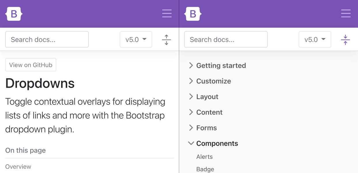
New look and feel
We’ve built on the improvements to our docs homepage in v4.5.0 with an updated look and feel for the rest of our docs. Our docs pages are no longer full-width to improve readability and make our site feel less app-like and more content-like. In addition, we’ve upgraded our sidebar to use expandable sections (powered by our own Collapse plugin) for faster navigation.
We’re also sporting a brand new logo! More on that when v5 goes stable, but suffice to say we wanted to give the ol’ B in a rounded square a small upgrade.
Inspired by the CSS that created the very beginnings of this project, our logo embodies the feeling of a rule set—style bounded by curly braces. We love it and think you will, too. Expect to see it roll out to v4’s documentation, our blog, and more over time as we continue to refine things and ship new releases.
jQuery and JavaScript
jQuery brought unprecedented access to complex JavaScript behaviors to millions (billions?) of people over the last decade and a half. Personally, I’m forever grateful for the empowerment and support it gave me to continue writing front-end code, learning new things, and embracing plugins from the community. Perhaps most importantly, it’s forever changed JavaScript itself, and that in itself is a monument to jQuery’s success. Thank you to every jQuery contributor and maintainer who made that possible for folks like me.
Thanks to advancement made in front-end development tools and browser support, we’re now able to drop jQuery as a dependency, but you’d never notice otherwise. This migration was a huge undertaking by @Johann-S, our primary JavaScript maintainer these days. It marks one of the largest changes to the framework in years and means projects built on Bootstrap 5 will be significantly lighter on file size and page load moving forward.
In addition to dropping jQuery, we’ve made a handful of other changes and enhancements to our JavaScript in v5 that focus on code quality and bridging the gap between v4 and v5. One of our other larger changes was dropping the bulk of our Button plugin for an HTML and CSS only approach to toggle states. Now toggle buttons are powered by checkboxes and radio buttons and are much more reliable.
Interested in helping out on Bootstrap’s JavaScript? We’re always looking for new contributors to the team to help write new plugins, review pull requests, and fix bugs. Let us know!
CSS custom properties
As mentioned, we’ve begun using CSS custom properties in Bootstrap 5 thanks to dropping support for Internet Explorer. In v4 we only included a handful of root variables for color and fonts, and now we’ve added them for a handful of components and layout options.
Take for example our .table component, where we’ve added a handful of local variables to make striped, hoverable, and active table styles easier:
We’re working to utilize the superpowers of both Sass and CSS custom properties for a more flexible system. You can read more about this in the Tables docs page and expect to see more usage in components like buttons in the near future.
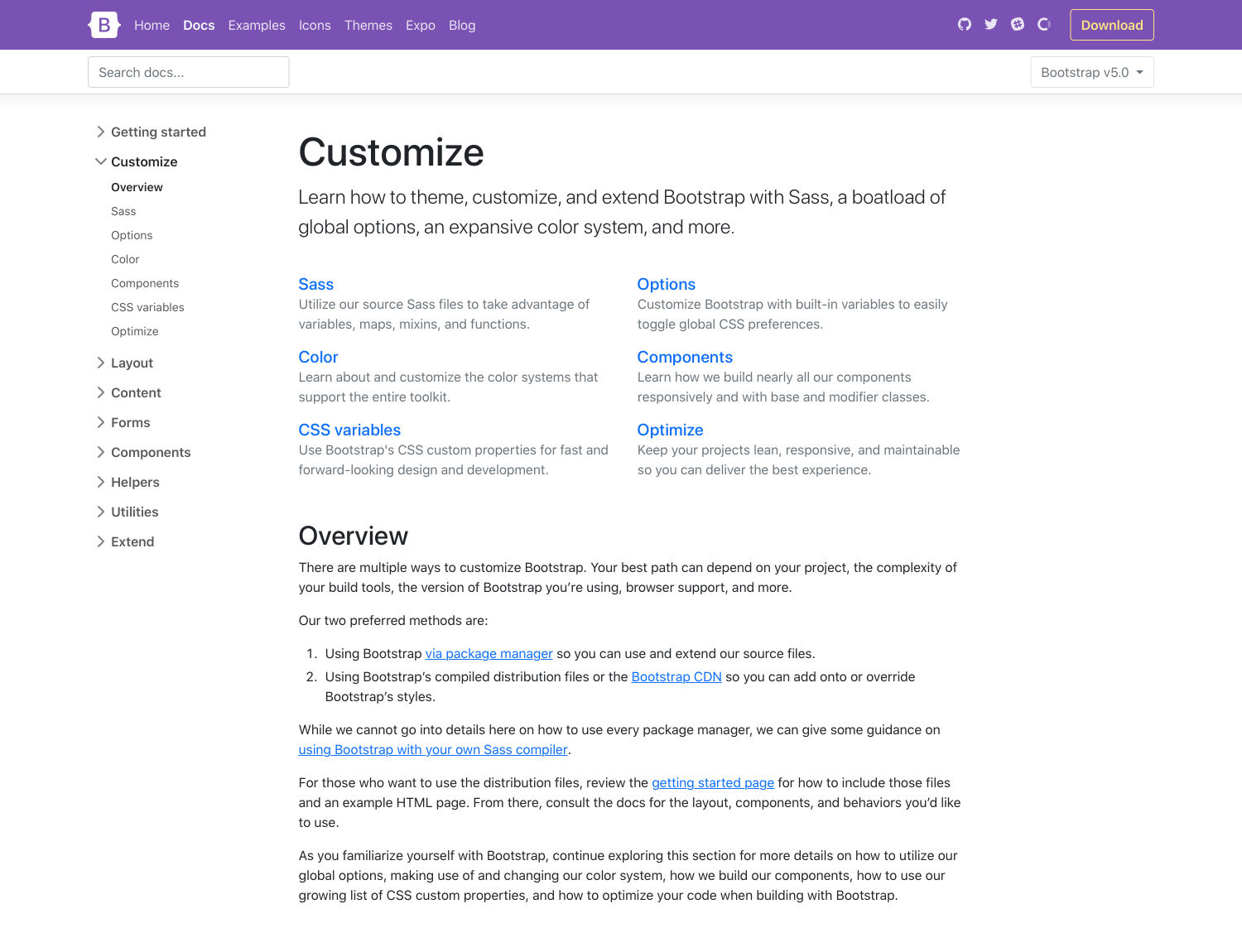
Improved customizing docs
We’ve hunkered down and improved our documentation in several places, giving more explanation, removing ambiguity, and providing much more support for extending Bootstrap. It all starts with a whole new Customize section.
v5’s Customize docs expand on v4’s Theming page with more content and code snippets for building on top of Bootstrap’s source Sass files. We’ve fleshed out more content here and even provided a starter npm project for you to get started with faster and easier. It’s also available as a template repo on GitHub, so you can freely fork and go.
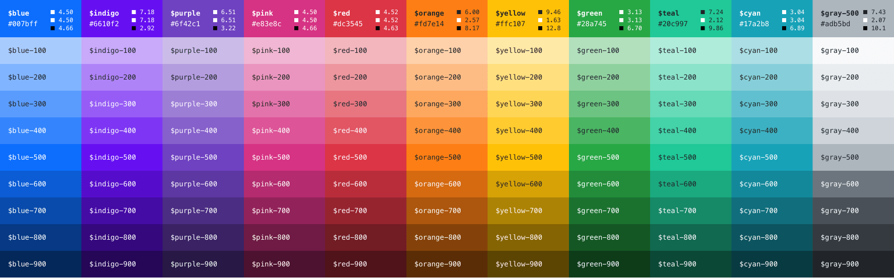
We’ve expanded our color palette in v5, too. With an extensive color system built-in, you can more easily customize the look and feel of your app without ever leaving the codebase. We’ve also done some work to improve color contrast, and even provided color contrast metrics in our Color docs. Hopefully, this will continue to help make Bootstrap-powered sites more accessible to folks all over.
Updated forms
In addition to the new Customize section, we’ve overhauled our Forms documentation and components. We’ve consolidated all our forms styles into a new Forms section (including the input group component) to give them the emphasis they deserve.
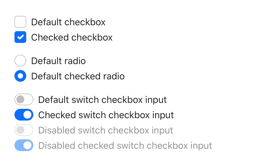
Alongside new docs pages, we’ve redesigned and de-duped all our form controls. In v4 we introduced an extensive suite of custom form controls—checks, radios, switches, files, and more—but those were in addition to whatever defaults each browser provided. With v5, we’ve gone fully custom.
If you’re familiar with v4’s form markup, this shouldn’t look too far off for you. With a single set of form controls and a focus on redesigning existing elements vs generating new ones via pseudo-elements, we have a much more consistent look and feel.
Every checkbox, radio, select, file, range, and more includes a custom appearance to unify the style and behavior of form controls across OS and browser. These new form controls are all built on completely semantic, standard form controls—no more superfluous markup, just form controls and labels.
We love seeing how many folks are building new and interesting CSS libraries and toolkits, challenging the way we’ve built on the web for the last decade-plus. It’s refreshing, to say the least, and affords us all an opportunity to discuss and iterate. As such, we’ve implemented a brand new utility API into Bootstrap 5.
Ever since utilities become a preferred way to build, we’ve been working to find the right balance to implement them in Bootstrap while providing control and customization. In v4, we did this with global $enable-* classes, and we’ve even carried that forward in v5. But with an API based approach, we’ve created a language and syntax in Sass to create your own utilities on the fly while also being able to modify or remove those we provide. This is all thanks to @MartijnCuppens, who also maintains the RFS project, and is responsible for the initial PR and subsequent improvements.
We think this will be a game-changer for those who build on Bootstrap via our source files, and if you haven’t built a Bootstrap-powered project that way yet, your mind will be blown.
Heads up! We’ve moved some of our former v4 utilities to a new Helpers section. These helpers are snippets of code that are longer than your usual property-value pairing for our utilities. Just our way of reorganizing things for easier naming and improved documentation.
Enhanced grid system
By design Bootstrap 5 isn’t a complete departure from v4. We wanted everyone to be able to more easily upgrade to this future version after hearing about the difficulties from the v3 to v4 upgrade path. We’ve kept the bulk of the build system in place (minus jQuery) for this reason, and we’ve also built on the existing grid system instead of replacing it with something newer and hipper.
Here’s a rundown of what’s changed in our grid:
We’ve added a new grid tier! Say hello to xxl.
.gutter classes have been replaced with .g* utilities, much like our margin/padding utilities. We’ve also added options to your grid gutter spacing that matches the spacing utilities you’re already familiar with.
Form layout options have been replaced with the new grid system.
Vertical spacing classes have been added.
Columns are no longer position: relative by default.
Here’s a quick example of how to use the new grid gutter classes:
CSS’s grid layout is increasingly ready for prime time, and while we haven’t made use of it here yet, we’re continuing to experiment and learn from it. Look to future releases of v5 to embrace it in more ways.
Docs
We switched our documentation static site generator from Jekyll to Hugo. Jekyll has long been our generator of choice given how easy it is to get up and running, and its simplicity with deploying to GitHub Pages.
Unfortunately, we’ve reached two major issues with Jekyll over the years:
Jekyll requires Ruby to be installed
Site generation was very slow
Hugo on the other hand is written in Go, so it has no external runtime dependencies, and it’s much faster. We build our current master branch site, including the doc’s Sass -> CSS in ~1.6s. Our local server reloads in milliseconds instead of 8-12 seconds, so working on the docs has become a pleasant experience again.
The Hugo switch wouldn’t have been possible without Hugo’s main developer work, Bjørn Erik Pedersen (@bep), who made quite a few codebase changes to make the transition possible and smooth!
Also a shoutout to @xhmikosr who led the charge here in converting hundreds of files and working with the Hugo developers to make sure our local development was fast, efficient, and maintainable.
Coming soon: RTL, offcanvas, and more
There’s a ton we just didn’t have time to tackle in our first alpha that’s still on the todo list for future alphas. We wanted to give them some love here so you know what’s on our radar throughout v5’s development.
RTL is coming! We’ve spiked out a PR using RTLCSS and are continuing to explore logical properties as well. Personally, I’m sorry for taking so long for us to officially tackle this knowing all the effort that’s gone into it community efforts and pull requests to the project. Hopefully, the wait is worth it.
There’s a forked version of our modal that’s implementing an offcanvas menu. We still have some work to do here to get this right without adding too much overhead, but the idea of having an offcanvas wrapper to place any sidebar-worth content—navigation, shopping cart, etc—is huge. Personally, I know we’re behind the times on this one, but it should be awesome nonetheless.
We’re evaluating a number of other changes to our codebase, including the Sass module system, increased usage of CSS custom properties, embedding SVGs in our HTML instead of our CSS, and more.
There’s a ton yet to come, including more documentation improvements, bug fixes, and quality of life changes. Be sure to review our open issues and PRs to see where you can help out by providing feedback, testing community PRs, or sharing your ideas.
Get started
Head to https://v5.getbootstrap.com to explore the new release. We’ve also published this updated as a pre-release to npm, so if you’re feeling bold or are curious about what’s new, you can pull the latest in that way.
npm i bootstrap@next
What’s next
We still have more work to do in v5, including some breaking changes, but we’re incredibly excited about this release. Let the feedback rip and we’ll do our best to keep up with y’all. Our goal is to ship another alpha within 3-4 weeks, and likely a couple more after that. We’ll also be shipping a v4.5.1 release to fix a couple of regressions and continue to bridge the gap between v4 and v5.
We’re closing in on 700 icons in Bootstrap Icons with today’s release, Alpha 4! We’ve spent some time under the hood of our build process to improve a few things, added tons of new icons, and fixed some bugs and inconsistencies.
We’ve shipped tons of new commerce icons for all your shopping cart needs, added tons of calendar options (I couldn’t settle on one design), tons of new shape arrows, and more.
~700 icons!
With 140 new icons in this release, we’ve almost hit 700 icons. We’re likely to fly by that in our next release, but in the meantime, have a look for yourself at the breadth of icons. Every icon has also been reprocessed to resolve SVGO issues that prevented them from being opened in some apps.
Download
Alpha 4 has been published to GitHub and npm (package name bootstrap-icons). Get your hands on it from GitHub, by updating to v1.0.0-alpha4, or by snagging the icons from Figma.
Bootstrap v4.5.0 has landed with dozens of bug fixes, some small new features, and some changes to our development. Originally planned as a v4.4.2 patch release, we’ve bumped this to a minor release on account of our new features that help bridge the gap between v4 and our upcoming v5.
Highlights
Here’s what you need to know about v4.5.0. Remember that with every minor and major release of Bootstrap, we ship a new URL for our hosted docs to ensure URLs continue to work.
New interaction utilities. Quickly set user-select with the new utilities and Sass map.
New Reboot style for pointer cursors. We now include a role="button" selector in Reboot to set cursor: pointer on non-<button> element buttons.
Examples are now downloadable. We’ve added a script to zip up and offer all our Examples as their own download from the docs.
Saved ~5% from the compressed minified JS builds.
Added guidance to our docs for how to work around our longstanding input group rounded corner bug.
Redesigned docs homepage and navbar to increment us towards v5’s new docs design.
Deprecated bg-gradient-variant mixin as it’s being removed in v5.
Updated to jQuery v3.5.1, Jekyll v4, and dropped Node.js < 10 for development.
While we continue to work on Bootstrap 5, I’ve been jamming away on the Bootstrap Icons library, continuing to create as many icons as time allows. Today marks the third alpha, and massive update to the project. We’ve officially crossed 500 icons!
We’ve cleaned up existing icons, created new permalink pages for each and every icon, and added hundreds of new icons—all in one release.
500+ icons!
I’ve added 221 new icons in our third alpha, the most ever in an alpha release thus far. And while I was drawing all these new awesome icons, I also cleaned up the existing ones by changing their viewBox size and redrew many to ensure more pixel perfect icons.
Why change the viewBox? In the first two alphas, I was drawing icons on 20x20 artboards in Figma. This seemed like a good idea, but every icon was roughly 16x16, so it ended up being dead space. Now, every icon has been updated to eliminate the 2px inner padding, making the viewBoxs 0 0 16 16 instead of 0 0 20 20.
This change has some slight file size improvements, and should help with sizing and positioning as well.
Permalink pages
Looking for a particular icon, but don’t want to download the entire project to snag the SVG source code? Need to send someone a link to an icon? Look no further than the new icon permalink pages!
From the Bootstrap Icons homepage, click any icon and you’ll be taken to a page dedicated to just that icon. It features the icon in various sizes and renders the source code like you’re used to seeing in Bootstrap’s docs.
Since this is still an alpha, some features are still missing from our docs. This includes unlinked tags, no category listing, and no copy to clipboard. I hope to see those added before our stable v1.0.0 release. PRs are very much welcome if you’d like to contribute!
Download
Alpha 3 has been published to GitHub and npm (package name bootstrap-icons). Get your hands on it from GitHub, by updating to v1.0.0-alpha3, or by snagging the icons from Figma.
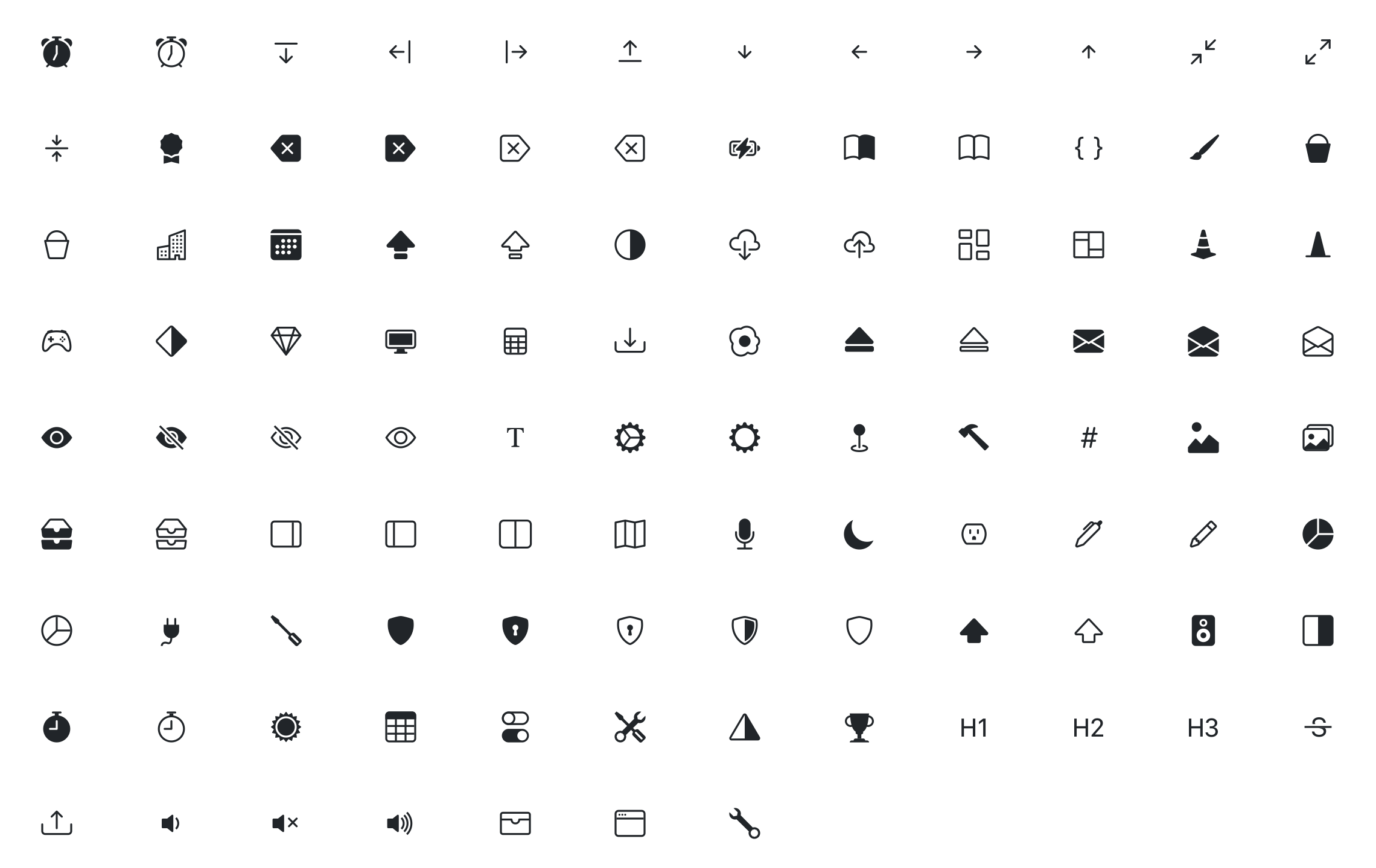
There’s a brand new update of Bootstrap Icons today with our second alpha release! We’ve updated nearly 20 icons and added over 100 new icons since our last release just a few weeks ago.
New icons
With over 120 new and updated icons, this is likely going to be our largest update before we our first stable release. We have some renamed icons, fixed bugs, new tools icons, new typography icons, tons of new arrows, and so much more.
Highlights
Here’s a summary of what’s been fixed, updated, or renamed in this release. For a full summary of what’s new, head to the GitHub release or Alpha 2 pull request.
Fixed:
Bootstrap icon stroke now 1px instead of 1.5px
tv-fill icon no longer has graphical glitch
circle-slash icon strokes now connect
trash icons now use a single shape
trash-fill icon no longer has a gap between lid and bin
layout-split no longer has space between vertical divide
Updated:
blockquote icons now feature more legible quotation marks
command icon now 1px smaller, no longer sitting on half pixel
gear icons now have rounded corners
eye is now outline by default (use new eye-fill variant if needed)
redrew sound waves on volume icons
corrected (reversed) the direction of backspace icon
Renamed:
changed microphone to mic
existing expand/contract icons are now angle-expand and angle-contract
Get ’em
Alpha 2 has been published to GitHub and npm (package name bootstrap-icons). Get your hands on it from GitHub, by updating to v1.0.0-alpha2, or by snagging the icons from Figma.
 @mdo
September 29, 2020
@mdo
September 29, 2020

