We’re a few weeks out from v4.1 and we have our first patch release of Bootstrap 4! It’s a straightforward set of bug fixes and build tool quality of life updates.
Here’s a quick rundown of some of the changes:
Added validation styles for file inputs
Improved printing of dark tables
Suppressed that text-hide deprecation notice by default
Fixed an issue where Collapse wasn’t working in Internet Explorer
Cleaned up some JS globals and improve coverage
Bumped dependencies, namely Jekyll
Fixed docs issue with incorrect name for our monospace font utility
Checkout the full v4.1.1 ship list and GitHub project for the full details. Up next will be v4.1.2, another patch release to address the next set of CSS and JS bugs you’ve help share with us since v4 launched.
Two months ago we shipped the first major release of Bootstrap 4 and we’re thrilled y’all love the latest release and our brand new themes so much. Today we’re shipping our first minor release, v4.1! This release comes later than expected and some of the fixes we intended, but there’s still a boatload of fixes, docs updates, build tool changes, and even a few small new features.
Updated docs URL
With the release of v4 stable, we moved to a versioned docs setup, meaning each minor release would bring with it a new hosted version of our docs. This allows folks who haven’t yet upgraded stick to the docs they know and love and avoids breaking URLs across the web. With today’s release, our we’ll have a new URL for this release’s documentation, getbootstrap.com/docs/4.1/. The previous URL, getbootstrap.com/docs/4.0/ will still work as y’all would imagine.
Highlights
Here’s what’s new in addition to our bug fixes and docs updates:
Added new custom range form control.
Added new .carousel-fade modifier to switch carousel from horizontal sliding to crossfade.
Added new .dropdown-item-text for plaintext dropdown items.
Added new .flex-fill, .flex-grow-*, and .flex-shrink-* utilities.
Added new .table-borderless variant for tables.
Added new .text-monospace utility.
Added new .text-body (default body color), .text-black-50 (50% opacity black), and .text-white-50 (50% opacity white) utilities.
Added new .shadow-* utilities for quickly adding box-shadows.
Added ability to disable Popper’s positioning in dropdowns.
Updated our Theming docs to confirm you cannot use CSS variables in media queries (sorry folks!).
Fixed longstanding issue with Chrome rendering CSS columns incorrectly for cards.
Deprecated .text-hide—you’ll see a warning during compilation—as it’s a dated and undocumented feature.
Fixed up Dashboard and Offcanvas examples across Firefox and IE.
Breadcrumbs can now use non-string values as dividers.
Be sure to look at the ship list and project board for more details on all our fixes. Also, as a small heads up, we’ve split our issue template on GitHub into two separate templates, one for feature requests and one for bug reports. Please let us know if you have any feedback on the change.
Next release
Next up, we’re looking at a v4.1.1 release. There are some bug fixes for input groups, form fields, and more that I know we need to tackle sooner than later. These were supposed to be in v4.1, but we couldn’t make it happen in time.
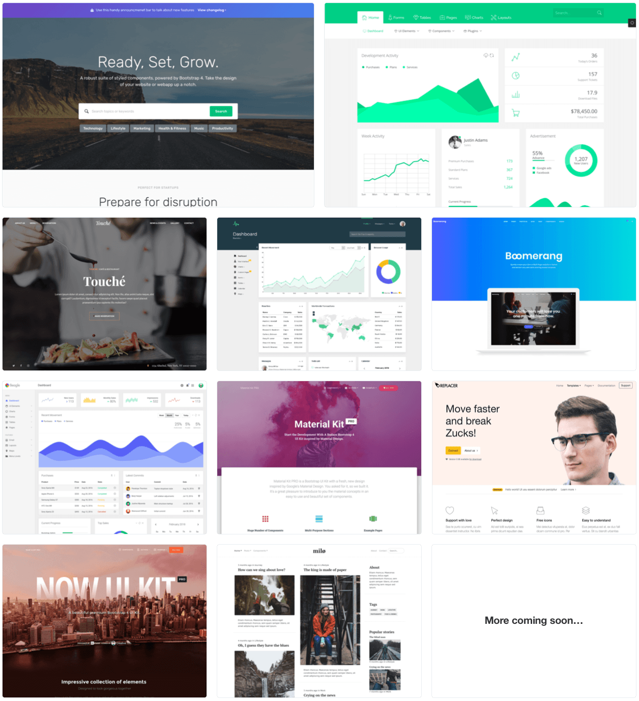
Just over a month ago, we shipped the long awaited Bootstrap 4 stable release. With a brand new codebase designed to better support customization with all new components and documentation, it was the perfect time to debut some brand new themes built. Today, we’d like to introduce you to our brand new Bootstrap Themes marketplace.
10 new themes
Over the last several months, we’ve been hard at work with theme creators to build the best themes for you. When we created our original three Bootstrap themes, our goal was to provide the best themes, build tools, documentation, and support to everyone building with Bootstrap. With today’s update, we’re adding 10 new themes to the mix from a global community of designers and developers.
Every theme is built on Bootstrap 4 (stable, no beta or alpha here!) and comes with its own build tools and customer support. Prices are set by creators with pricing that incentivizes unique and well supported themes. Collectively, this inaugural batch of theme developers have built themes used by over 500,000 people. We’re excited to grow our Themes user base, push the boundaries of premium themes, and help everyone bring their ideas to life on the web.
Our new marketplace isn’t just for buying themes. If you’re a theme creator, we’d love to work with you to include your themes or to build new exclusive themes. We’re looking for new creators to design and build high quality themes, provide first class documentation and support, and help create unique experiences built on Bootstrap.
It’s literally taken us years to do it, but Bootstrap 4 has finally arrived! Words cannot begin to describe the elation the entire team and I have for this release, but I’ll do my best. Thank you to everyone, especially to the team, and to everyone who’s contributed code in a pull request or opened an issue. Thank you.
Since our last beta, we’ve been hard at work stabilizing a few key pieces of our CSS, polishing our documentation, adding some extra surprises, and planning for our follow-up releases. We still have some kinks to iron out, but nothing’s going to stop us from shipping a stable release.
Want to know more before hitting the docs? Great, let’s dive in!
What’s new
There are no breaking changes since our last beta, but we have made some key improvements and resolved some tricky bugs.
Print styles and utility classes have been updated. We’ve improved how printed pages are rendered to ensure pages are reasonably sized instead of rendering them as mobile devices. Print display utilities also include a whole slew of new display values to match our standard display utilities.
Additive border utilities have been added (e.g., .border-top) and default to a solid 1px light gray border. Now it’s easier to quickly add all borders or a subset of borders to your components.
Our $spacers and $sizes Sass maps have been updated to allow more customization the same way our color maps work. You can now add, remove, or replace all your key-value pairs consistently across our CSS. Head to our Theming docs for more information and examples.
Added documentation to our Theming docs for using our provided CSS variables for those are living on the edge and don’t want to use Sass.
Added responsive .order-0 and .order-last classes for more control over the flexbox grid.
In addition, we’ve made plenty of improvements to reusing and extending variables and general code cleanup. But, that’s still not everything.
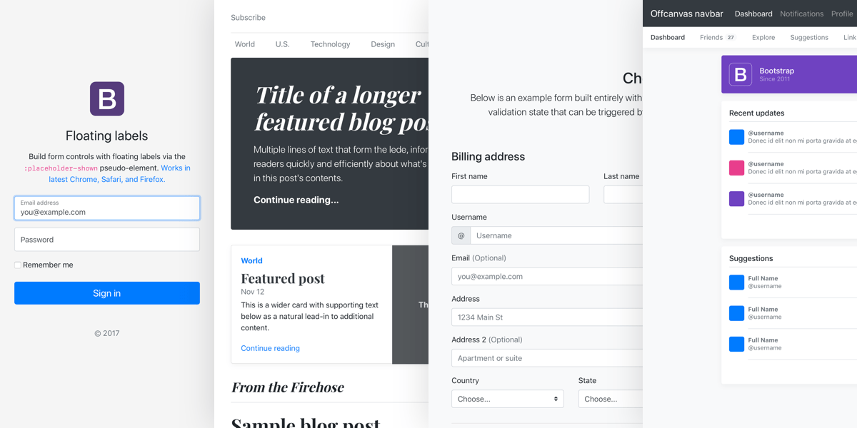
New examples
Nearly every example has been overhauled for our stable v4 release. We’ve removed a couple outdated examples, added brand new ones, and really overhauled a few others.
Here’s the rundown of changes to each:
You’ve likely already seen our Album example, but it’s been updated for this release to include more content in our photo cards and improved mobile rendering.
Pricing is brand new with this release and is a fully custom page built with our utilities and card components. It’s responsive and easily extended.
Checkout is a brand new, extensive form example featuring all the best parts of our form layouts, validation styles, grid, and more.
Product is also new and is a cheeky riff on Apple-style marketing pages, largely built with only our utility classes. Don’t take it too seriously!
Blog has been rewritten from the ground up. Gone is the two column blue header layout. We’ve built a snarky magazine-style layout with featured posts and responsive navigation.
Dashboard has been overhauled as well to feature a live ChartJS example, includes a refreshed sidebar with Feather icons, and is semi-responsive.
Floating labels is brand new and builds on our sign-in example to provide a CSS-only implementation of the floating input label. This one’s experimental and may see major changes before we bring it to Bootstrap proper.
Finally, Offcanvas has been rewritten from the ground up to show off a navbar-built drawer, horizontal scrolling navigation, and some custom lists built on media object and utilities.
Cover, Carousel, Sign-in, and our framework examples only saw minor updates to improve code quality and fix a few smaller bugs. Overall this was a huge update for our examples and I’m excited to iterate on these and add more in future releases.
Documenting our approach
New with v4 stable is a brief overview of some of the guiding principles behind why we do the things we do in Bootstrap. Our intent is to distill and document all the things we keep in our heads while writing code, building linters, and debugging. Much of this is focused on concepts and strategies for writing responsive CSS, using simple selectors, and limiting how much JavaScript one needs to write.
Check out the new Approach page, and be sure to open an issue or pull request with feedback and suggestions on what else to cover.
Known issues
No release fixes every bug, and the same can be said for our v4 stable release. Here’s some of the things that we’re looking to tackle first in either a minor release (v4.1) or a patch release (v4.0.1) as time and scope allow.
Input groups, validation, and rounded corners. I rewrote this for Beta 3 and I thought nailed it, but I was mistaken. We have some rounded corner issues and the only way we can fix them with CSS without breaking backward compatibility is by limiting how extensible the component can be made. We may need a modifier class to avoid some gnarly CSS and satisfy all the key functionality. Check out the issue and cross-linked PR for more details.
Table variants, in particular .table-active, have a weird selector we’ve unintentionally left linger since prior releases. The bug results in double application of an rgba() background color—once for the <tr> and once for any <td>/<th> elements within.
There are a few more issues not yet confirmed or slated for our first patch release, but expect a handful of fixes coming your way before we hit the next minor release. We’ll likely also package up the default branch change for our repository in this next patch release. We didn’t have time to fit in testing a merge of a hugely divergent code base without nuking the entire Git history of v3. Again, more on that soon.
Next releases
Speaking of releases, we’re excited about the momentum we have going for us. Our GitHub project boards are mostly up to date on upcoming releases, so feel free to jump in and take a look. Our next release will be v4.1 (pending any bugfix patches) and will focus on a slew of small new features, utilities, responsive font sizes, and more. From there we have a couple more minor releases that rally around another group of features.
We aim to make RTL part of an upcoming minor release depending on overall scope. It’s taken us far too long to commit to this, but we’re on it. Our current plan is focused on implementing this into our build tools and components so you conditionally serve, for example, bootstrap.min.css or bootstrap-rtl.min.css. Weigh in on the open issue please with any feedback; when we’re ready, we’ll tee up a fresh pull request with help from the community.
It’s worth reiterating that each minor release will bring a new hosted version of our documentation. Right now, we have getbootstrap.com/docs/4.0/ and come v4.1’s release, we’ll have that plus getbootstrap.com/docs/4.1/. Prior releases will continue to be linked from our navigation as is already the case for v3.x and the last v4 alpha.
Themes update
Bootstrap Themes are getting a major update this year! We’ve been absolutely thrilled with the response since we originally launched Bootstrap Themes and we’re finally ready to share our plans for what’s next.
For the past few months, we’ve been working with some amazing theme creators to bring their awesome work to the Official Bootstrap Themes store. We couldn’t be more excited to announce we’re expanding Bootstrap Themes to include ten brand new themes. We’re currently targeting a first quarter launch with themes all built on Bootstrap 4 (sorry, no v3 for these). Depending on final reviews, we might even get them to y’all in the coming weeks.
So much of Bootstrap’s reach and usefulness comes directly from designers, developers, and creators all over the world building businesses with and on top of Bootstrap. We want to use our platform to give these creators an even larger audience and provide y’all with the best Bootstrap team-approved themes.
Stay tuned for more information as we get ready to launch.
Thank you
Finally, one last thank you to everyone who’s contributed to Bootstrap 4. It’s been a crazy journey and I’m personally relieved, thrilled, and anxious to call it stable. There have been roughly 6,000 commits to v4 since we first starting working on it back in 2015. We’ve gone every which direction and rewrote far too many things far too many times, but I’m so very happy and fortunate with where we landed.
Cheers once again to everyone who’s contributed to and built with Bootstrap. It’s an honor to be building these kind of tools alongside and for all of you.
Welcome to the final beta of v4! It’s been over two months since we shipped our second beta and we’ve been busy making the last breaking changes before moving to our next stable release, v4.0.0! We have a few more breaking changes than we were planning, but fret not, we’ve detailed them all.
Beta 3 primarily focuses around our forms, but it also includes key fixes to tables, some global styles, our documentation, and some JavaScript bugs. Following this release, we’ll address a few issues and PRs before doing a stable v4 release a week or two into the New Year.
Let’s dive into all the highlights.
Breaking changes
As mentioned in our Beta 2 release, we needed to make a few more breaking changes in Beta 3. We’ve summarized them here and in our migration docs—be sure to read them!
Rewrote native and custom check controls. Both browser default and custom checkboxes and radios now have simpler markup after removing the <input> from the <label>. Now, all checkboxes and radios have a parent <div> and sibling <input> and <label> pair. This is essential for form validation and disabled inputs because we can use the input’s state to style the label.
In addition, custom checkbox and radio elements no longer have a .custom-control-indicator. This is generated from the new .custom-control-label.
Input groups were rewritten with specific .input-group-{prepend|append} classes. The new approach allows us to support validation styles and messages within input groups, while also adding support for custom selects, custom file inputs, and multiple .form-controls.
Responsive tables are once again parent classes to avoid accessibility issues with changing a <table>’s display.
Deleted the .col-form-legend class, consolidating it’s styles into the .col-form-label class.
In addition to the breaking changes, we’ve addressed a few more general issues that may impact your project.
Restored cursor: pointer to non-disabled links, buttons, .close, navbar toggler, and pagination links.
Added a new vertically centered modal option with .modal-dialog-centered.
Added new dropleft and dropright variants for dropdowns in #23860.
Our npm package no longer includes any files other than our source and dist JavaScript and CSS files. If you previously relied on our running our scripts via the node_modules folder, you’ll need to update your build tools.
Print styles have moved to bottom of the import stack to properly override styles.
Stable v4.0.0 is our next release and we already have a GitHub project board to track issues and PRs. There will be no breaking changes from Beta 3 to stable, so our changelog should be short and sweet. Expect some linting, Sass variable improvements, updated docs Examples, and more build tool improvements.
With our next release, the master branch will once again become our default branch. We’ll merge v4-dev into master, meaning v3’s source code will only be in our v3-dev branch and past releases.
Just over two months ago we shipped our first beta for Bootstrap 4, and now we’re ready to share our second with you. We’ve improved customization, documentation, build tooling, and naming inconsistencies all while fixing hella bugs.
We’ve done our best to prevent breaking changes, but we had to sneak some in. Regrettably, we’ll also have a few more coming in Beta 3, too. However, we’re clearly outlining all of them for you to make the upgrade and testing process as easy as possible.
Let’s start with the good news though—Beta 2 is here!
Highlights
We’ve pushed over 500 commits in our two months, so we have a few changes since Beta 1 to highlights to share with you.
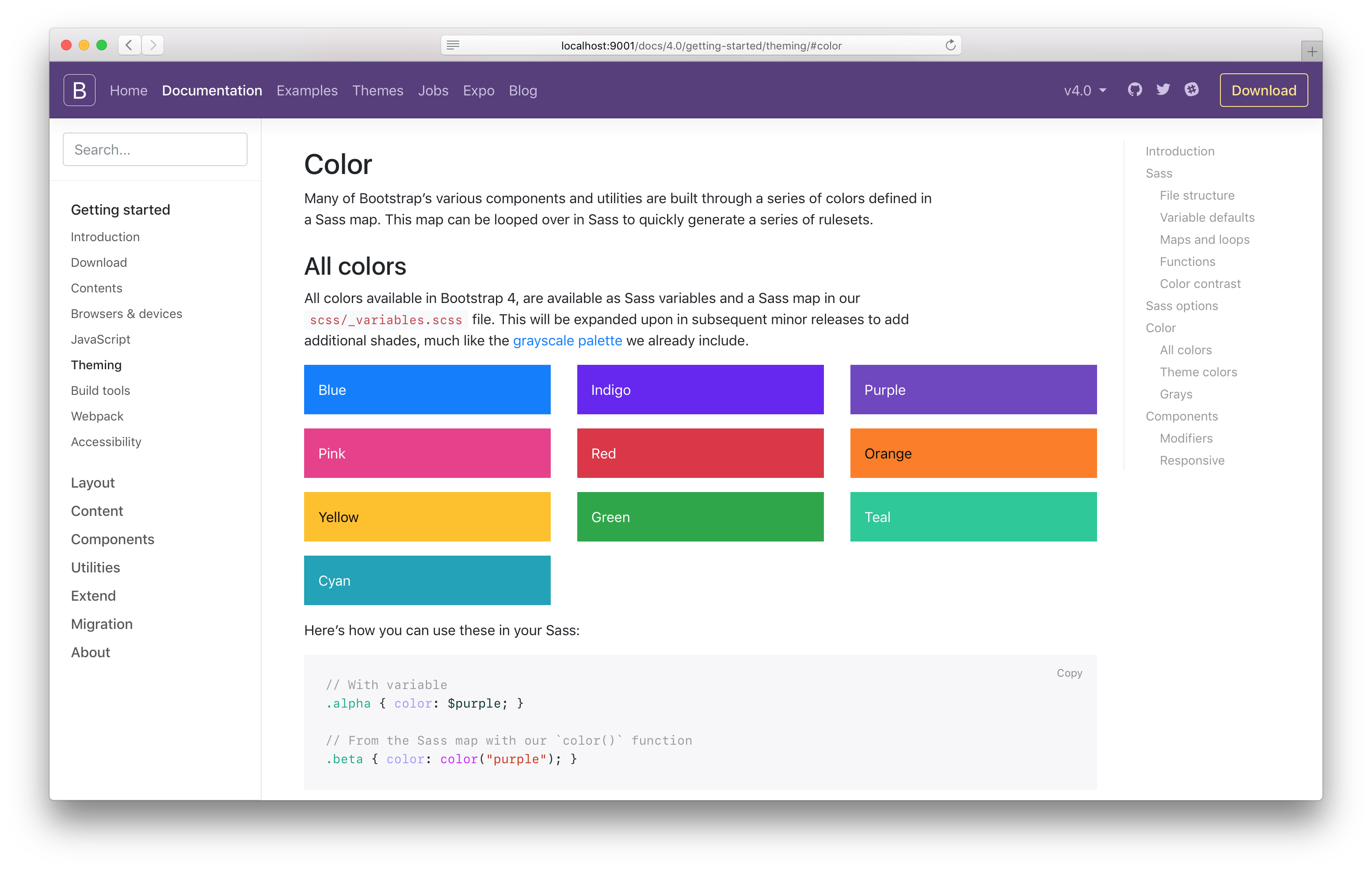
Improved theming
We have a brand new Theming docs page to replace our old Options page (we’ll automatically redirect folks from the old page). This new page delves into the structure of our Sass files, default variables and customizing them, maps and loops we use, functions, colors, and of course or global Sass options. It also includes a new section to explain how we build our components via Sass maps and loops, specifically our modifier classes (e.g., .btn-danger).
In addition to the documentation changes, we’ve made a few CSS changes to improve how folks interact with our theming options.
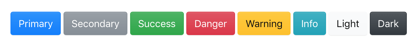
We’ve added new theme color variables in addition to the map. Now you can use $primary or theme-color("primary") as needed. The values in $theme-colors are also now mapped to these new variables instead of their direct color.
We’ve improved the ability to customize Sass maps. With Beta 1, we didn’t have a setup in place to modify your $theme-colors map without replacing it wholesale. That’s been fixed in Beta 2—override existing values and add more as needed. Our new Theming docs page will show you how it’s done.
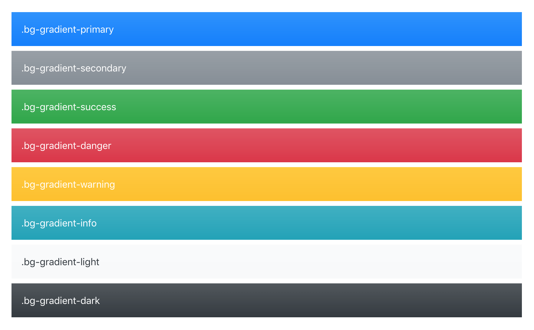
Lastly, our $enable-shadows and $enable-gradients Sass variables have finally been updated and integrated into several of our components. Now, when you enable those variables (both are false by default) and recompile, you’ll see subtle gradients and shadows across alerts, buttons, carousels, custom form controls, and dropdown items.
And when you use $enable-gradients, you’ll enable the new .bg-gradient- utilities (disabled by default) for use in navbars and more.
Check it out and please share any feedback in an issue.
Offset grid classes
We brought them back! Prematurely removed ahead of Beta 1, we underestimated the appeal of the .offset- classes for our grid system. Auto margins are simply not enough for y’all. The styles have been restored and our grid docs have been updated. Enjoy!
Updated migration docs
Given our handful of breaking changes since Beta 1, we added a new section to our migration docs page to detail exactly what we changed that might be broken for you. We had to rename a few classes here and there to ensure everything’s consistent with the rest of the project.
We’ll be updating this page again for Beta 3 in the same way.
And more!
Introduced new pointer-events usage on modals. The outer .modal-dialog passes through events with pointer-events: none for custom click handling (making it possible to just listen on the .modal-backdrop for any clicks), and then counteracts it for the actual .modal-content with pointer-events: auto.
Responsive tables now generate classes for each grid breakpoint, meaning we’ve added .table-responsive-{sm,md,lg,xl} to the already present .table-responsive. You might need to adjust your usage depending on when you want a table to resize.
Remove unnecessary color from .badge, and its associated $badge-color variable.
Include two new dist files which contain Popper.js inside bootstrap.bundle.js and bootstrap.bundle.min.js.
Dropped support for Bower as they’ve deprecated the package manager.
Switched breadcrumbs from float to flexbox.
Switched to Stylelint for our CSS linting needs.
We’re now outputting a handful of CSS variables in our compiled CSS for easy prototyping and customizing with our dist files.
Changed the color-yiq from a mixin that included the color property to a function that returns a value, allowing you to use it for any CSS property.
Coming in Beta 3
Beta 3 is up next for us and already has a GitHub project board setup to track issues and PRs. Beyond the standard docs improvements and bug fixes, there are a few issues and PRs that are of mind for us:
Be sure to follow those issues and PRs if you’re interested in when the merge to our v4-dev branch.
Getting to v4 Final
After Beta 3, we’re hoping to quickly move into a final v4 release. Ideally, it’ll also be a smoother and more focused release than the Alpha 6 to Beta 1 move. We heard from a lot of you that the delta between those two releases was too great.
Two years in the making, we finally have our first beta release of Bootstrap 4. In that time, we’ve broken all the things at least twenty-seven times over with nearly 5,000 commits, 650+ files changed, 67,000 lines added, and 82,000 lines deleted. We also shipped six major alpha releases, a trio of official Themes, and even a job board for good measure. Put simply? It’s about time.
Beta!?
Long story short, shipping a beta means we’re done breaking all your stuff until our next major version (v5). We’re not perfect, but we’ll be doing our best to keep all the classes, features, and docs URLs as they appear now in this release. We can always add more things, but we cannot take away.
For those who haven’t been using the v4 alpha releases, here are some highlights to get you caught up.
Moved from Less to Sass. Bootstrap now compiles faster than ever thanks to LibSass, and we join an increasingly large community of Sass developers.
Flexbox and an improved grid system. We’ve moved nearly everything to flexbox, added a new grid tier to better target mobile devices, and completely overhauled our source Sass with better variables, mixins, and now maps, too.
Dropped wells, thumbnails, and panels for cards.Cards are a brand new component to Bootstrap, but they’ll feel super familiar as they do nearly everything wells, thumbnails, and panels did, only better.
Forked Normalize.css and consolidated all our HTML resets into a new CSS module, Reboot. Normalize.css has taken a different path than we’d prefer, dropping some core CSS tweaks we’ve long depended upon. Reboot takes the core of Normalize.css and expands it to include more opinionated resets like box-sizing: border-box, margin tweaks, and more all in a single Sass file.
Brand new customization options. Instead of relegating style embellishments like gradients, transitions, shadows, grid classes, and more to a separate stylesheet like v3, we’ve moved all those options into Sass variables. Want default transitions on everything or to disable rounded corners? Simply update a variable and recompile.
Dropped IE8 and IE9 support, dropped older browser versions, and moved to rem units for component sizing to take advantage of newer CSS support. Aside from our grid, pixels have been swapped for rems and ems where appropriate to make responsive typography and component sizing even easier. Need support for IE8/IE9, Safari 8-, iOS 8-, etc? Keep using Bootstrap 3.
Rewrote all our JavaScript plugins. Every plugin has been rewritten in ES6 to take advantage of the newest JavaScript enhancements with new teardown methods, option type checking, new methods, and more.
Improved auto-placement of tooltips, popovers, and dropdowns thanks to the help of a library called Popper.js.
Redesigned and improved documentation. We redesigned it, rewrote it all in Markdown, and added a few handy plugins to streamline examples and code snippets to make working with our docs way easier. We also added an amazing new search form!
New build tools completely rewritten in npm scripts instead of Grunt, immensely simplifying the process of developing and contributing to Bootstrap.
And so much more! Custom form controls, a redesigned carousel, an overhauled navbar, HTML5 form validation styles, hundreds of responsive utility classes, new components, and more have also been included.
Okay, phew, want to learn even more? Keep reading, or jump right to those brand new docs!
New look
Bootstrap 4 has been sporting a slightly updated look throughout our alpha releases, but it wasn’t until recently that we gave the docs and our components a refresh, too.
In addition to a new color palette and new systems fonts, we have a brand new layout for our documentation. New with this beta is an amazing search form powered by Algolia’s DocSearch, an improved page layout with stickied navbar and sidebar, and a new table of contents.
Alpha 6 has landed, and it’s one of our biggest ships to date. We’ve rewritten our grid system and all major components in flexbox, forging ahead with it as our default layout option as we drop IE9 support. With 700 commits since our last release, we have some catching up to do.
Read one for highlights from this release. We also recommend reviewing the ship list and milestone for a more detailed look at what’s changed.
Embracing Flexbox
Bootstrap 4 is now flexbox by default! Flexbox is an immensely powerful layout tool, providing unparalleled flexibility (hah) and control to our grid system and core components. It comes at the cost of dropping IE9 support, but brings significant improvements to component layout, alignment, and sizing.
If you’re unfamiliar with flexbox, here’s some of the power you can expect to utilize in Bootstrap 4:
Automatic equal-width grid columns (e.g., two columns are automatically 50% wide)
Equal height and equal width cards
Vertical and horizontal centering without hardcoding values with translate or margin
Utility classes for easily (and responsively!) changing display, direction, alignment, and more
Auto margins for easy spacing
Justified navigation and button groups
No more HTML white space or broken table-style rendering
Nearly every component now takes advantage of flexbox in place of display: table hacks and floats. That means less reliance on clearfix, more control over DOM and visual order, and fewer bugs. Navs, list groups, cards, and more all utilize flexbox. Even more complex components like the carousel have been modified to use flexbox in some places.
With Alpha 6, we’ve made Bootstrap’s extensive suite of utilities—including classes for display, float, and flexbox, and more—completely responsive. To keep these class names as approachable and representative of their scope as possible, we’ve also made two important changes to their naming scheme.
First, we’ve dropped the -xs infix from our lowest (extra small) breakpoint. xs isn’t a responsive breakpoint quite like sm, md, lg, and xl because it doesn’t start applying styles at a min-width and up. It simply applies to everything as there’s no bounding @media query.
Second, we’ve renamed several classes to better articulate their property-value pairings. Instead of pull, we use float. Instead of creating new names for the various flexbox properties, we start with the property name.
Put that all together and you end up with updated classes like .col-6, .d-none, .float-right, .d-md-flex, .justify-content-end, and .text-lg-left. These new classes bring immense power and customization to folks building with Bootstrap. They also make it easier for those migrating from v3 with clearer mappings to legacy class names.
More grid improvements
We’re back at it with more grid improvements. This time we’ve added responsive autosizing columns and more container padding options. Add any number of .col-* classes and they’ll automatically be equal in width.
Padding for grid containers can now be configured across breakpoints with the new $grid-gutter-widths Sass map. In addition, you can remove gutters from grid rows and their columns with the .no-gutters modifier.
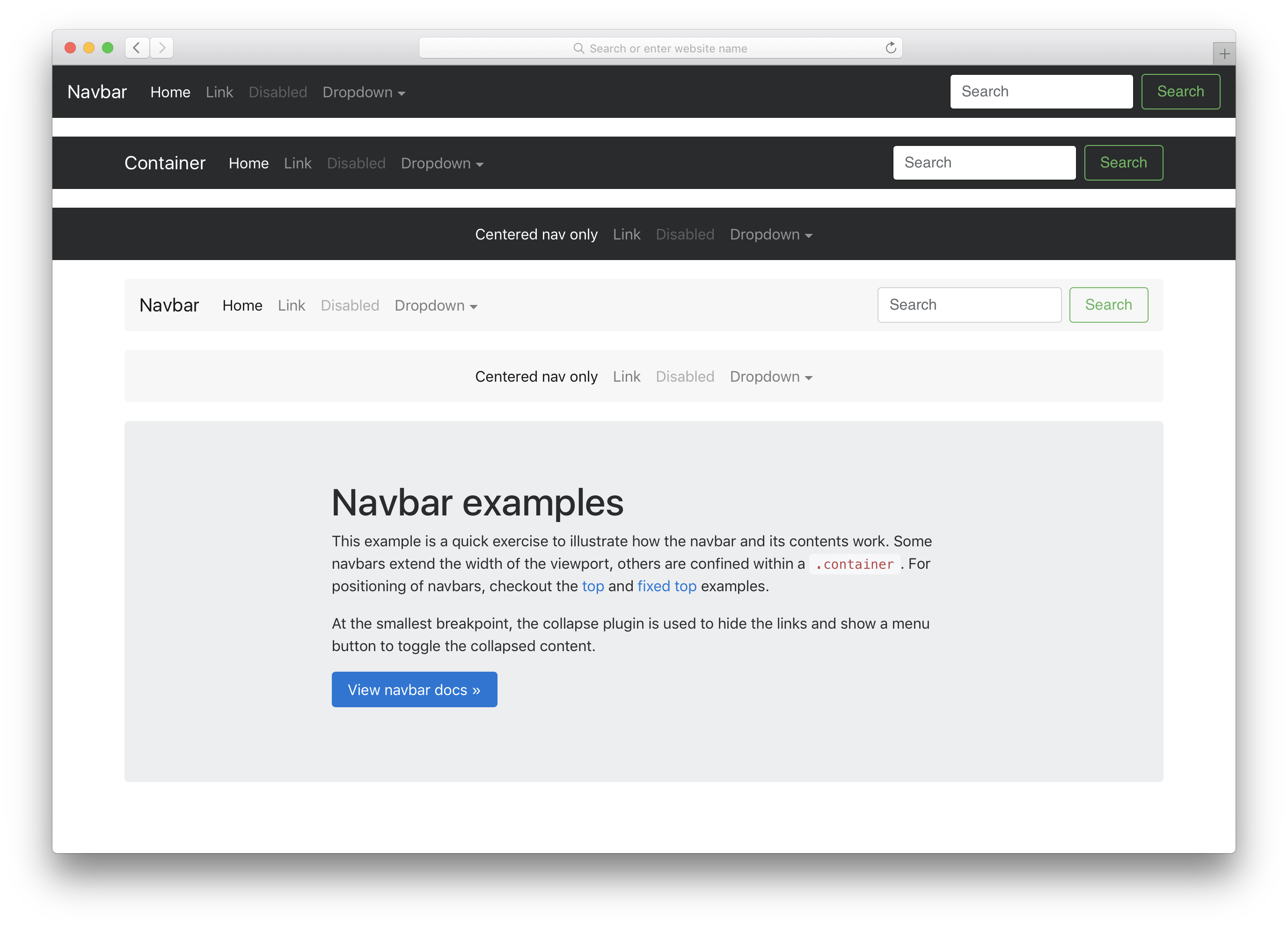
Updated navbar
As mentioned in our last release, the Alpha 5 navbar was a little half baked. This time around, we’re completely baked. No, but seriously, the navbar has been rewritten to provide better built-in responsive behaviors and improved layout customization thanks to our move to flexbox.
Here’s the rundown on what’s changed:
Navbars are built with flexbox! Instead of floats, you’ll need flexbox and margin utilities.
Navbar navs no longer require the .nav base class. While it provided a starting point, these shared styles often got in the way of navbar behaviors. Now it’s just .navbar-nav and utilities for alignment.
The .navbar-toggleable classes are now applied to the .navbar instead of the .collapse within. This allows us to provide better responsive behavior with just one class change.
The responsive navbar toggle, .navbar-toggler, has also been updated. The icon is once again a child element, .navbar-toggler-icon, for improved customization. It also includes easy modifiers for absolutely aligning it to the top right or top left.
Check out the navbar docs to learn more and see it in action.
Up next, our first beta
Like you, we’re very much ready for our first beta release. Luckily, we’re in great shape to get there from this alpha. We have the fewest open issues and pulls we’ve had in easily the last 18 months, and the contributions from the community have been outstanding. As we head to our first beta, we’ll be focused on not adding anything new, ideally making as few breaking changes as possible, and emphasizing documentation quality and bug fixes.
We need your help to get there though. Please dive into this latest release and continue to report bugs and submit pull requests as you can. Every bit helps us improve the next release!
Alpha 5 has arrived just over a month after Alpha 4 with some major feature improvements and a boat load of bug fixes. We still have a lot of work to do, but we’re closing the gap and getting more stable with each release. Keep reading for the highlights and plans for Alpha 6.
New CSS bundles
We’ve updated our build process to include compiled versions of all our CSS bundles. In addition to the longstanding default compiled and minified bundles, we now include compiled CSS files for our flexbox mode, grid system only, and Reboot only bundles. Each bundle includes a compiled, minified, and Sass map, just like the default compiled CSS.
Grid updates
Our grid system has been updated and is more flexible than ever. New in Alpha 5 are breakpoint specific grid gutters. That’s right, now you can customize the width of your gutters across each and every grid tier by modifying the Sass map.
The .container behaviors have changed slightly in Alpha 5. We now set the width of each container alongside a max-width: 100%; to ensure proper rendering across browsers in both our default and flexbox modes. Similarly, we fixed a bug in our flexbox grid where columns didn’t properly collapse at lower breakpoints.
Lastly, we’ve changed a few breakpoint and container dimensions. The sm tier’s container is now smaller than it’s viewport dimensions and the lg tier has changed from 940px to 960px for grid columns that more cleanly by 12.
Utilities overhaul
Utility classes got a ton of attention with Alpha 5 and will continue to in Alpha 6. Major changes in this release include:
Simpler margin and padding syntax (e.g., now mx-auto instead of m-x-auto).
Renamed .pull-*-left and .pull-*-right to their CSS properties (e.g., now .float-*-left and .float-*-right).
Separated background and color utilities for more explicit styling.
Renamed image utilities, moving from .img-rounded and .img-circle to .rounded and .rounded-circle, respectively.
Removed the display: block; from .img-fluid as it’s unnecessary for creating responsive images (the inline-block default works great as-is).
Added new vertical-align utilities with .align-top, .align-middle, and more.
Be sure to scope out the open issues in the Alpha 6 milestone. There are more updates coming to utilities to add more responsive variations, more consistent naming, and more.
Navbar updates
We’ve put a ton of time into the navbar for Alpha 5, but honestly it’s still not done. Rather than hold back the progress we’ve made for it until Alpha 6, we’re including a somewhat half-baked iteration.
Here’s a look at what’s new, how it works, and what might change in our next release.
First up, the navbar has a brand new toggler that features a customizable SVG-based background-image. With the power of Sass variables, that allows us to easily change the color of those hamburger menu icons.
Second, the default styles for the brand and navigation have largely been tweaked. There’s less custom styling overall and an emphasis on positioning and flexibility.
Building on that, we overhauled the collapse plugin integration for responsive navbars. With the help of some utility classes and collapse classes for each grid tier, you can easily pick the breakpoint for collapsing your navbar without having to recompile your Sass. Also included is the auto restyling of dropdown menus for mobile so they no longer hide other navbar content when toggled.
Lastly, we’ve updated the styling and documentation for various navbar subcomponents. There’s more flexibility and examples of the .navbar-brand, better form control support, higher nav contrast, themed responsive toggles, and more.
The navbar is a tricky one—there’s so much functionality and styling that can go into them. We’ve outlined the next major pieces for the navbar, but there’s likely more we’re missing. Be sure to give the updated component a whirl and report back with your feedback.
Getting to Alpha 6
We’re planning on one more major alpha release before getting into the slightly more stable beta ships. There’s still more to do around our major components—the navbar, flexbox variants, utilities, and accessibility—before we button things up.
Once done, we’ll review all on our docs and update all our example templates to the latest and greatest. From there we’ll need your help to test these changes and report bugs. Stay tuned for more updates as we get closer to that release.
Alpha 4 is here to address those pesky build and package errors, a few CSS bugs, and some documentation inconsistencies we introduced in our last release.
This is a super small release compared to our previous alphas, so here’s the rundown on what’s changed:
Fixed package.json errors
Additional migration notices for more components
Fix broken flexbox utilities on flexbox grid page
Fix inconsistent checkbox and radio markup, as well as validation styles
Minor tweaks to cards, alerts, utilities, and input groups
At the time of release, the Bootstrap CDN hasn’t been updated for Alpha 4. Apologies for the delay, and stay tuned for an update on when they’re live.
 @mdo
April 30, 2018
@mdo
April 30, 2018