Today we’re stoked to ship Bootstrap v3.1. We’ve got a handful of new features, plenty of bug fixes and improvements, and updated build tools.
New docs
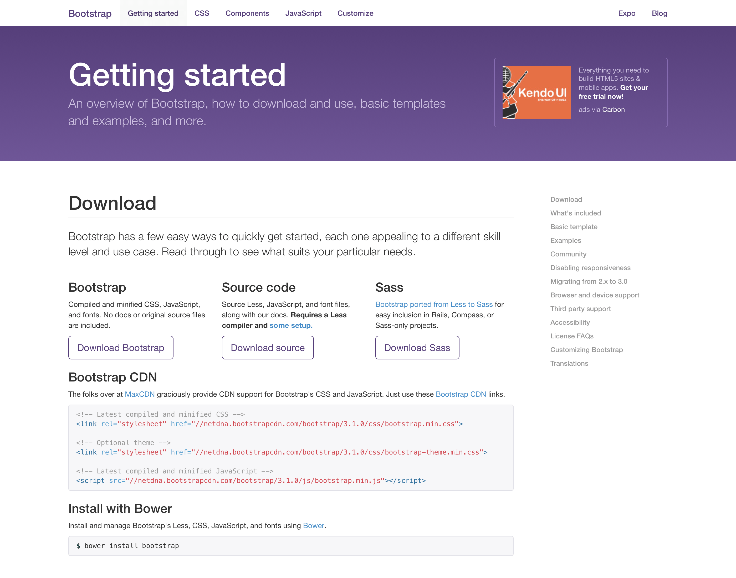
We’ve made tons of changes across the board, most notably to our documentation. Just like v2.1 brought a brand new design, v3.1 overhauls the docs to refocus on the actual documentation rather than the chrome around it. Our new homepage restores the quick run through of key features and showcases some awesome examples from the Expo.
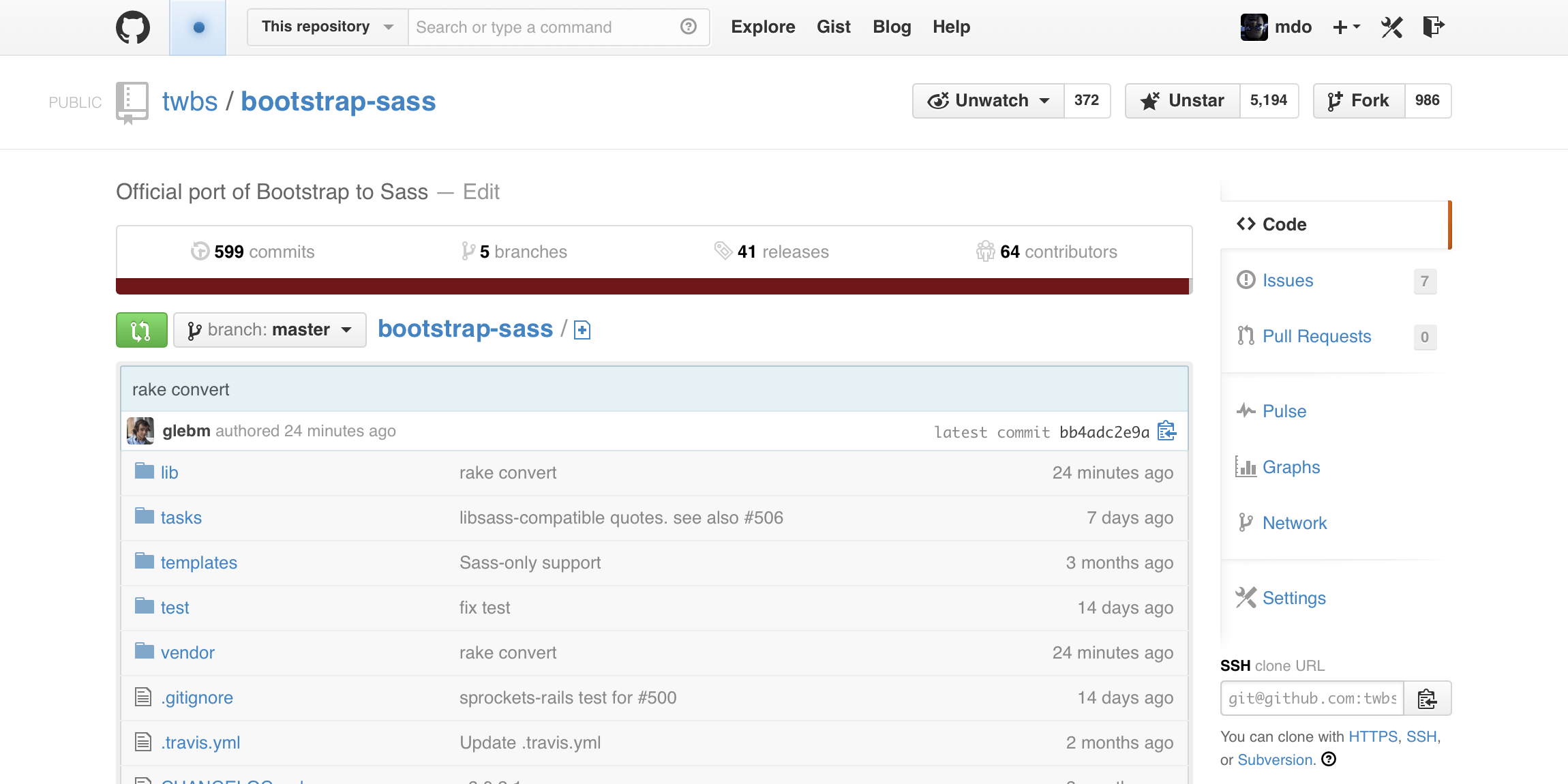
Official Sass port
The best part about v3.1 is that we’re shipping with an official Sass port. A few weeks ago we moved over the most popular port on GitHub and made it official—Bootstrap is now available in Sass. Rather than bloat the main project with support for Less and Sass—and all the documentation for both—we’ve kept them separate for the time being. Prominent links in the docs are included though, so enjoy!
New examples
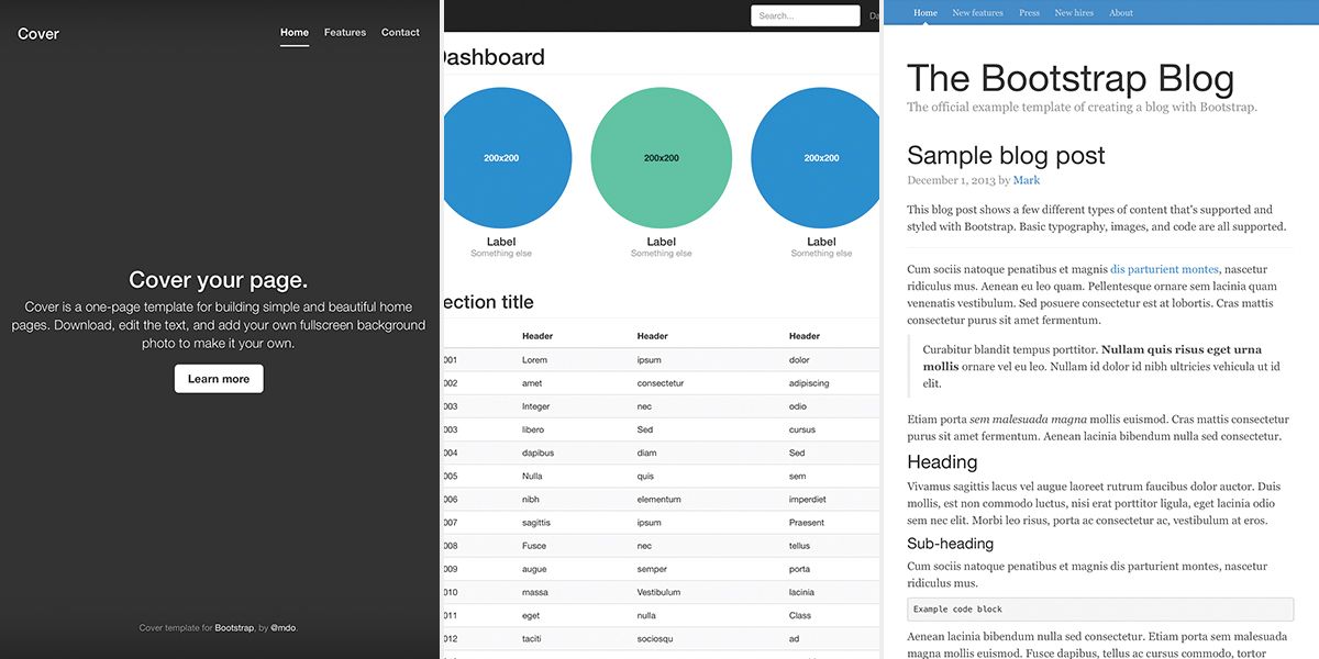
We’ve added three new examples: Blog, Cover, and Dashboard. Each example provides a single page of awesomeness for you to quickly get started on a project built with Bootstrap. They’re responsive and ready to go.
Improved features
A handful of features that aren’t exactly new to Bootstrap have seen an update in v3.1:
Modals now include optional sizes
Dropdowns now have their own alignment classes for easier customization
Form feedback styles for validation states now include optional icons to reinforce color changes
All-in-all these make components more focused, more durable, and easier to work with. See the changelog included with the GitHub release for the complete list of new features.
Remote modal content
One of the more important improved features is for our modals. If you currently use the modal’s remote option, be aware this release may break your modals. Yes, this is a breaking change, but it’s first and foremost a bug fix that corrects a rather longstanding and overlooked error. Our apologies for any headaches it may cause, but it’s been missed in the last few patch releases.
See the #11933 pull request for details on the code changes.
New license
We’ve been talking about it for what seems like forever, but thanks to all our contributors and the core team, we’ve finally done it. As of v3.1, Bootstrap ships under the MIT license to allow as many people to utilize Bootstrap as possible. Thanks to all our contributors for helping make it happen.
Improved build tools
We’re constantly trying to improve our tools for developing Bootstrap and v3.1 brings a slew of updates to do just that.
We’ve switched from Recess to grunt-contrib-less for our compiler, giving us access to Less 1.6.x (as opposed to 1.3.x with Recess).
Our compiled code is virtually identical in formatting and organization thanks to CSScomb and some other Grunt-fu.
Tests also run a tad faster with the help of some magical caching and parallelization.
The web Customizer is now generated from a Grunt task, meaning we’ll never miss updating or adding a variable again. If you contribute to Bootstrap regularly, just run grunt and commit to update the page.
Heads up! If you develop Bootstrap locally, be sure to nuke your node_modules/ directory and run npm install before getting started with v3.1.
Download Bootstrap
Get downloading now, or see the list below for more information on what’s new in this release. Download it from GitHub or snag it from the CDN:
#11572: Add contextual background-color classes to match our existing text classes. (This also moves both sets of classes to the Helper Classes section of the CSS docs.)
#11675: Add .text-justify class to round out the text alignment classes.
#11836: Add new form control feedback classes to toggle icons for each validation state. Works on regular forms, horizontal, and inline.
While we originally wanted v3.1 to include RTL support, we decided to hold back on that for some potentially beneficial unreleased tooling. We’ll share more on that when we know more, but suffice to say it’s been bumped to v3.2.
CSS changes
#10951: Add outline: 0 to .modal to prevent a focus outline from appearing in Chrome for Windows.
#11107: Add @modal-backdrop-opacity variable for customizable modal backdrop.
#11266: Apply a pixel-based line-height that matches the height to date inputs for iOS 7 for proper vertical alignment of text in the form control.
#11302: Refactor the responsive utility classes to cut a few hundred lines of CSS (more context in #11214).
#11435: Prevent the double borders between multiple buttons in an input group.
#11561: Add float: left; to .form-controls within input groups to prevent IE9 from screwing up placeholder text and select menu arrows.
#11588: Scope font-size to only <p> elements in .jumbotrons and remove the super-sized line-height from the base class to avoid interference with sub-components.
#11676: Add -webkit-overflow-scrolling: touch; to modals for smooth scrolling on iOS devices.
#11744: Clean up some incompatible properties in forms.less: block level inputs no longer receive vertical-align: middle; unless necessary, e.g. in inline forms.
#11748: Updated .scale() mixin so that it accepts optional vertical scale as second parameter.
#11750: Reverts v3.0.3’s refactor to contextual table classes to ensure they work with striped tables.
#11757: Darken default navbar toggle bars to meet WCAG criteria.
#11766: Use @color variable in .button-variant() mixin to set background-color on .badges in buttons for proper default button badge styles.
#11741: Don’t set @headings-font-family to the same font stack as the <body>; instead, just use inherit for same default CSS.
#11786: Nest media queries within print utilities for mixin-friendliness.
#11790: With upgrade to Less v1.6.0, remove duplicate CSS generated from the nested .clearfix class and mixin by switching to &:extend(.clearfix all).
#11801: Use correct variables for grid containers.
#11817: Rework input groups to use the font-size: 0; and white-space: nowrap hack for a more durable component with regards to code formatting and custom font size changes.
#11829: Add .make-xs-column mixins to complement the recently added extra small predefined grid classes.
#11836: Along with the form validation update, we reset some key form and icon styles:
All .form-controls within inline forms are set to width: auto; to prevent stacking of .form-label within a .form-group.
Removes all select.form-control settings since those are now inherited by the above change
Removes the width: 1em; from the Glyphicons because it was virtually impossible to override.
#11841: Breadcrumb padding values now use variables.
#11859: Restore @dropdown-caret-color variable, but deprecate it.
#11861: Add @list-group-active-text-color variable for improved customization on active list group items.
#11868: Cleanup modal z-index values in modals.less.
#11990, #12159: Make range inputs block level and 100% wide by default.
#12073: Make order of component variations consistent throughout the repo.
#12164: Fix value of SVG font ID and removed hard coded value.
#12171: Ensure panel groups have a bottom margin since we nuke it on child panels.
#12247: Add and use .text-emphasis-variant() mixin for emphasis classes. Also updated emphasis classes to only apply :hover styles to linked content.
#12248: Add and use .bg-variant() mixin to generate background classes.
#12249: Add and use @modal-md Less variable for uniformity.
#12250: Remove print margins per upstream H5BP change, thus deferring to browser defaults, or users’ custom values should they set them.
#12286: Only remove appropriate border-radius from first and last tables or list groups in panels.
#12353: Scope table border reset in panels to first-child rows.
#12359: Reset min-width on <fieldset>s so they don’t break responsive tables and behave more like standard block level elements.
#12270: Add namespace .bs also to the event dismiss.modal.
Deprecations
#10370: Deprecated the .pull-right method for aligning dropdown menus. Includes the following changes:
Removed an old and unused pair of selectors that didn’t properly target the right-aligned navbar alignment of dropdown menus.
Deprecates the .pull-right alignment in favor of a more specific and unique class name.
Adds .dropdown-menu-right as the new alignment class. This is then mixin-ed into the .navbar-right.navbar-nav dropdown menus for auto-alignment (keeping the current behavior we have today).
Adds new ability to override that auto-alignment though with the new .dropdown-menu-left, which is mixin-ed in the same way to provide the appropriate specificity of an override. This should never need to be used except for within right-aligned .navbar-nav components.
#11660: Deprecate small and .small in blockquote citation in favor of footer element.
#12037: Move docs .html pages and assets into docs/ subfolder to clean up project root directory. Also moves .csscomb.json and .csslintrc to less/ to further clean up project root.
#12073: Make order of component variations consistent throughout the repo.
#12244: Move v2.x to v3.x migration docs to a separate page.
#12311: Expand information on how to handle overflowing content in navbars.
#12314: Add warning about modal markup placement affecting modal appearance/functionality.
#12345: Add note about printer viewport weirdness.
There are a few dozen bug fixes and changes in this release, but we’ve called out the ones we think matter most:
Padding of .navbar-collapse and alignment of .navbar-right:last-child elements has been reworked.
Added a max-width: 100%; to .containers.
Restored the twelfth column’s float: left; at all grid tiers.
See the list below for more information on those changes and more.
Specific bug fixes and changes
#9927: Update non-responsive example to prevent .navbar-collapse border from increasing height and increase specificity of nav selectors to keep dropdowns looking the same.
#10147: Remove outline from carousel controls on focus.
#10353: Tell Bower to ignore development and documentation files.
#10483, #10357: Make .container mixin-friendly by moving the width declarations within one class.
#10662: Enable individually linked images within thumbnails.
#10744: Use border-style: solid; on .carets to undo a previous Firefox fix that appears to no longer work.
#10936: Increase height of large inputs to fix Firefox inconsistencies by using ceil() instead of floor().
#10941: Fix Glyphicons path for those importing bootstrap.less from another directory.
#10979: Don’t use .img-thumbnail as a mixin for .thumbnail to avoid duplicate and unnecessary styles.
#11217: Fix vertical alignment of labels within buttons, just like badges in buttons.
#11268: Account for badges within buttons by matching background to text color and text color to background.
#11277: Drop the abbr element from the .initialism selector.
#11351: Correct grid class reset on input groups by using attribute selector, not an old class from v3 betas.
#11357: Vertically center .btn-sm and .btn-xs variations of .navbar-btns in the navbar.
#11376: Don’t deselect radio buttons when double clicking.
#11387: Improve nesting on table classes to enable easier use of mixins.
#11388: Simplify contextual table styles mixin (also drops the border parameter since we longer apply that anyway).
#11390: Add max-width: 100%; to containers within jumbotrons to avoid horizontal scrollbar.
#11402: Set width: auto; on select.form-control within .form-inline.
#11414: Add .small support to blockquote citations.
#11425: Use margin instead of padding on .modal-dialog to click-thru to .modal-backdrop.
#11432: Corrected color contrast to WCAG 2.0 AA for @state- variables (applies to forms and labels).
#11444: Use @navbar-padding-vertical for nav links vertical padding.
#11449: Prefer Menlo over Monaco for monospaced fonts.
#11468: Prevent default gradient background-image on .navbar-toggle in Firefox for Android.
#11476: Remove unnecessary prefixed keyframe declarations for animated progress bars. Given our browser support requirements, we can drop the -moz- prefix as the last several versions don’t require it.
#11477: Use namespace events for dropdowns and carousel.
#11493: Ensure proper width of dropdown buttons within vertical button groups.
#11499: Switch from overflow-y: auto; to overflow-y: visible; to prevent vertical scrollbar in some navbar situations.
#11502: Add missing data namespace for dropdown plugin.
#11513: Float navbar-text elements only when screen width is above @grid-float-breakpoint.
#11515: Reorder the headings with body text and text emphasis classes.
#11516: Invert dropdown divider border in navbars.
#11530: Reworked padding on .navbar-collapse and negative margin for right-aligned navbar content to ensure proper alignment on the right side.
#11536: Add support for button dropdowns within justified button groups.
#11544: Add color: inherit; to .panel-title to ensure proper text color when customizing @headings-color.
#11551: Remove color from outline reset for improved outlines on focus.
#11553: Prevent double border on tables in panels without thead content.
#11658: Increase min-height of .radio/.checkbox for horizontal forms to ensure alignment of content below.
#11693: Adds .table to responsive visibility mixin.
#11694: Remove unnecessary prefixes for gradient mixins given our stated browser support.
#11712: Better support for .table-responsive within .panel’s.
Removed browser default top margin from dls. Commit
Docs changes
Be sure to run npm install if you’re running grunt locally—we’ve updated our build process and have some new dependencies.
#9898: Improve scrollspy and affix plugin documentation.
#10716: Update “What’s included” docs section with info on full source code download directory structure.
#11303: Add link to the docs site in compiled assets, and remove personal usernames.
#11330: Add overflow-x: hidden; to body in offcanvas example to prevent horizontal scrolling.
#11369: Speed up jQuery and Twitter widgets on docs pages by using Google’s CDN for jQuery and the async snippet from the Twitter dev site for the widgets.
#11385: Warn about Webkit bug for justified nav example.
#11409: Add release checklist to contributing guidelines.
#11412: Add word-wrap: break-word; to docs Glyphicons class names to ensure proper wrapping in IE10-11.
#11434: Mention form validation class changes in migration docs.
#11534: Document that modal show() and hide() return before animation finishes.
#11634: Add warning to docs to not combine icon classes with other elements.
#11671: Updated third party asset libraries (for Customizer and Holder, our thumbnail utility).
#11701: Switch to Sauce Labs for our cross-browser JS unit testing needs.
Removed mention of Chrome from Webkit rendering bug for justified nav. Commit
Next up is v3.1.0, the first new feature release for Bootstrap 3. Stay tuned for more information on what’ll be in that release as we continue to plan out subsequent releases.
Today we’re shipping a quick v3.0.2 patch to fix incorrect version numbers in our JavaScript files, restore missing grid classes, and make a few improvements to our documentation.
#11334: Remove unnecessary & from CSS nesting for panels.
#11335: Add Grunt task to update version numbers across entire project. (Note: If you run our docs locally, you’ll need to run npm install in order to run grunt).
#11336: Don’t use nonstandard window.location.origin in Customizer.
#11345: Remove duplicate class changes in migration instructions.
#11349: Add screen reader text for navbar toggles.
#11378: Use .navbar-* alignment classes in .navbar-text example.
This release was unplanned, and as such it bumps a lot of planned fixes to a v3.0.3 release. We’ve already updated the relevant issues to be under the new v3.0.3 milestone. Look for that release, and perhaps another patch, before v3.1.0 ships in the coming months.
Today we’re shipping v3.0.1, a huge patch release with over 750 commits since v3 was released two months ago. We’ve outlined most of the changes below, including documentation updates, bug fixes, and even a few deprecations (our first in the history of the project).
Remove links to navbar examples from example navbars in Theme example
Delete smaller touch icons and only include one
Remove unused mention of .prettyprint styles from code.less (we no longer use that plugin and the class is undocumented, so we’re nuking it)
Remove unnecessary left and right properties from .modal-dialog since we use margin to center the modal
Add Linux Firefox to supported browsers list
Update outdated JSFiddle example
Bug fixes and changes
#9855: Partial fix for open modal content shifting: removed all margin settings to prevent some of the content shifting. Still needs JS love to detect scrollbars and adjust content accordingly (will address in v3.0.2).
#9877: Add improved .active state to navbar nav in theme
#9879: Add hover state (move gradient up 15px) to theme buttons]
#9909: Add @component-active-color variable to complement @component-active-bg (and apply it to dropdowns, nav pills, and list group items)
#9964: Add fonts directory to bower.json main files list
#9968: Simplify striped progress bar mixin to remove unused color
#9969: Add support for output element by styling it more like our .form-control
#9981: Account for hover and focus states on pagination disabled items
#9989: Set monospace font-family on <kbd> and <samp> to match browser defaults
#9999: Make .table-hover styling apply to <th> within contextual table rows too
#10013: Position carousel left and right controls from the left and right, respectively
#10014, #10406: Update grid to use width on .containers instead of max-width as IE8 doesn’t fully support box-sizing: border-box when combined with min/max width/height
#10022: Add width: 1em; to all empty Glyphicons to prevent loading flicker
#10024: Use negative margin to fix the border between button and input in input groups
#10601: Use overflow-y: auto; for .navbar-collapse instead of visible to better enable scrolling on Android 4.x devices (see issue for more details on support and gotchas)
#10620: Remove filter on buttons for IE9 in theme.less due to bleed-through with rounded corners (matches behavior and style of Bootstrap 2.x)
#10641: Remove unused .accordion-toggle class from docs example
#10656: Inherit link and caret colors for textual dropdowns in panel headers
#10694: Remove unnecessary content property from .caret
#10695: Ensure carets in .nav-pills dropdown links inherit active color
#10729: Removed the unnecessary override and the !important from .wrap in the sticky footer examples
#10755: Don’t remove quotes around q element by default
#10778: Use newly-updated Glyphicons to workaround old Android WebKit bug
#11126: Remove box-shadow from .btn-link.dropdown-toggle
#11127: .navbar-fixed-bottom should have a top border, not a bottom border
#11139: Add position: relative; to .modal-dialog so that the z-index takes effect
#11151: Remove rogue H5BP .ir class from print styles
#11186: Add background-color hacks so that clicking carousel indicators in IE8-9 works as intended
#11188: Refactor z-index on navbars. Removes the default z-index: 1000; and instead only applies it to static-top, fixed-top, and fixed-bottom. Also fixes up the broken default navbar example’s fubared padding.
#11206: Remove padding-left from first list item within .list-inline
#11244: Adds .animation() mixin to replace .progress-bar’s regular CSS animation properties (and drops the -moz, -ms, and -o prefixes as they are not needed per https://caniuse.com/#feat=css-animation).
#11248: Apply background-color: #fff; to selects in print styles to fix Chrome bug
Audited Customizer variables section and rearranged content
Deprecated
#9963, #10567: Deprecate @screen-* variables for @screen-*-min to better match the @screen-*-max variables and provide more context to their actual uses.
#10005: Finish removing uses of @screen-{device} variables by deprecating them for @screen-*-min wherever possible.
#10100: Deprecate .hide-text mixin for .text-hide. This matches our class-mixin strategy elsewhere (e.g., .clearfix) and ensures the class and mixin use the same name to avoid confusion.
#10125: Deprecate inconsistent container variables for new @container-{screen-size} variables (e.g., use @container-sm instead of @container-tablet)
#10769: Deprecate .hide for .hidden so we don’t duplicate functionality.
We’ve been looking to move to the MIT license for quite some time, and today’s release takes us that much closer. Starting with v3.0.1, all new contributions to Bootstrap will be dual-licensed as Apache 2 and MIT. The intent is to move the entire project (including all prior contributions) to the MIT license in a future version (hopefully v3.1.0).
To make the change, every contributor to Bootstrap must consent to relicense their changes (since we have no CLA). We’re making excellent progress on that front with the community’s help and will address holdouts as they come up.
As a heads up, we’ve placed notices in the contributing guidelines and our project readme about the pending change and transition period.
It goes without saying that we don’t need to do this, but we want to make Bootstrap available to all communities who cannot currently use it due to licensing conflicts. Theoretically these communities could change their licenses, but when you step back and objectively look at the situation, it’s much easier for us to change. We hope you understand and stick it out with us as we make the move.
Growing the team
The Bootstrap core team doubled a few months ago when we added Chris and Julian to the project. They’ve helped manage issues, written some awesome code, and provided critical input in the direction of the project. As Bootstrap grows, so too must our core team, and we’re once again actively seeking new team members.
It’ll be a slow process, much like last time, but we need the help on several fronts to keep us shipping and iterating. In particular, we’ll be keeping an eye out for folks with top notch CSS and JavaScript skills.
Up next
We’re already tracking issues for a v3.0.2 release and its changes will be along the same lines as today’s release—bugs and docs. v3.1.0 will likely ship after that sometime with a few new features. As always, no dates have been set yet for any future releases.
Today, on the two year anniversary of releasing Bootstrap to the world, we’re shipping Bootstrap 3.0. It’s been a crazy long ride to say the least and we’re stoked to finally have this out in the wild. Thanks to everyone who’s tested our RCs (er, betas), reported bugs, and contributed code. We couldn’t have done it without you beautiful nerds.
What’s new
For those who haven’t been following along too closely, here’s a recap of all the biggest changes shipping with Bootstrap 3:
New design and an optional theme! With v3, we’ve gone flat. Don’t call it a trend—it’s all about customization, folks. Since we simplified the aesthetics though, we thought it’d help to have an optional theme. To use it, check out the Bootstrap theme example.
Mobile first and always responsive! Nearly everything has been redesigned and rebuilt to start from your handheld devices and scale up.
Brand new Customizer! It’s been redesigned, is now compiled in the browser instead of Heroku, has better dependency support, and even has built-in error handling. Better yet, we now save your customizations to an anonymous Gist for easy reuse, sharing, and modifications.
Better box model by default. Everything in Bootstrap gets box-sizing: border-box, making for easier sizing options and an enhanced grid system.
Super-powered grid system. With four tiers of grid classes—phones, tablets, desktops, and large desktops—you can do some super crazy awesome layouts.
Rewritten JavaScript plugins. All events are now namespaced, no-conflict stuff works way better, and more.
New Glyphicons icon font! While they were gone for a while, we’ve since restored the Glyphicons to the main repo. In 2.x, they were images, but now they’re in font format and include 40 new glyphs.
Overhauled navbar. It’s now always responsive and comes with some super handy and re-arrangeable subcomponents.
Modals are way more responsive. We’ve overhauled the modal code to make it way more responsive on mobile devices. They now scroll the entire viewport instead of having a max-height.
Added some components! New to the mix are panels and list groups.
Removed some components! We’ve dropped the accordion (replaced with collapsible panels), submenus, typeahead, and a few more small items. (Worth celebrating as much as adding new ones.)
More consistent base and sizing classes. Buttons, tables, forms, alerts, and more have been updated to have more consistent classes for easier customizer and extensibility.
Docs have been blown up, yo. We’ve added a lot of new documentation, not only for our components, but for browser support (including gotchas and bugs), license FAQs, third party support (and workarounds), accessibility, and more.
Dropped Internet Explorer 7 and Firefox 3.6 support. For Internet Explorer 8, you’ll need to include Respond.js for all the media queries to work correctly. You can read more about browser support in the docs.
For our pre-release testers and others who have been following along with the RCs, here’s a list of some of the more prominent changes made since RC2:
Hella bugs have been fixed (duh, right?).
Restored the Glyphicons icon font.
Navbars now require a .navbar-default for the standard version.
Panels now require a .panel-default for the standard gray variation.
Alerts now require a modifier class (e.g., .alert.alert-warning for the previously default yellow alert).
Multiple responsive utilities can now be applied to the same element.
Examples are back in the main repo and have been fully updated.
Docs have been updated for more consistent placement, naming, etc.
Customizer compiling bugs have all been fixed.
The optional theme has been added and is demonstrated in an example.
Jumbotrons are now made to extend the full width of the viewport with a container inside, but if you reverse that, the jumbotron in a container will be rounded and padded.
The navbar components have been updated to better account for the presence of containers and more. You’ll see some new margin and padding changes, but no markup changes should be required.
The numbers game
For those keeping track, Bootstrap 3 took nearly nine months to design, develop, and ship. In that time we’ve had:
Over 2,700 commits from 319 contributors
379 files changed, meaning 84,000 additions and deletions
Over 900 comments in the pull request
Over a 20% reduction in minified CSS (from 127kb to 97kb)
Beyond this release, numbers everywhere else are looking amazing. It’s been staggering to watch these grow.
Over 56,000 stars and 19,000 forks on GitHub (still number one, baby!).
Over 9,800 closed issues (that’s over 13 a day since we released Bootstrap).
Last month, we had nearly 15 million pageviews on our docs (and that barely includes anything from our v3 pre-releases).
In the last year, we’ve logged over 3 million downloads just from the docs, 40% of which are from the Customizer.
This was a massive undertaking and it couldn’t have come out better. Thanks once again to all our contributors and the rest of the community for helping us make this a reality.
What about non-responsive sites?
With Bootstrap 3 we’ve gone deep on responsive and mobile first—it’s built in and no longer requires a separate stylesheet. That’s great for most folks, but not everyone needs or wants an adaptive web site or application. To help, we’ve added some documentation and an example that disables the adaptive or responsive features with some extra CSS.
While we’re not actively maintaining or supporting 2.3.2, you can still get to the old documentation. Head to https://getbootstrap.com/2.3.2/ and you’ll find everything right where you left it (including the old customizer). We’ll leave this up and available for the foreseeable future.
As a side note, we apologize for all the redirect and 404 problems folks ran into during the last few weeks. This was our first time moving an entire repo on GitHub and we hit a huge snag with old builds of our docs and did our best to deal with those to not further confuse folks. We’ll do better next time.
Coming up next
As always, we’ll have one or two patch releases before hitting our next minor release. Beyond that, we have a few things we’d like to tackle for BS3.1 and are already tracking those as potential additions in #9397. If you’d like something considered for v3.1, check that list. If it’s not there, open a new issue to discuss.
No dates have been set for any patch or minor release yet. As soon as we figure that out, we’ll let you know.
Download!
Woo, all set? Then head to the docs and download yourself some Bootstrap 3!
We’ve just cut a new release for Bootstrap 3, RC2. It’s a big release as lots has changed, but that should all be for the better. Thanks everyone who’s given feedback and submitted pull requests thus far—we’re getting super close!
Key changes from RC1
Without listing all the minor changes (there have been over 500 commits since RC1!), here’s a quick overview of the changes.
Docs changes:
The Customizer is back! Still needs some work, but functionality has been rewritten and will be improved as we head to final release.
Added new mention to our browser compatibility docs to highlight the workaround for Internet Explorer 10 in Windows Phone 8 not picking up media queries. See #9171.
Added new Accessibility section, lots of new aria and role attributes, and more for improved 508 and WCAG compliancy. See #9186. Also improved used of more semantic HTML5 elements in docs per #9332, #9347, and #9352.
Added HTML validation tests, and made any existing failures pass. See #9396.
Global CSS changes:
Update vertical and horizontal gradients to make start and end color parameters come first, then start and end positions. Fixes #9049.
Make .pull-right and .pull-left classes use !important to avoid needing overrides due to specificity (like in navbar, button groups, etc). See #8697.
Lots of variable additions to components.
Updated gradients to not include background-color for improved use of rgba() colors within mixins. See #8877
Grid system:
Overhauled grid system to include four tiers instead of the original three of RC1. We now have .col-xs (phones), .col-sm (tablets), .col-md (desktops), and .col-lg (large desktops). Responsive utilities have been updated to match these new tiers as well. See relevant commit.
.rows only have negative left and right margins if they sit within a .container. This resolves the horizontal scrollbar issue for folks with full page containers (restoring the full behavior of the old fluid container from 2.x). See #8959.
Grid now includes offset, push, and pull classes for each break point See #8974.
Updated mixins to include ability to specify gutter width as a second parameter. See #8935.
Buttons:
Buttons and inputs, and their large counterparts, are now a bit shorter.
New default button styles and higher contrast on :hover and :active states. Fixes #8786.
New classes for size modifier classes—instead of .btn-mini, .btn-small, or .btn-large, we now have .btn-xs, .btn-sm, and .btn-lg. See #9056.
New button group sizing classes: just add .btn-group-xs, .btn-group-sm, or .btn-group-lg to any .btn-group and you’re good to go. See #9295.
Forms:
Similar to the new button classes, we have new input size classes: .input-sm and .input-lg. See #9056.
Input focus states now generated via variable and mixin. Use the @input-focus-border variable and .form-control-focus mixin to generate a custom border-color and box-shadow.
Size modifier classes for large and small components—including buttons, form inputs, pagination, and wells—have all been standardized to use -sm or -lg. See #9056.
Inline forms now require the use of .form-group, per #9382, to properly align and size all (native and custom) form controls. This also helps make form markup more consistent and flexible (just swap a class), so woohoo!
Added .static-form-control to account for static, placeholder text in horizontal form layouts. Fixes #8150.
New input group sizing classes: just add .input-group-sm or .input-group-lg to any .input-group and you’re good to go. See #9295.
Dropped accordion for updated panel.
We’ve removed the accordion and instead chosen to extend the panel component to provide the same functionality. See #9404.
Navbar:
Overhauled navbar to always be responsive and mobile first.
Navbars now require a .navbar-header to wrap up brand and toggle.
.nav-collapse has been renamed to .navbar-collapse and automatically hits a max-height and will overflow to keep your nav content in the same viewport.
Navbar’s no longer use .pull-left or .pull-right, but rather .navbar-left and .navbar-right. This avoids issues with specificity due to chaining classes and enables easier styling.
Miscellaneous component changes:
Alerts that are to be dismissed now require .alert-dismissable to properly pad the alert and align the close button. See #9310.
Responsive utilities are now mixin-able thanks to #9211.
Dropped .alert-block for a simpler .alert.
Linked panel titles now inherit their color. Fixes #9061.
List groups in panels no longer require .list-group-flush.
Labels now require .label-default for the “default” gray option. See #9123.
Labels now collapse automatically (not in IE8) when empty. See #9241.
What’s left?
RC2 takes care of nearly all our bugs that have been filed thus far, but we have a few more to address before our final release. Check the issues to see what’s there already if you run into any problems. If you do find something, open a new issue with an example to reproduce it (jsbin or jsfiddle are awesome!) or submit a pull request.
Today we’re releasing the first of at least two release candidates for Bootstrap 3, and along with it a slew of updates to the project and community. Buckle up.
New organization
We’ve mentioned it a few times in previous updates, but today it’s Facebook Official: Bootstrap has moved to @twbs/bootstrap. Watchers, stars, and the like are all maintained in the move, as is all Git history. New digs, same code.
Docs for v3 and v2.3.2
With today’s release we’re pushing forward 100% on Bootstrap 3, meaning when you head to https://getbootstrap.com/ you’ll see the v3 RC1 documentation. Our intention is to make BS3’s testing and development as widespread as possible so we get the best final release possible.
Head on over to https://getbootstrap.com/ to check it out. If you’re running into any broken links on the downloads, give it a bit for the DNS to sort itself out.
We’re fully aware everyone cannot simply jump right into BS3 yet, so we’ve kept the docs for 2.3.2 around for easy access. You’ll find a prominent link to the old docs in all of BS3’s documentation. If you’re in need, head over to https://getbootstrap.com/2.3.2/.
What’s changed!?
With over ~1,600 commits, ~72,000 additions/deletions, and ~300 files changed, everything has changed. We’ve added features, removed features, and cleaned up a lot more. The v3 pull request on GitHub has all the details you’ll need for a complete list of changes and some helpful migration tips.
Onward to RC2
Bootstrap 3 RC1 is just the start, and we need your help to get to RC2. Download it and give it a go, and most importantly, tell us what you find. If something new is all funky or you found a bug, let us know by opening a new issue.
This morning we pushed out a 2.3.2 patch release to address a single bug (see #7118) related to dropdowns and command/control clicking links in Firefox.
Work on Bootstrap 3 continues and we’re almost ready to do an official release candidate. We’ve addressed nearly all our chosen changes and are now at a point where we’re smoothing things out as much as possible. We’ll share more information on the RC and v3 in the coming weeks.
Today we’re launching a new project to showcase the absolute best projects built on Bootstrap, the Bootstrap Expo.
The Bootstrap Expo is all hosted on GitHub, meaning recommending new sites is as easy as opening a new issue. It also keeps the primary Bootstrap repo focused on code and documentation, and not dozens of extraneous images.
As a side note, the Expo is the second project appearing under the twbs organization (this blog is already there in private mode). We’ll be moving Bootstrap and the Customizer over with v3 soon.
 @mdo
January 30, 2014
@mdo
January 30, 2014