Bootstrap v5.1.1 has landed with a handful of bug fixes and documentation improvements. Following this release, we’ll be shipping another bugfix and docs update before moving onto additional new features. Keep reading for the highlights.
Highlights
Fixed broken .bg-body utility. This was caused by the same --body-rgb CSS variable for both text and background. --body-rgb is now split into --body-color-rgb and --body-bg-rgb for proper usage. While this could be considered a breaking change, the current implementation was outright broken, so we’ve chosen to address this head-on.
All CSS dist builds now include _root.scss and all our :root-level CSS variables. The goal here is consistency across the distribution files so that no matter what CSS build you use, you have the same level of customization potential.
We’ve had a number of Visual Studio users mention that Sass compiling for Bootstrap 5.1.0 is broken when using the Web Compiler extension. This extension hasn’t been updated in more than five years, so we recommend moving to a newer alternative. Some users mentioned the Sass Compiler extension as a successful alternative. If you have additional recommendations, please leave a comment to share.
Ten years ago today, we shipped the first release of Bootstrap. Releasing it on GitHub was my first real plunge into open source—what an introduction! Here we are a decade later with one of the most widely used open source projects and frontend toolkits on the web. Happy birthday, Bootstrap—what a ride!
While numbers certainly don’t tell the whole story, Bootstrap has reached some incredible milestones over the past decade. Here are some highlights:
Over 2.5 billion pageviews for our docs. That’s more than 685,000 a day.
394,000,000 npm downloads since 2015—over 131 million of which were in 2020 alone. That’s 180,000 a day over the last six years.
Over 21,100 commits on GitHub with nearly 35,000 issues and pull requests
Hidden in all those numbers are millions and millions of people that interact with Bootstrap just by visiting the sites and apps built with it. It’s still mind-blowing to see what’s been built with it after over the years, especially with how it all started.
Back in early 2011, the two of us were just a couple of nerds working at Twitter—Jacob was an engineer working on internal tools, me a product designer working on ads. Our paths crossed when the project I was working on needed to have its own internal tools app built for managing Twitter ad campaigns. Over a few months, we started working more and more together before ultimately deciding to release our project to the world.
Here we are 10 years later, still just a handful of nerds doing what we love, contributing to open source, and having an impact on people’s lives through our work. Bootstrap continues to be a passion project for me, from major rewrites to new features and from a growing icon library to a full-blown marketplace. It’s been an incredible journey, and one that’s still going strong thanks to the community’s love and the support of a small group of maintainers over the years.
The maintainers and contributors deserve the utmost thanks and appreciation. Please join me in thanking them—and every other open source maintainer!—whenever and however frequently you can. While this list can never fully represent all the contributions made to Bootstrap, I want to give a special shoutout to maintainers past and present, and some of the most prolific contributors.
Thank you again, folks. And to everyone who has used Bootstrap over the years, thank you for making a decade of building with Bootstrap possible. Cheers to whatever comes next, and see you soon for our next release.
The first minor release of Bootstrap 5 is here! v5.1.0 has arrived and is packed with exciting new features and improvements. There’s experimental support for CSS Grid, offcanvas in the navbar, a new placeholders component, horizontal collapse support, new helpers, new CSS variables in our utilities, refactored JavaScript, and more.
We’ve added an experimental version of a new CSS Grid as an opt-in replacement to our default grid system. To enable it, disable the default grid, by setting $enable-grid-classes: false and enable the CSS Grid by setting $enable-cssgrid: true. Once recompiled, you’ll be able to switch to the new classes. Our new CSS Grid docs page has all the details and some helpful examples to get you started.
Shipping CSS Grid support as experimental allows us to play with things a bit without breaking backward compatibility for folks. Please help us out by testing it and sharing feedback. We expect it to go stable for widespread use in a future minor release.
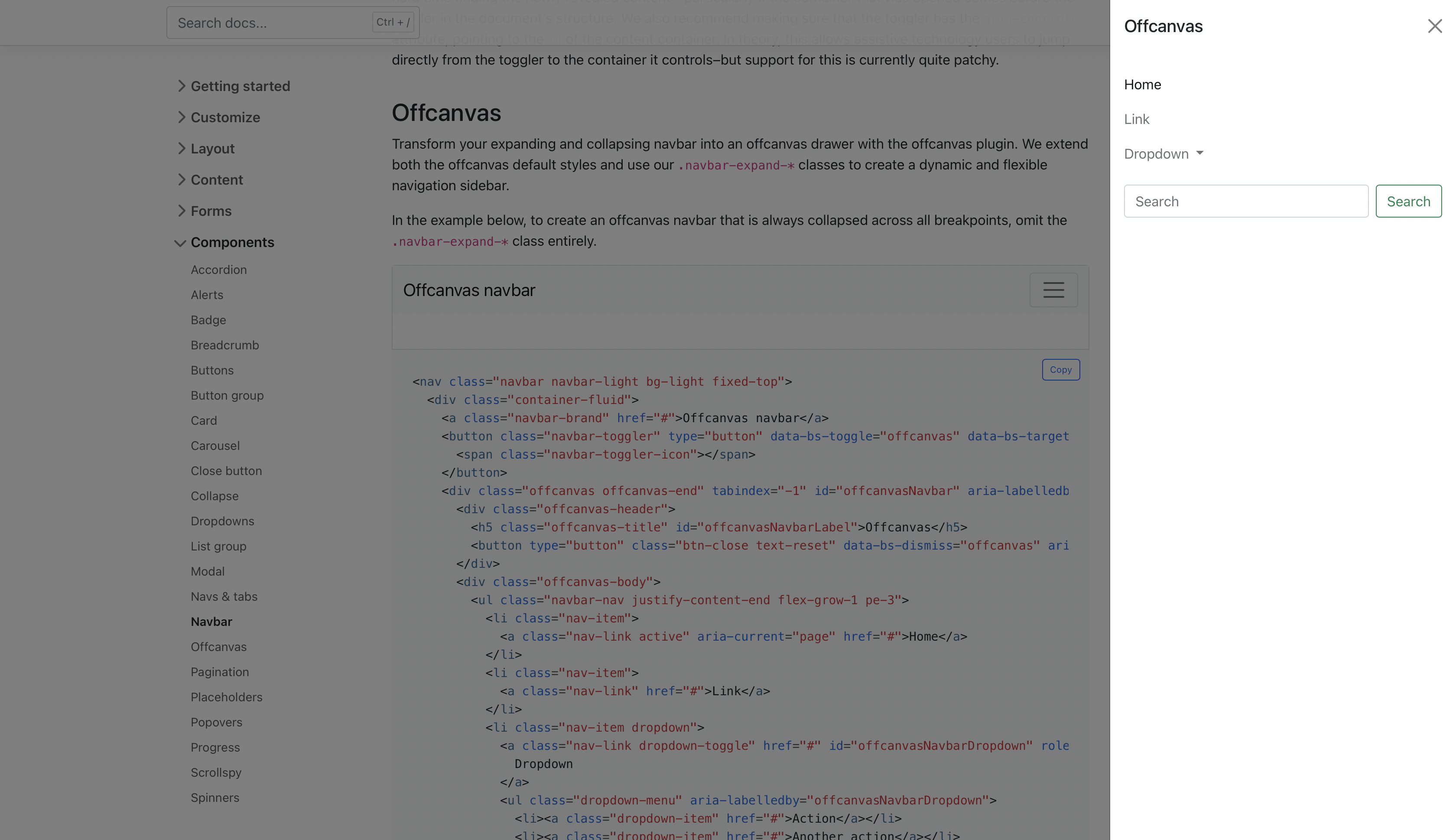
We’ve expanded our .navbar-expand-* classes (see what we did there?) to include support for offcanvases inside the navbar. Wrap your navbar elements with the appropriate offcanvas HTML, point your navbar toggler button to the offcanvas, and voila.
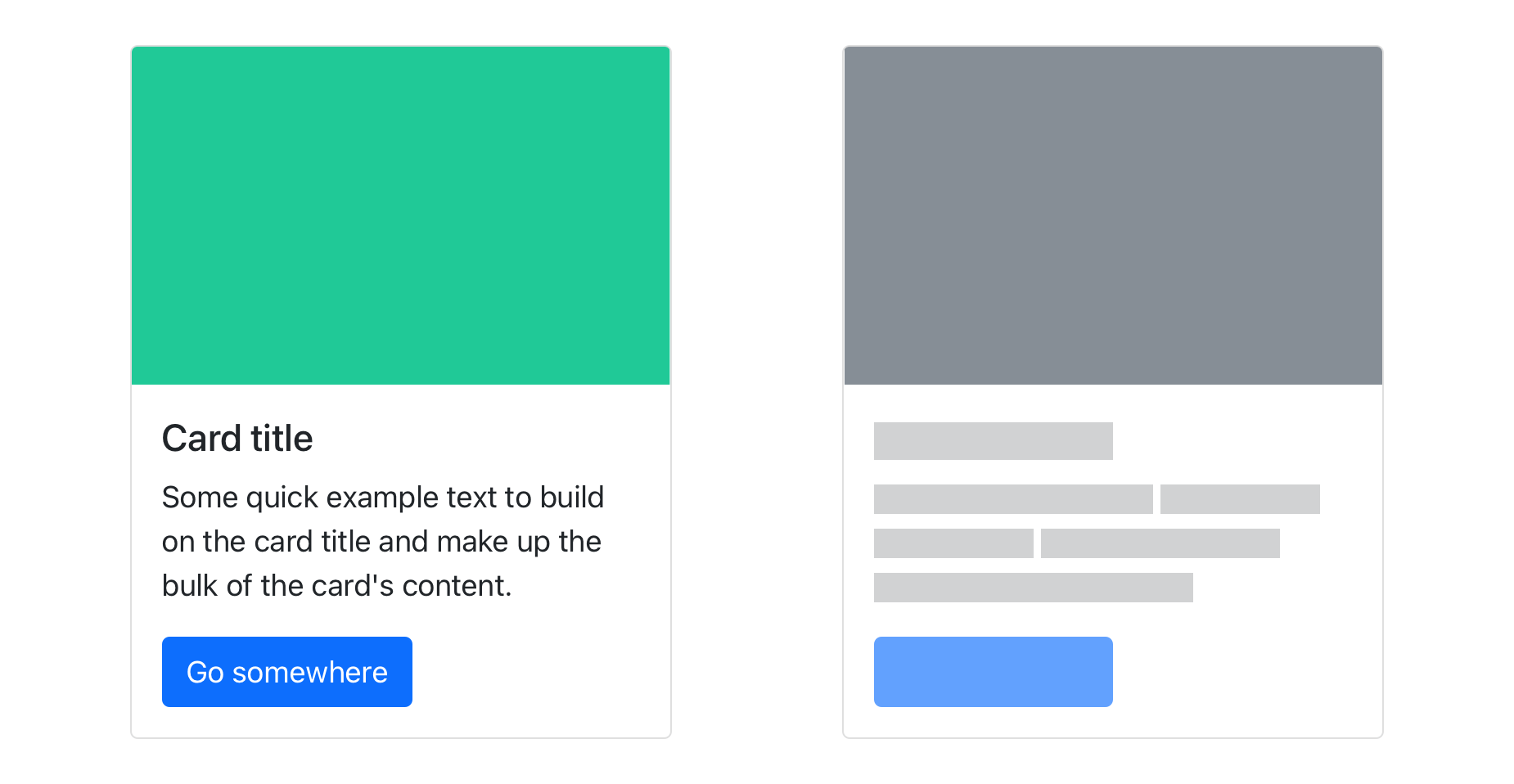
There’s a new component in town with placeholders, a way to provide temporary blocks in lieu of real content to help indicate that something is still loading in your site or app. Our first iteration here aims to only provide the HTML and CSS—it’s up to you to implement these placeholders with whatever custom code you might need.
Consider the basic Bootstrap card component shown above.
<divclass="card"><imgsrc="..."class="card-img-top"alt="..."><divclass="card-body"><h5class="card-title">Card title</h5><pclass="card-text">Some quick example text to build on the card title and make up the bulk of the card's content.</p><ahref="#"class="btn btn-primary">Go somewhere</a></div></div>
Here it is rebuilt with glowing placeholder bars to indicate something is still loading.
Hot damn, we’ve finally added official support for horizontally collapsing! The collapse plugin has been able to detect width vs height for some time (even in v4), but we never had a working example in our docs until now. Add the .collapse-horizontal modifier class to transition the width instead of height and set a width on the immediate child element.
<buttonclass="btn btn-primary"type="button"data-bs-toggle="collapse"data-bs-target="#collapseWidthExample"aria-expanded="false"aria-controls="collapseWidthExample"> Toggle width collapse
</button><divstyle="min-height: 120px;"><divclass="collapse collapse-horizontal"id="collapseWidthExample"><divclass="card card-body"style="width: 300px;"> This is some placeholder content for a horizontal collapse. It's hidden by default and shown when triggered.
</div></div></div>
Heads up! You may need some min-height or height to avoid excessive browser repainting, as we’ve included in our demo above.
Stack and vertical rule helpers
While utilities get most of the spotlight these days, helpers are still incredibly useful. Our newest helpers are called stacks and they’re shortcuts for vertical and horizontal stacks of elements. They’re inspired by the open source Pylon project, which was in turn inspired by iOS’s stacks. Right now, stacks aren’t responsive, but that can easily change with your feedback.
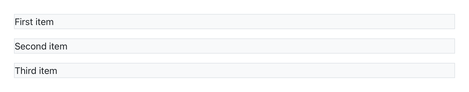
To create a vertical stack, wrap a series of elements in .vstack. Use .gap-* utilities on the parent (or set individual margin utilities) to quickly space elements.
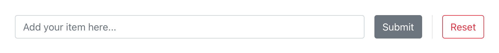
To support these stacks, we’ve also added an additional new helper—.vr, or vertical rule. HTML has had native <hr> elements for the longest time to create horizontal rules, but never anything for vertical rules. The new .vr helper works great in horizontal stacks and other situations where borders are a little trickier.
<divclass="hstack gap-3"><inputclass="form-control me-auto"type="text"placeholder="Add your item here..."><buttontype="button"class="btn btn-secondary">Submit</button><divclass="vr"></div><buttontype="button"class="btn btn-outline-danger">Reset</button></div>
We’ve expanded our :root CSS variables to include our gray color palette, new <body> variables, and new RGB variables for our theme colors. The grayscale colors join our existing color and theme color variables to complete the set of globally available CSS colors. As the development of v5 progresses, these variables will be used more and more in our components to better enable global theming.
Speaking of, our new <body> CSS variables now control the styling of the <body>. This is what you’ll find in the compiled CSS:
Like all our other :root CSS variables, the values for these are generated from our Sass variables. That means that no matter how you customize Bootstrap—via Sass or CSS variables—you haven’t lost any functionality or convenience.
Our new RGB values are built to help us make better use of CSS variables across the entire project. To start, our background-color and color utilities have been updated to use these new RGB values for real-time customization without recompiling Sass and on-the-fly transparency for any background or text color.
Here’s how our .bg-* and .text-* color utilities look now once compiled:
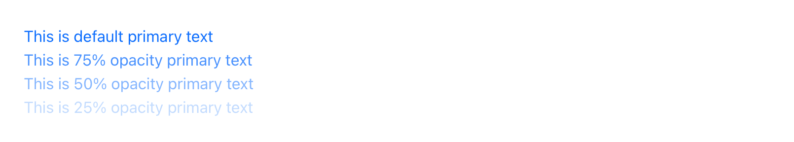
We use an RGB version of each color’s CSS variable and attach a second CSS variable, --bs-text-opacity or --bs-bg-opacity, for the alpha transparency (with a default value 1 thanks to a local CSS variable in the ruleset). That means anytime you use .text-primary now, your computed color value is rgba(13, 110, 253, 1). The local CSS variable inside each .text-* class helps avoid inheritance issues when nesting instances of these classes.
To support these changes, we’ve added some new .text-opacity-* and .bg-opacity-* utilities. Choose from a predefined set (which you can modify in the utilities API) of classes to quickly change the local CSS variable when a given .text-* or .bg-* utility is used. For example:
<divclass="text-primary">This is default primary text</div><divclass="text-primary text-opacity-75">This is 75% opacity primary text</div><divclass="text-primary text-opacity-50">This is 50% opacity primary text</div><divclass="text-primary text-opacity-25">This is 25% opacity primary text</div>
We expect this approach to make its way to border utilities next. Have more CSS variables you’d like to see added? Share your thoughts on a new issue on GitHub. Head to the color utilities or background utilities docs to learn more.
Four new examples
We’ve expanded on our component examples with four new examples that customize some of our core components and implement common patterns. Here’s what’s new:
We’ve variablized the class name for our backdrops that are used across our modal and offcanvas components. This comes with a new class for the offcanvas backdrop, .offcanvas-backdrop, and perhaps more importantly, some updated z-index values.
Previously, there was a single offcanvas z-index between the modal and modal backdrop z-indexs, due to offcanvas sharing the modal’s backdrop.
// Before v5.1.0
$zindex-modal-backdrop:1040!default;$zindex-offcanvas:1050!default;$zindex-modal:1060!default;
We’ve changed this to allow offcanvases and modals to work together better with separate z-index values for offcanvas, the offcanvas backdrop, modal, and the modal backdrop.
// After v5.1.0
$zindex-offcanvas-backdrop:1040!default;$zindex-offcanvas:1045!default;$zindex-modal-backdrop:1050!default;$zindex-modal:1055!default;
Unless you’ve modified the offcanvas component or its Sass variables, there should be no breaking changes for you.
And more!
There’s a lot more in this release that we didn’t include in the highlights above:
Reverted the ability for .col-* classes to override .row-cols-* as it caused some breaking bugs in our layouts. We’ll revisit and restore it when we can engineer it in a more scalable and easy to maintain way.
Added new .opacity-* utilities (with 0, .25, .5, .75, and 1 as default values).
Updated several JavaScript plugins with some major cleanups—alerts, collapse, dropdowns, popovers, and tooltips.
Plugins now accept arguments of different types in the getInstance method.
Added new Sass maps for all our colors, as well as a new map-merge-multiple() function to combine Sass maps.
Updated data-dismiss on modals so that it can be outside of a modal using bs-target.
Updated toasts to change show timings and classes to keep toast display: none by default.
Added Shift + Tab keyboard support to modal and offcanvas components.
Renamed Build Tools page to Contribute to better communicate its purpose.
Fixed Manipulator.offset() in Scrollspy to improve scroll position detection.
Our latest patch release has arrived to improve our JavaScript plugins, address the / deprecation in Dart Sass, fix a few CSS bugs, and make some documentation improvements.
Sass division
One of the biggest fixes in Bootstrap v5.0.2 patches the deprecation of / for performing division in Sass. The Dart Sass team deprecated it due to the use of / characters in actual CSS (e.g., separating background values). The bad news was this shipped with deprecation notices, which in our case heavily polluted the build process for everyone. Our potential solutions included:
Ignore it entirely and silence the deprecation warnings
Drop implicit support for LibSass and use the Dart Sass math module
Figure out a custom fix to keep the widest possible Sass support
We chose the third option—keeping support for both LibSass and Dart Sass, even though the former is deprecated. There are many projects out there that simply haven’t or cannot update to Dart Sass (including Hugo, which we use to build our docs).
Our solution meant rolling a custom divide() function and replacing division with multiplication wherever possible. We wanted to limit the use of a custom function, so the situations where we used $value / 2 were replaced with $value * .5. This custom function has also been added to the RFS project in a new release. While the precision in our compiled CSS has been reduced by two decimal places, the output remains otherwise unchanged.
If you have any ideas or suggestions on further improvements, please don’t hesitate to open an issue.
Highlights
Here are some highlights from the changelog.
CSS
Fixed deprecation warnings in Sass for / division. Replaced most / division with multiplication and added a custom divide() function to avoid adding Dart Sass modules (as this would negate the usage of LibSass).
Individual .col-* grid classes can now override .row-cols.
Updated line-height for floating forms to fix cut-off select menu text.
Added missing transition to .form-select.
Fixed .dropdowns-menu-* position in RTL.
Decoupled --bs-table-bg and --bs-table-accent-bg to separate table accent highlights.
Improved support for complex expressions in add() and subtract() functions.
Fixed horizontal padding for select elements in Firefox.
Updated border color for popover header to match the outer border.
Fixed offcanvas header alignment for RTL.
JavaScript
Popovers now remove titles or content when they’re empty instead of returning empty HTML elements.
Dropdown items are now automatically selected when using arrow keys.
We now register only one DOMContentLoaded event listener in onDOMContentLoaded utility function.
Fixed arrow keys breaking animation when the carousel sliding.
Fixed handling of transitioned events dispatched by nested elements (e.g., modals didn’t transition when clicking buttons).
Fixed backdrop errors with stale body cause by unnecessary default and removeChild.
Fixed issue where the show.bs.modal event with the .fade class prevented modals from being displayed again.
Fixed isVisible false positives.
Added getOrCreateInstance method in our base component that is applied to all components.
Docs
Documented how to make utilities responsive using the API. Also added !important to the sample output CSS and mentioned the $enable-important-utilities global setting.
Added a mention of the breakpoint mixins changes from v4 to the migration guide.
Added a new example of positioned badges to the docs.
Clarified variable overrides in the Customizing > Sass page.
Our first patch release for Bootstrap 5 has landed with v5.0.1! We’ve fixed a handful of bugs in our CSS and JS while also resolving a few issues with our docs and examples.
Changelog
Fixed an issue where dropdowns wouldn’t close after clicking into an <input>
Validated inputs in .input-groups no longer render behind sibling elements
Prevent accent-bg from leaking in nested tables
Modal backdrops no longer throw Uncaught TypeError when initialized through JS
Refactored disposing properties into the base component
Extracted static DATA_KEY and EVENT_KEY to the base component
Merged transitionend listener callbacks into one method
Popovers and tooltips have a streamlined config property
Toasts no longer automatically hide on focus or hover
No longer redefining $list-group-color in the list group loop
Our docs and examples also received a few updates:
Fixed Sidebars example not rendering correctly in Chrome
Fixed RTLCSS stringMap configuration snippet
Updated offcanvas navbar example to prevent console error
Fixed miscellaneous typos, grammatical errors, and links in the Migration guide
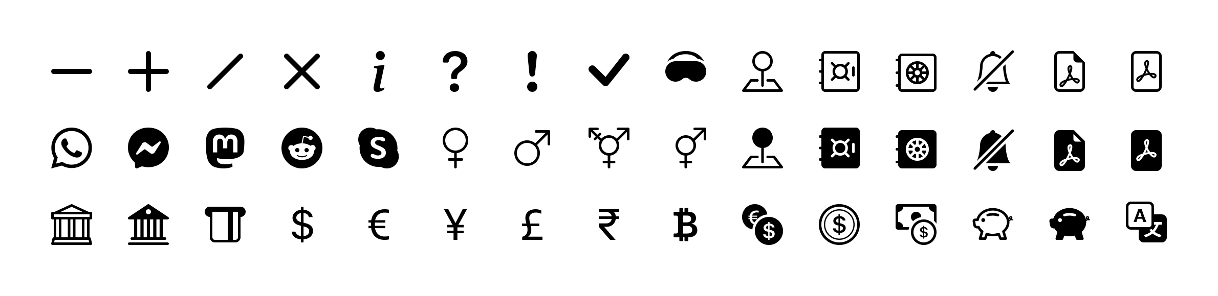
Bootstrap Icons v1.5.0 adds 45 new icons across a few categories as I continue to round out the set. Keep reading to see what’s new!
45 new icons
The primary goal with this release was to round out some of the most requested icons to date. Here’s the lowdown:
First up are large versions of our dash, plus, slash, x, and other alert signage icons. The existing icons are based on their placement in other shapes, so rather than upsize those ones and potentially break things for folks, I’ve added new large options.
Commerce icons have a huge update with new currency options, banks, insert credit card, vaults/safes, and even a couple piggy banks.
For people and identity, we’ve added our first gender icons for female, male, trans, and ambiguous. It’s just the start, as I’m sure there are significant gender and identity roles I’m missing. Please open an issue with feedback if there are improvements I can make here to be more inclusive of everyone.
On the communications side, there’s finally a translate icon and bells with slash.
And to round it out, there’s a new VR headset icon, a couple new geo pin icons, and some new social options like Messenger, Reddit, WhatsApp, and more.
The Figma file is now published to the Figma Community! It’s the same Bootstrap Icons Figma file you’ve seen from previous releases, just a little more accessible to those using the app.
Bootstrap 5 has officially landed! After three alphas, three betas, and several months of hard work, we’re shipping the first stable release of our new major version. It’s been a wild ride made possible by our maintainers and the amazing community that uses and contributes to Bootstrap. Thanks to all who have helped us get here!
Keep reading for details on what’s new compared to v4 and what’s coming for subsequent releases. Want to get right to it? Head to the new v5 docs or fly by the seat of your pants and just npm i bootstrap.
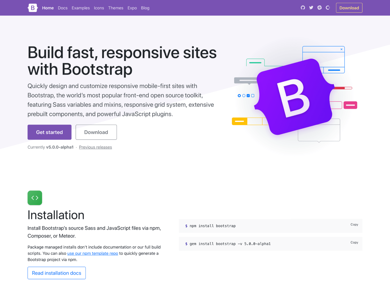
One of the biggest changes with v5 came with our redesigned logo and updated docs design. Inspired by the work we’ve done in Bootstrap Icons, our new logo is a callback to CSS’s curly braces and our longstanding B icon. It’s a small upgrade, but a fun one nonetheless, and one that we feel helps set the tone for this new major release. Still the same Bootstrap, just slightly refined. 😅
And the new docs are brighter, better organized with new content sections, and also feature improved navigation.
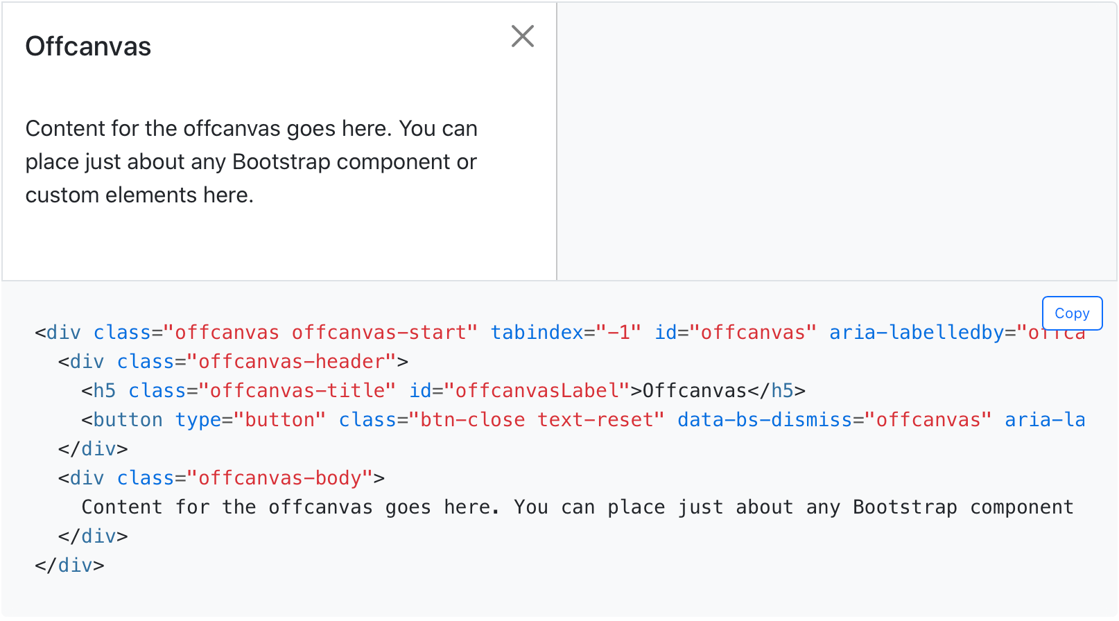
New offcanvas component
One of our big new component additions is the all-new offcanvas!
Built on and sharing fundamental pieces of our modals, our new offcanvas component comes with a configurable backdrop, body scroll, and placement. Offcanvas components can be placed on the top, right, bottom, or left of the viewport. Configure these options with data attributes or via the JavaScript APIs.
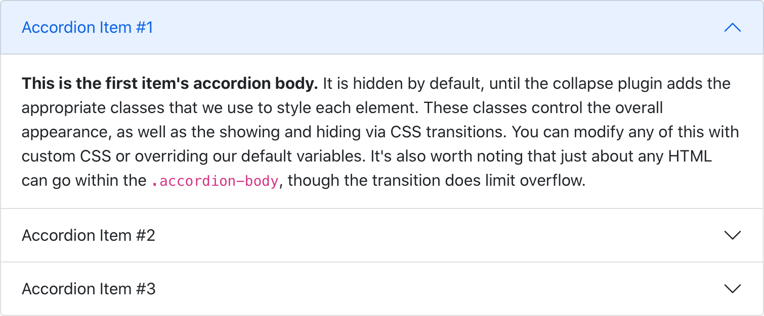
New accordion
We’ve replaced our .card accordion component with a brand new .accordion component, solving several bugs in the process. Our new accordion still uses the Collapse JavaScript plugin, but with custom HTML and CSS to support it, it’s better and easier than ever to use.
The new accordion includes Bootstrap Icons as chevron icons indicating state and click-ability. We’ve included support for a flush accordion (add .accordion-flush) to remove the outer borders, allowing for easier placement inside parent elements.
We’ve overhauled our Forms documentation and components. We’ve consolidated all our forms styles into a new Forms section (including the input group component) to give them the emphasis they deserve.
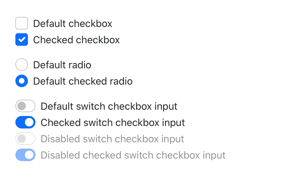
Alongside new docs pages, we’ve redesigned and de-duped all our form controls. In v4 we introduced an extensive suite of custom form controls—checks, radios, switches, files, and more—but those were in addition to whatever defaults each browser provided. With v5, we’ve gone fully custom.
Checks and radios
If you’re familiar with v4’s form markup, this shouldn’t look too far off for you. With a single set of form controls and a focus on redesigning existing elements vs generating new ones via pseudo-elements, we have a much more consistent look and feel.
Every checkbox, radio, select, file, range, and more includes a custom appearance to unify the style and behavior of form controls across OS and browser. These new form controls are all built on completely semantic, standard form controls—no more superfluous markup, just form controls and labels.
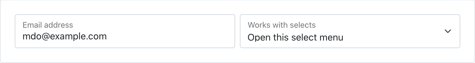
Floating labels
Floating labels include support for textual inputs, selects, and textareas. We have one limitation with textareas where multiple lines of text can be obscured by the floating label. We’re working on fixes for this, so if you have ideas, please let us know!
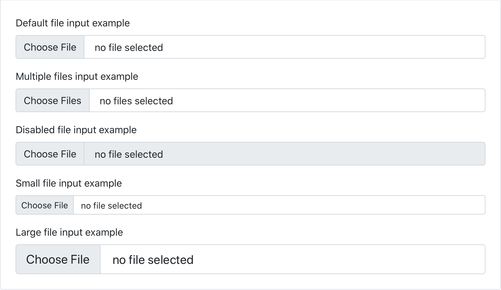
New file input
We’ve dropped our custom .form-file class for additional styles on the .form-control class. This means we no longer require additional JavaScript to make our file input styles functional—the new form file is all CSS!
Simplified layout
Using our new grid updates, form layout has never been easier. We’ve dropped the .form-group, .form-row, and .form-inline for the grid system.
Five new RTL Examples that show our new RTL CSS in action, converting our Album, Checkout, Carousel, Blog, and Dashboard examples into all-new right-to-left equivalents.
Our approach is built on RTLCSS, an awesome project that helps reprocess an existing LTR stylesheet for RTL. We’ve classified it as an experimental feature for now, anticipating that we’ll get some of this wrong. We’re looking to the community to help us round out the feature as we wrap up some remaining todos.
Overhauled utilities
Given the love utility-driven frameworks have garnered the last few years, we’ve invested in adding more utilities to Bootstrap along with a new method of managing them across your projects.
New utilities API
We’ve implemented a brand new utility API into Bootstrap 5 as the primary way to extend Bootstrap’s default utility classes. Easily generate and customize utilities with support for custom class names, support for generating state-based classes like :hover, print versions, and more.
Ever since utilities become a preferred way to build, we’ve been working to find the right balance to implement them in Bootstrap while providing control and customization. In v4, we did this with global $enable-* classes, and we’ve even carried that forward in v5. But with an API-based approach, we’ve created a language and syntax in Sass to create your own utilities on the fly while also being able to modify or remove those we provide.
Part of our approach to adding RTL to Bootstrap was to add it in a way that felt future-friendly to ourselves and the web at large. As such, we’ve embraced the spirit of CSS logical properties and have renamed several classes and variables. It’s a risky change because of the size and impact of the change, but we hope you’ll appreciate it overall!
Most of you have already interacted with logical properties thanks to our flex utilities—they replace direction properties like left and right in favor start and end. Things like align-items-end have been welcomed additions. This makes horizontal directional class names appropriate for LTR and RTL without any additional overhead moving forward.
For example, in a LTR context, instead of .ml-3 for margin-left, use .ms-3. Be sure to read the RTL Migration guide for a full list of renamed classes and variables.
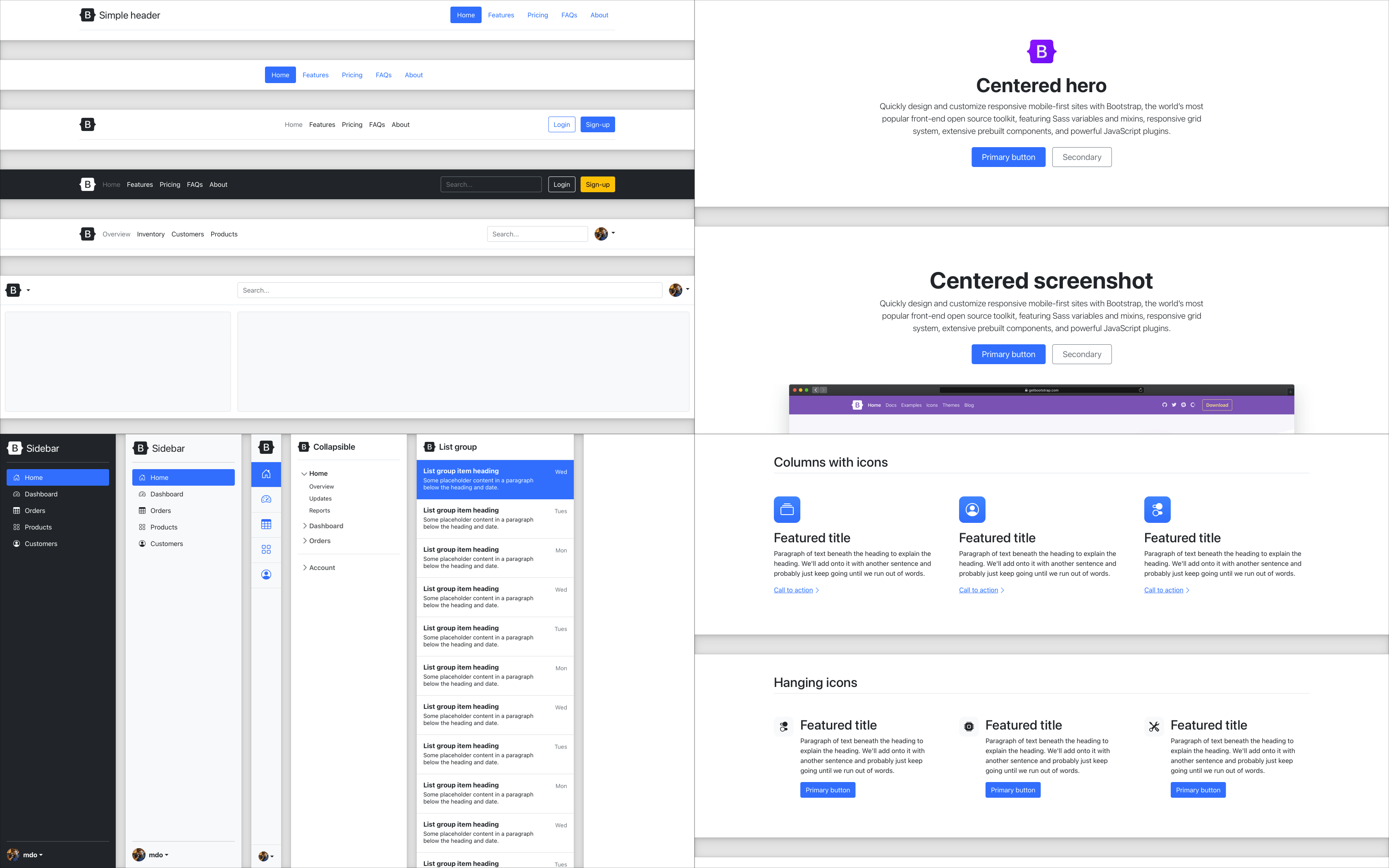
New snippet examples
We’ve added four brand new snippet-heavy examples and refreshed a few other examples while we were at it. These new snippet examples feature several variations of common components, served up in different ways for you to easily copy and paste.
These new snippets will continue to grow with new additions over time, showing just how fun and easy it is to build with Bootstrap.
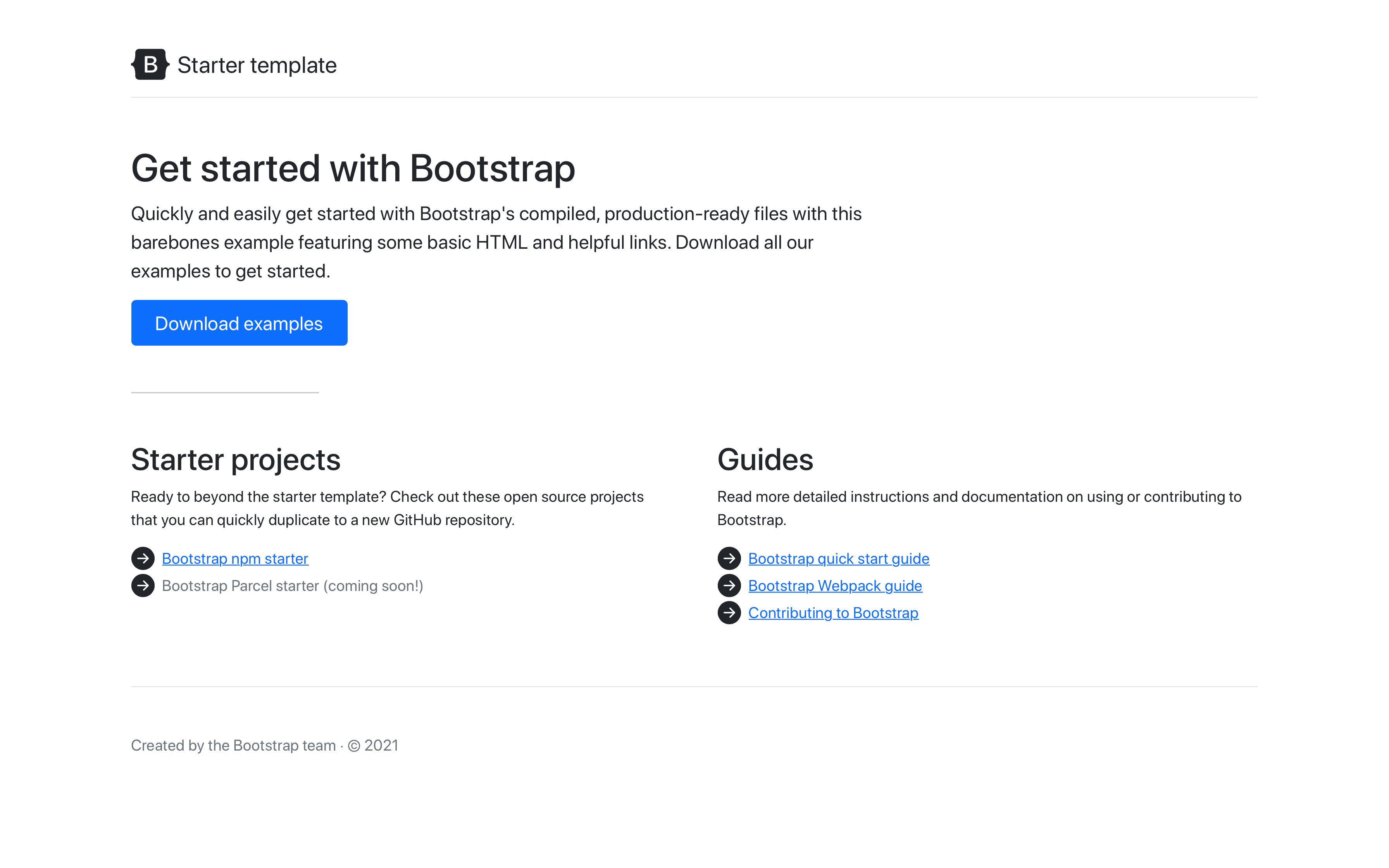
We’ve also updated our starter template with a refreshed design and more resources.
Grid and layout
Our grid system and layout options saw some changes to streamline and improve things, namely:
Column classes can now be used as width utilities (e.g., .col-6 is width: 50%) as padding is no longer applied outside a .row.
New gutter utilities can responsively customize horizontal and vertical grid gutters. The gutter width has also been reduced to 1.5rem.
Removed position: relative from column classes
Dropped the .media component for utilities
We also updated our layout documentation to break apart the exceptionally long pages into more focused topics. We’ve also added a clarified explanation of breakpoints, containers, and more.
Across the board we’ve made a number of other enhancements and changes to key components:
We’ve overhauled the JavaScript and positioning for our dropdowns as part of our adoption of Popper 2. You can see all the options in a new example in our docs and new CSS selectors and data attributes used to position them.
Dropdown menus now have a new .dropdown-menu-dark modifier class.
Similarly, carousels now have a new .carousel-dark modifier class to invert the controls, text, and indicators.
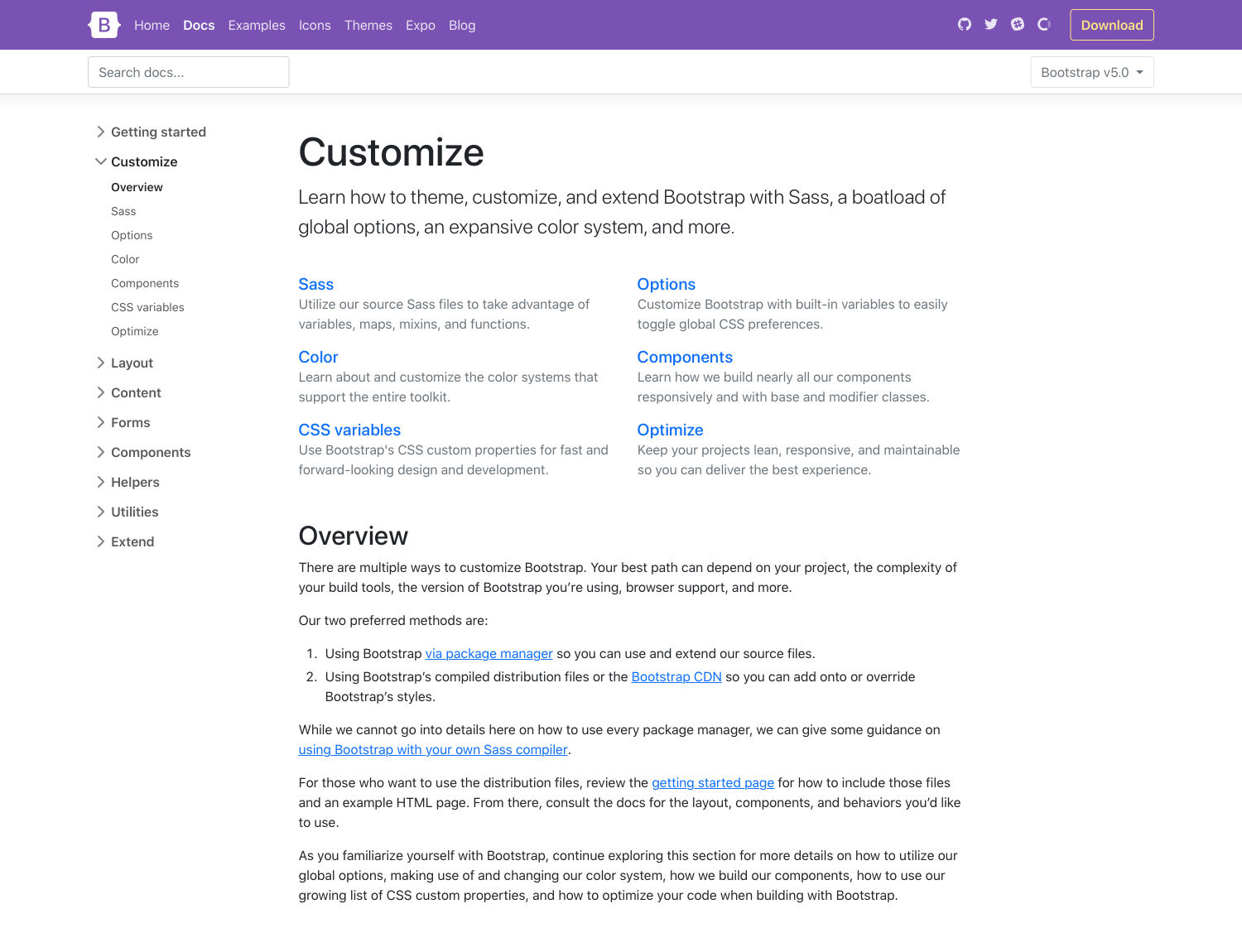
We’ve hunkered down and improved our documentation in several places, giving more explanation, removing ambiguity, and providing much more support for extending Bootstrap. It all starts with a whole new Customize section.
v5’s Customize docs expand on v4’s Theming page with more content and code snippets for building on top of Bootstrap’s source Sass files. We’ve fleshed out more content here and even provided a starter npm project for you to get started with faster and easier. It’s also available as a template repo on GitHub, so you can freely fork and go.
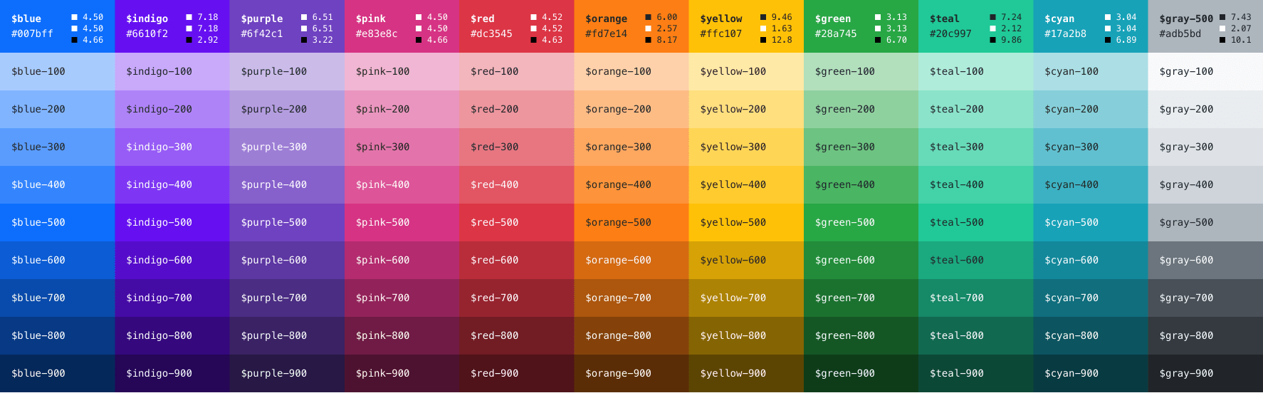
We’ve expanded our color palette in v5, too. With an extensive color system built-in, you can more easily customize the look and feel of your app without ever leaving the codebase. We’ve also done some work to improve color contrast, and even provided color contrast metrics in our Color docs. Hopefully, this will continue to help make Bootstrap-powered sites more accessible to folks all over.
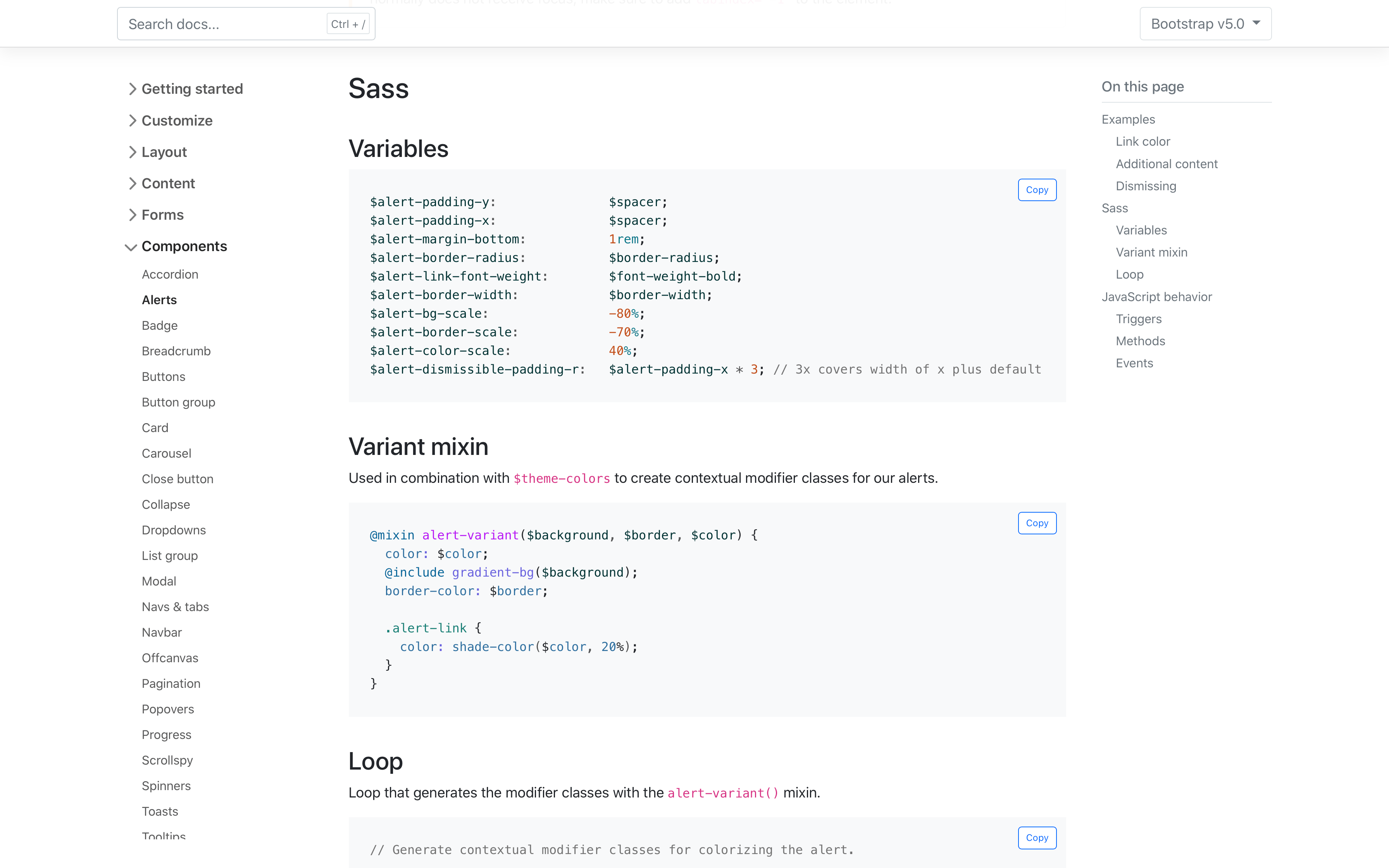
We’ve also added new sections to most of our pages to document the source Sass code that powers each component. Variables, mixins, loops, and maps are all rendered and kept up to date in each page, making it easier to reference and customize values as you build.
Dart Sass
We’ve switched to Dart Sass with LibSass being deprecated. We’ve been testing our builds with Dart Sass for a while and decided to make the switch with LibSass being deprecated just a couple of weeks ago. We’re holding on to the Sass modules for now. We’re still not using the new module system for compatibility concerns and a greater gap for folks upgrading from v4.
Browser support
We’ve dropped a ton of older browsers in this update, making it one of our biggest leaps in a while:
Dropped Microsoft Edge Legacy
Dropped Internet Explorer 10 and 11
Dropped Firefox < 60
Dropped Safari < 10
Dropped iOS Safari < 10
Dropped Chrome < 60
Dropped Android < 6
You can find the full browser and device support in our .browserslistrc.
JavaScript
The biggest change to our JavaScript has been the removal of jQuery, but we’ve also made a number of enhancements beyond that as well.
No more jQuery!
All plugins can now accept a CSS selector as the first argument.
Updated to Popper 2!
Data attributes for all JavaScript plugins are now namespaced with bs. For example, we use data-bs-toggle instead of data-toggle.
We overhauled dropdown, popover, and tooltip placement with the arrival of Popper v2.
Toast positioning was also overhauled and now leverages our new position utilities.
Added ability to use custom classes for tooltips and popovers.
Made various optimizations to better share code across components.
Changed dropdowns to emit events on .dropdown-toggle instead of .dropdown.
Removed underscore from public static methods like _getInstance() to getInstance().
Renamed whiteList to allowList in popovers and tooltips`
Migration guide
We’ve updated our migration guide page to consolidate all our changes across the six pre-releases into a single set of changes. We’ve condensed much of the content this way and added Breaking change labels throughout to help draw you attention to potential gotchas while upgrading.
We still think there’s more to do here—including tutorial-like guidance on the code changes, diffs and code snippets for our dependencies, etc. If you have suggestions or want to contribute, please open an issue or pull request.
Head to https://getbootstrap.com to explore the new release. We’ve also published this update as our new latest release on npm, so if you’re feeling bold or are curious about what’s new, you can pull the latest in that way.
Feel free to open issues or pull requests if you have any additional ideas for upcoming releases!
v5.1.0 preview
While we were polishing up this release, we also had our eyes towards the future to ship a few minor releases. Here’s a quick look at what’s coming in our next minor release, v5.1.0:
Our latest Bootstrap Icons update has arrived to fix a few bugs and improve our build tooling. Keep reading for what’s new.
Key changes
Here are the highlights from this release:
Updated: PowerPoint icons now look more capitalized
Fixed: skip-forward and skip-backward icons are now properly named
Fixed: mic and record icons no longer appear filled
Fixed: Codepoints for icon font will no longer change between versions
Upgraded SVGO to v2.3.0, bringing some minor SVG optimizations to ~200 icons
The update to codepoints is the most important change in this release. It ensures the content property values for each icon doesn’t change. This gives our icon font more stability between versions, allowing for easier upgrades and maintenance.
Our final beta for Bootstrap 5 has come with some amazing new changes (including a new component!), documentation updates, and more. We’ve also fixed some important bugs since our last release, in particular with our dependencies. Next up is our stable release!
Keep reading for a recap of what’s new in Beta 3.
New offcanvas component
Thanks to our newest team member, @GeoSot, we have a brand new component to unveil in Beta 3—introducing offcanvas! Built on and sharing fundamental pieces of our modals, the offcanvas comes with configurable backdrop, body scroll, and placement. Offcanvas components can be placed on the left, right, and bottom of the viewport. Configure these options with data attributes or via the JavaScript APIs.
We’re excited about iterating on the new offcanvas component and building additional examples and demos with you. Please share any feedback on an issue or pull request as you start to use it in your projects.
New and refreshed examples
Our examples have been updated in Beta 3 as well. We’ve added four brand new snippet-heavy examples and refreshed a few others. New with this release are several snippets for headers, heroes, features, and sidebars. These new snippets will continue to grow with new additions over time, showing just how fun and easy it is to build with Bootstrap.
We’ve also updated our starter template with a refreshed, simplified design and more resource links. We’ll also incorporate this new look and feel into our npm starter project project, and eventually add a Parcel starter project.
Lastly, we’ve updated our pricing, checkout, and sign-in examples. We’ve also added a new jumbotron example to show you how to create your own jumbotron since we removed it in Bootstrap 5.
Improved Sass docs
Since our last release, we’ve added a new section to nearly every component and utility documentation page for the source Sass code. Where appropriate, we now list Sass variables, maps, loops, and animation keyframes. These are directly linked from our source files, so whenever we ship new code, they’ll automatically be up-to-date.
And more!
Some highlights from the rest of our documentation updates and bugfixes include:
Updated .browserslistrc to drop Android and add Safari/iOS 12 as the new minimum version (completing our two latest major releases guideline for supported browsers).
A huge thanks to another new team member, @rohit2sharma95, for the dozens of pull requests, bug fixes, and code reviews for our JavaScript plugins.
Get the release
Head to https://getbootstrap.com to explore the new release. We’ve also published this updated as a pre-release to npm, so if you’re feeling bold or are curious about what’s new, you can pull the latest in that way.
npm i bootstrap@next
What’s next
Looking ahead, we’re eyeing our first stable release for Bootstrap 5! But we also have some other releases on the horizon:
As mentioned in our last release, after v5 goes stable, we’ll look to add some of the awesome features we’ve built up in our backlog. Check out the v5.1 project for an idea of what’s being planned. Feel free to open issues or pull requests if you have any additional ideas!
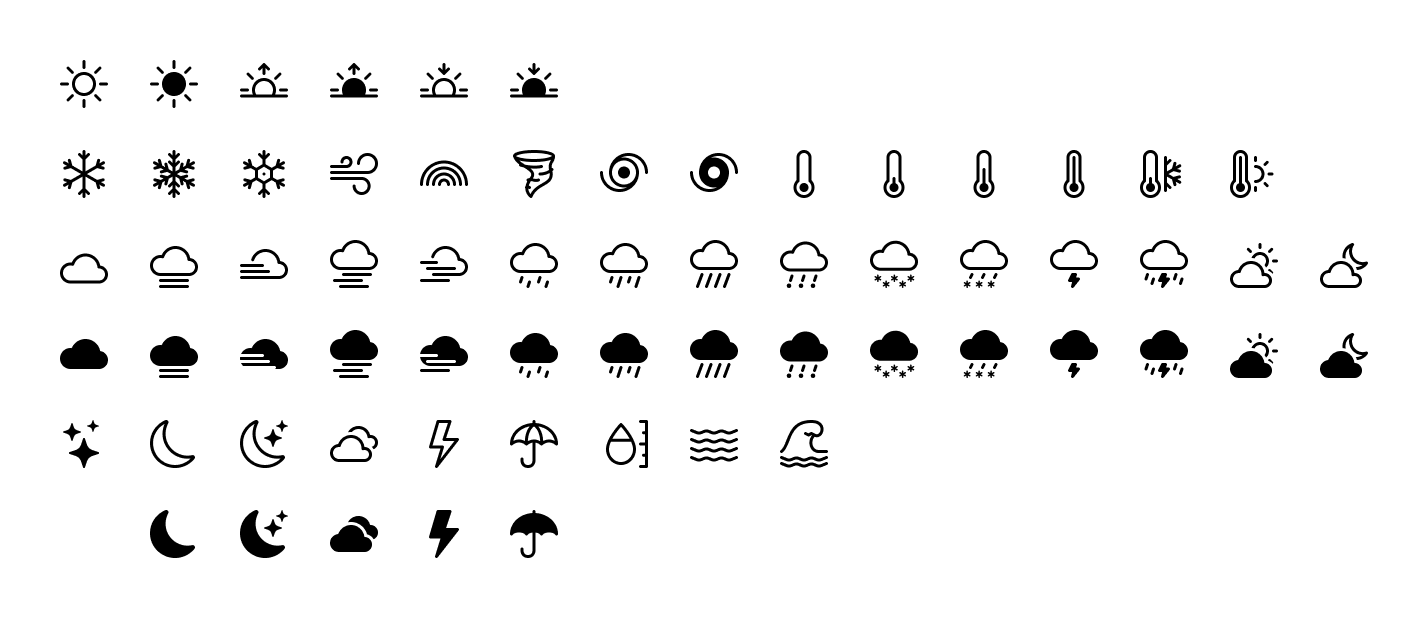
Bootstrap Icons v1.4.0 adds over 60 new icons as part of a brand new weather category. Also included are some long requested improvements to vertical alignment and a handful of updates to tags and categories.
Keep reading for a preview of the new icons and how icon alignment has changed.
60+ weather icons
The new weather category includes over 60 icons for various weather and atmospheric conditions. From fog and haze to rainstorms and hurricanes, we now have icons for just about every weather situation. We undoubtedly have some more work to do to refine and add to this new category, but it’s a pretty big addition to the project. Let us know what you think and what’s missing so we can keep adding to it over time.
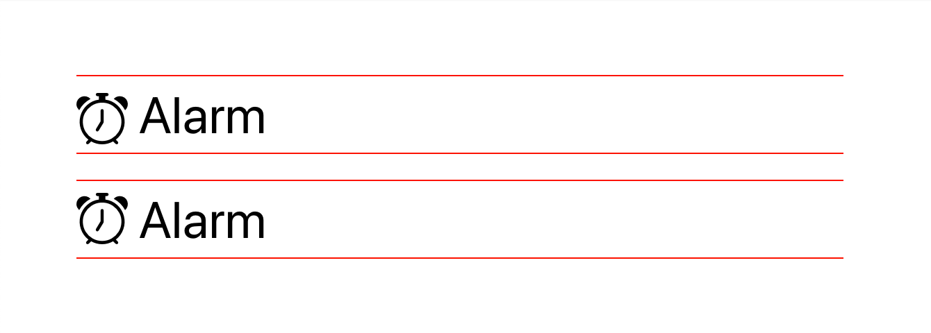
Alignment changes
Also new in v1.4.0 are some alignment changes—before and after are shown above. Previously we used vertical-align: text-top in our CSS to aligning individual icons. This wasn’t as much of an issue when we only had SVGs, but with the addition of icon fonts and their generated CSS in v1.2.0, we had to make some changes.
New in this release is a change to vertical-align: -.125em. This new alignment is similar to that found in the tried and true Font Awesome project. This change essentially raises icons up about 1px to better vertically center them with nearby text.
It may not be perfect in all implementations, so additional changes might still be needed, but this should give you a stronger baseline to start (pun intended). Should you still run into issues, please don’t hesitate to open an issue on GitHub.
And more…
We’ve also made several updates under the hood, from dependencies to build tools. This has resulted in improved speeds for our development scripts and more resilient tooling for packaging our icons. We’ve also included category names into the fuzzy search on the homepage, making it a lot easier to search for groups of icons.
We still have some work to do on our docs and search, so stay tuned as we’ll eventually add category pages and more for easier browsing and navigating. If you’re reading this and want to help improve the Bootstrap Icons docs, please consider opening a PR anytime.
 @mdo
September 07, 2021
@mdo
September 07, 2021
