Alpha 3 has landed! We have an overhauled grid, updated form controls, a new font stack, tons of bug fixes, and more. It’s been several months since our last update, but the size of this update should help get us back on track.
Work on Alpha 3 started rather broadly, addressing bug fixes and docs updates of all shapes and sizes, but finished with a narrow focus on our form controls and grid system. If you’ve followed the development in our v4-dev branch, you might already be familiar with some of these bigger changes.
The grid system was overhauled with three major pull requests—#19099, #20349, and #20361. Those PRs largely focused on the following changes:
Our ready-made grid classes (containers and columns) are now behind a Sass variable, meaning grid classes can easily be disabled via Sass variable. Update the boolean $enable-grid-classes variable and recompile to remove them.
Grid modifier classes are simpler and no longer require the col- prefix. For example, instead of .col-offset-*-*, .col-push-*-*, and .col-pull-*-*, we now have .offset-*-*, .push-*-*, and .pull-*-*.
Mixins have been changed, and then changed again, to in an effort to keep generated classes simple and cooperative between standard and flexbox modes. Our two primary column mixins are now make-col-ready, which houses the position, padding-*s, and min-height (to prevent collapsing empty columns), and make-col for setting the float and width.
Added a grid customization section to the docs to explain how to change the number of columns, grid tier breakpoints, container widths, and more.
These changes are available in our standard grid, as well as our flexbox grid. More on that below.
Flexbox
Flexbox mode has been updated across the board in Alpha 3, starting from the grid system (it uses the same variable and the updated Sass mixins) and moving through our utilities and components.
New flexbox grid docs. In addition to the standard grid docs, we now have a dedicated docs page for our flexbox grid as it behaves slightly differently than the standard grid. This new page includes details on how and why this grid works the way it does, as well as additional code examples.
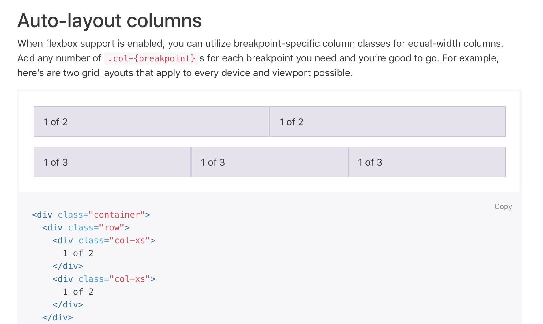
Automatic equal-width column sizing with new .col-{breakpoint} classes. For example, for three equal-width columns at the xs breakpoint, you’d create three columns each with just .col-xs.
New flexbox alignment utility classes for vertically and horizontally distributing items. Works with our flexbox grid, as well as just about any other custom component.
Forms
Forms saw a ton of activity early on in Alpha 3’s development. Documentation, class names, layout options, and validation styles have all been drastically improved.
New classes for checkboxes, radios, input sizing, and legends. While not 100% final, all our form controls are named more clearly and consistently across our CSS.
Replaced the base64 PNG background images with inline SVGs for our custom form controls and validation states. Scale those form controls to your heart’s content!
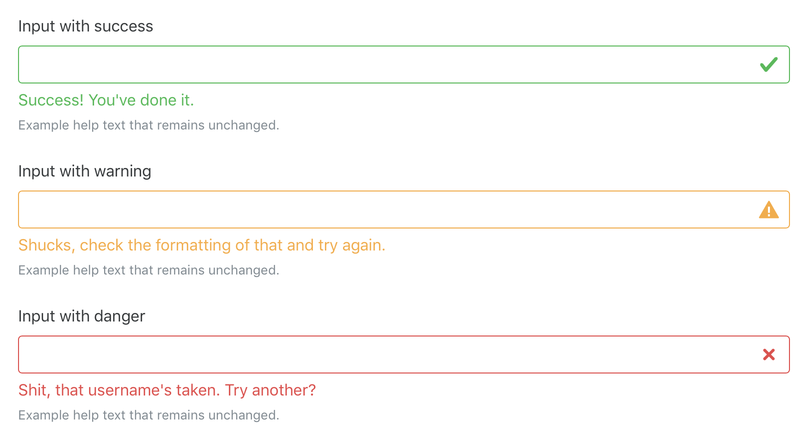
Speaking of validation states, we have brand new form validation and help text options. Validation states can now be applied on a per-input basis (with .form-control-{state}) and optional validation feedback can be shown with .form-control-feedback. Independent form help text can now be controlled with the new .form-text class.
<divclass="form-group has-success"><labelclass="col-form-label"for="inputSuccess1"> Input with success
</label><inputtype="text"class="form-control form-control-success"id="inputSuccess1"><divclass="form-control-feedback"> Success! You've done it.
</div><smallclass="form-text text-muted"> Example help text that remains unchanged.
</small></div>
Fixed a few form related bugs, like the horizontal label padding in #17498, misuse of <fieldset>s for form groups, sizing classes not applying to <select>s, and more.
Documentation for forms has been overhauled. We have simpler examples of our available form controls, clearer guidance on validation states (and when to use each), and more.
System fonts
We’ve replaced the decades old Helvetica/Arial font stack with a system font stack, utilizing newer, more readable, and more powerful fonts that companies like Apple, Google, and Microsoft have specifically designed for today’s devices.
Originally this was planned to affect Linux users, but font usage and support is rather inconsistent across distros and user preferences. For that reason, there’s no intended font change for folks on Linux.
And so much more…
There were nearly 1,200 commits to Alpha 3 and this post barely scratches the surface. We’ve fixed dozens of other bugs and worked hard to improve our documentation across the board.
More exploration, more bugfixes, more docs updates, and, best of all, more alphas. The daily grind keeps us super busy these days, but we’ll do our best to keep the momentum going. Stay tuned!
Bootstrap 4 alpha 2 is now available. Since our last release, nearly 100 people have pushed over 900 commits to v4 and we’ve closed over 400 issues and pull requests. Those numbers are outrageously awesome to see, and we’ve still got a ton of work ahead of us this year for v4.
As mentioned in our last post, the general plan for v4’s development starts with a few alpha releases. We’re a little behind on that, but should be getting caught up as the year winds down. Expect another alpha or two this month to really round things out.
Here’s a look at a handful of the changes since our last alpha:
Overhauled spacing utilities to use a numerical tiering (to avoid confusion with grid tiers).
Continued refactoring efforts to replace markup-specific selectors with classes across several components (including pagination, lists, and more). Still more to do here with additional components.
Reverted media queries and grid containers from rems to pixels as viewports are not affected by font-size. See #17403 for details. We’ve got a ton of grid work left, too. Feel free to follow along with #18471.
Reverted .0625rem width borders to 1px for more consistent component borders that avoid zoom and font-size bugs across browsers.
Renamed .img-responsive to .img-fluid to avoid future confusion on the various responsive image solutions out there.
Replaced ZeroClipboard with clipboard.js for Flash-independent copy buttons.
Inputs and buttons now share the same border variable to ensure components are always sized similarly.
Updated all pseudo-element selectors to use the spec’s preferred double colon (e.g., ::before as opposed to :before).
Cards now have outline variants and mixins to support extending base classes further.
Utility classes for floats and text alignment now have responsive ranges. This means we’ve dropped the non-responsive classes to avoid duplication.
Added support for jQuery 2.
And hundreds more Sass improvements, bug fixes, documentation updates, and more.
We highly encourage folks to skim through the second alpha’s milestone on GitHub for a better idea of what’s changed across the board. You can also follow along with other v4 efforts with the v4 label on our issue tracker.
Bootstrap 3.3.6 is here! It’s a long overdue release that addresses dozens of CSS bug fixes and documentation updates. We’ve had over 180 commits and 100 closed issues and pull requests from nearly 30 contributors since our last release. Woohoo!
Here are some of the highlights:
Added support for an official NuGet package (yeah, it’s an old one, but folks still use it!).
Enabled source maps for our compiled minified CSS.
Updated over a dozen browser bug entries as browsers continue to fix bugs (aww yeah!).
Updated several JavaScript plugin docs to clarify usage.
Made local documentation development easier with a local jQuery fallback.
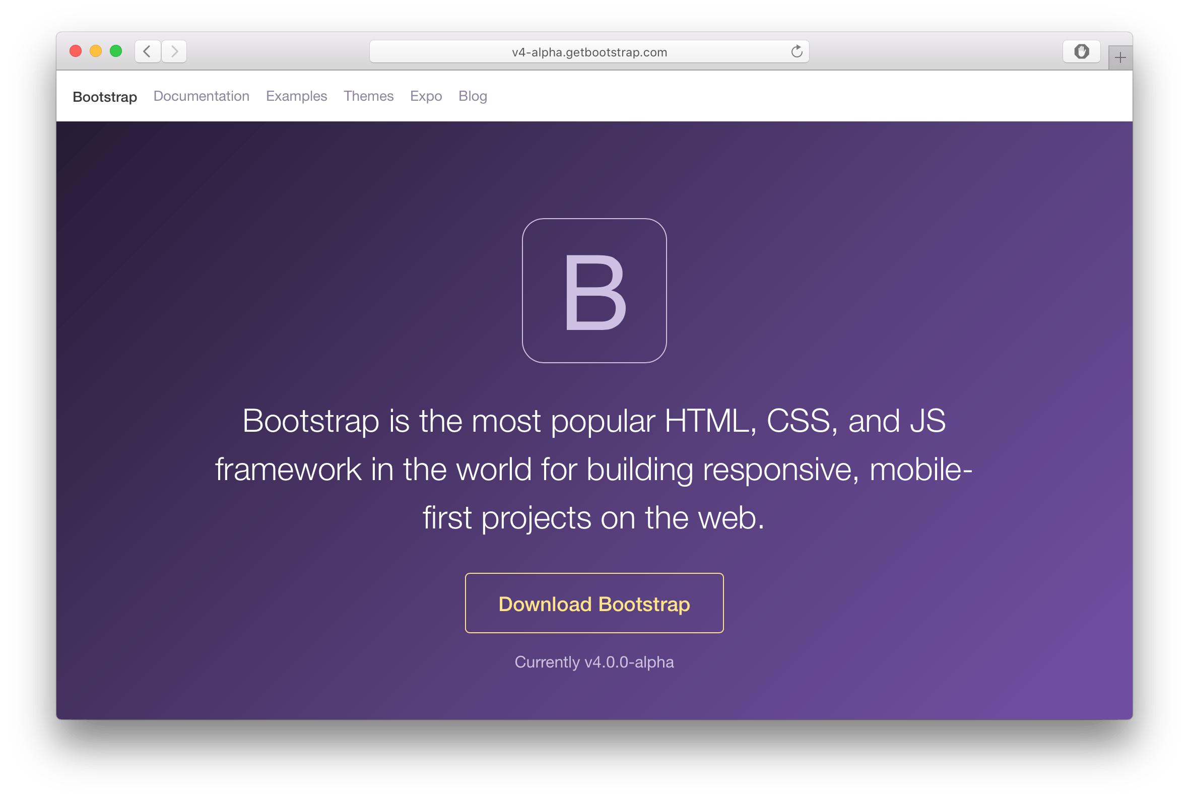
Today is a special day for Bootstrap. Not only is it our fourth birthday, but after a year of development, we’re finally shipping the first alpha release of Bootstrap 4. Hell yeah!
Bootstrap 4 has been a massive undertaking that touches nearly every line of code. We’re stoked to share it with you and hear your feedback. We’ve got a lot of news to share with you, so let’s jump right into it.
What’s new
There are a ton of major changes to Bootstrap and it’s impossible to cover them all in detail here, so here are some of our favorite highlights:
Moved from Less to Sass. Bootstrap now compiles faster than ever thanks to LibSass, and we join an increasingly large community of Sass developers.
Improved grid system. We’ve added a new grid tier to better target mobile devices and completely overhauled our semantic mixins.
Opt-in flexbox support is here. The future is now—switch a boolean variable and recompile your CSS to take advantage of a flexbox-based grid system and components.
Dropped wells, thumbnails, and panels for cards. Cards are a brand new component to Bootstrap, but they’ll feel super familiar as they do nearly everything wells, thumbnails, and panels did, only better.
Consolidated all our HTML resets into a new module, Reboot. Reboot steps in where Normalize.css stops, giving you more opinionated resets like box-sizing: border-box, margin tweaks, and more all in a single Sass file.
Brand new customization options. Instead of relegating style embellishments like gradients, transitions, shadows, and more to a separate stylesheet like v3, we’ve moved all those options into Sass variables. Want default transitions on everything or to disable rounded corners? Simply update a variable and recompile.
Dropped IE8 support and moved to rem and em units. Dropping support for IE8 means we can take advantage of the best parts of CSS without being held back with CSS hacks or fallbacks. Pixels have been swapped for rems and ems where appropriate to make responsive typography and component sizing even easier. If you need IE8 support, keep using Bootstrap 3.
Rewrote all our JavaScript plugins. Every plugin has been rewritten in ES6 to take advantage of the newest JavaScript enhancements. They also now come with UMD support, generic teardown methods, option type checking, and tons more.
Improved auto-placement of tooltips and popovers thanks to the help of a library called Tether.
Improved documentation. We rewrote it all in Markdown and added a few handy plugins to streamline examples and code snippets to make working with our docs way easier. Improved search is also on its way.
And tons more! Custom form controls, margin and padding classes, new utility classes, and more have also been included.
And that barely scratches the surface of the 1,100 commits and 120,000 lines of changes in v4 so far. Plus, we’re not even done yet!
We need your help to make Bootstrap 4 the best it can be. Starting today, the source code for v4 will be available in a v4-dev branch on GitHub. In addition, we have a v4 development and tracking pull request that includes a master checklist of changes we’ve made and our remaining possible todos. We’d love for y’all to help chip away at those todos.
The general development and release plan looks something like this:
A few alpha releases while things are still in flux.
Two beta releases after features and functionality are locked down to really test things out.
Two release candidates (RCs) to really test things out closer to production environments.
Then, the final release!
For those jamming on v4 with us, we also have a dedicated v4 Slack channel. Jump in to talk shop and work with your fellow Bootstrappers. If you haven’t yet, join our official Slack room!.
If you’re not keen on pushing code to v4, we’d love to hear from you in our issue tracker with bug reports, questions, and general feedback.
Supporting v3
When we shipped Bootstrap 3, we immediately discontinued all support for v2.x, causing a lot of pain for all our users out there. That was a mistake we won’t be making again. For the foreseeable future, we’ll be maintaining Bootstrap 3 with critical bug fixes and documentation improvements. v3 docs will also continue to be hosted after v4’s final release.
One more thing…
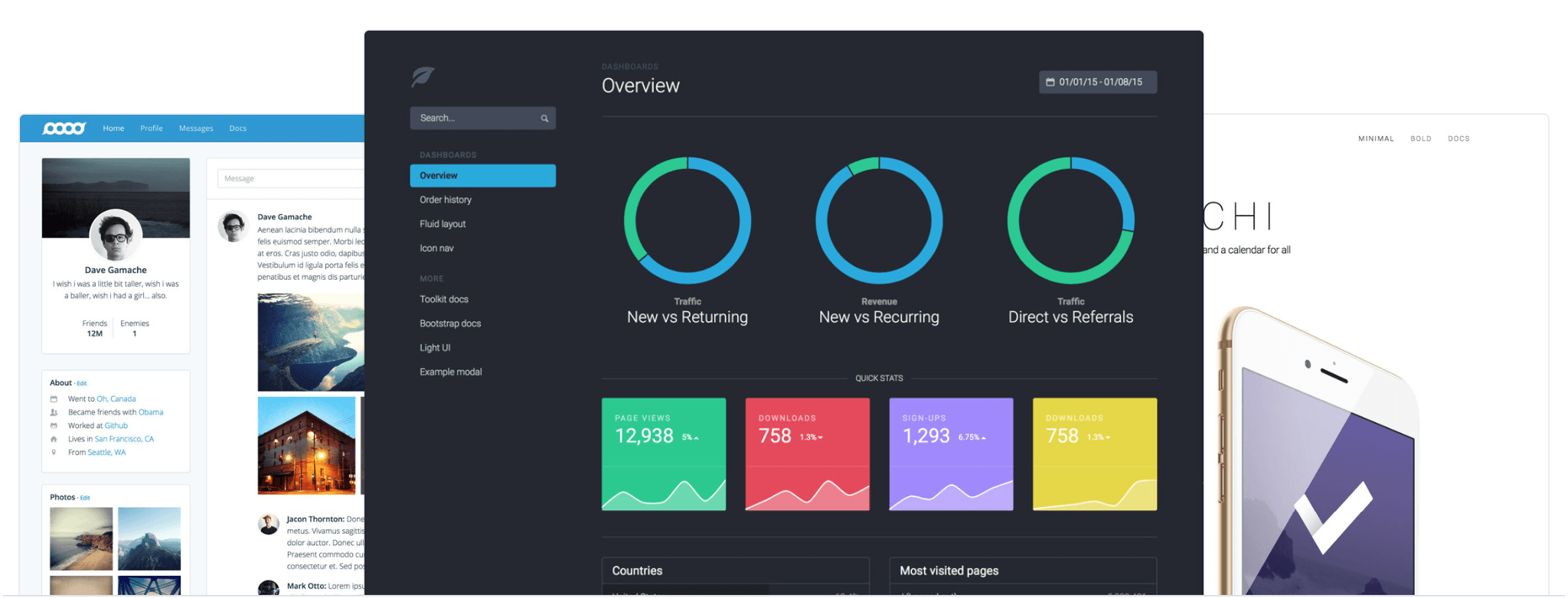
In addition to shipping the first Bootstrap 4 alpha today, we’re also launching our latest side project, Official Bootstrap Themes.
We’ve talked about building premium themes for Bootstrap since our earliest releases, but never quite found the time or ideal approach until earlier this year. We’ve poured hundreds of hours into these themes and consider them to be much more than traditional re-skins of Bootstrap. They’ve very much their own toolkits, just like Bootstrap.
To start, we’re launching with three themes built on Bootstrap 3: a dashboard, an application, and a marketing site. Each theme contains everything you’d find in Bootstrap, plus stunning real world examples, brand new components and plugins, custom documentation, and simple build tools.
All themes include a multiple-use license for the purchaser and free updates for bug fixes and documentation updates for the life of the themes.
Say hello to our newest bot, No Carrier. Inspired by the classic modem disconnection error message of yesteryear, No Carrier helps us track issues that appear to have been abandoned by the original poster. Issues that go without a reply to our questions for two weeks are closed with a friendly explanation by No Carrier.
To date, we’ve handled abandoned issues just like any other issues—with ad-hoc reviews. We felt that could be improved, so we made a bot to automate the process. No Carrier appears on our issue tracker as @twbs-closer and will monitor issues we tag with awaiting-reply. Should no one reply within two weeks, @twbs-closer will post a final comment explaining the situation and our policy, and then automatically close the issue. If someone later replies after the cutoff, a member of our team will happily reopen the issue manually and continue pursuing it.
No Carrier is available for any GitHub project, not just Bootstrap. If you have a project on GitHub that might benefit from this automation, we invite you to try out No Carrier. For more details, usage instructions, and feedback, check out the No Carrier project on GitHub. You can download the assembly JAR from the “Downloads” section of the v1.0.0 release page.
Bootstrap 3.3.5 is here! This release has focused on bug fixes, accessibility improvements, and documentation updates. We’ve had over 330 commits and 160 closed issues and pull requests from over 40 contributors since our last release! Hell yeah.
Since we last shipped a release, we made an official Slack for folks to hang out with other Bootstrappers. Registration is completely open thanks to the Slackin open source project. We have two channels to start—general and help—and nearly 1,000 members to date!
Bootstrap 3.3.4 is here! This release has been focused on bug fixes and documentation improvements. We’ve had over 325 commits from 29 contributors since our last release! Nice.
Here are some of the highlights:
Fixes for a few significant bugs in the Modal plugin.
Fixes for a couple annoying bugs in the ScrollSpy plugin.
Convenience aliases have been added for currency symbol Glyphicons based on their related 3-letter ISO currency codes. For example, .glyphicon-rub is a new alias for .glyphicon-ruble, the currency symbol for the Russian ruble (RUB).
We have deployed AnchorJS in our documentation to make it easier to link to specific sections within the docs.
Since our previous release was v3.3.2, you’re probably wondering why this release isn’t v3.3.3 instead. Basically, the official Sass port of Bootstrap had a Sass-specific bug in their v3.3.2 release, so they immediately issued a follow-up release to fix the bug. This bugfix release was initially numbered as v3.3.2+1. However, this 4-digit version number scheme has caused grief with some tools, so with the blessing of the Core Team, the Sass Team took this opportunity to switch to a more vanilla 3-digit SemVer numbering scheme. Thus, bootstrap-sass v3.3.2+1 was re-released as bootstrap-sass v3.3.3, with only the version number changed compared to v3.3.2+1.
To avoid confusion regarding which bootstrap-sass release(s) correspond to which upstream Bootstrap release, Bootstrap’s version numbering will henceforth skip over any bootstrap-sass patch release version numbers. Thus, the patch digit (i.e. the 3rd digit) of bootstrap-sass’s version number may be ahead of Bootstrap’s due to Sass-specific fixes, and the next Bootstrap release’s number will always be greater than the previous bootstrap-sass release’s number.
Download Bootstrap
Download the latest release—source code, compiled assets, and documentation—as a ZIP file directly from GitHub:
Bootstrap 3.3.2 is here! This release has been all about bug fixes, accessibility improvements, and documentation updates. We’ve had over 300 commits from 19 contributors since our last release. Woohoo!
Here are some of the highlights:
Updated Glyphicons to v1.9.
Reverted support for delegating multiple tooltips via a single element, because it caused nasty regressions.
Fixed a regression that broke wrap: false for the carousel plugin.
Added manual vendor prefixing back to carousel CSS to avoid a regression among folks not yet using Autoprefixer.
Improved accessibility of our examples and added more accessibility guidance to our docs.
We’ve also deployed two new bots to aid Bootstrap’s development:
Savage, a bot to automatically run Sauce cross-browser tests on JavaScript pull requests.
@twbs-grunt, a bot to automatically keep our compiled /dist/ files up-to-date
We’re stoked to welcome Patrick to the Bootstrap team! Patrick brings with him terrific accessibility expertise and has already contributed many improvements to Bootstrap’s components and documentation.
Download Bootstrap
Download the latest release—source code, compiled assets, and documentation—as a zip file directly from GitHub:
Say hello to Bootstrap 3.3.1. As one of our fastest follow up releases, the changelog is focused around a small set of bug fixes for our CSS and JS, loads of accessibility improvements, and several documentation improvements.
 @mdo
July 27, 2016
@mdo
July 27, 2016