After several months, we’ve finally shipped Bootstrap v4.6.2, one of our last releases for the v4. It’s a bit of a maintenance patch featuring bug fixes, dependency updates, and some docs updates.
First, we’ve added an example to our Collapse plugin docs to show how to use horizontal collapsing. This has long been possible via our JS, but we never had an official class to utilize it.
Second, we’ve replaced the deprecated color-adjust with print-color-adjust in our Sass files as part of the Autoprefixer v10.4.6 issues. This should quiet the issues folks have seen from that dependency change. If you’re using our distribution CSS files, like bootstrap.min.css, you may still see the warning.
Beyond that, we’ve addressed a few other things:
Tweaked the size of small and .small to compute to a whole pixel value (was 12.8px and now is 14px).
Improved accessibility around our dropdowns, color contrast, and role attributes.
Fixed some broken links to supporting documentation.
From here, we don’t expect to ship any meaningful updates to v4.6.x other than major security or dependency updates. Everything will focus on v5 and beyond after this release, starting with the stable release of v5.2.0. Bootstrap 4 will officially end of life January 1, 2023, though you’re obviously welcome to continue using it longer than that. Follow our release repo to stay in the loop on release maintenance status.
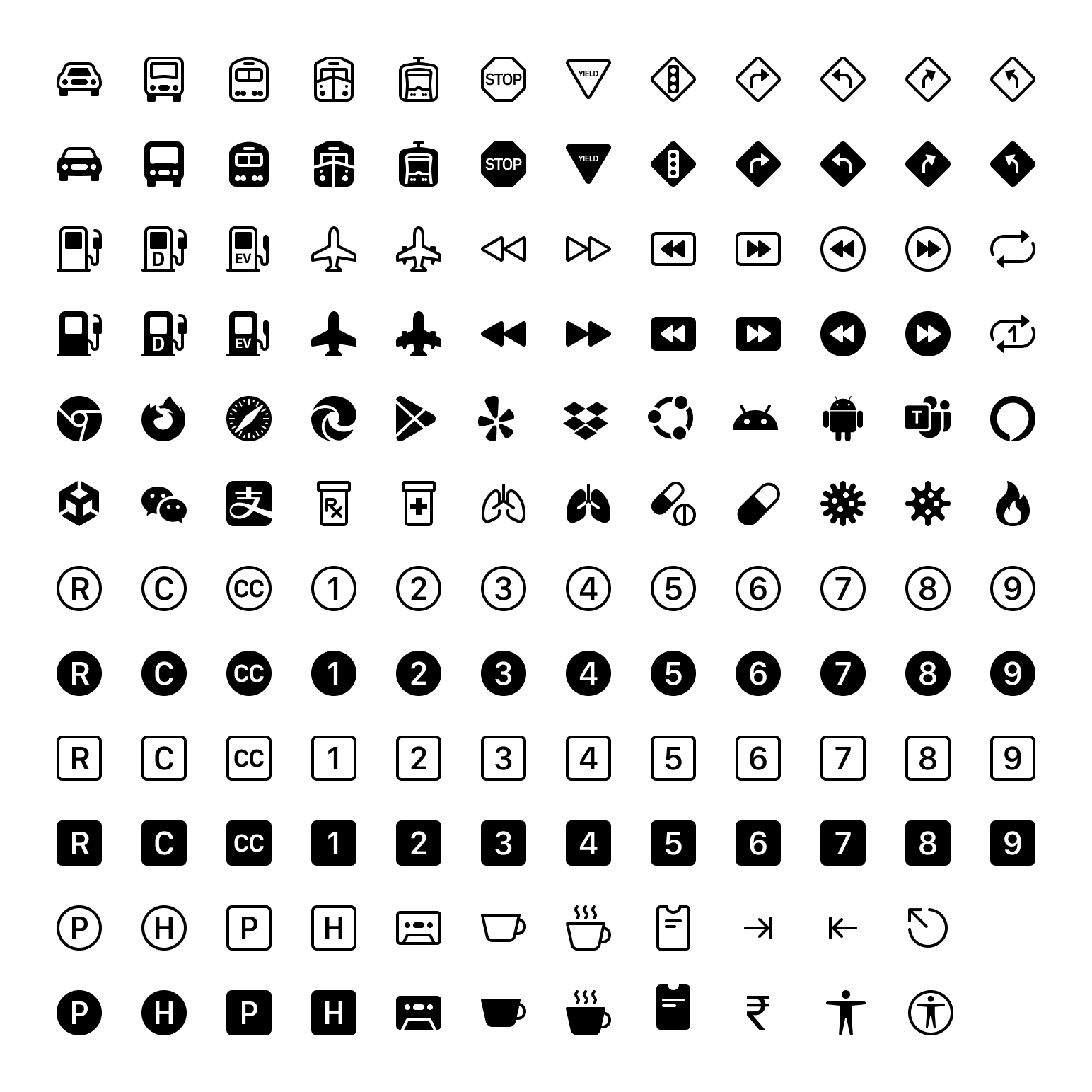
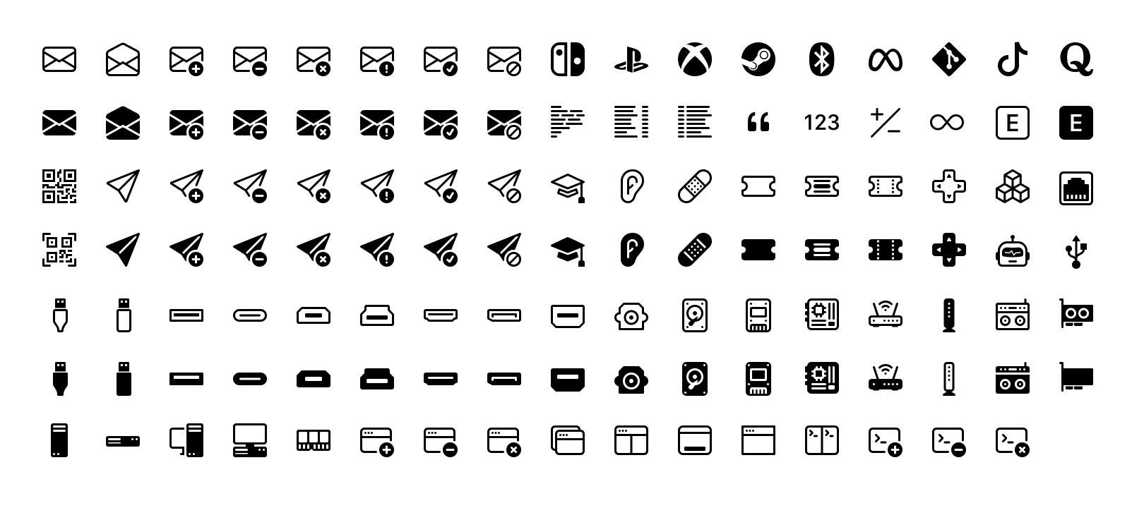
Bootstrap Icons v1.9.0 is here with over 140 new and updated icons, including some longstanding requests for new brands, transportation options, numbers and letters, and so much more. With this release, we’re now at over 1,800 icons!
140+ new icons
Here’s a quick look at all the new icons in v1.9.0:
Tons of new brand icons including popular browsers, Ubuntu, Google Play, Android, Dropbox, and many more.
New transportation icons including cars, trains, planes, fuel, and common road signs.
New number and letter icons for 1-9, R, C, CC, H, and P (for use cases like registered trademark, copyright, Creative Commons, hospital or helicopter, and parking).
New medical icons for prescriptions, pills, and viruses.
New keyboard icons for tab and escape.
New Universal Access cions.
Redrawn cup icon, now with a steam variant for hot beverages.
Fire, finally!
There are a handful more in there as well, so have a look and put them to use in your next update! In addition, we’ve updated our docs to include mention of Composer installs.
Looking for more new icons? Head to the issue tracker to check for open requests or submit a new one.
The Figma file is now published to the Figma Community! It’s the same Bootstrap Icons Figma file you’ve seen from previous releases, just a little more accessible to those using the app.
Bootstrap v5.2.0-beta1 added a slew of CSS custom properties, or CSS variables, across the :root level and all our core components. Here’s a quick look at how you can utilize them in your projects.
With CSS variables, you can now customize Bootstrap easier than ever, and without the need for a CSS preprocessor. All the power of Sass is still there behind the scenes, but CSS variables adds a ton of power for the future. Use and compose new values, updates styles globally without recompiling, set fallback values, setup new color modes, and more.
Let’s dig in.
CSS variables?
Their official name is custom properties, but they’re often referred to as CSS variables thanks to their most immediate use case for setting specific values. Consider reading the MDN CSS custom properties article or the CSS Tricks guide if you need a primer.
In a nutshell, CSS variables allow you to name frequently used values. For example, instead of writing #6f42c1 everywhere, you can set --purple: #6f42c1. Then you can use that variable later on with the var() function.
We use CSS variables in Bootstrap to set many property values globally, across our components, and in some of our utilities.
Groups of variables
When we talk about CSS variables in Bootstrap, we’re referring to three major groups:
Root variables — Globally scoped variables available on the :root element (<html> usually) and accessible by any element throughout the DOM.
Component variables — Variables scoped specifically to each component, usually on the component’s base class, and their modifier classes and Sass mixins.
Utility variables — Used as modifiers within other utility classes.
Regardless of where they are, all of our CSS variables are prefixed with --bs-, so you know where they’re coming from and how they might be used across codebases that mix Bootstrap’s CSS with additional custom styles. You’ll also notice that we don’t put all our component variables at the root level. This keeps CSS variables scoped to their intended use cases and prevents polluted variables in the global :root scope.
It’s also worth mentioning two larger efforts that are still to come around CSS variables:
Adding CSS variables to all our forms
Adding more nuanced global theme variables and support for color modes like dark mode.
These are likely coming in v5.3.0 (our next minor release after v5.2.0 stabilizes), so in the mean time, check out the GitHub repo to see how things are shaping up.
Root variables
Bootstrap has a ton of root variables and we’ll only be adding more in future updates for the aforementioned color mode support. As of this post, we have the following CSS variables on the :root element:
Colors — All named colors, gray colors, and theme colors. This also includes all our $theme-colors in their rgb format.
Body font styles — Everything from font-size to color and more, all applied to our <body> element.
Shared properties — For property-value pairings that we consider theme specific, like link colors and border styles.
Root CSS variables are used extensively across other parts of Bootstrap to allow you to easily override our default styles at a global level. For example, if you wanted to adjust the default border-radius and link color for our components, you could override a couple variables instead of writing new selectors.
Without CSS variables, you’d have to use a preprocessor like Sass or write new selectors for every instance of these properties across all components. The former is relatively easy, the latter not so much. CSS variables help solve that.
Component variables
On our components, CSS variables get even more power for customizing. Nearly everything under the Components section in our docs sidebar now has CSS variables available to you:
Scrollspy and close button have no relevant CSS variables, so they’re excluded here.
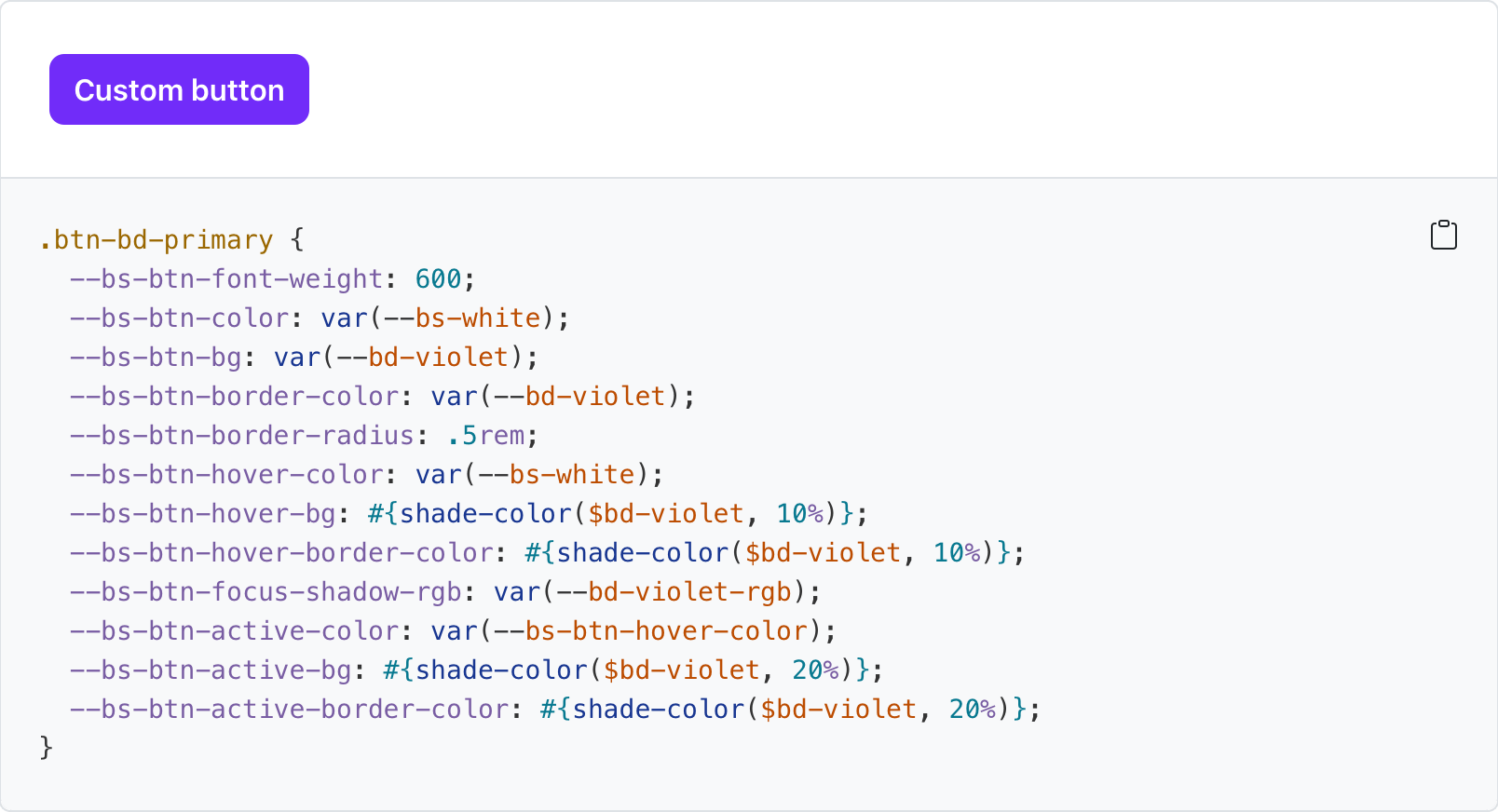
Throughout our documentation you’ll find examples of customizing our default components by overriding their CSS variables. One great example comes from our own docs where we write our own button styles to create a purple button.
Another great example is from our tooltips. You can add custom classes to tooltips and popovers in Bootstrap with data-bs-custom-class="custom-tooltip". Then, with one CSS variable, you can change the tooltip background and arrow color.
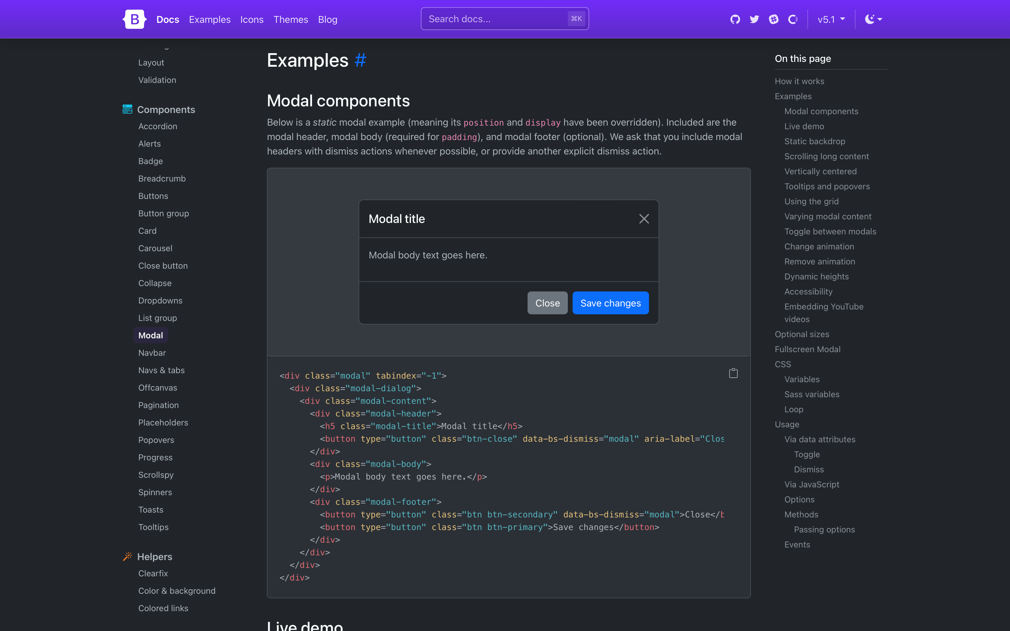
There are dozens of CSS variables in play across our components. All of them are referenced in a new section on the relevant docs page. For example, here are our modal CSS variables. This is in addition to all the Sass variables, mixins, loops, and maps used for each component.
Utility variables
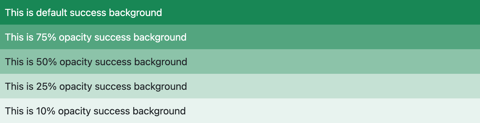
Not every utility class uses CSS variables, but the ones that do gain a good amount of power and customization. Background, border, and color utilities all have what we call “local CSS variables” to improve their usefulness. Each of them uses CSS variables to customize the alpha transparency value of rgba() colors.
Consider our background color utilities, .bg-*. By default each utility class has a local variable, --bs-bg-opacity with a default value of 1. To change the background utility alpha value, you can override that value with your own styles, or some new .bg-opacity-* utilities.
Here’s how .bg-success looks with all our .bg-opacity-* classes applied:
And the same is available for border color opacity (--bs-border-opacity and .border-opacity-*) and text color opacity (--bs-text-opacity and .text-opacity-*). So many color options are now available with these utilities.
By default, we ship with five values for these various opacity utilities.
Expect more CSS variables to make their way into our utilities. There’s a lot of power in real-time customization, even for what we consider immutable styles.
Ready to get started with Bootstrap? Checkout the quick start guide so you can put these new CSS variables to work in your next project!
The Figma file is now published to the Figma Community! It’s the same Bootstrap Icons Figma file you’ve seen from previous releases, just a little more accessible to those using the app.
It’s the biggest release since v5 itself—Bootstrap v5.2.0-beta1 is here! This release features redesigned docs, CSS variables for all our components, responsive offcanvas, new helpers and utilities, refined buttons and inputs, and lots of improvements under the hood.
Given the size of the update and time since our last release, we’re doing something different and shipping it as a beta first. Keep reading for details.
Why so long?
I want to start by acknowledging the time it’s taken to ship a new release. As an open source maintainer, I’m constantly worried about not doing or being good enough of a developer for my projects. Pair that with a distributed team all working through this pandemic and me having a heart attack, we’ve all needed some down time. I managed to put together a Bootstrap Icons release with what energy I had before needing another break. The rest of the team has also needed some well deserved down time.
I ask that you all please take some time to send some appreciation and support to your favorite open source maintainers. Everyone could use a little more love in this work.
All that said, we’re shipping v5.2.0-beta1 first since it’s been so long—we’d love your help testing things out. We’ll follow up with a stable release as soon as possible.
Okay, now onto the good parts!
Redesigned docs
Another release, another docs refresh! From the get go, you’ll notice our Bootstrap Purple™ is much more vibrant now, making everything feel brand new. We’ve rewritten our entire homepage to better show off all the awesome features of Bootstrap.
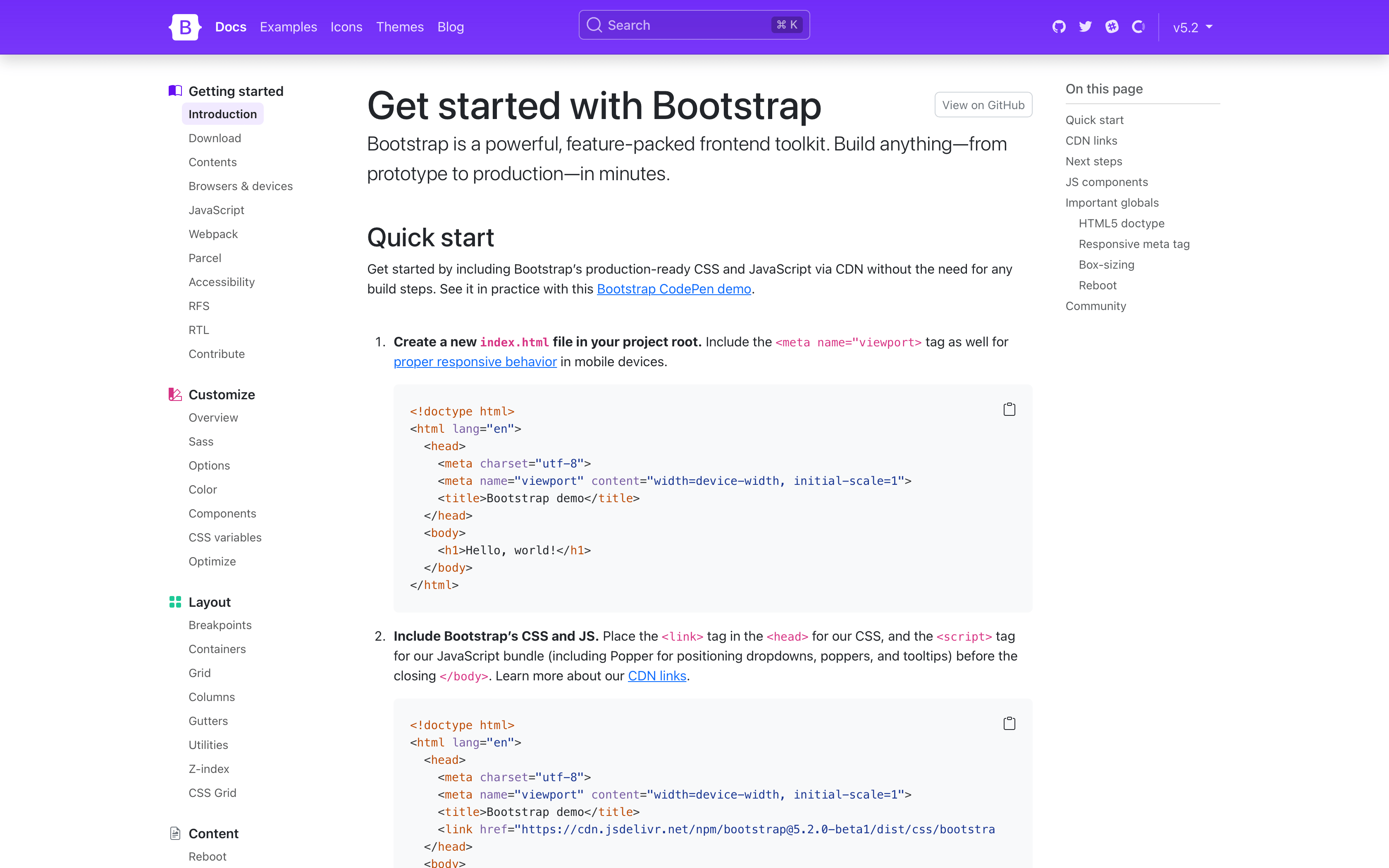
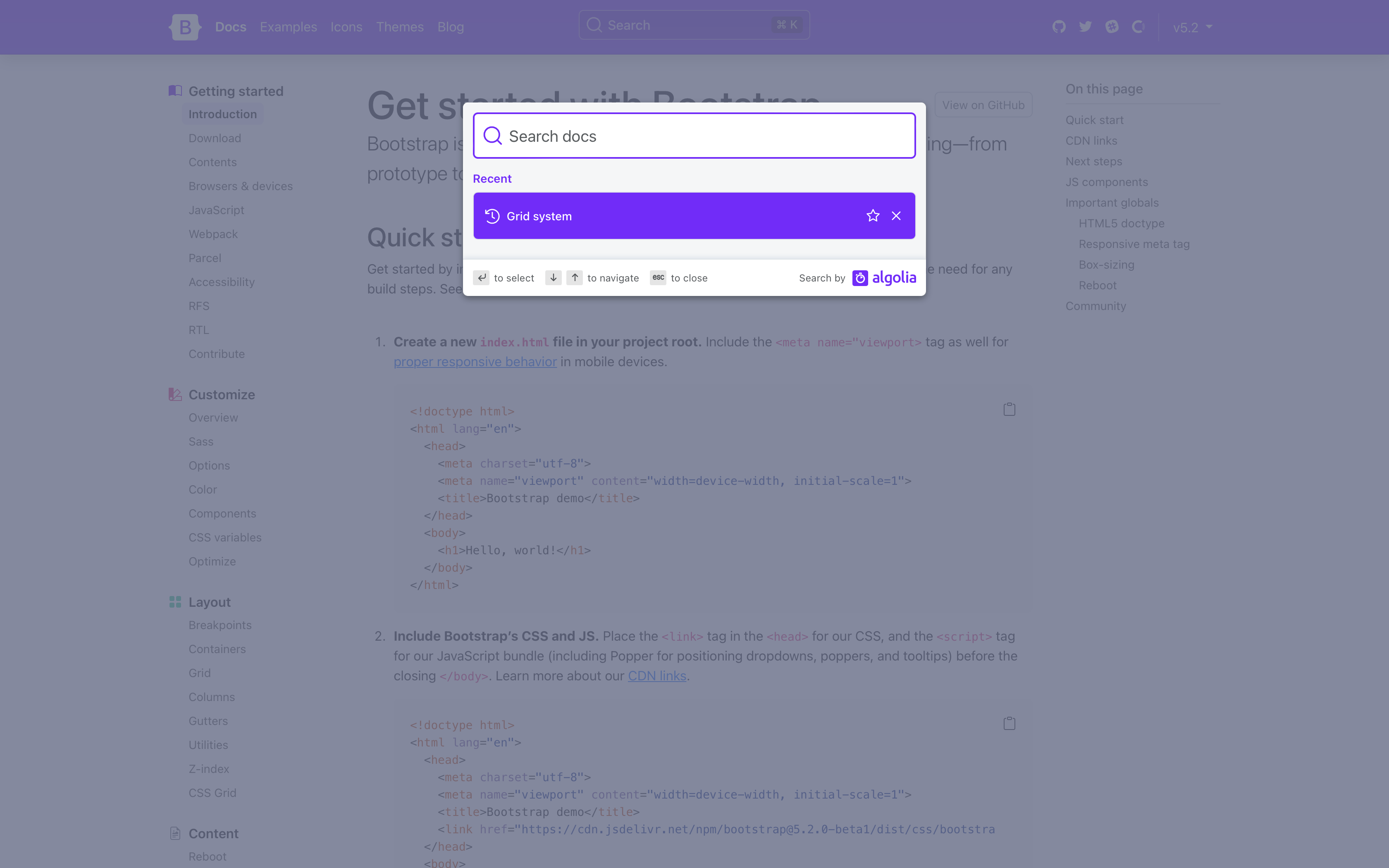
Stepping into the actual docs, you’ll notice quite a few changes. We’ve streamlined our navbar, done away with our subnav, and changed the sidebar to always show every page link for greater discoverability. Show above is also our refreshed quick start guide, which is now a step-by-step instructional guide for using Bootstrap via CDN.
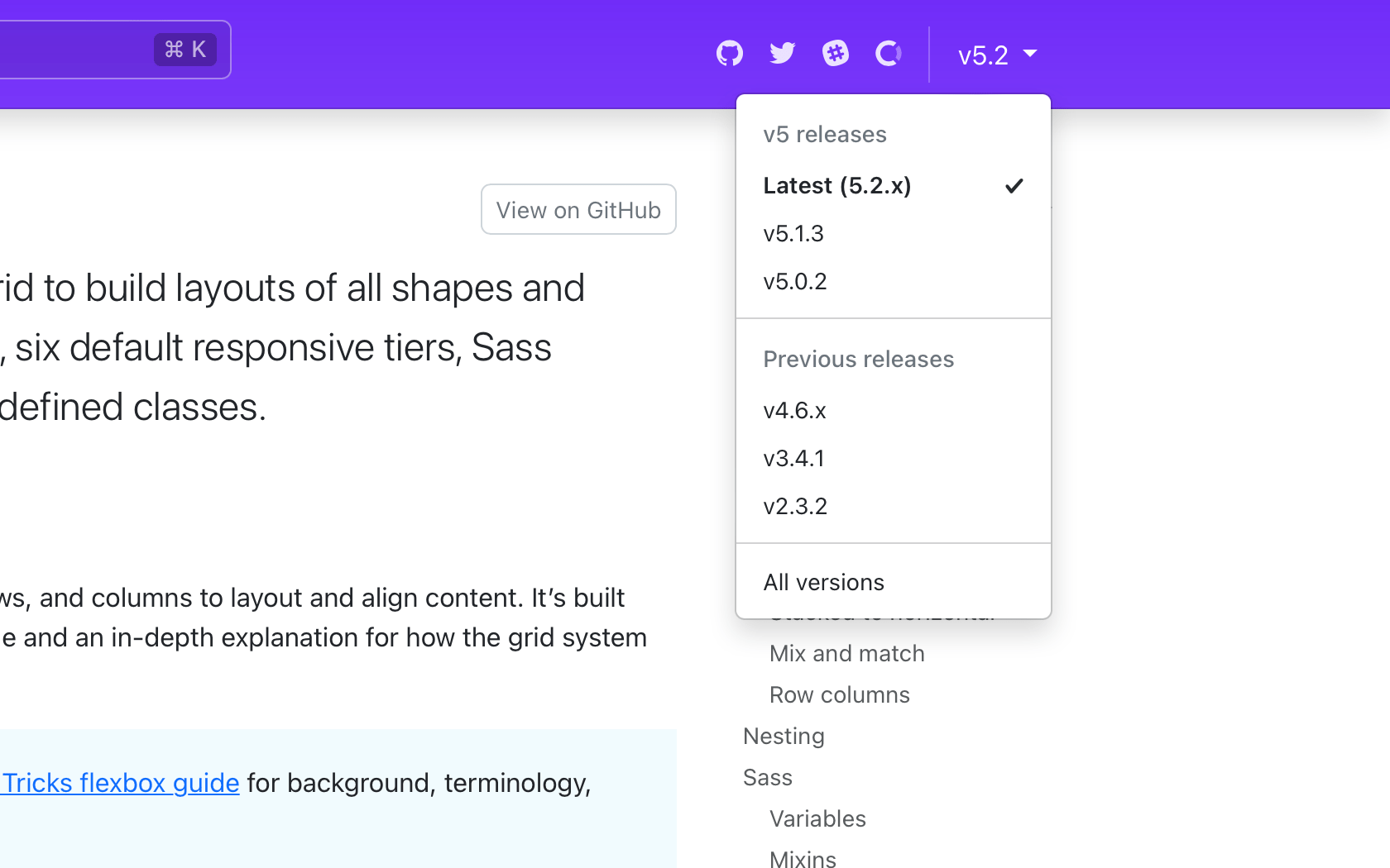
The refreshed navbar also has a long-awaited new version picker for v5.2.0 and beyond. From any page, click the version and see options to navigate to previous minor releases of that same page. When a page doesn’t exist in an older release, you’ll see a disabled version in the dropdown. We currently have no plans to link pages across major versions.
The docs search is now powered by the latest version of Algolia’s DocSearch, bringing an improved design that even shows your most recent searches.
Design tweaks
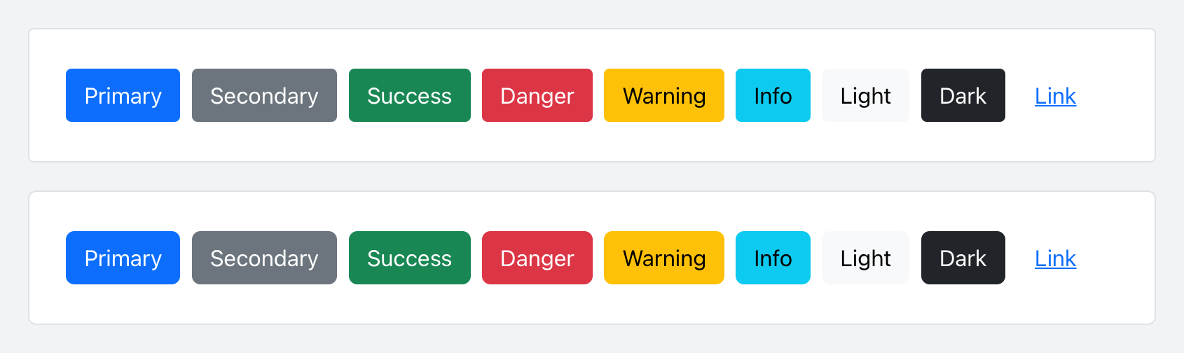
To coincide with our docs redesign, we’ve given our buttons and inputs a slight refresh with some refined border-radius values. It’s a small change, but a welcomed refresh to keep things modern and fresh. Here’s a look at the before and after of our buttons:
With this release, all our components now include CSS variables to enable real-time customization, easier theming, and (soon) color mode support starting with dark mode. Every component page has been updated to include a reference guide of the relevant CSS variables. Take for example our buttons:
Values for virtually every CSS variables are assigned via Sass variable, so customization via CSS and Sass are both well supported. Also included for several components are examples of customizing via CSS variables.
Check out all our components to see how you can customize them to your liking.
New _maps.scss
Bootstrap v5.2.0-beta1 introduces a new Sass file with _maps.scss that pulls out several Sass maps from _variables.scss to fix an issue where updates to an original map were not applied to secondary maps that extend it. It’s not ideal, but it resolves a longstanding issue for folks when working with customized maps.
For example, updates to $theme-colors were not being applied to other maps that relied on $theme-colors (like the $utilities-colors and more), which created broken customization workflows. To summarize the problem, Sass has a limitation where once a default variable or map has been used, it cannot be updated. There’s a similar shortcoming with CSS variables when they’re used to compose other CSS variables.
This is also why variable customizations in Bootstrap have to come after @import "functions";, but before @import "variables"; and the rest of our import stack. The same applies to Sass maps—you must override the defaults before they get used. The following maps have been moved to the new _maps.scss:
$theme-colors-rgb
$utilities-colors
$utilities-text
$utilities-text-colors
$utilities-bg
$utilities-bg-colors
$negative-spacers
$gutters
Your custom Bootstrap CSS builds should now look like this with a separate maps import.
  // Functions come first
  @import "functions";

  // Optional variable overrides here
+ $custom-color: #df711b;
+ $custom-theme-colors: (
+   "custom": $custom-color
+ );

  // Variables come next
  @import "variables";

+ // Optional Sass map overrides here
+ $theme-colors: map-merge($theme-colors, $custom-theme-colors);
+
+ // Followed by our default maps
+ @import "maps";
+
  // Rest of our imports
  @import "mixins";
  @import "utilities";
  @import "root";
  @import "reboot";
  // etc
New helpers and utilities
We’re continuing to invest in our helpers and utilities to make it easier to quickly build and modify custom components.
Added new .text-bg-{color} helpers. Instead of setting individual .text-* and .bg-* utilities, you can now use the .text-bg-* helpers to set a background-color with contrasting foreground color.
Expanded border-radius utilities to include two new sizes, .rounded-4 and .rounded-5, for more options.
Expect more improvements here as v5’s development continues.
Responsive offcanvas
Our Offcanvas component now has responsive variations. The original .offcanvas class remains unchanged—it hides content across all viewports. To make it responsive, change that .offcanvas class to any .offcanvas-{sm|md|lg|xl|xxl} class.
And tons more!
Introduced new $enable-container-classes option. — Now when opting into the experimental CSS Grid layout, .container-* classes will still be compiled, unless this option is set to false. Containers also now keep their gutter values.
Thicker table dividers are now opt-in. — We’ve removed the thicker and more difficult to override border between table groups and moved it to an optional class you can apply, .table-group-divider. See the table docs for an example.
Scrollspy has been rewritten to use the Intersection Observer API, which means you no longer need relative parent wrappers, deprecates offset config, and more. Look for your Scrollspy implementations to be more accurate and consistent in their nav highlighting.
Added .form-check-reverse modifier to flip the order of labels and associated checkboxes/radios.
Added striped columns support to tables via the new .table-striped-columns class.
Much of the work we’ve done in v5.2.0-beta1 has been in support of adding dark mode to Bootstrap. Yes, it’s finally coming in our next minor release!
We’re adding tons of new global CSS variables, cleaning up docs styles, and better supporting overall customization. Some details and topics being worked on for dark mode:
Do we provide a JS plugin for toggling color modes? Right now we’re just building custom functionality for our docs.
Our current implementation is being built with data-theme selectors which allows explicit color mode switching (via user control vs and system preference) and custom color modes beyond light and dark.
We’re adding quite a few new colors outside $theme-colors to improve subtle UI customization. These are being implemented via :root and [data-theme="{theme}"] selectors for global use.
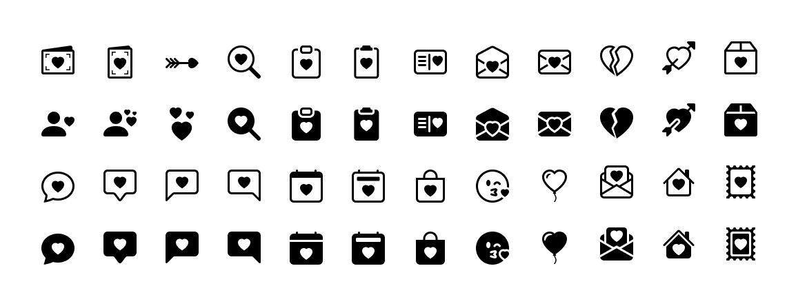
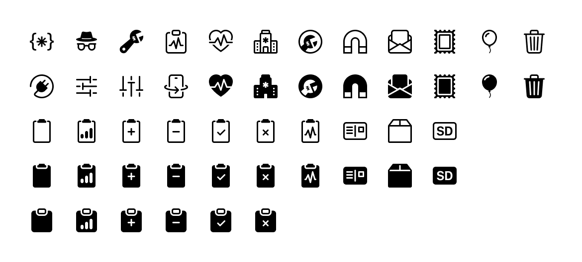
Bootstrap Icons v1.8.0 is here with over 140 new icons, including dozens of new heart icons ready for Valentine’s Day and dozens of filetype icons. We’re now at almost 1,700 icons and is once again our second largest release. Keep reading to see what’s new.
140+ new icons
Perfect for Valentine’s Day or any other time you need to show a little heart, there are dozens of icons to choose from.
Want to visually show the extensions of your files? There are tons of new options for programming languages, audio and video, images, and more.
Elsewhere we’ve expanded a number of other categories of icons. There are some new medical icons (more are planned), lots of new clipboard icons, additional tools, and more.
Looking for more new icons? Head to the issue tracker to check for open requests or submit a new one.
The Figma file is now published to the Figma Community! It’s the same Bootstrap Icons Figma file you’ve seen from previous releases, just a little more accessible to those using the app.
Bootstrap Icons v1.7.0 is here with 120 new and updated icons, taking us over 1,500 total icons for the project! It’s the largest update since the initial release, so keep reading to see what’s new.
120 new icons
This update was a lot of fun for me—drawing all these tiny computer parts most of all! There are dozens of new computer-related icons for parts, ports, and peripheral devices. There are also several new brand icons, including Meta, and some other fun icons like a new robot head and a boombox.
Looking for more new icons? Head to the issue tracker to check for open requests or submit a new one.
The Figma file is now published to the Figma Community! It’s the same Bootstrap Icons Figma file you’ve seen from previous releases, just a little more accessible to those using the app.
Bootstrap v4.6.1 has finally arrived! Biggest change here is a re-implementation of our Sass division functions and updates from v5, as well as some accessibility improvements and general bug fixes.
We’ll be flipping back to v5 development after this release, focusing on v5.2.0 with some additional updates to using more CSS variables and other awesome features. Sometime after that, we hope to ship a v4.7.0 release with some additional backported features and improvements to v4.
Please keep the feedback coming on what we can improve, how our releases are performing, and any other suggestions.
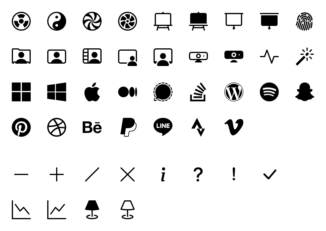
Bootstrap Icons v1.6.0 adds over 30 new icons, adds official Composer support, includes a new .scss stylesheet for the icon font, plus some other enhancements and bug fixes. Keep reading to see what’s new!
1,400+ icons
We’ve officially passed 1,400 glyphs in Bootstrap Icons with this release—woohoo! Seems utterly insane to me that the project has come this far and there are still so many more icons to include.
We have a few dozen new and updated icons in this release, including:
New brand icons for Apple, Behance, Dribbble, Line, Medium, Microsoft, PayPal, Pinterest, Signal, Snapchat, Spotify, Stack Overflow, Strava, Vimeo, Windows, and WordPress
Two new easel variations
New fingerprint icon
New magic stick
New people variations for rolodex, workspace, and video chat
New webcam icons
New radioactive icon
New fan icon
New hypnotize icon
New yin yang icon
New activity/pulse icon
Updated large dash, plus, slash, x, i, ?, !, and check icons to have a thinner stroke that better matches other icons
Updated lamp icons
Updated graph-up and graph-down icons, with the previous ones being renamed to graph-up-arrow and graph-down-arrow
New features
We’ve added a handful of new features and enhancements to how you can use Bootstrap Icons in this release:
Added Composer support with automatic publishing to Packagist. See the official package for more information.
Added new bootstrap-icons.scss stylesheet for the icon font. This includes font name and path variables, plus a Sass map of icon names and unicode values.
Added new .bi CSS selector to the icon font ruleset (in addition to the attribute selectors we had through v1.5.0) to allow for easier @extending of icon styles. This has also been reflected in the new .scss stylesheet.
Our next minor release will continue to see improvements to our icon permalink pages, adding more options for copying and pasting our icons. If you have other suggestions, please don’t hesitate to open a new issue!
Bug fixes
We’ve fixed a few glitches with existing icons in this release:
droplet-fill now renders correctly thanks to an updated fill rule
lamp and lamp-fill now look more like lamps and less like toilets 😅
coin now renders correctly thanks to an updated fill rule
cloud now renders correctly thanks to an updated fill rule
textarea-resize is no longer incorrectly placed in the viewBox
Found another bug, or have a suggestion? Check out the issue tracker and open an issue if you don’t see one already opened.
The Figma file is now published to the Figma Community! It’s the same Bootstrap Icons Figma file you’ve seen from previous releases, just a little more accessible to those using the app.
Bootstrap v5.1.2 is here with a handful of improvements across our components, plus a fix for an issue in another project that prevented our Sass from compiling properly. Keep reading for the highlights.
Highlights
Temporarily patched a postcss-values-parser issue by rearranging our calc() functions that use negative numbers. This should restore the ability to import and compile Bootstrap’s Sass in create-react-app.
Added border-radius sizes to small and large .form-selects
Added align-self: center to buttons for improved rendering in flex containers
Fixed Collapse regression that prevented toggling between sibling children
Updated JS Sanitizer to add sms in the SAFE_URL_PATTERN
Improved docs around .img-fluid
Added role="switch" to our form switches in our docs
Implemented GitHub Issue forms to replace our previous issue templates.
Up next
Up next is our v5.2.0 release, adding more utility improvements and fixing an issue with how Sass handles re-assigned maps and variables. Alongside that, we’ll be shipping an update to v4 soon as well.
 @mdo
July 19, 2022
@mdo
July 19, 2022


