Our second beta has arrived for Bootstrap 5! We delayed its release to iron out some issues with third-party libraries and stabilize our major changes. We’ve also once again shipped some awesome updates to our documentation.
Next up is our final beta, which we may even promote to a stable release depending on how development proceeds. Stay tuned for that!
Dropdowns
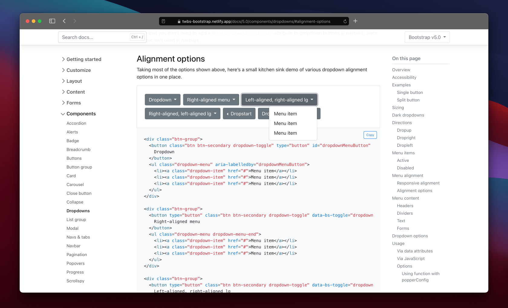
Dropdowns saw a lot of work in Beta 2 because of how much has changed in both our JavaScript and in Popper.js (which we depend on for most dropdown, popover, and tooltip positioning). We’ve modified our dropdown plugin to add a new data attribute to help separate our own positioning styles with that of Popper’s. The issues we saw—like a .dropstart menu overlapping a button or an incorrect responsive .dropdown-menu-end class—were largely the result of competing positioning.
Now when dropdown menus have data-bs-display="static", we’ll add data-bs-popper="static" via JavaScript to their associated .dropdown-menu. When dropdowns are in our navbars, their menus will have data-bs-popper="none" added. This separates two different positioning libraries, ours and Poppers, and ensures all behaviors are supported. You can see all the options in a new example in our docs. We updated our CSS selectors to use these new data attributes, too.
In addition, we’ve removed the initial margins from dropdowns and popovers, instead of relying on Popper’s offsets. These also conflicted with the default styling for elements positioned by Popper.js. Relatedly, there was a bug in how popover arrows were aligned that has now been resolved.
Color utility docs
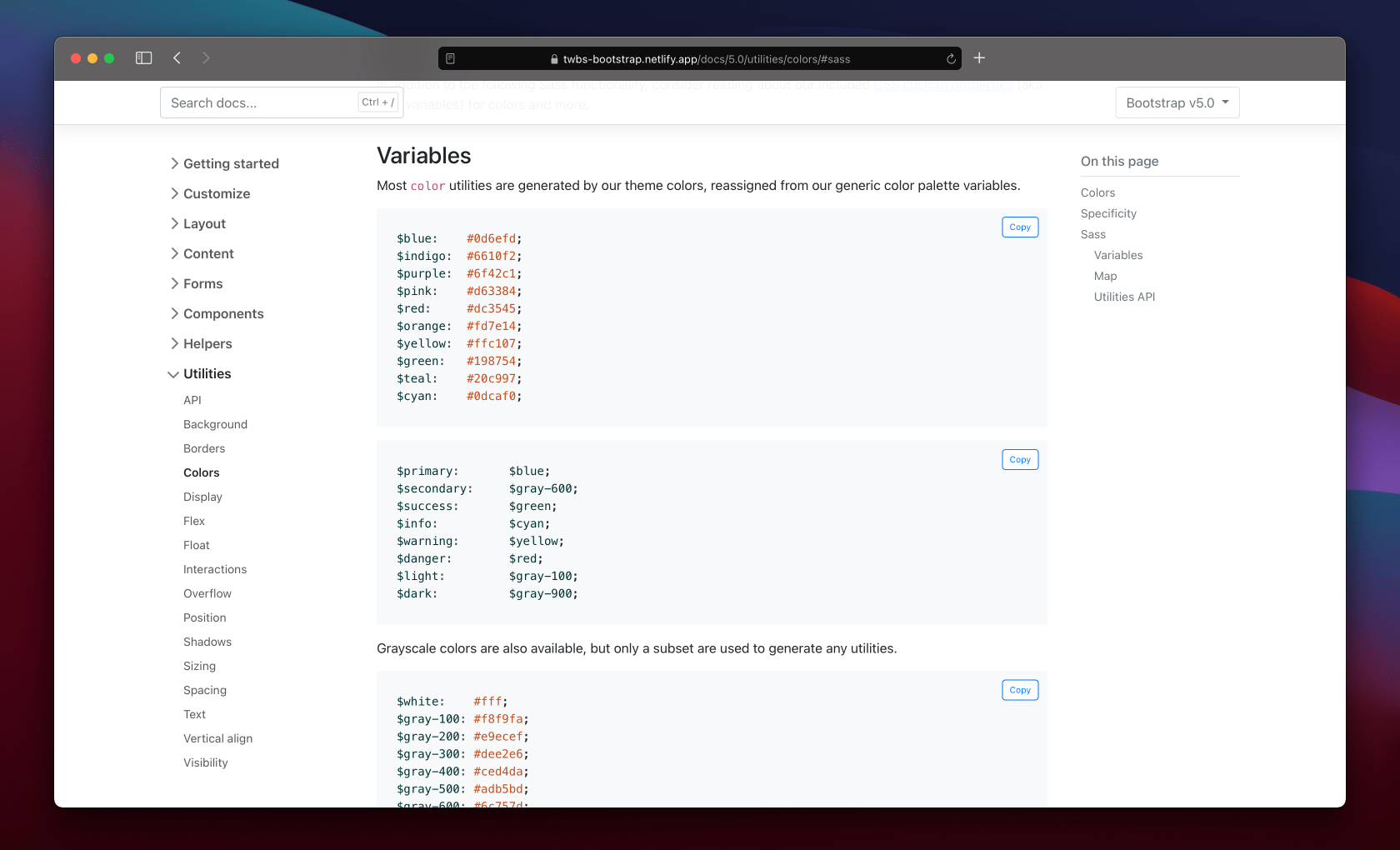
We’ve overhauled our color utility documentation, separating the text color classes from our background-color ones. We’ve also made extensive use of our scss-docs shortcode to include tons more code snippets in our docs.
Both pages now include a new Sass section, showing relevant snippets of our source code that are related to each set of utilities. We list all our available color variables, our theme color variables and maps, associated mixins and loops, and even where these utilities are generated in the utilities API.
We’ve spent a significant amount of time in Beta 2 improving our JavaScript plugins to fix bugs and improve behaviors since dropping jQuery.
Dropdown now emits events on the .dropdown-toggle instead of the .dropdown.
Restored the offset option for dropdowns.
Fixed modal toggling when clicking on data-bs-toggle="modal".
We now build our base component as a separate .js file.
We now prevent getSelector from returning URLs as selector which caused errors in dropdown and scrollspy plugins.
Refactored components to use a utility function to define jQuery plugins
Miscellaneous updates
Across the board, we’ve made a few small changes to other components that are worth a brief mention here.
Navbars:
Added a new .navbar-nav-scroll class to enable vertical scrolling when a collapsed navbar is opened. It’s customizable via Sass and a CSS variable. Read more in the docs.
We’ve re-added flex-grow to the .navbar-collapse to restore the flexbox behaviors from v4 and prevent some content from being inadvertently squished.
Forms:
Removed vertical-align from .form-select
Form validation mixin updated with additional parameters
Fixed validation icon placement in .form-select
Checkboxes and radio buttons are aligned better in input groups
Buttons:
Added variables for tinting and shading button state colors
Suppressed the default focus outline for buttons in Chromium
Toasts:
Added word-break to .toast-body
Added a live example to the docs to trigger a real toast
Bundles:
Added our helpers to the utilities CSS bundle
Carousels:
Updated docs examples to use <button>s wherever possible instead of <a> elements.
CSS selectors changed for using <button>s as indicators (from .carousel-indicators li to .carousel-indicators [data-bs-target]).
Head to https://getbootstrap.com to explore the new release. We’ve also published this updated as a pre-release to npm, so if you’re feeling bold or are curious about what’s new, you can pull the latest in that way.
npm i bootstrap@next
What’s next
We have three releases coming up next for the team:
Bootstrap v5.0.0-beta3 (possibly promoted to v5 stable)
Bootstrap v4.6.1 (bringing in some more bugfixes and alignment with the latest in v5)
Bootstrap Icons v1.4.0
Our v5 Beta 3 will continue to focus on JavaScript issues and documentation improvements. Tooltips in particular need some attention after our fixes to dropdowns and popovers. After v5 goes stable, we’ll look to adding some of the awesome features we’ve built up in our backlog. Check out the v5.1 project for an idea of what’s being planned.
Bootstrap v4.6.0 is here with a couple new features, several bugfixes, and some awesome documentation updates to make v4 more maintainable alongside our development of v5.
Read on for the highlighted changes or head to the v4.6 docs to see the latest in action.
Hugo!
The biggest change in v4.6.0 is under the hood—we’ve overhauled our development environment to match that of v5. Our v4.x docs are now powered by Hugo. That means no more Ruby dependency for v4.x, improved maintainability between major versions, faster development, and incredibly fast build times compared to Jekyll.
Fix for npm 7.x package.json: move version_short variable under the config object; backport of #32737
Update build-examples script so that the resulting examples zip file includes only the needed files
Various CI tweaks
Updated devDependencies
Next up
Our second beta of v5 is coming. We’re working on ironing on some kinks from the update to Popover 2, which has taken longer than expected. This affects our dropdowns, popovers, and tooltips. Once some of the major issues are resolved, we’ll ship our next beta.
Please keep the feedback coming on what we can improve, how our releases are performing, and any other suggestions.
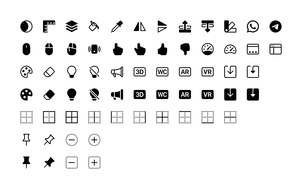
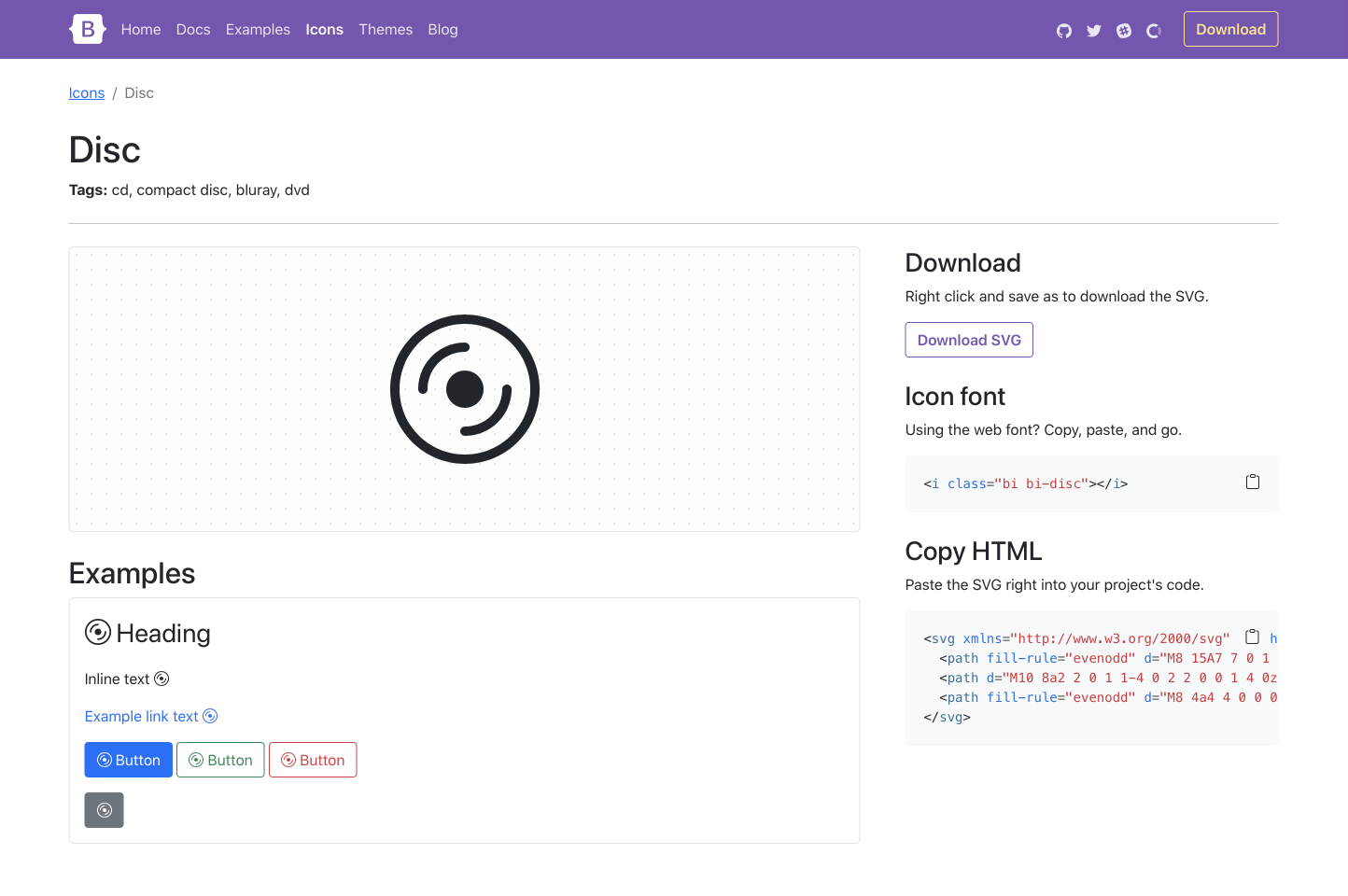
Say hello to over 60 new icons with Bootstrap Icons v1.3.0! We focused our efforts on filling in some holes and expanding some coverage of a few categories. We’re super happy with how the new additions came out and hope y’all love them, too!
As usual, we also snuck in some bug fixes to existing icons and ours docs. After this release, we’re back to focusing on shipping updates to Bootstrap v5 and v4. More on that soon, and in the mean time, enjoy the new icons!
60+ new icons
Here’s a look at the new icons in v1.3.0:
Added window-dock and window-sidebar
Added two symmetry icons
Added new stack icon
Added two speedometer icons
Added four save icons
Added rulers icon
Added filled variations for phone-vibrate, mouse, mouse2, mouse3, and four hand icons
Added several border icons
Added paint bucket
Added four new badges (3D, AR, VR, WC)
Added four lightbulb icons
Added eyedropper
Added mask icon
Added three color palette icons
Added layer-forward and layer-backward
Added two eraser icons
Added two megaphone icons
Added four push pin icons
Added Whatsapp and Telegram social icons
Added dotted circle dash, circle plus, square dash, and square plus
Have some ideas for new icons we should consider? Open an issue to tell us about it!
CDN quickstart with icon fonts
Since we added icon fonts in v1.2.0, it’s been possible to use a CDN to deliver and use Bootstrap Icons in seconds. Include the stylesheet, place short HTML snippets where you want icons, and you’re done! If you want to include it yourself, here’s how.
Include the Bootstrap Icons font stylesheet in the <head> of your website. Or, use @import to include the stylesheet that way.
<!-- Option 1: Include in HTML --><linkrel="stylesheet"href="https://cdn.jsdelivr.net/npm/bootstrap-icons@1.3.0/font/bootstrap-icons.css">
/* Option 2: Import via CSS */@importurl("https://cdn.jsdelivr.net/npm/bootstrap-icons@1.3.0/font/bootstrap-icons.css");
Add HTML snippets to include Bootstrap Icons where desired.
ProTip: Most browsers do not allow SVG sprites to be used across domains, which is why having icon fonts (when SVGs are the preferable and more accessible method of delivering icons) are so useful. Whenever possible, please use SVGs over icon fonts.
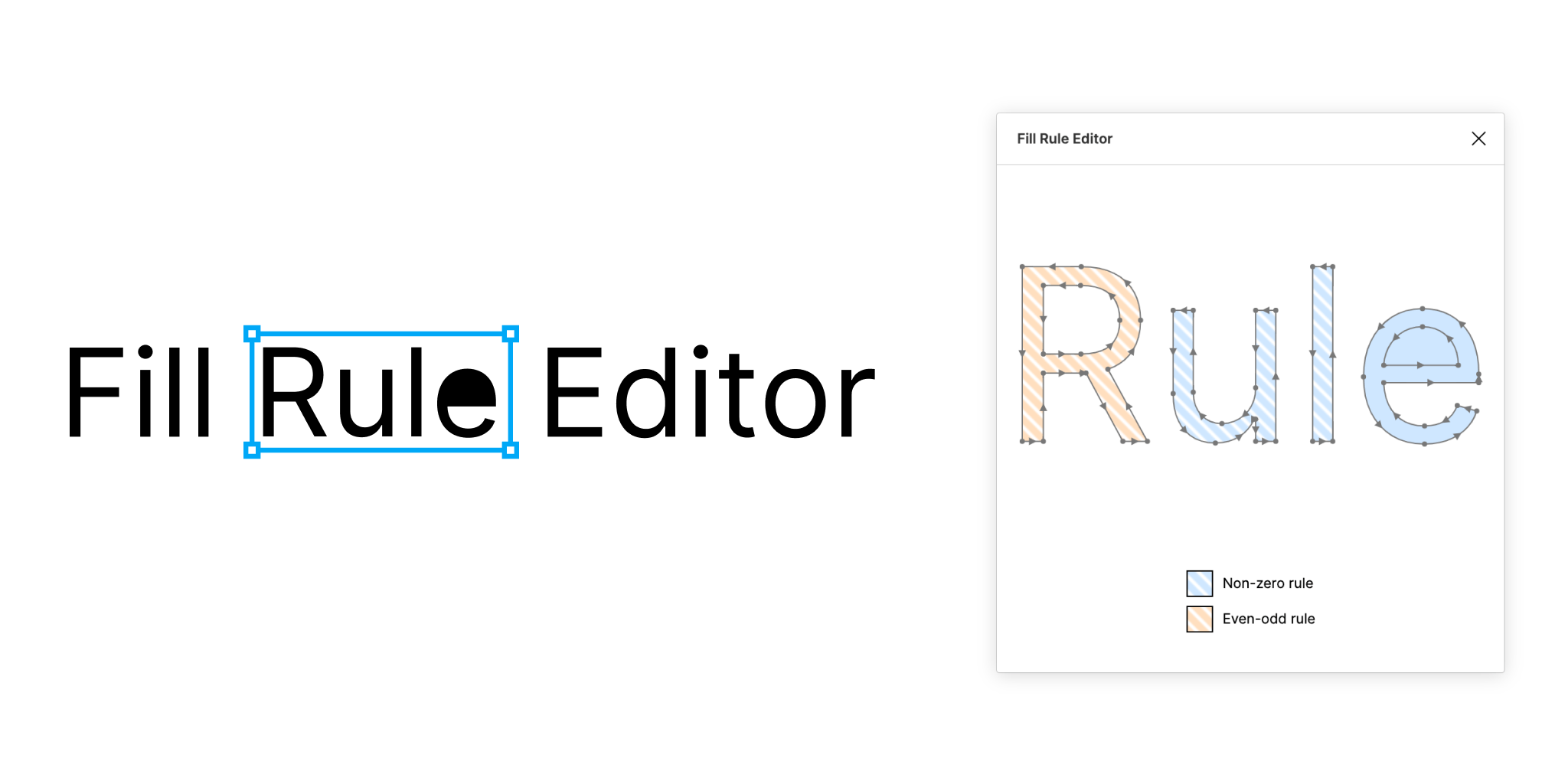
We’re ironing out the kinks in our new font files with Bootstrap Icons v1.2.2! We went back to the Figma file and ironed out all the fill-rule details to ensure our SVGs translated into font files properly.
We also snuck in a few bug fixes to existing icons, docs, and some slight visual improvements to some existing icons. Get the details below!
Font files
Our icons fonts are (fingers crossed!) free of visual glitches that made so many unusable across Windows devices. For some reason macOS and iOS had no problems, but Windows butchered the font files. Turns out this was a result of inconsistent fill-rule values in our icons, and some font formats and renderers only support a non-zero fill rule. We revisited nearly every icon and got it all sorted out.
Massive shoutout to the Figma Fill Rule Editor plugin that made this relatively quick and painless to update. You can even see in the plugin’s image below how this rule affects rendering of SVGs.
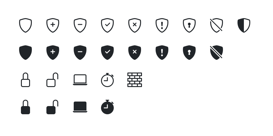
A few icons got touched up with the work for our font files to clean up paths and make them more visually pleasing.
Locks are a little more legible—they’re taller and narrower.
Laptops now have a half pixel gap between their base and screen, making them look a little sleeker.
Shields are 1px taller now, with their inner icons now raised 1px as well. No reason to make them not take up the full viewBox.
Stopwatch icons look more like actual stopwatches with separate start/stop and lap buttons.
The bricks icon has its missing grout line restored.
Renamed patch fill icons to fix typos in their file names (fll to fill).
Have some other refinements we should consider? Open an issue to tell us about it.
Last but not least, we ironed out some docs issues. Our navbar is fully functional and inline with the v5 beta site. We also added new aliases for icon filtering on homepage.
Our latest Bootstrap Icons release includes dozens of new icons, redesigned documentation, and the most highly requested new feature—icon fonts!
New social icons
We’re starting slow with social icons—just a handful of the biggest sites and networks folks are likely to need. We’ll keep this list purposefully small as the intent isn’t for full coverage. We’ll aim to add a few over time, but this should suffice for the time being!
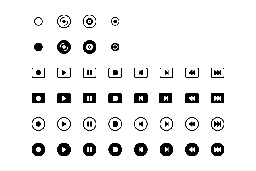
New media icons
The other main addition is our extended suite of media icons. We had folks ask for more options when it came to media controls, as well as different media types, so we’re getting the ball rolling with this update.
Icon fonts!
Finally, they’re here! We’re now generating web fonts for our icons thanks to a wonderful project, Fantasticon. To start, we’re generating two web font formats—.woff and .woff2. We’re also including an HTML index of all icons in web font format, powered by a generated CSS file.
This is our first foray into icon fonts, and we’re likely to make some tweaks along the way. Help us iron out any kinks by testing the fonts yourself and sharing any feedback in an issue.
Refreshed docs
The homepage for Bootstrap Icons has a new look thanks to an updated hero. The new hero features a new colorful icon image, clearer project description, and an upfront npm i snippet to help folks get started faster. A new notice at the top links to the blog post to tell folks what’s new, too.
Individual icon permalink pages have also been refreshed and greatly simplified. We’ve reduced the main example down to one instance of the icon, and expanded the examples below it to include the icon in more Bootstrap components.
The new permalink sidebar also features new and improved access to the icons. Need just an SVG or two? Use the new Download SVG button. Looking for the HTML for the new icon fonts? Just copy-paste. And as always, want the raw SVG HTML? That’s still there, too.
With our first beta release of Bootstrap 5, we’re calling it on new features and breaking changes. From here on out, we’re only fine-tuning features, bugs, and documentation on our way to a stable v5 release. Woohoo!
Just like with the v4 development process, our docs for v5 have been temporarily hosted on a subdomain for the next major release. Starting today, those docs are being moved to the main domain and our old v5.getbootstrap.com domain will redirect.
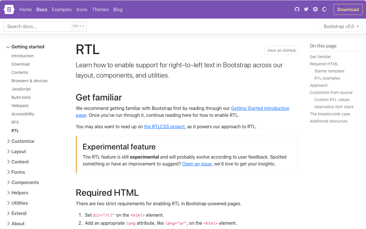
There are some really awesome new features—RTL!—that have been added in this release, and they’ve come with some important changes. Keep reading for the lowdown and let us know what you think!
RTL
Our biggest addition to the project in years, we’ve finally added RTL support to Bootstrap! Please join me in giving @ffoodd—one of our newest contributors and author of the RTL pull request—a massive thank you. The pull request includes nearly 50 references to existing issues and PRs that have tried to implement the feature into our core.
At a high level, our RTL approach includes a handful of changes:
Five new RTL Examples that show our new RTL CSS in action, converting our Album, Checkout, Carousel, Blog, and Dashboard examples into all new right-to-left equivalents.
Our approach is built on RTLCSS, an awesome project that helps reprocess an existing LTR stylesheet for RTL. We’ve classified it as an experimental feature for now, anticipating that we’ll get some of this wrong. We’re looking to the community to help us round out the feature as we wrap up some remaining todos.
This issue has some outstanding todos already planned for our team to address. See something else we can improve? Please consider opening an issue or pull request.
Part of our approach to adding RTL to Bootstrap was to add it in a way that felt future-friendly to ourselves and the web at large. As such, we’ve embraced the spirit of CSS logical properties and have renamed several classes and variables. It’s a risky change because of the size and impact of the change, but we hope you’ll appreciate it overall!
Most of you have already interacted with logical properties thanks to our flex utilities—they replace direction properties like left and right in favor start and end. Things like align-items-end have been welcomed additions. This makes horizontal directional class names appropriate for LTR and RTL without any additional overhead moving forward.
For example, in a LTR context, instead of .ml-3 for margin-left, use .ms-3. Be sure to read the RTL Migration guide for a full list of renamed classes and variables.
Popper.js v2
We’ve upgraded Popper.js from v1.x to v2.x, bringing with it some small breaking changes to our tooltips and popovers. These two changes are why we haven’t been able to update to v2.x sooner.
Removed offset option from our Tooltip/Popover and Dropdown plugins; this can still be achieved using the popperConfig parameter.
The fallbackPlacement option has become fallbackPlacements.
Popper.js v2 also comes with a smaller file size for our primary dependency, updated positioning calculations, and much more. Beyond that, our tooltips and popovers are unchanged and just as powerful.
Namespaced data attributes
We’ve renamed all our data attributes to include bs as an infix, thereby namespacing all the HTML attributes that enable JavaScript behaviors from our plugins. See #31827 for details. It helps keep Bootstrap-required JavaScript triggers clearly identified throughout your projects.
Making this change is a tad annoying, but easy enough to remedy with a find and replace. The new attributes work just like the old ones, just a little more specific. For example, here’s a dropdown button and menu with the newly renamed data-bs-toggle attribute.
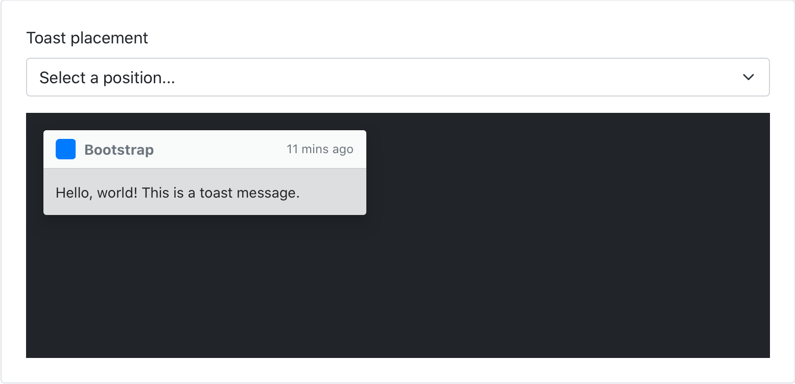
After dabbling in some JavaScript solutions to positioning toasts, we’ve landed on a new CSS-only approach thanks to our new positioning utilities. This comes with some minor breaking changes—namely some changes to exact CSS properties and how we toggle visibility of the toasts—but largely keeps them intact.
Beyond the namespacing, we’ve been chipping away at a few other JavaScript improvements and bug fixes. Here’s a rundown of what’s new:
Created a new base component to share logic across our components. See #29370.
Migrate to more modern APIs across our plugins. See #32095.
Tooltips and popovers can now have custom classes. See #32217.
Don’t hide modal when config.keyboard is false. See #32179.
More JavaScript updates are coming soon, from performance and file-size improvements to new features.
States in the utilities API
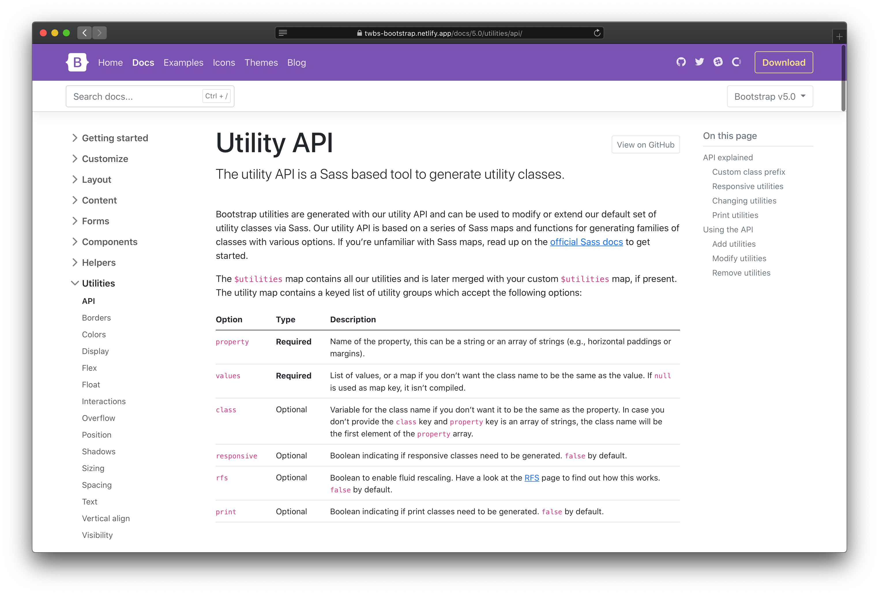
One of the biggest new features of Bootstrap 5 is our utilities API, an extensible way to customize, add, or remove Bootstrap utilities. We’ve been iterating along the way and our newest improvement is the ability to add pseudo-class variants with the state option.
Use the state option to generate pseudo-class variations. Example pseudo-classes are :hover and :focus. When a list of states are provided, classnames are created for that pseudo-class. For example, to change opacity on hover, add state: hover and you’ll get .opacity-hover:hover in your compiled CSS.
Need multiple pseudo-classes? Use a space-separated list: state: hover focus.
Elsewhere we’ve made a handful of other breaking changes and improvements. The most notable updates include:
Breaking: Renamed scale-color() function to shift-color() . See #32149.
Breaking: Simplified the make-container() mixin and $container-padding-x. See #31735.
Fixed: Corners remain rounded now in vertical button groups. See #31303.
Fixed: Removed default linear gradient on some table rows that caused undesirable performance. Still more work to do here FYI. See #32277.
Updated: Breadcrumbs now have a simplified appearance. Use utilities to restore the padding, background-color, and border-radius as desired. See #32249.
Updated: Finalized browserslist configuration to match our supported browsers. See #30986.
Head to https://getbootstrap.com to explore the new release. We’ve also published this updated as a pre-release to npm, so if you’re feeling bold or are curious about what’s new, you can pull the latest in that way.
Our third alpha release has landed with tons of updates to our components, utilities, docs, forms, JavaScript, and more. This is a larger alpha release for us and sets us up for our first beta where we’ll introduce some final breaking changes and features.
We’re trying to move fast and keep the future of the project and the web in general in mind, so this release is an important milestone for us. We’re balancing practical migration from v4 with meaningful changes that reflect the ever-changing front-end community.
We think you’ll love this release, so keep on reading and let us know what you think!
Components
We’ve improved a handful of components in this release, and even dropped one for some new and improved utilities.
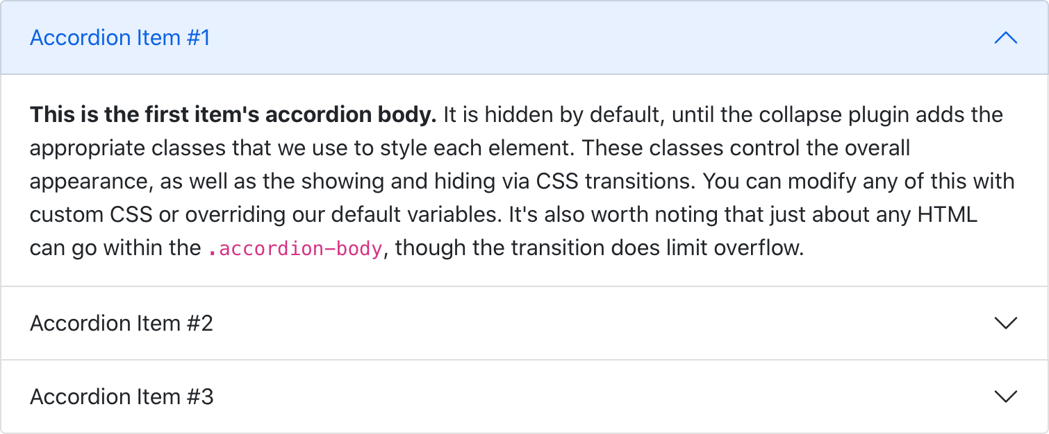
New accordion
We’ve dropped the .card based accordion for a brand new .accordion component, solving several bugs in the process. Our new accordion still uses the Collapse JavaScript plugin, but with custom HTML and CSS to support it, it’s better and easier than ever to use.
The new accordion includes Bootstrap Icons as chevron icons indicating state and click-ability. We’ve included support for a flush accordion (add .accordion-flush) to remove the outer borders, allowing for easier placement inside parent elements.
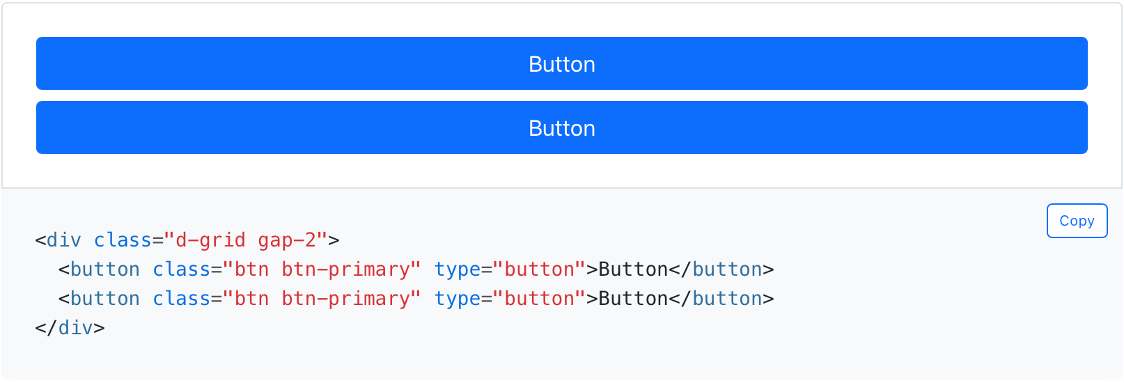
Block buttons are no more in v5—we’ve dropped the .btn-block class for .d-grid and .gap-* utilities. This allows for the same behavior and style, but with much greater control over spacing, alignment, and even responsive layout options.
We’re always looking for new ways to improve our documentation, and this release is no different. We have a ton of changes big and small.
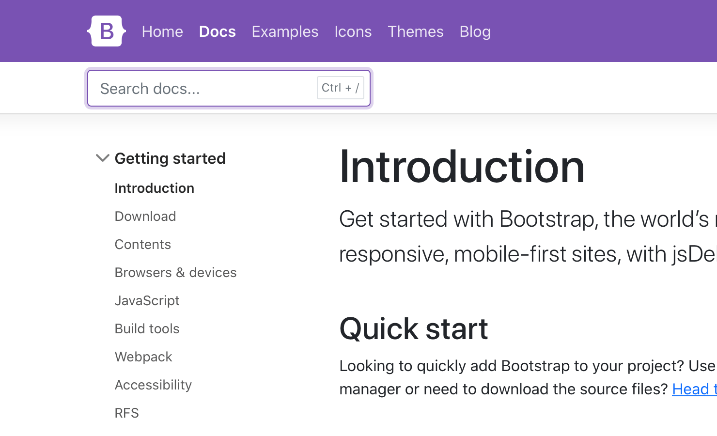
We’ve added a keyboard shortcut to focus you on the search field. Hit Ctrl + / to trigger it.
We’ve also rewritten the docs sidebar to use actual <button> elements instead of anchors, and improved the focus styling.
Content-wise, we’ve renamed the “Navs” page to “Navs & Tabs” to help folks find our tab JavaScript features better. We’ve also made some style changes, improving the focus styles of heading anchor links and removing text wrapping from code snippets for shorter and easier to read code.
Sass
Three important and helpful changes to our Sass source code:
We’ve switched to Dart Sass with LibSass being deprecated. We’ve been testing our builds with Dart Sass for a while and decided to make the switch with LibSass being deprecated just a couple of weeks ago. We’re holding on the Sass modules for now.
The color system which worked with color-level() and $theme-color-interval was removed in favor of a new color system. All lighten() and darken() functions in our codebase are replaced by tint-color() and shade-color(). These functions will mix the color with either white or black instead of changing its lightness by a fixed amount. The scale-color() will either tint or shade a color depending on whether its weight parameter is positive or negative. See #30622 for more details.
We’ve added a Sass variable for CSS custom property prefixes.
JS
Ahead of some larger and necessary JavaScript changes in Beta 1, we’ve shipped a few updates to our plugins.
Simplified dropdown’s placement
Removed redundant polyfills since we dropped IE and Legacy Edge
Fixed the carousel data-interval bug by checking for data-interval on the first slide
Removed Manipulator.toggleClass to simplify some code since we only used it one place
Utilities
Utility classes are incredibly powerful in Bootstrap, especially with our new utilities API.
With our first beta, we’ve overhauled our API docs to provide clearer examples and information on adding, modifying, removing, and extending our default utilities.
In addition, we’ve added some new default utilities to make life a little easier:
Added .d-grid for display: grid
Added .fs utilities for font-size
Renamed font-weight utilities to .fw
Added .rounded-1, .rounded-2, and .rounded-3 for new small, medium, and large border-radius utilities
Added .overflow-visible and .overflow-scroll utilities
Our next release will also add another powerful feature to our utilities, pseudo-class support!
Forms
Forms have some exciting changes thanks to the addition of floating labels as a fully-fledged form layout option and a new file input.
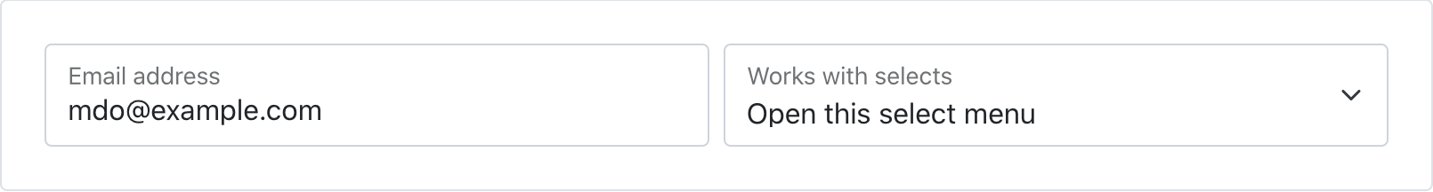
Floating labels
Floating labels include support for textual inputs, selects, and textareas. We have one limitation with textareas where multiple lines of text can be obscured by the floating label. We’re working on fixes for this, so if you have ideas, please let us know!
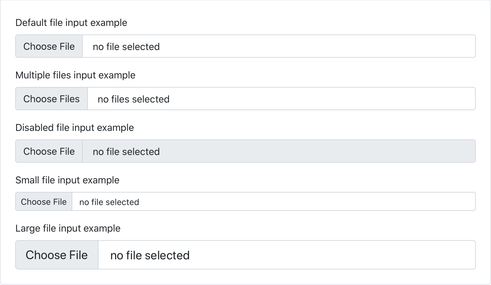
New file input
We’ve dropped our custom .form-file class for additional styles on the .form-control class. This means we no longer require additional JavaScript to make our file input styles functional—the new form file is all CSS!
Input group rounded corners
Beyond that, we’ve finally resolved ourselves to adding a new class to fix the rounded corners on input groups when using validation. Add the .has-feedback class to the .input-group to enable validation messages inside input groups without any visual regressions. The good news is this is also being backported to v4 in our next release.
And more
In addition, we’ve made a few other form-related improvements:
Removed explicit height from most of our form controls.
Fixed the disabled checkbox toggle buttons
Added docs examples for disabled .form-control, .form-select, and .form-range elements
Have some form feature requests or improvements we should consider? Please open an issue!
Quality of life
Lastly, across the board we’ve made some minor updates to browser support, Reboot styling, components, and more
Moved our preferred CDN from BootstrapCDN to jsDelivr
Dropped support for Legacy Edge (woohoo!)
Updated to Node.js 14 and PostCSS 8.x
Removed obsolete prefixes in our CSS
Added cursor: pointer and heights to color inputs
Removed background-clip on .btn-close so the background-image is no longer clipped
Improved sans-serif font selection in Ubuntu
Spinners now slow down when reduced motion is enabled rather than stopping outright
Beta 1 will be a more narrowly focused release and we’re hoping to ship these final breaking changes as part of it.
RTL!RTL is still coming! The PR is being reviewed by our team would like it to land in Beta 1 to ensure we can get some testing from the community.
Updating to Popper.js v2. Still on our radar, but moving slower than we anticipated due to some of the differences in the major release. See the PR for details.
Namespaced data attributes to help keep our functionality clearly separated from your own. See the PR.
Updated utilities API with pseudo-classes support via a state option. Add any space-separated list of states to get additional utilities for that pseudo-class. See the work-in-progress PR for details.
For a more up to date list of changes, be sure to follow along with the v5 Beta project board.
Get started
Head to https://v5.getbootstrap.com to explore the new release. We’ve also published this updated as a pre-release to npm, so if you’re feeling bold or are curious about what’s new, you can pull the latest in that way.
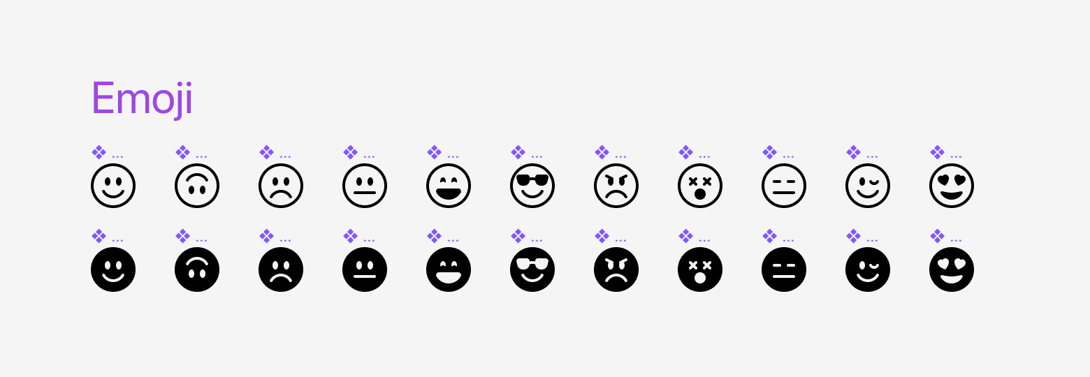
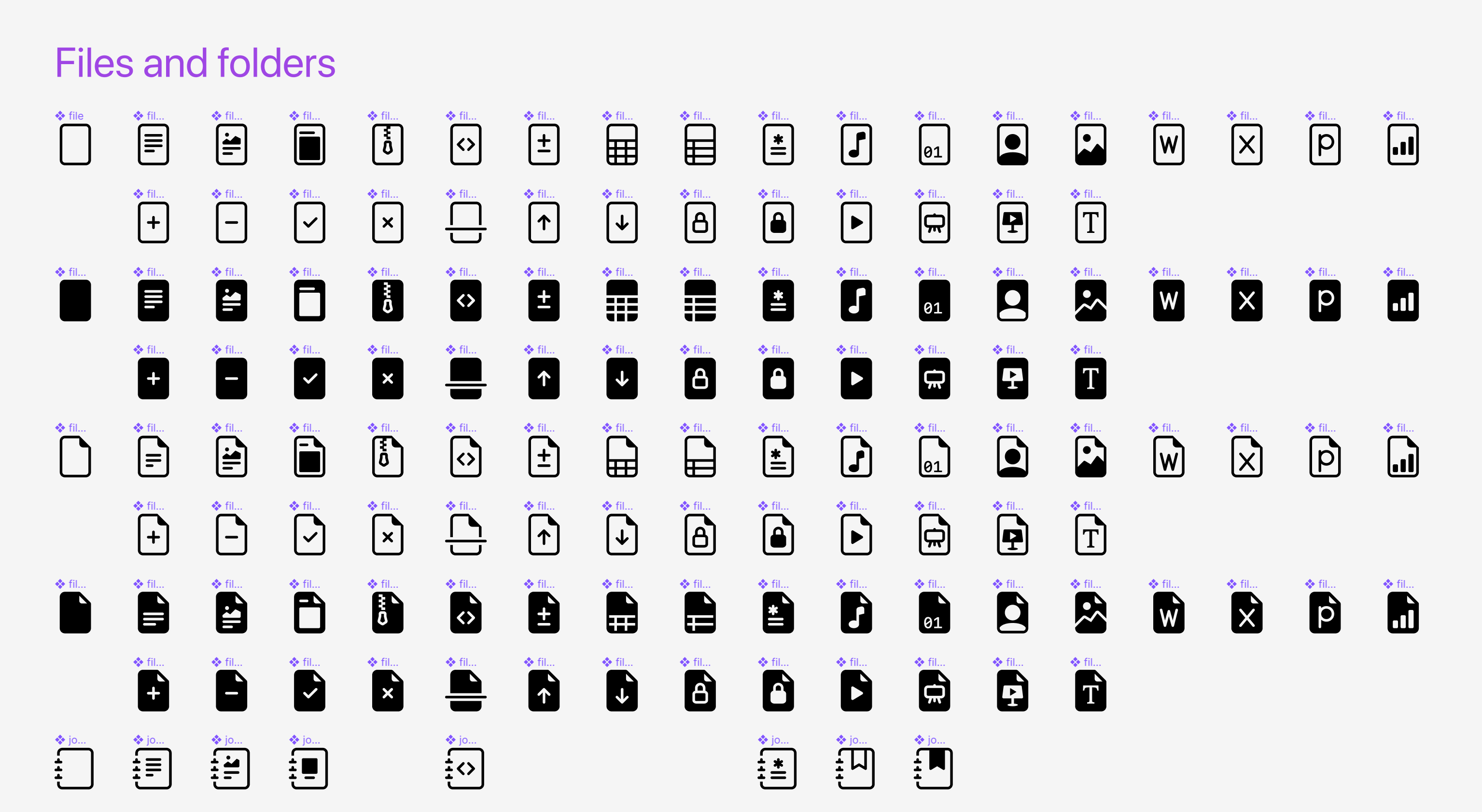
Our first minor release for Bootstrap Icons is here, with over 30 new icons and a few bug fixes. New icons include fill variations for our emoji icons, including a few new emojis, and several new file type icons.
30+ new icons
Here’s a look at our file and emoji icons as of v1.1.0. New in this release for emojis are the wink and heart eyes, along with fill versions for the full set. In addition, we’ve added icons for Word, Excel, PowerPoint, and a general bar chart file type.
Changes
Here’s a more complete look at what’s changed in this release.
Fixed #415: Properly name grip-horizontal and grip-vertical
We’ve updated Bootstrap 4 with a new patch release to fix some bugs, backport some iterative changes from v5, and more. Enjoy!
As you may already know, we’re alternating between v4 and v5 releases to keep both versions moving in tandem. This helps us close the gap between v4 and v5 and make updating to v5 as easy as possible.
We’ll be back to v5 with our third alpha release coming in a couple of weeks. After that, we’ll ship another v4 update with v4.6.0 that continues the v5 backports and feature development. Please keep the feedback coming on what we can improve, how our releases are performing, and any other suggestions.
 @mdo
February 10, 2021
@mdo
February 10, 2021
